Mark’s Notebook - Page 10
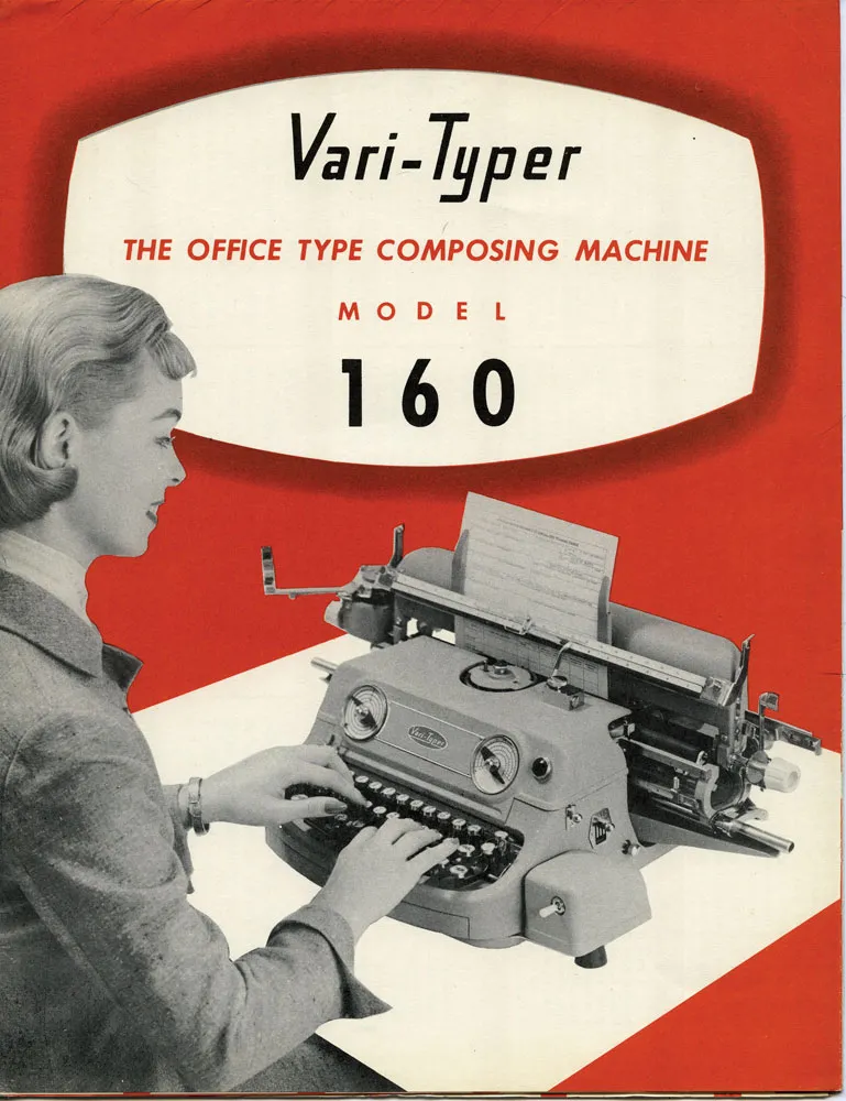
I was looking through my collection of old printing ephemera and found this lovely 1957 brochure for the Vari-Typer Model 160. Machines like this became practical with the spread of offset printing. Professionals pasted up proofs of hand-set metal type or output from a phototypesetting machine. But, if you were on a budget, the Vari-Typer offered a low-cost alternative.
It was essentially a fancy typewriter, but with proportional fonts, different type sizes and the ability to justify lines. It didn’t really look like professional typesetting, but it looked better than a typewriter, which was good enough for many purposes. It was desktop publishing before computers.
I really like the logo. But this is what made me want to post these scans:
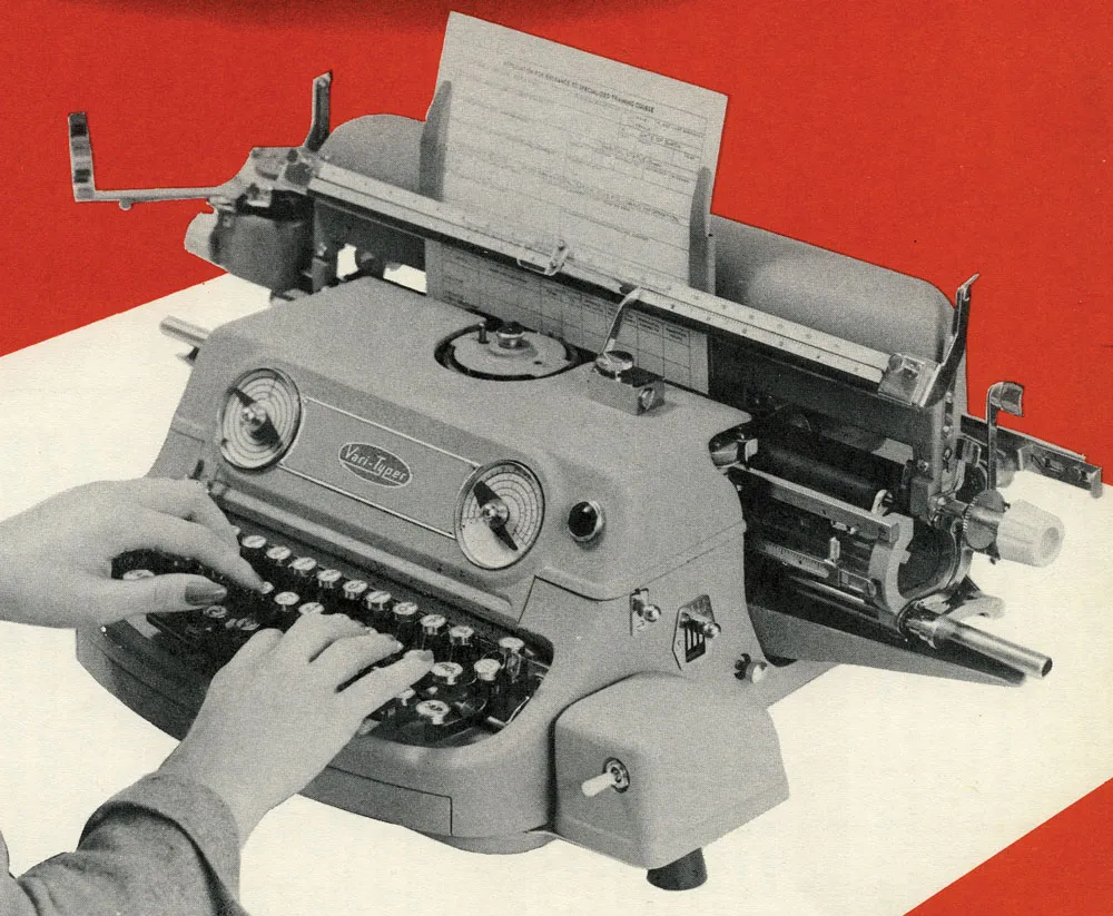
I really wonder what was going through the minds of the industrial designers who created this machine. Did they mean for it to look like a little grinning monster? So easy to use—just stick your fingers in its mouth and type!
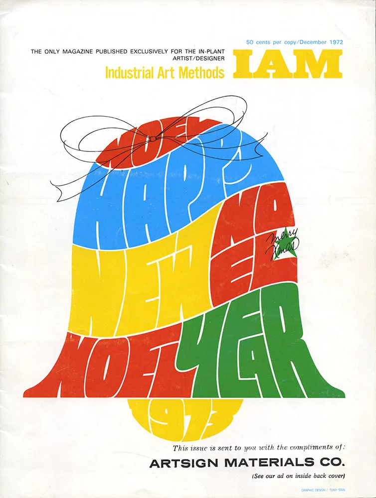
I don’t remember the details of how I got hold of this particular issue of Industrial Art Methods (“The Only Magazine Published Exclusively for the In-Plant Artist/Designer”), but it was one of the key things that sparked my interest in type design when I was a teenager.
I didn’t notice until years later that the lettering/illustration on the cover was by Tony Stan, designer of many faces for International Typeface Corporation, such as ITC Garamond, ITC American Typewriter, and ITC Cheltenham.
What caught my interest, though, was an article titled “How visual graphics develops new alphabets for the photo typositor”. By “visual graphics” they mean Visual Graphics Corporation (VGC), and by “photo typositor” they mean the Photo Typositor®, one of the most widely used headline setting machines of the phototype era. The article included this two-page spread:
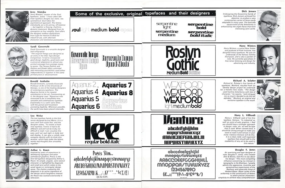
I was already interested in type at this point, having purchased sheets of rub-down type for my high school newspaper. I didn’t know what a Typositor was, but here were a bunch of guys who had designed some really cool typefaces for it. I started imagining creating my own type designs and maybe getting them published, like these guys. Let’s take a closer look.
I have no idea what became of Jerry Matejka. His Soul family was one of my favorites in this article. It seemed very hip and cool. I’ve rarely seen it used, though. It’s funny how the description isn’t much different than what you still see in the marketing hype for fonts. As far as I know, this is Jerry’s only type design.
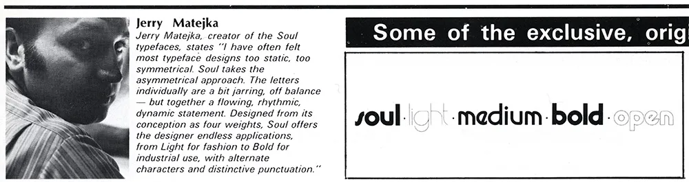
Sandi Governale’s description is even more hyperbolic—there’s nothing this typeface can’t be used for! Can’t say I ever did see it in use, though. I remember thinking this was one of the weaker designs in the article. Sandi also designed some typefaces for Photo-Lettering, Inc.
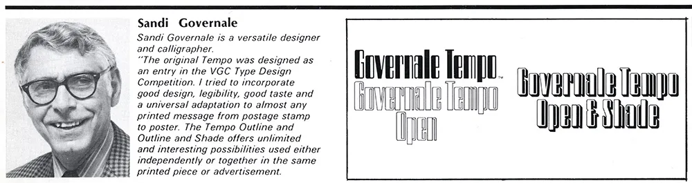
Ron Arnholm is still around. He is best known for designing ITC Legacy (1992), a “super family” with both serif and sans serif styles. I used to see Aquarius quite a bit on book covers back on the seventies. It always reminded me of the old 3M corporate typeface, but more stylish. Ron has attended the last few TypeCons, so I’ve gotten to know him a little bit. Nice guy. What I want to know is, whatever happened to Aquarius 1 and 3?
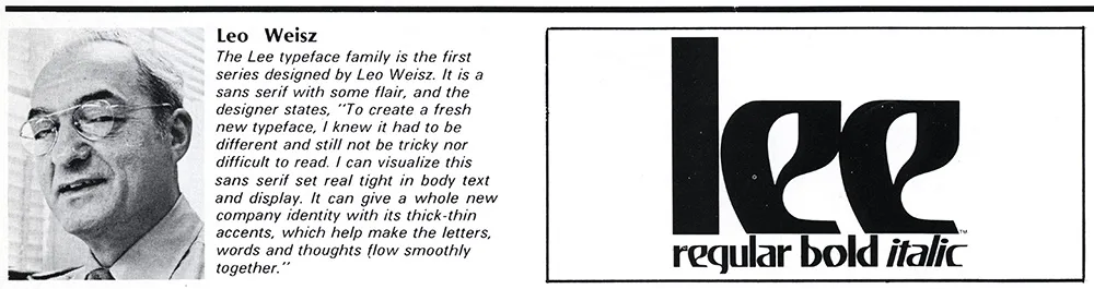
You wouldn’t expect that a guy who looked like Leo Weisz would have designed a weird-ass typeface like this, would you? It seems to be his only type design. You’ve see Lee in use on the VHS logo and the Charlie’s Angels logo. Leo is still around. He’s over 100 years old now, still paints, and even has a Facebook page.
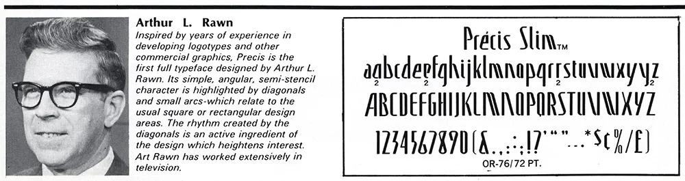
As far as I know, this is the only typeface Arthur Rawn is credited for. It seemed strange to me when I first saw it, even more so looking at it now. A very odd design, very uneven rhythm. I can see a little bit of Amelia and Peignot as possible influences. I don’t recall ever seeing it in use.
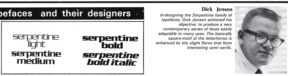
Serpentine is probably the most well-known typeface of the bunch, one of the few that made the transition to digital type fairly early on. I can’t explain why, but Dick Jensen looks like just the guy to design something like this. Turns out Dick was a Minnesota boy, born in Saint Paul (where I live now). As far as I can tell, this is his only type design. He died in 2000 at the age of 72.
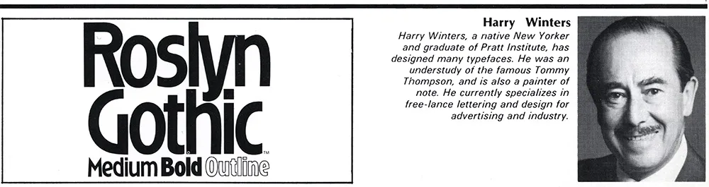
I remember liking this one a lot when I first saw it. It was fairly popular in the seventies. Looking at it now, it has a kind of Arts & Crafts look to it. Not sure what became of Harry Winters. He doesn’t seem to have been responsible for any other type designs.
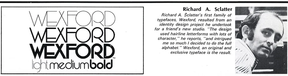
Richard Schlatter (his name was spelled wrong in the magazine) is still around and living in Michigan. Besides Wexford, he also designed a series called Glyphic, a very bold, high contrast sans serif. Wexford was another of my favorites from the article. A very seventies art deco face if there ever was one.
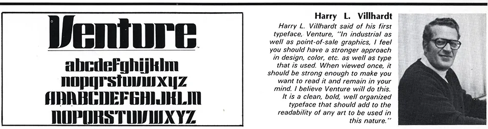
According to Canada type, which did a revival of Venture recently under the name Chopper, Harry Villhardt was a friend of Dick Jensen (above). I can’t remember this typeface having been used much, although it’s easy to picture it being used on 1970s science fiction paperback covers.
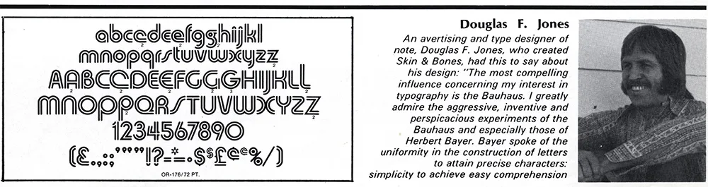
When I tried to do a web search of Douglas Jones and his Skin & Bones typeface, all I could find were references to a TV show called Fear Itself which had an episode called “Skin and Bones” starring an actor named Doug Jones. As for Doug Jones the type designer, Skin & Bones is the only published design of his I could find. I quite liked it back when I saw it in this article. Doug also gets my vote in the Sonny Bono Look-Alike Contest.
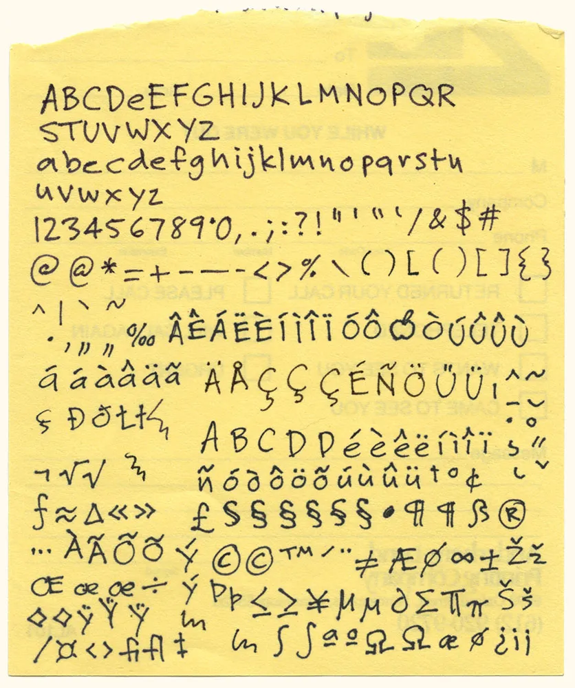
Here it is: The original artwork for one of my most popular fonts, Felt Tip Roman. I scribbled out all the characters needed in a typical font on the back of a phone message pad (about 4.128” x 5”) using a Pilot Razor Point felt pen. I deliberately tried not to be too neat or careful to try to capture the spontaneity of natural handwriting. Whether it would actually work as a font, I had no idea. That it would become a commercially successful font someday would have struck me as absurd at the time. I probably would have been a bit more careful and circumspect if I’d known. But perhaps then it would not have been as popular.
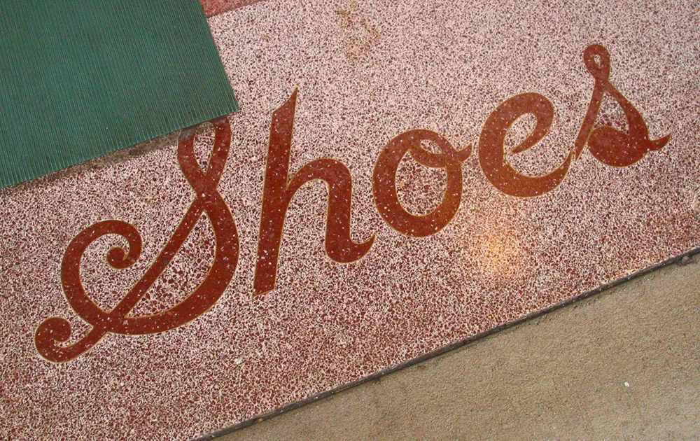
Inlaid tile lettering, seen in Beloit, Wisconsin on November 27, 2004.
I first launched my website in spring of 2000, offering my services for design, illustration, and lettering. Oh, and I also showed a few fonts I’d made.
I’d just quit my job as a product designer at Rivertown Trading Company, and I had a big plan to do all the things I had long dreamed of doing, but couldn’t because of my “day job”. I wanted to get back into doing illustration. I wanted to try to sell my services as a lettering artist, something I’d only previously done on my own design projects. And I also wanted to get back into making fonts, something I hadn’t really done very much since I released a few fonts through FontHaus in the early nineties.
My website has evolved over the past thirteen years, just as my career has. The illustration thing never really went anywhere. The lettering thing peaked about 2005. But the font thing really took off. My site has changed to reflect this.
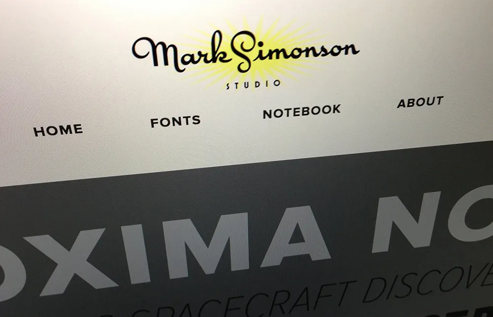
The new design, which I’m launching today, is all about the fonts. Among the changes, I’ve created all-new PDF specimens, added more complete “where to buy” information, and I’m (finally!) using webfonts on my site (Proxima Nova via Typekit). There is a new Licensing FAQ and a new feature called “Evolution of a Typeface” where I go into excruciating detail about the design process that goes into making a font. Plus: A studio tour.
I kept the blog (“Notebook”) intact, and folded my early articles (“The Scourge of Arial” and “Typecasting”) into it. My writing has been sporadic in recent years, but I plan to change that and write more regularly again. I’ve even gone through and replaced all the tiny 350px-wide blog images with big hi-res versions—Notebook: Now available in HD!
The new site is what they call responsive, meaning that the layout changes to fit any screen size, from a 25-inch desktop monitor to a 3.5-inch smartphone. Not only that, it’s all high-dpi-ready, so if you’ve got a “retina” screen, the site will look nice and sharp.
In the past, I did all my own web coding and design. But this time around, I decided to leave that work to the professionals. (You wouldn’t hire a web designer to make a font for you, would you?) The new site was designed by Trent Walton, Dave Rupert, and Reagan Ray at Paravel in Austin, Texas. (Thanks to Jason Santa Maria for recommending them.) The back end stuff was done by Matt Weinberg and his team at Vector Media Group. I’m really happy with the way it turned out (and discovered what a terrible client I can be—I’m not used to being on that side of the fence!) and I look forward to working with the new design for years to come.
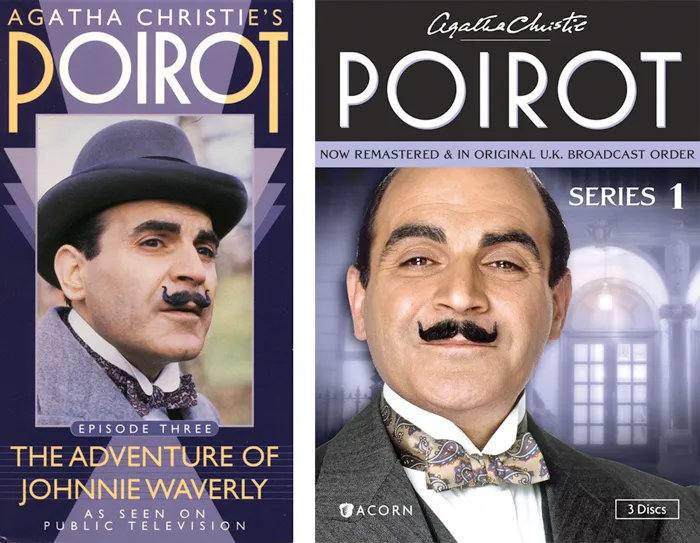
Back in 1991, I designed a series of packages for the American release of London Weekend Television’s Poirot series on VHS. (My design is above on the left.) As part of the design, I drew the name “POIROT” in a geometric Art Deco style, which I thought was fitting for the series.
The other day, I happened to see the latest incarnation of the series packaging (above on the right) and noticed that the designer had set the title in one of my fonts, Mostra, which I never noticed before is pretty similar to my 1991 lettering design.
I wonder if they knew?