Mark’s Notebook - Page 11
Alastair Johnston, who has written some very nice books about type, has posted an item on his blog skewering the period typography of the TV movie The Mystery of Edwin Drood.
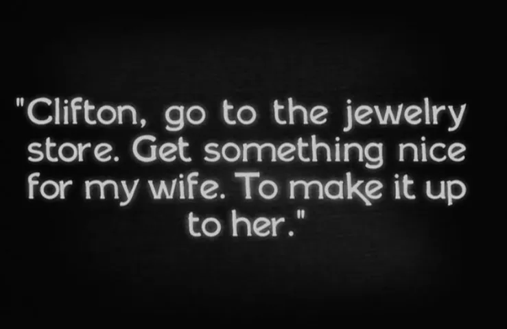
I don’t normally plug movies here, but I had a small part to play in this one as a technical advisor. It’s set in 1972. My job was to advise about typographic details so they would be correct for the period. (See Typecasting and Son of Typecasting.)
I haven’t seen the movie yet, or even all the shots that have typography in them, but you can see some of the results in the trailer. They first contacted me about it in 2008. It’s really cool to see it finally coming to theaters this fall. Congrats to Justin and his crew!
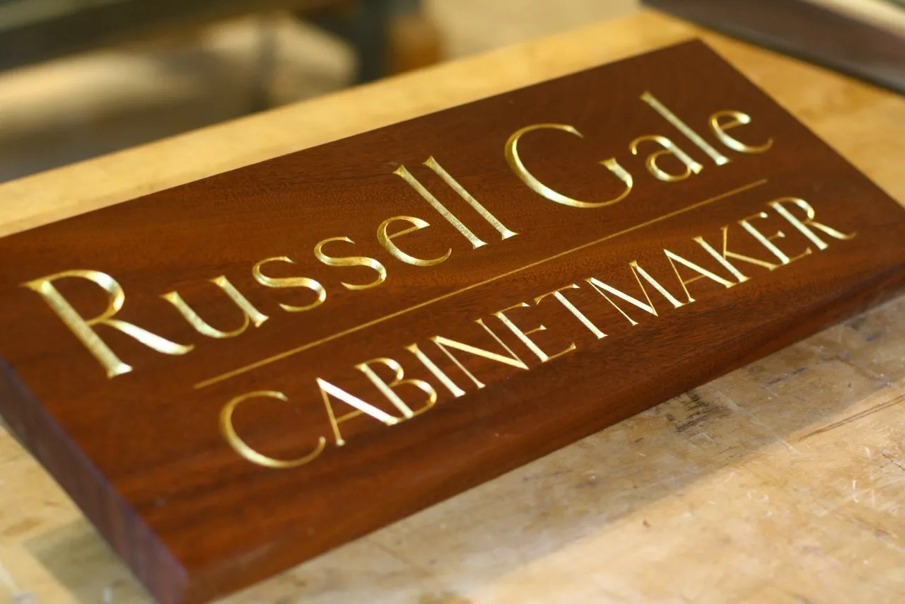
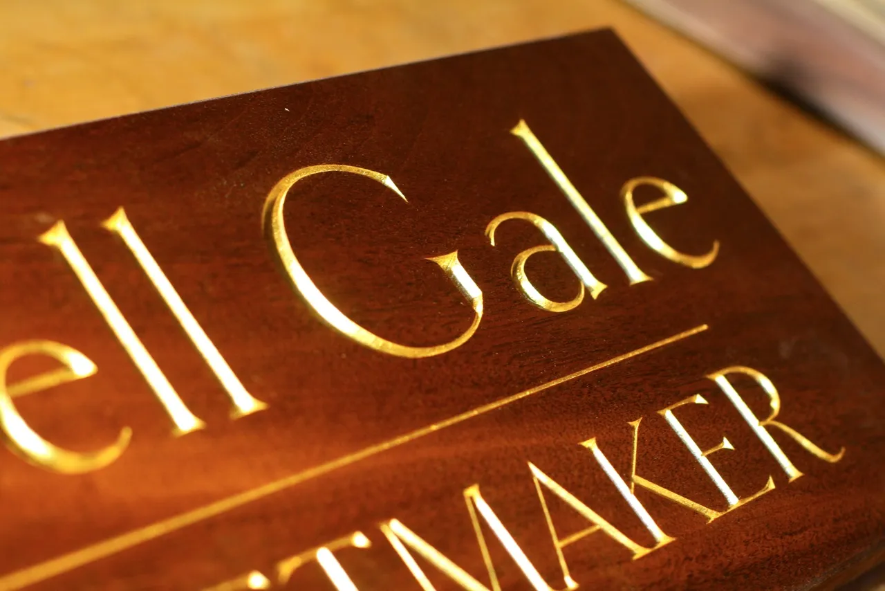
Clark Kellogg, a furniture maker and letter carver in Houston, recently completed a commission for a sign for a friend and fellow cabinetmaker. He writes, “I was excited to do it, as it finally gave me a chance to carve something with your epic Goldenbook font. The client flipped out when he saw the sign, and liked the font so much he ended up using it for his business cards.”
Very nicely done!
(Photos by Clark Kellogg.)
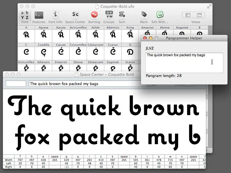
Almost ten years ago, I made a little program called Pangrammer Helper. It’s a little tool to help compose pangrams, which are sentences containing every letter of the alphabet. It was built in Flash and was designed to run in a web browser.
Type designers are especially enamored of pangrams, as you can imagine. Fellow type geek and friend, Craig Eliason, has been using it for several years to compose entries for his Daily Pangram site.
Recently, a new font editing app called RoboFont was released, and I’ve been starting to use it in my work. One of the neat things about it is that it’s fully extendable—that is, if you are willing to do a little Python programming, you can add features to it.
Last week, the Robothon 2012 conference was held in The Hague. It was all about type design and technology. I wasn’t able to attend, but videos of most of the talks have been made available on Vimeo, and I’ve been watching them the last couple days. Two of them in particular, one by Tal Leming about Building Stuff and another by Frederick Berlaen introducing RoboFont, inspired me to rewrite my Pangrammer Helper in Python so it could work inside RoboFont.
It took less than a day to do it, and it works great. You can use it by itself, and it works a lot like the old Flash version (a bit simplified), or, if you have RoboFont’s “Space Center” window open (the window were you work on your font’s spacing), the text also appears there as you compose it.
If you happen to be a RoboFont user, you can download version 1.2 of the script here. Just drop it into your scripts folder and you can run it right from the Extensions menu.
Update: Frank Grießhammer (currently working in Adobe’s type department) has contributed some improvements to my script, mainly adding the ability to add non-ASCII characters (as in “Grießhammer”) and an option for mixed-case pangrams. Thanks, Frank! The download link above will download this version (1.2).
The Artist won this year’s Oscar for Best Picture about a week ago. It seems to say something about the state of movies today that a black and white, silent picture—not even wide screen—wins the big prize. I’ve seen it, and it’s good, but I confess that I had to force myself to ignore most of the type in it in order to enjoy it.
The Artist mimics the look and feel of a late 1920s silent film. The sets, the costumes, the makeup, the lighting, the camera work, the acting—even the way it’s written—makes you almost believe you are watching a classic of the silent era. Of course, you know it’s not. After all, there are recognizable modern actors in it, like John Goodman and James Cromwell. And, for me, there was the type.
Most of the fonts they used looked more or less right for the 1920s, although quite a few were badly made free fonts (or badly made commercial fonts—those exist, too). Others are not quite from the era or were applied in an anachronistic way—for example, using negative line spacing, which is impractical to do with metal type.
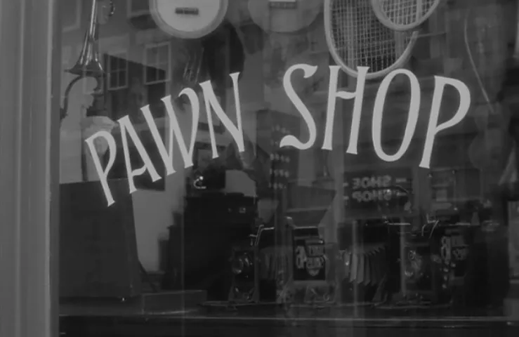
But the real problem was that they used type at all. Except for things like newspapers, a few other small props, and the intertitles (more on these later), type would not have been used. Movie posters, signs, magazine covers, movie titles and credits—back in the 1920s and 1930s, that kind of thing was almost always lettered by hand. Type—and it would have been metal type, back then—was not up to the job. There were too few styles, too few sizes. It just wasn’t as flexible as someone skilled with a brush. Things that are so easy for us to do with type today were practically impossible back then, which provided plenty of work for letterers.
If you’re careful, it is possible to get close to the look of lettering with modern fonts. Some are even made to look that way (I’ve made a few myself). But for all the attention they paid to other period details, there is something slap-dash about the way this stuff was handled in The Artist.
The opening titles are okay, but not great. The font may be custom. I don’t recognize it. Nice quote marks:
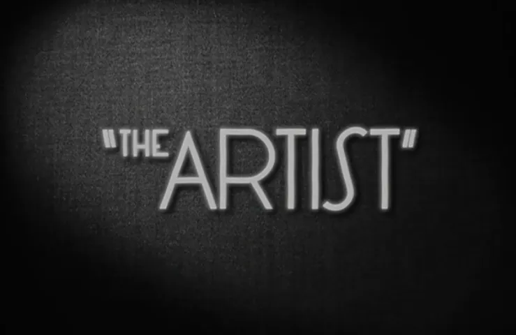
I can’t decide if this custom font works or not. It’s not lettering, so that’s wrong, especially since it makes it look more uniform than it should be. It has an appropriately Art Deco feel, but there’s something not quite period about it that I can’t put my finger on. Maybe it’s the little hook on the lowercase “l” or the tilt of the uppercase “C” that feels more 1970s than 1920s to me:
Here is a title from the 1946 film Étoile Sans Lumere, which has a similar style, for comparison:
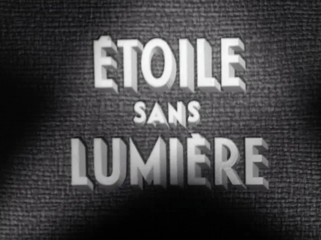
This may be what they were inspired by, but as you may be able to see, it was hand lettered, and much more charming because of that.
In general, the intertitles—the text used in silent movies to convey dialogue—look right. Two fonts were used. The first is in the movie-within-a-movie near the beginning, a quaint roman face that I wasn’t able to identify. It looks the part, but seems a little too wonky. The right kind of quote marks are used, but they seem to be from a different font:
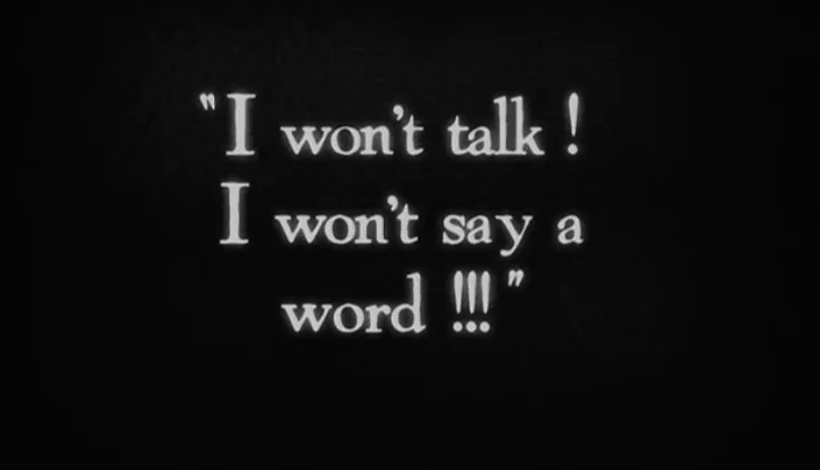
One small thing here as well: Putting a space before the exclamation point is a French convention. Ironically out of place? Some kind of very subtle foreshadowing? A clue to the nationality of the production designer?
The second face, used throughout the film for (nearly) all the dialog is Silentina, a modern font based on Pastel, a typeface that was actually used a lot in silent movies:
The only problem with these are the “straight quotes.” This kind of quote mark is a hallmark of the digital age. You have to be paying attention to avoid it when setting type on a computer. Silentina’s proper quote marks capture the authentic look:
![]()
…but were not used, unfortunately.
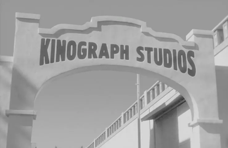
The Kinograph Studios logo shows up a few times. It appears to be set in Hermes with an envelope effect applied to fit the letters into an arch shape. Needless to say, you could not set type this big or distort it like this back in the twenties. Even so, it looks plausible, style-wise:
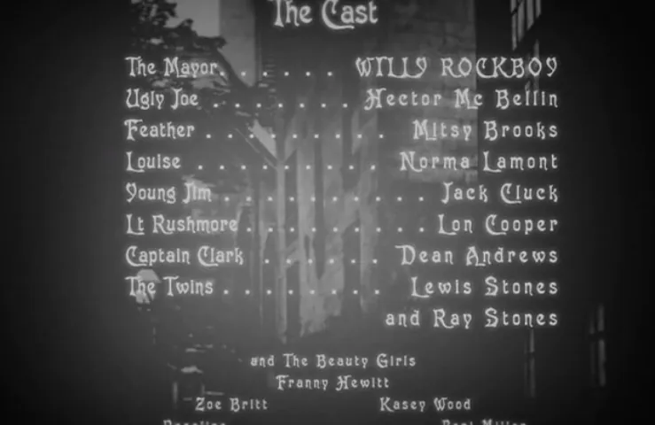
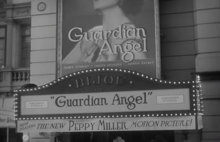
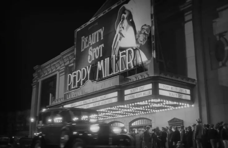
Fonts are used for the title and credit screens in the movies-within-the-movie. The choice of Victorian fonts feels wrong, and these should be hand lettered anyway. So, wrong on two counts:
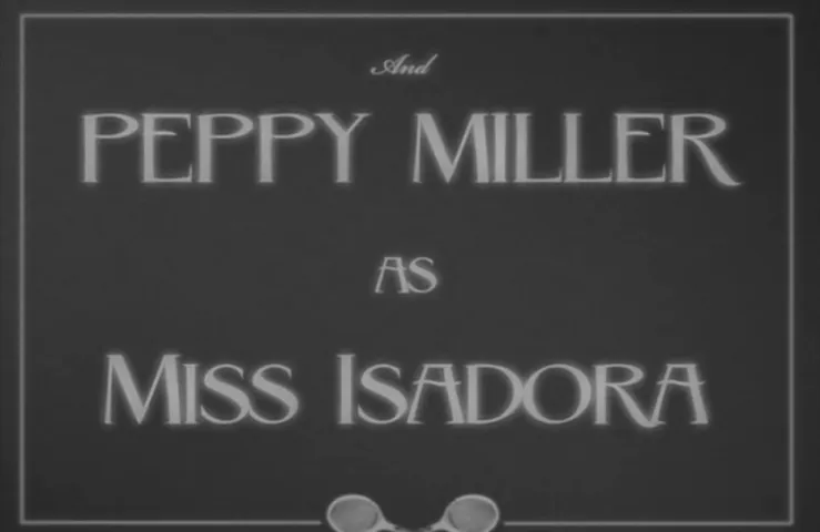
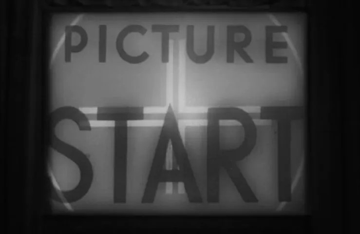
This one is a font, too, but the style looks appropriate for the twenties:
Fonts are used on the slates, too. In this case an old German typeface called Berliner Grotesk. Again, this would have been lettered with a brush, not typeset. You can see it in this one in the small print:
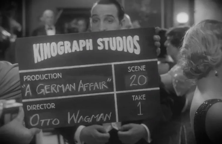
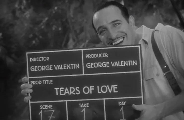
Berliner Grotesk does look a bit like careful hand lettering of the period, but it definitely shouldn’t have been used the way it was in the next one, where the production info should have been handwritten in chalk like the first one:
Using fonts in the newspaper props is appropriate, but there are some missteps here as well. The font Albertus, which was released a bit later than when this movie takes place (late thirties), is used several times, but has rarely been used in real newspapers, as far as I know. Not only that, the type is set with negative leading, practically impossible for metal type:
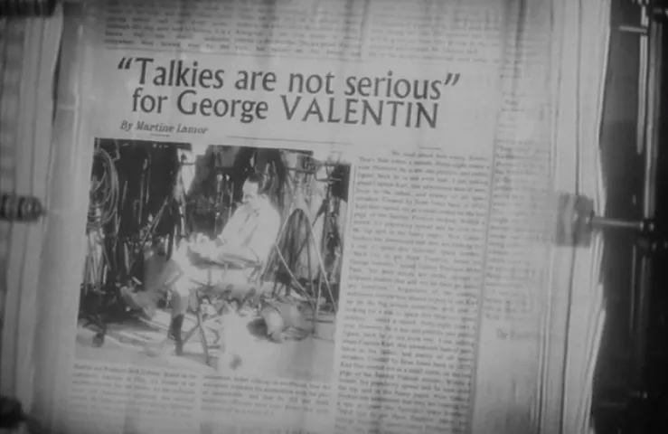
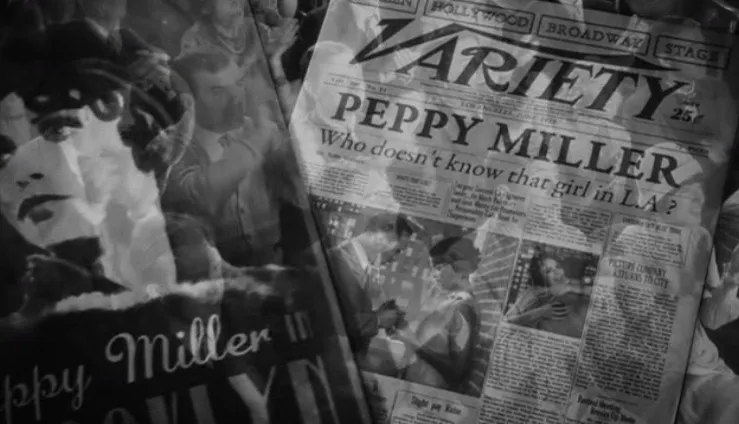
Variety traditionally used either Cheltenham or Franklin Gothic for its headlines. Definitely not this, whatever it is:
And, look, there’s ITC Benguiat (1975):
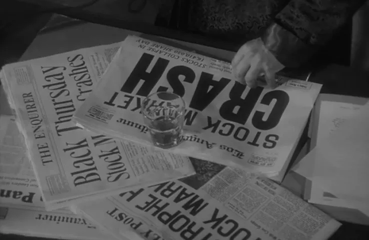
These stock-market crash banner headlines are more like it:
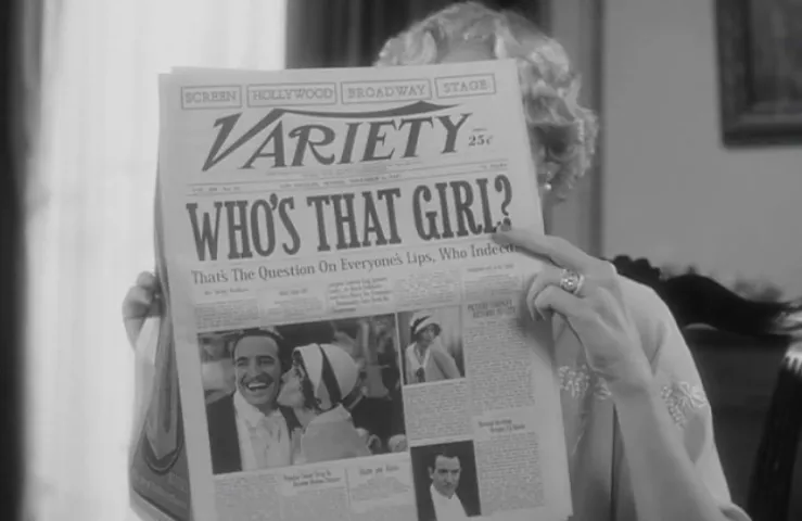
The typography in the magazines and posters is all over the place. I see Goudy Bold (1915), which is okay for the period, but not okay for Variety. I also see some sort of slanted Garamond on the Variety cover, implausible and wrong:
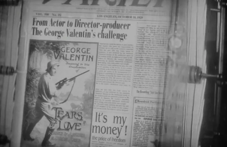
…Plaza (oops—1975), Marker Felt (oops—1992):
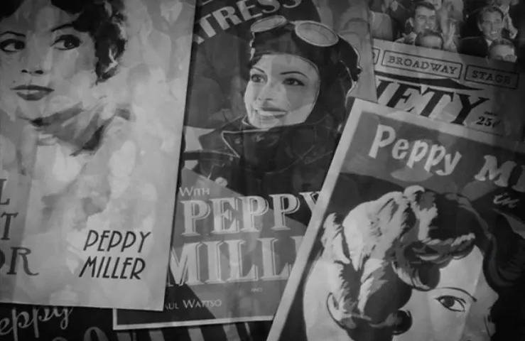
…Desdemona (c. 1900—okay), ITC Anna (oops—1991):
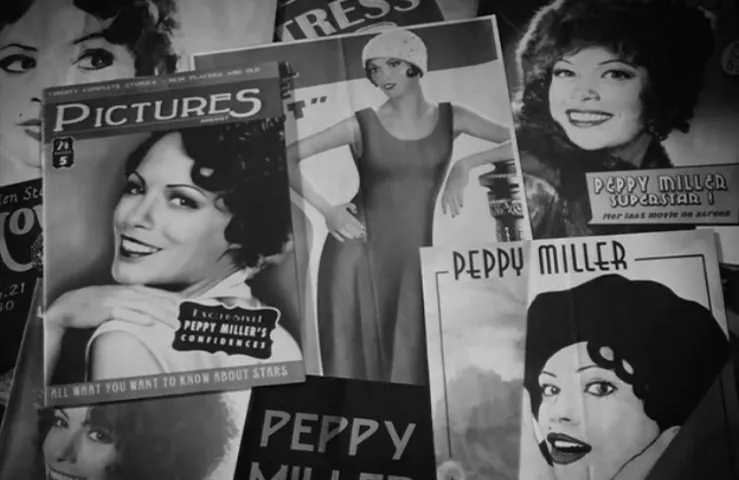
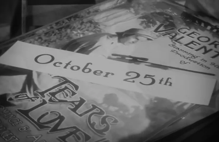
…and a lot of random, probably-recent, ’20s-style fonts I can’t place. Some of these work, as far as it goes. But, again, most of this would not be type, it would be lettering. This poster has the right feel, but the fonts are badly drawn, and “October 25th” would have been some kind of wood type instead of what they used here:
This is probably a font, but a good example of how a font can be used successfully to mimic a hand-painted sign:
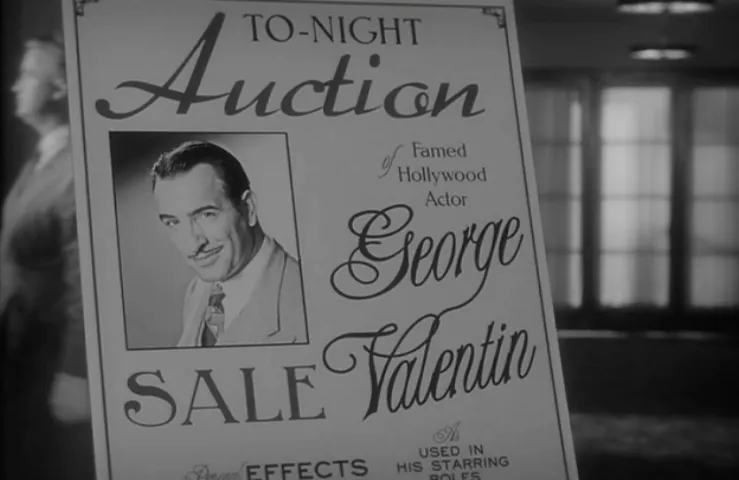
There are some awful fonts in the next example, a classic “show card.” “Auction” is set in a really horrible version of a 1936 typeface called Arabella, and “George Valentin” is set in a poorly digitized version of the 1980s Letraset font Alexei Copperplate:
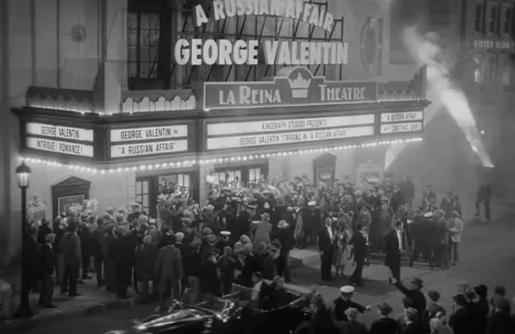
Next, we see more fonts used, this time for large outdoor signs, which would have been made by sign painters, not typesetters. I’m not going to try to identify all of these, except to point out Futura Extra Bold Condensed and Binner in the first one:
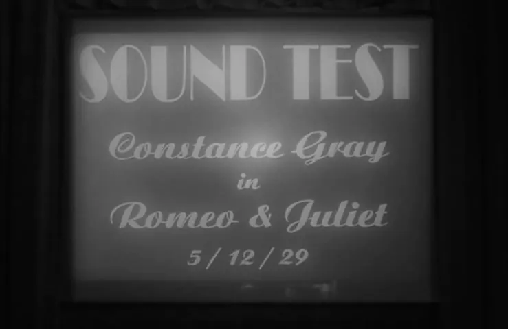
This film leader graphic is perfect, probably from an actual historical film:
But the custom part is clearly fake, and the type is the giveaway—Broadway (1929) and Ariston (1933). Again, it’s not that the typefaces are wrong for the period, but that type would not have been used. Aside from that, both fonts have been distorted to fit, impossible to do with metal type, and a big reason for using lettering on things like this back then:
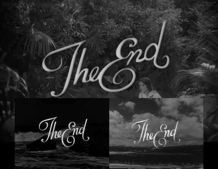
There were two “The End” titles in the movie. Christian Annyas, of The Movie Stills Collection points out that this one is (appropriately) swiped from Laurel & Hardy films from the same era (1927-1930):
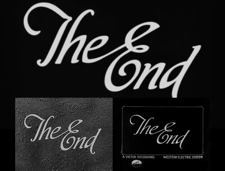
The second one is swiped from much later R.K.O. films (1947-1952). It’s not very well traced, either:
In conclusion, the typography in The Artist wasn’t way off the mark—it does seem that some effort was made. And I’m sure that, for 99.999 percent of the movie-going public, it was more than sufficient effort. But it would have been great to see the typography get the same high degree of attention that the other period details in the film got.
Thanks to Christian Annyas, of The Movie Stills Collection for suggesting this article and providing stills.
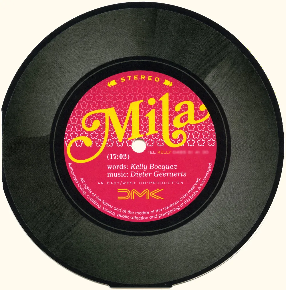
I got this birth announcement in the mail (all the way from Belgium!) that features Bookmania prominently. Designed by Yves Peters (of The FontFeed and elsewhere). Nice!