Craig Eliason has been writing a pangram almost every day for over two years on his site The Daily Pangram. For the last week, they’ve been about me or my fonts, which is quite an honor.
Pangrams are tricky enough to write without having to keep track of all the letters, so Craig uses my Pangrammer Helper so he can focus on the creative part of the task. He’s gotten quite good at it.
Craig and I both work in St. Paul, so we see each other from time to time, traveling in similar circles (he teaches art history at the University of St. Thomas and is learning to design type).
I should really just end this with a pangram, except I can’t quite think of any words that fit that have a z. Hmm…
[ ]
]
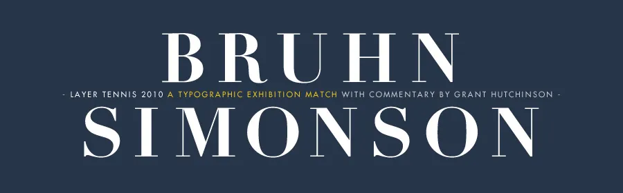
Just a note to say, this Friday afternoon, I’ll be pitting my type chops against (with?) fellow type designer Peter Bruhn for a “exhibition” game of Layer Tennis. I expect this to be a friendly match, more improvisational than competitive. But we’ll see.

Typedia (typedia.com), a shared, online encyclopedia of typefaces, just launched today.
It’s the brainchild of Jason Santa Maria, who invited me to contribute when it was in its early planning stage. I helped mostly with the classification system. (I actually have mixed feelings about classification systems in general and I think the tags will be ultimately more useful. But the classifications will at least provide a starting point.)
I’m very excited about Typedia. I’m hoping it will be the online equivalent of resources like Matt McGrew’s American Metal Typefaces of the Twentieth Century or Jaspert, Berry & Johnson’s Encyclopeadia of Type Faces, two books I rely on when I want to know the history of a typeface (see my Son of Typecasting series).
However, unlike a printed book, Typedia will be continuously updated and will grow in its usefulness as more and more people contribute to it.
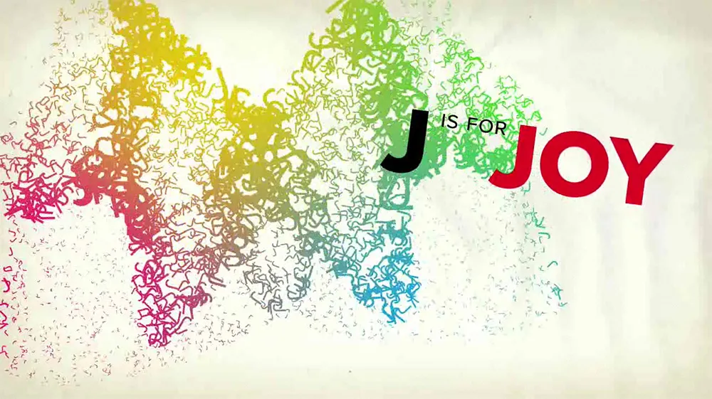
Proxima Nova stars in a new animated short film by Brent Barson, sponsored by Veer: “F is for Fail” (and co-starring Adobe’s Arno Pro). The still from the film (above) sums up my reaction. Well done, Brent! (And thanks to Veer, too.)
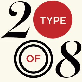
I’m really honored to have my Lakeside and Filmotype Zanzibar among the 40 typefaces chosen in Typographica’s “Our Favorite Typefaces of 2008”. Thanks so much, Dyana and J.F.
I participate in this annual tradition from the other side of the fence as well. I chose Nick Shinn’s Modern Suite, which blew me away when I saw the specimen book for it at last year’s TypeCon in Buffalo.
The results of a survey on the meanings of the words typeface and font among both “type industry professionals” and graphic designers, conducted by Thomas Phinney. My opinions on the matter fall squarely with the “type industry professionals” for the most part.
(via Typophile.com.)