Sorry for not posting more stuff here lately. I’ve been busy working on fonts (probably a better use of my time anyway). In the mean time, here is another interview with me, this time with Grant Friedman of ArtBistro.com.
I’m the featured guest on episode #6 of the typography and design podcast Read Between the Leading.
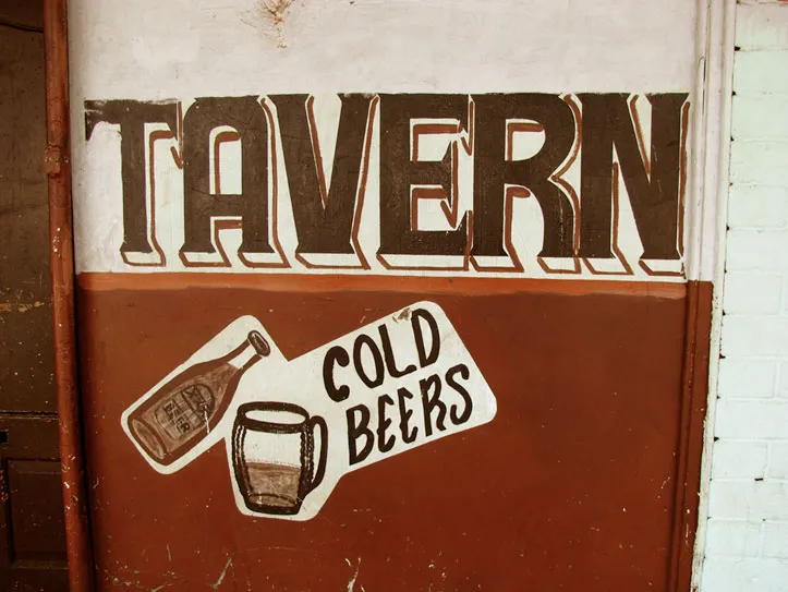
On his blog, Shane Durant is sharing his collection of photos of South African township type and signage. (Update: Link seems to be dead.)
I purposely exempt titles from my nitpicking about anachronistic type in movies. I consider them part of the world in which the film was created, not the world in which the story is set. They may be appropriate or inappropriate, but they can’t be anachronistic.
Nevertheless, it’s one of my favorite parts of watching movies. A friend alerted me to an op-ed in yesterday’s New York Times, Credit Where Credits are Due, about how there ought to be Oscars for movie title sequences. Perhaps, but the lack of an award hasn’t stopped title designers from doing brilliant work.
This reminded me of my favorite site on the topic. The Art of the Title Sequence maintained by a pair of fans, Ian and Alex, who have compiled a growing list of their favorites from movies and TV shows. You can watch most of the sequences in their entirety, some in HD. Many include short articles or interviews with the designers.
AIGA New Orleans has posted a really cool video on Vimeo: A slide show from 1962 created by the Art Directors and Designers Association of New Orleans (now an AIGA New Orleans). The pace is almost painfully slow by today’s standards, but patience yields a fascinating glimpse into the design world of the early 1960s.
Several things caught my eye as I watched it, including two Filmotype typefaces I recently revived: Ginger (at 4:43) and Glenlake (at 14:16). But I did a double take, and then a triple take when I saw this slide (at 30:52):
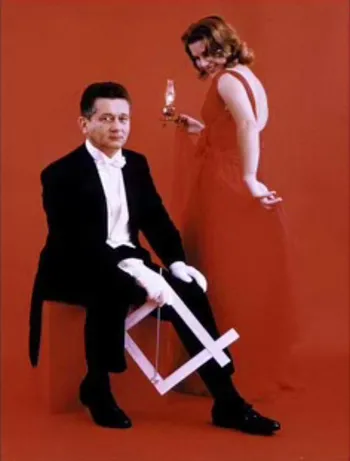
First of all, it looks like a White Stripes CD cover.
Second, the gizmo in the guy’s hand is a Scaleograph, an aid for sizing photos and art that was commonplace before computers made their way into design studios.
Third, according to the narrator, the guy in the photo, New Orleans designer Bob Brandt, invented it.
I still have one of these once handy gizmos hanging in my office for sentimental reasons. Sure enough, in small print it says: MFD. BY THE BRANDT CORP., NEW ORLEANS, LA.
Cool.