My new Bookmania fonts are now available at MyFonts.com, Fontspring, and FontHaus. More vendors will be added to this list as they are ready. Update: Bookmania is now available at nearly all my distributors. For a complete list, see the Bookmania page, under Where to Buy.
-
Bookmania Now Available
-
Coming Soon: Bookmania
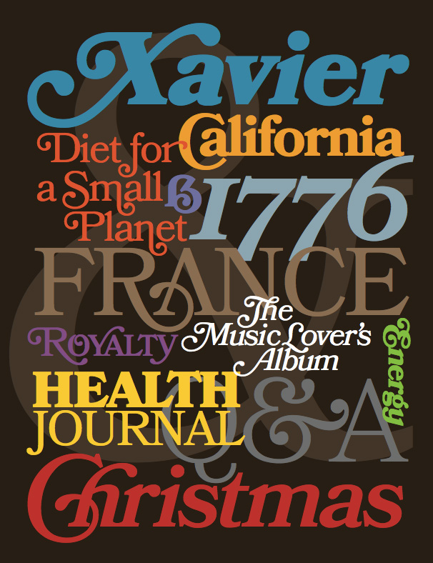
For the last four years, I’ve been working on a revival of the classic ATF Bookman Oldstyle and the Bookmans of the 1960s. But it’s not a slavish replica. It’s my own idea of what Bookman could be. It’s the revival I always wished someone would do.
I thought about doing a cursive italic, like others have tried, but in the end I decided that the original slanted roman should be preserved. Bookman has always been known for its swashes, so I also made a superset of the dozens of swash characters that have been added to Bookman over the years.
I wanted to go beyond its past and make something new. I added things that Bookman never had like small caps, old style figures, alternate characters, ligatures, stylistic sets, extensive language support, and more.
The family is composed of five weights—Light, Regular, Semibold, Bold, and Black, plus italics.
It’s my love letter to the classic Bookman: Bookmania.
Coming soon to all the places you can get my fonts.
Follow @marksimonson on Twitter for updates on availability.
Update: Now available at Fontspring. Other distributors to follow.
I’ve also updated my website and added a page for Bookmania here where you can download a PDF specimen booklet.
-
Superserendipitousness
One of my favorite bloggers, Jason Kottke, posted an item and link today about a story on the NPR site about “the longest word in the English language”.
This piqued my interest. When I was a kid I used to watch the Mike Douglas Show every afternoon after school. One time he had some sort of word expert on the show who revealed what the longest word was. I was impressed and taught myself to pronounce it correctly (still can).
Was it still the longest word? Sure enough, it was in the article:

Well… not the longest word anymore, if it ever was.
But then I noticed that all the “long words” in the article were set in one of my fonts—Felt Tip Woman! (My partner, Pat, whose handwriting was the model for Felt Tip Woman, loves words and language, not to mention NPR, and thought this was pretty cool, too.)
So I memorized a word that’s not really as special as I thought it was. On the plus side, NPR is using one of my fonts, so I’m happy anyway.
-
Diane Script and Filmotype Honey
If you pay close attention, you may notice two additions to the list of fonts over on my site: Diane Script and Filmotype Honey. I’ve been meaning to add these for a while (a long while in the case of Diane Script).
Diane Script (and Diane Script Première) were released in late 2008 through FontHaus, who commissioned me to digitize them. More about Diane here.
Filmotype Honey is my latest contribution to the Filmotype project and was released on the Font Bros site back in February.
-
WOFF, a.k.a. Web Fonts
Mozilla announced today that it is going to include support for WOFF fonts, a font format designed for use on the Web, in Firefox version 3.6. I support this format and plan to allow my distributors to license WOFF fonts to customers.
At this point, Firefox is the only browser to support this format, so it’s not quite ready for prime-time yet. But there is a lot of support for this in the font industry, and hopefully the other major browser makers, Apple and Microsoft, will join in soon.
-
Anonymous Pro 1.001 Released
I’m pleased to announce the release of Anonymous Pro Version 1.001. This version contains mostly user-requested tweaks and fixes, including:
- The comma and the comma part of the semicolon have been moved down about a pixel (depending on the size) to improve clarity.
- The design of the “quotesinglbase” and “quotedblbase” match the look of the “straight” quotes (the earlier designs didn’t match anything).
- The periods and other “dot” punctuation elements are a bit bigger in some bitmap sizes/styles.
- Fixed the hinting problem that caused the tops of the caps to vary in height a certain sizes on Windows (hard to figure out the reason, but easy to fix once I knew).
- Corrected the 13ppem bitmap glyph for the Greek character “omicrontonos” (which, embarrassingly, sported an umlaut).
And last, but not least:
- I dropped my old DIY license and switched to the SIL Open Font License, which should make a lot of users in the open source community happy.
Small note to Windows users: I haven’t updated the sample that shows what Anonymous Pro looks like in text sizes on Windows with ClearType enabled. It looks better than that now. I’ll update it soon.
Page 4 of 9