I’ve been thinking about letters and drawing letters for as long as I can remember. Not so much as building blocks of language, but for the particular and peculiar forms they take on in the physical world.
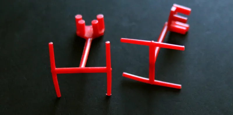
I had a few Kenner® building sets when I was a kid. You could build skyscrapers, or bridges, or anything you wanted. One set was for building houses. It included a little red plastic TV antenna you could attach to a roof on your little houses. It looked like an “H”, or an “I” depending on which way you turned it. With two of them, you could spell the word “HI”.
Something about this must have planted a seed in my imagination. My elementary school papers were covered in doodles of the word “HI” drawn in different styles. I was partial to the triangular serifs of the Latin type they used in Mad magazine.
Something else that goes way back for me is an almost synesthetic feeling about letters, that they have distinct attitudes and personalities, as if each letter is like a face. The letter “e” looks like it’s smiling. The letter “a” looks alert. The letter “E” has a sort of grimace. I’m convinced that it’s this feeling I have about letters that makes it easy for me to recognize different typefaces, as easily as most people recognize other people.
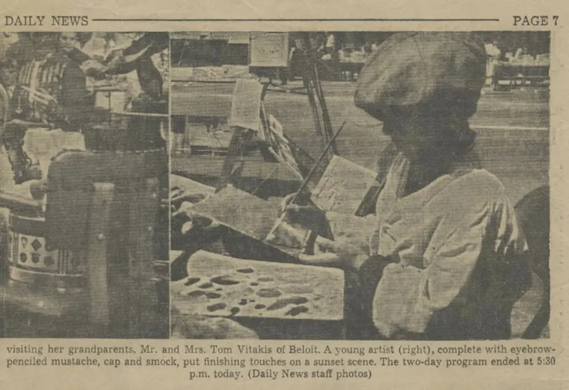
Me at 10 years old, painting on the sidewalk for “Sidewalk Daze” in downtown Beloit, Wisconsin, 1966.
I drew pictures all the time when I was a kid. I sat at the coffee table in front of the TV, watching The Flintstones and Batman, a sheaf of discarded paper my dad brought home from work placed over a magazine to protect the table, drawing pictures of cartoon dogs and cars. I wanted to be some kind of artist or cartoonist when I grew up. I was always the “best drawer” in my class. I was encouraged by two uncles, one from each side of my family. My uncle Bill painted wildlife, did sign-painting and cartooning, and worked as a printer. My uncle Knut went to art school and became a graphic designer. Art seemed to be my calling.
My dad was an engineer. I spent a lot of time with him in his basement workshop, watching him make things and fix things. He had a habit of explaining to me how things work. He was very much a do-it-yourselfer. I don’t have a tool-filled workshop like he did, but his love of gadgets and technical know-how definitely rubbed off on me.
All of this somehow led to my interest in designing typefaces. It takes both artistic skills and technical skills to make a font. I put on the beret when I’m dreaming of new typefaces, and insert the pocket protector when I sit down at the computer to start building a font.
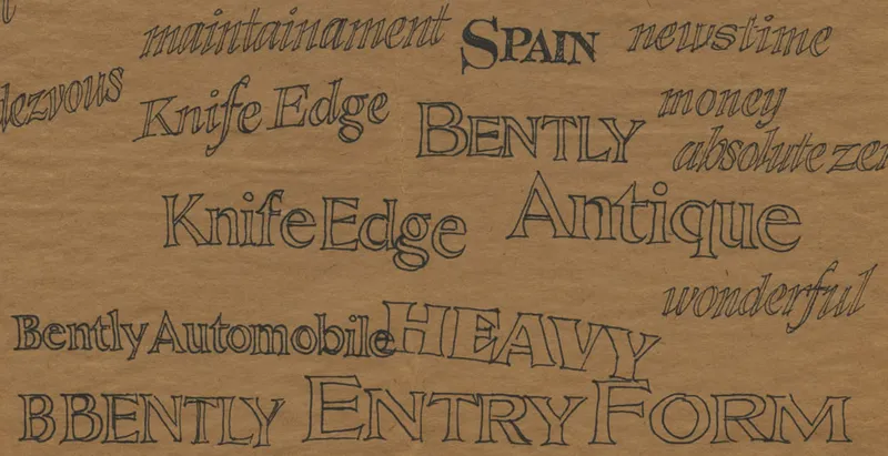
Random typeface concept sketches, 1980.
I didn’t start out my career making fonts. It was a daydream that began when I was in college in the mid-seventies. I became aware that designing typefaces was a thing one could do. My early attempts were feeble, but I kept practicing and dreaming while I spent several decades being a magazine art director or designing packaging and brochures.
I didn’t make fonts full-time until I was well into in my forties. So, I’m kind of a late bloomer. I like to think that the years I spent as a designer using fonts gave me an appreciation for what designers look for in a font. It also taught me that fonts are tools for making things, not ends in themselves. My attitude about licensing reflects this, so you won’t find restrictions in my license about using my fonts in logos or on t-shirts.
I feel lucky to be doing something that was only a pipe dream for me once. I hope you like my work, and feel free to contact me if you have any questions.
About This Site
This site is designed to showcase the fonts I’ve created, with information about licensing if you wish to use them. It’s also the home of my blog (“Notebook”) where I share photos, tips, thoughts, links, and the occasional full article on topics that interest me.
Elsewhere
Interviews and articles about my work by other people, plus articles and talks by me, starting with the most recent:
Rising Stars: Meet Mark Simonson, interview at VoyageMinnesota. (April 2024)
Unique Ways podcast, “20 questions” interview by Thomas Girard. (May 2023) (no longer online).
Monotype’s Creative Characters Podcast, S3 E7: “Exploring all things novel and familiar with Mark Simonson”, hosted by Charles Nix. (April 2023)
Mark Simonson and Anthony Bryant | Designers on Designers, a conversation between me and art director Anthony Bryant, shot
by TypeNetwork during Typographics 2022. (Recorded June 2022, released March 2023)
“What serif typeface would go well with Proxima Nova?” An online talk I gave about Proxima Sera for I Love Typography’s Font Fashion Week 2022. (Youtube video, text and slides.) (March 2022)
Episode 100: Desert Island Typefaces, interview with Diana Varma for the Talk Paper Scissors podcast. (March 2022)
Introducing Mark Simonson Studio, interview on the Creative Market blog. (February 2022)
Ohno Radio Interview, episode 6 of the Ohno Radio podcast, hosted by fellow type designer James Edmondson. (May 2021)
Hamilton Hang, a Zoom call for The Hamilton Wood Type & Printing Museum where I discussed my Etna type family with Hamilton artistic director Bill Moran and friends of the museum. (January 2021)
How I Become a Type Designer in Only 30 Years, a talk I recorded for the Type@Cooper Lubalin Lecture Series. Pretty much my entire story of becoming a type designer in under an hour. (June 2020)
Just Start, a short piece I wrote about procrastination for Superyesmore.com. (August 2017)
TDC Member of the Month interview. (May 2017)
Remembering Adobe Illustrator 1.0, a short piece I did for Illustrator’s 30th anniversary. (March 2017)
Lettering Legend—Mark Simonson, interview on LetteringTutorial.com. (March 2017)
The Origins of the Modern Type Designer, a talk I gave at the Kerning conference in Faenza, Italy. (June 2016)
Mark Simonson Studio: Breathing New Life into the Past, interview on Fontstand.com. (April 2016)
Conversation with Mark Simonson, a short interview on the Mic Product Blog. (December 2015)
Why Proxima Nova Is Everywhere, a short article on the Mic Product Blog. (December 2015)
The single reason why Proxima Nova is the world’s best font, essay about my font Proxima Nova by art director Andy Cowles. (June 2015)
Between Screens podcast interview part 6. Subjects: Type design, Influences, Type sins, Choosing & pairing type, Contrast. (June 2015)
Between Screens podcast interview part 5. Subjects: Typomania, Names vs nature, Sound fonts,Type anatomy. (May 2015)
Proxima Nova, ca. 1981, essay about my font Proxima Nova by designer Cameron Moll on Medium. (April 2015)
How to Design a Typeface, Mark Simonson’s Process, interview by Tamye Riggs on Adobe’s Create blog. (April 2015)
Between Screens podcast interview part 4. Subjects: Q&A #02, Improve, Design work, College, Idols, Decompress, Current work. (April 2015)
The Romance of Offset, version 2, a talk I gave at TypoSF in San Francisco. This is a repeat of the talk I gave at TypeCon in 2014 (below), but is a bit more polished. Unfortunately, the slides are not as easy to see in the video of this version. (April 2015) (no longer online).
Between Screens podcast interview part 3. Subjects: Q&A #01, Pipe dream, Proxima Nova, Process, Procrastination, Impostor. (March 2015)
Focus Forum, a short interview for TypoSF. (March 2015)
Between Screens podcast interview part 2. Subjects: Dabbling | Focus | Serial obsessions | Type design | Early days | Python | Hacking. (February 2015)
Between Screens podcast interview part 1. Subjects: Designing typefaces | Naming | Difficulties & joys. (January 2015)
Fontcast #19, video interview on the Fontshop’s FontFeed blog (scroll down to find mine). (November 2014, but conducted in July at TypeCon 2014)
The Romance of Offset, a talk I gave at TypeCon 2014 in Washington, DC. (July 2014)
Interview on Workspiration. (December 2013)
Interview on One Minute With… (July 2013)
Interview in 8 Faces #5. (August 2012) (print edition only—no longer online).
Interview with Proxima Nova Designer Mark Simonson on WebINK. (August 2011)
Interview on Everyday Type Subject: Why Type Costs Money. (May 2011)
Profile on WWWord (February 2011).
Interview in Uppercase #4. (Winter 2010) (print edition only—no longer online)
Q&A: Mark Simonson on Typepedia. (September 2010)
Typtekens (Type Signs), profile of me by Henk Gianotten in the Dutch graphics magazine, Publish. (In Dutch, November 2009)
The Making of Kandal, on LetterCult. (June 2009)
Interview on ArtBistro. (March 2009)
Audio interview on the Read Between the Leading podcast (March 2009).
Interview on MyFonts’ Creative Characters. (January 2009)
Interview on LetterCult. (September 2008)
Interview on Planet Typography. En outre disponible en français. (May 2007)
Interview on Right Brain Left Field. (April 2005)