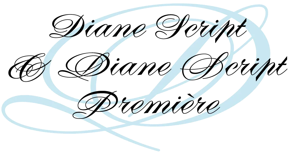
Introducing Diane Script
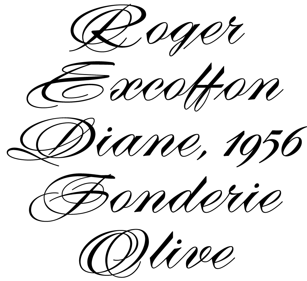
I recently partnered with Mark Solsburg of FontHaus, who has lately become fascinated with twentieth century French type foundries and type designers, to create a faithful digital revival of Diane, a typeface designed by Roger Excoffon. It was released in 1956, around the same time as his more famous Mistral and Choc. For reasons that aren’t clear to me, Diane seems to have never become as popular as his other faces, especially in the U.S. Finding full specimens of the font turned out to be quite a challenge. In many cases, only the caps and lowercase are shown.
With Mark’s help, I was able to get hold of source material from the University of Groningen in the Netherlands, D. Stempel GmbH metal type services in Frankfurt, Germany, as well as from some type specimen books that I already had in my possession.

As I researched and studied the face, many curious facts came to light. The caps in earlier specimens of Diane are completely different from specimens published later, suggesting that the face was redesigned at some point, perhaps in the mid-1960s. So we are left with two different sets of caps.


The original had very elaborate, swirly strokes, characteristic of Excoffon’s gestural designs for posters and logos. Later on, these appear to have been replaced by a set of simpler, more traditional script caps. The original caps are criticized in one source I found (“Practical Handbook on Display Typefaces”, 1959) as being “exquisite” but “not highly legible”. Perhaps this is what led to the simpler caps being introduced.

Even more curious, the caps shown in the Olive specimen “3 Scriptes” that accompanied its release in 1956 are noticeably different from the ones found in existing Diane metal fonts. The only conclusion I can make is that Diane, as it was shown in the “3 Scriptes” specimen, was not yet finalized when this was published. (Some of these earlier character designs are included in my revival.)

Changes appear to have been made in the lowercase as well. Several characters have non-connecting incoming strokes in the 1956 version. In the later version, the strokes all connect. The lowercase o also differs, with the original “3 Scriptes” specimen showing a loop inside the counter, apparently dropped in the released version.
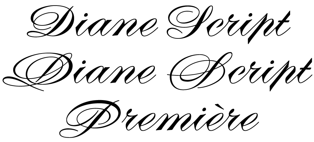
In my digital revival of Diane, I’ve included many of these differences. Diane Script Première includes the beautiful caps from the original version, while Diane Script features the later, simpler caps. Both faces include the non-connecting lowercase characters and the earlier lowercase o as alternate characters. Diane Script Première includes three of the “unfinished” caps from the “3 Scriptes” specimen as alternates.

Of course, metal foundry faces had nowhere near the number of characters that modern digital faces do, so it was necessary to design quite a few new characters to match Excoffon’s original ones. This proved to be a fairly straightforward process, with one exception: the ampersand.
 and Diane Script Premiere (right).")
As hard as it is for me to believe, it appears that Diane never had an ampersand. None of the specimens I’ve found so far has shown one. I still hold out the possibility that one exists, and intend to add it if it turns up. In the mean time, I have come up with two that I am satisfied with. The first is a simpler design to go with the simpler caps in Diane Script. In the second, I tried to capture the energy and exuberance of Excoffon’s original caps. Studying Excoffon’s gestural design work was very helpful for this. Diane Script Première includes both ampersands, with the simpler one as an alternate.

Diane Script and Diane Script Première are not the first attempt to revive Diane digitally. However, in my research, I discovered a detail that previous attempts have gotten wrong: the alignment and spacing of the caps in relation to the lowercase. Unlike most typefaces, Diane’s caps actually sit slightly below the lowercase baseline. The most easily found specimens of Diane show the caps and lowercase separately, so this fact is hidden. Luckily, my source material included a few obscure specimens in which the correct relationship can be seen.

Several of the lowercase letters have disconnected outgoing strokes, intended to connect to the following letter. However, when it falls at the end of a word, the disconnected stroke is conspicuous and unnecessary. In the metal typeface, this was apparently an acceptable compromise. But in OpenType format, we can have it both ways. When such a character falls at the end of a word, the orphaned stroke is omitted automatically. (An OpenType-savvy application and/or operating is system required for this feature to work.)
In reviving Diane, I’ve sometimes felt more like a detective than a type designer. I’m very happy with the way it turned out and hope my efforts will bring new life to Roger Excoffon’s masterpiece.
Diane Script and Diane Script Première are available now from FontHaus.