Fifty years ago this month, March 1976, at 20 years old, is when my interest in type design began.
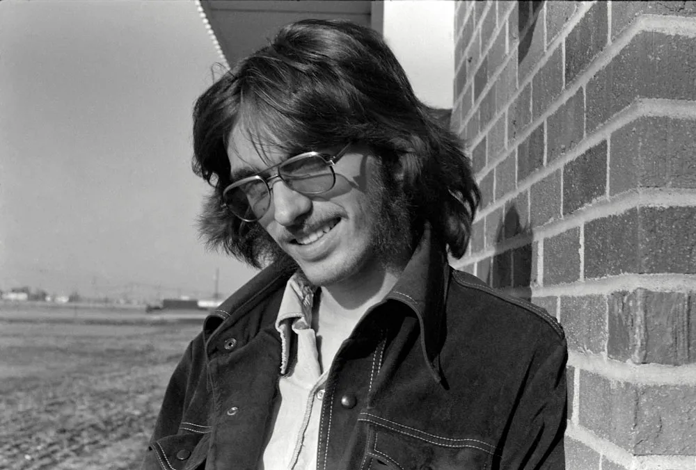
Me, in spring of 1976, about the time I discovered type design, standing outside the art department at NHCC. (Photo by Dan Bagaus)
I was in my second year of a two-year commercial art program at North Hennepin Community College, in a northern suburb of Minneapolis.
At first I was thinking of pursuing a career as an illustrator, but I was also interested in graphic design. In addition to these, I studied art history, drawing and painting, lettering, printmaking, as well as writing and other liberal arts classes.
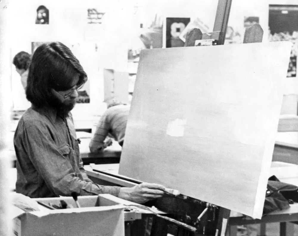
Me again, working on a project for a painting class in the graphics classroom at NHCC c. 1976. (Photo by Dan Bagaus)
What sparked my interest in type design was a project in the advanced lettering class. The instructor was Lance Kiland, with whom I kept in touch until his untimely passing in 2015. We mostly learned to do lettering with brushes and Speedball pens. At the time, lettering was considered a basic skill for a graphic designer. At the very least, you’d need it to do marker layouts, in order to sell a design to a client before it was set in actual type, which was very expensive. It was a decade before desktop publishing would allow anyone to set their own type on a personal computer and turn the business of typesetting upside down.
Lettering design I did for my high school yearbook in 1974.
I‘d been working with type and doing lettering since high school, as editor and designer of the school newspaper and yearbook. Frustrated with the limited methods we had to set headlines, I started purchasing rubdown type on my own. I fell in love with type from looking at Chartpak and Letraset catalogs, and started developing a taste for typography under the influence of my uncle Knut, who was a graphic designer in Chicago.
The final project in my college lettering class was to design a complete, original alphabet—a typeface.
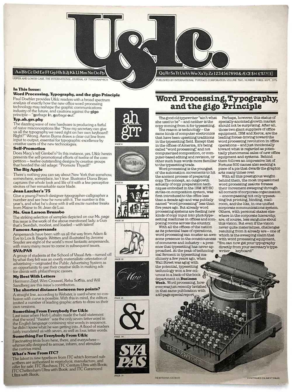
The issue of U&lc I discovered in the graphics classroom: Volume Two, Number Three, Sept. 1975.
Just by coincidence, I discovered a copy of U&lc magazine in the graphics classroom. U&lc was published by ITC, the International Typeface Corporation, a typeface publisher, and the designer and editor was the legendary Herb Lubalin. I’d never seen such beautiful typography and design. It was a motherlode for an aspiring typophile like me.
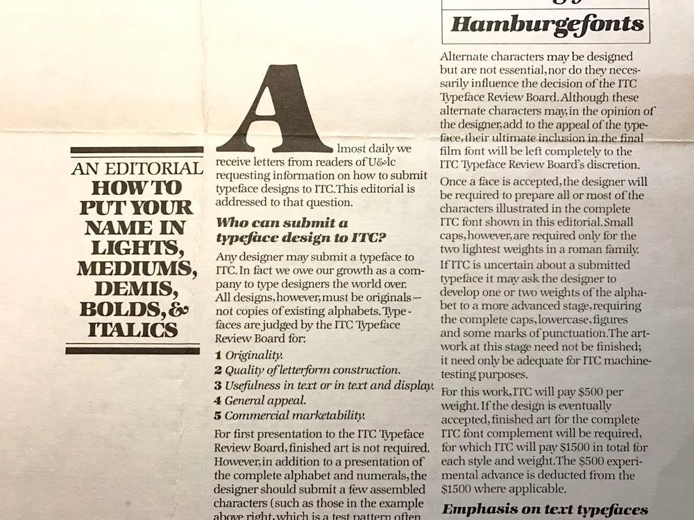
ITC’s call for typeface design submissions.
You could get ITC typefaces on virtually every typesetting machine and alphabet product, such as Letraset. In U&lc, I spotted a call for typeface submissions. If accepted, ITC would pay an advance plus royalties. Lance told me he’d heard of a designer in Minneapolis who’d made over $50,000 on a typeface design that got published (almost $290K in 2026 dollars).
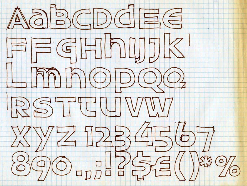
The concept sketch for my typeface design project, which I called Uncial Sans.
All of this was on my mind as I worked on the assignment. I came up with the idea of doing a very modern, geometric sans serif design based on the underlying forms of uncial calligraphy. I drafted the artwork on a large sheet of illustration board, with 2.5”-tall letters drawn by hand in ink with Rapid-o-Graph technical pens, T-square, circle templates, and other drawing tools.
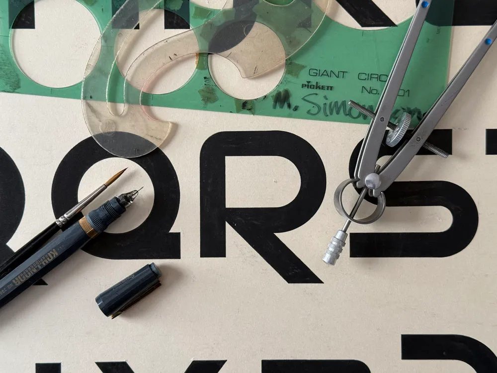
A close up of the finished artwork for Uncial Sans, showing some of the tools I used: circle templates, French curve, Rapid-O-Graph pen, brush, and compass.
Designing a typeface was very exciting. The idea of coming up with an original alphabet design fired my imagination. And learning that it was possible to design type professionally was a revelation. I decided right then that someday, somehow, I wanted to design typefaces. From that day on, even though I was doing other kinds of work in the coming decades (graphic design, art direction, some illustration), it was always in the back of my mind, and I found myself frequently sketching ideas for typefaces.
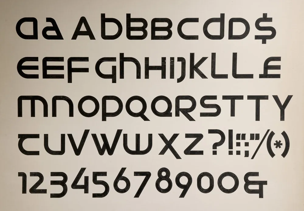
The finished artwork for Uncial Sans. Each letter is 4 inches tall, drawn by hand. Looking at it 50 years later, it’s got some design issues, but I got an encouraging A+ on the project.
It wasn’t until almost twenty years later, in the mid nineties, that I finally got a typeface published. But looking back, that lettering assignment in 1976 was where it all started.
It didn’t start out as a digital type foundry.
Back in the nineties, I worked as senior designer for Rivertown Trading Company, a sister company to Minnesota Public Radio that sold public radio and public TV-related merchandise through the Wireless and Signals mail order catalogs. I’d worked there full-time since 1993 after having freelanced for them since 1985. I had a long history with both Rivertown and MPR.
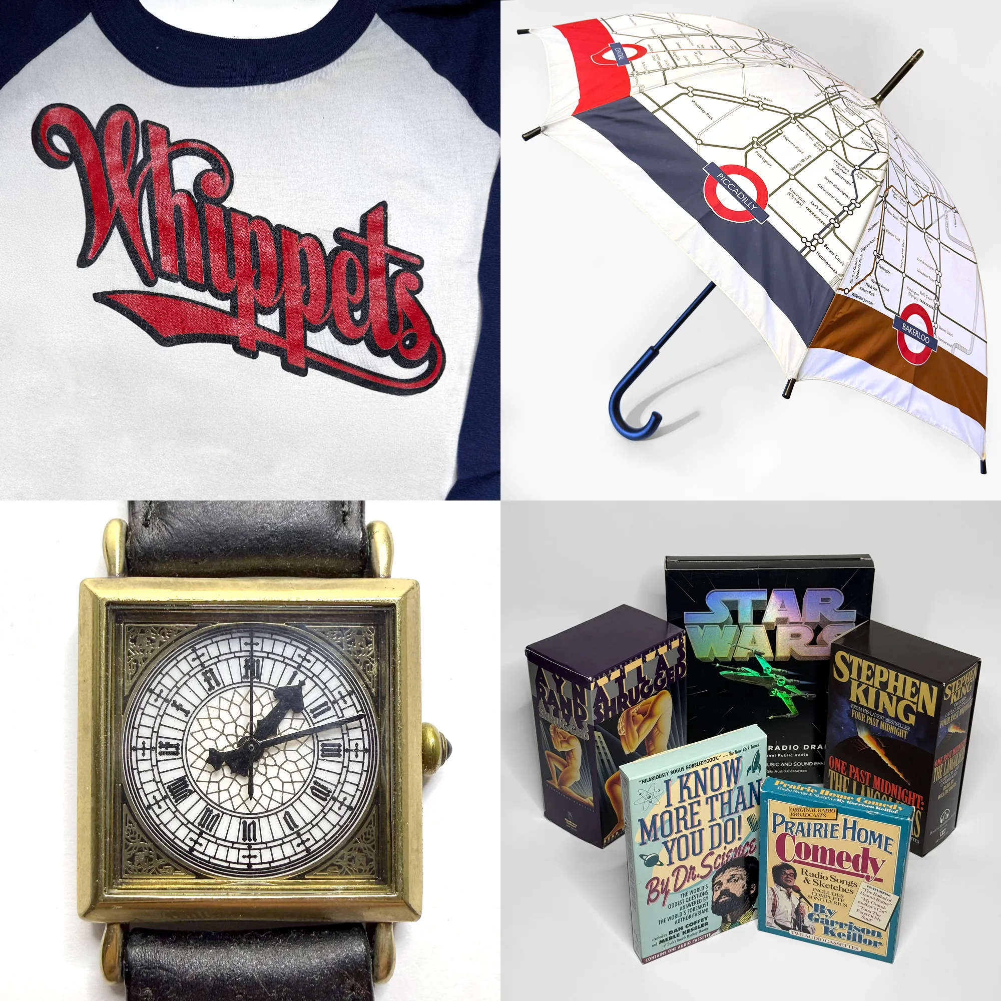
A few of the things I designed at Rivertown: Lake Wobegon Whippets jersey (lettering), London Underground umbrella, wristwatch based on the Big Ben tower clock, and a few of my audiobook packages.
While at Rivertown, I mainly designed audiobook packages (over 200 of them) and products (t-shirts, mugs, even things like watch faces and umbrellas). By 1998, I was feeling like I was in a rut as a designer. So for the next couple of years, I shifted into web design at the company, designing sites and animated GIFs for Wireless and Signals in Macromedia Fireworks and trying to get the “e-commerce” people to implement my designs faithfully in the days before CSS and web standards.
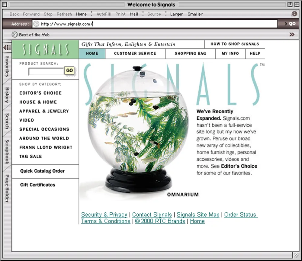
Homepage of the Signals website I designed, as it appeared in early 2000. And, yes, that’s an early version of my Blakely typeface, which was originally created for Signals.
Around the same time, Rivertown was sold to Target Corporation, mainly because of its experience with online sales and its giant distribution center in Woodbury, Minnesota. After the transition, Rivertown Trading Company was renamed target.direct, and the old company culture, which felt almost like a family, disappeared overnight.
The web design thing wasn’t quite what I thought it would be, and Rivertown wasn’t the company I knew and loved anymore, so I quit in June 2000, at the age of 44, to resume my freelance career.
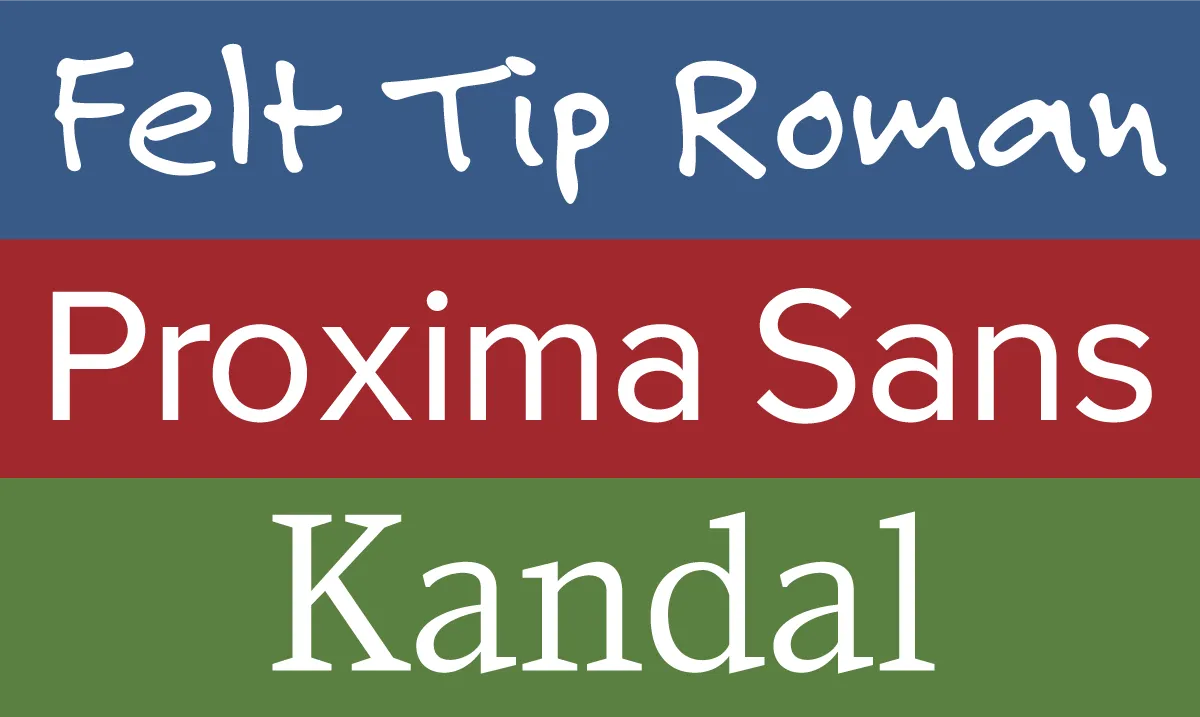
My first published fonts, released in 1992-94 through FontHaus.
I’d previously freelanced under the name Blue Sky Graphics—the name I used when I published my first fonts, Felt Tip Roman, Proxima Sans, and Kandal, through FontHaus in the early nineties. But I wanted a fresh start, so I picked a less generic name: Mark Simonson Studio.
![]()
Although I’d published a few fonts, I wasn’t making much money from it. And Mark Simonson Studio wasn’t really a font foundry yet. I did offer type design, but it was alongside other services such as graphic design, web design, illustration, and lettering, which I’d hoped would be the basis of a solid freelance career. So I created a website, got a domain (ms-studio.com because marksimonson.com was unavailable at the time) and hoped for the best.
But Mark Simonson Studio struggled. I was very bad at finding new clients and mostly just worked for people I’d known or worked with for years, taking whatever projects they happened to have.
Meanwhile, I noticed people starting to sell fonts on the web. I got an account at Makambo.com, a sort of web-based consignment store that was home to some type designers I’d heard of, like Jim Parkinson and Nick Shinn. Unfortunately, I had an exclusive arrangement with FontHaus, so I couldn’t sell the fonts I’d published there. But I had a few others in the works—Refrigerator, Blakely, Sharktooth, and Felt Tip Senior—which I started selling on Makambo. Sadly, Makambo closed after a few months, and with very few sales. Everyone seemed to be moving to a new platform—MyFonts.com—so I did the same.
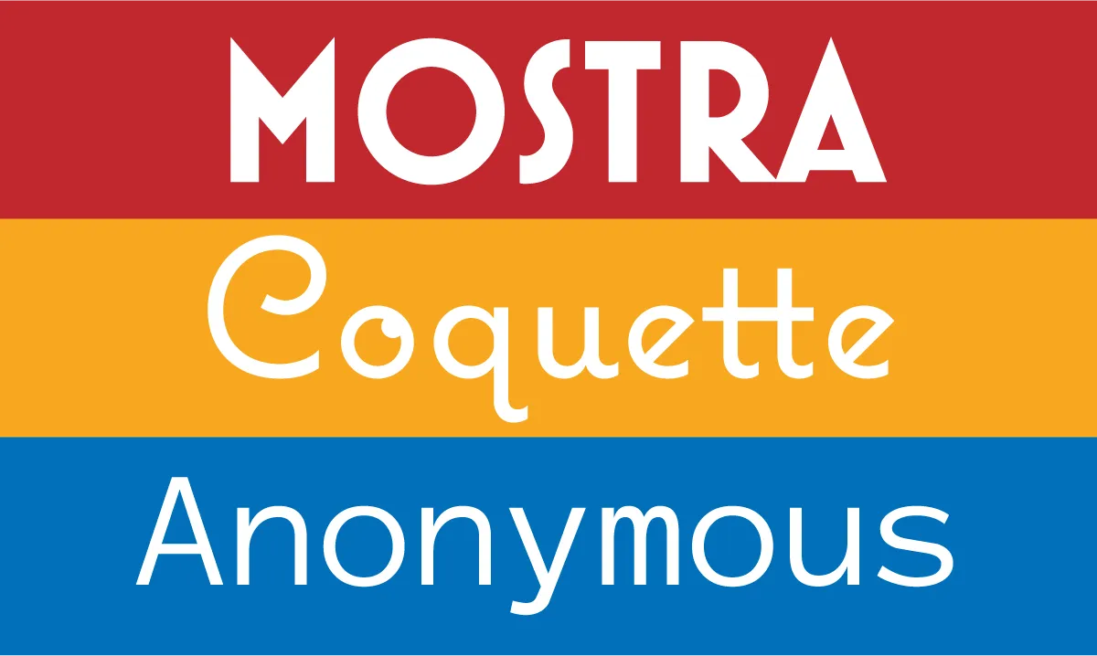
Right around this time, in Fall of 2000, my partner Pat landed a spot as a contestant on Who Want’s to Be a Millionaire? She did very well—well enough that I was able to take six months off from my freelance work to make and release some new fonts—Mostra, Coquette, and Anonymous.
I was soon making more from selling fonts through MyFonts than I ever did from FontHaus, who were late in moving to the web, and also had a much lower royalty rate. But I still relied on other work to pay the bills. Despite that, I kept making new fonts, including 35 new ones in 2003, and started working with other resellers, such as FontShop and Veer.
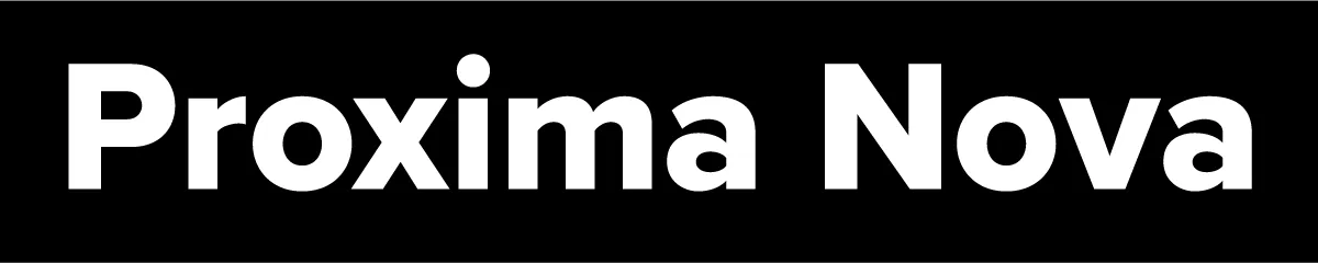
By 2005, when I released Proxima Nova, I was making enough from selling fonts that I was able to drop all my other work and design type full-time. Mark Simonson Studio became solely a digital type foundry.
Looking back, it’s clear that my calling was type design. It’s the thing I’ve been most successful at, and it fits my skills and sensibilities better than anything else I’ve done. I didn’t know it at the time, but opening Mark Simonson Studio in June 2000 was what put me on that path.
Last week I did a talk for Type Tuesday in Minneapolis where I did a live demo of early font editors on a real Macintosh Plus. I’ve uploaded a video recording of it on YouTube, or you can watch it here.
6/27/24 Update: I’ve also posted a video about the story behind the Mac Plus I used for my Type Tuesday talk:
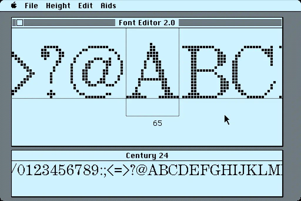
In 1984, I bought one of the original 128K Macs. A big draw for me was how it could display multiple fonts—proportional or fixed-width—anywhere on its screen. I desperately wanted to make my own fonts for it. This was before modern PostScript/TrueType/OpenType fonts, back when there were only “bitmap” fonts—fonts composed of discrete black and white pixels.
That summer, I read about an Apple developer tool called Font Editor 2.0 and sent for a copy of it. It was crude and crashed easily, but it allowed me to make my first Macintosh bitmap fonts. (A little later, AltSys released FONTastic, which was better in every possible way, including being less crash-prone.)
Recently, I fell down the rabbit hole investigating and reacquainting myself with Font Editor 2.0. I wound up making a user guide and a video demo and walk-through. I also prepared some disk images you can use with a real 128K or 512K Macintosh computer or an emulator, such as Mini vMac if you want to try it out for yourself.
I’m planning to make more videos about early font development on the Mac in the near future on my YouTube channel.
I’m known as a type designer—and fonts are pretty much what it’s all about here on my website, and in my life in general. But I haven’t always been making fonts. At various points of my career (which goes back to 1976) I’ve been a graphic designer, art director, web designer, package designer, product designer, lettering artist, and—very early on—illustrator.
Learning to Do Caricatures
My most active period as an illustrator was for Metropolis, a weekly newspaper in Minneapolis (1976-77). Patrick JB Flynn was the art director. Fairly soon after I started working for them, he asked if I could do caricatures. Caricature was something I dabbled in going back to middle school, mostly in a simple cartoon style. My inspiration came mainly from artists like Mort Drucker (Mad) and Rick Meyerowitz (National Lampoon). But I’d never done a full caricature before. Not really. But, I thought, how hard could it be?
And so I started doing caricatures for Metropolis. I wasn’t that good at first, but I got better. I was actually kind of surprised I could pull it off. Caricature is not the easiest skill—even when you can draw well. And some of my caricatures were better than others.
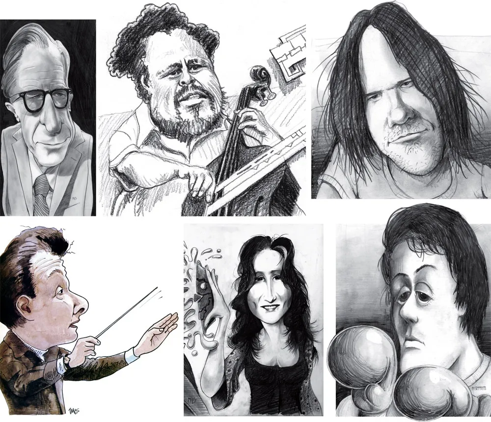
Above, some of my early caricature work. Clockwise f**rom the top left: economist John Kenneth Galbraith, Jr.; jazz bassist Charles Mingus; a “stoned out” Neil Young; Sylvester Stallone as Rocky with “puppy-dog eyes.”; singer Bonnie Raitt; and orchestra conductor Sir Neville Mariner.
After Metropolis, I kind of stopped doing it. I’d also dropped the idea of being an illustrator. It was easier to be an art director, think up the concepts, and let someone else do the drawing. Plus, I didn’t think my caricature style was “in.” It wasn’t the sort of thing I was seeing in the illustration annuals. I associated it with “kid’s stuff” (Mad especially) and felt almost embarrassed by it.
Getting Back Into It
Earlier this year, I made an effort to get back into drawing and other creative pursuits, and get away from staring at a computer screen all day (see my “1979” post from February). I filled up several sketchbooks over the next few months, drawing nearly every day. And then in July, I started doing daily drawings in Procreate on my 12.9” iPad Pro—quick caricature sketches of people I saw on YouTube while watching videos.
Drawing digitally—that is, drawing on a tablet or screen with a stylus—has always been problematic for me, in spite of all the money I’ve spent on Wacom tablets and Cintiqs and iPads over the years. For some reason, I just never took to it, no matter how much I wanted to. It didn’t feel as fluid and natural to me as drawing on paper. So I never did much but doodle, rarely doing a full drawing.
But I had a breakthrough while doing these quick studies. I figured out a technique for doing full caricatures that works for me, like the ones I used to do for Metropolis. In fact, it works even better.
The trick is to keep things really simple. I use the 6B Pencil brush for the line work on one layer, and the Tamar brush—sort of like painting with a sponge—for shading (and color) on a second layer. I’m careful not to change the size of the pencil brush (~60%). I try to draw at actual size as much as possible and stay loose. It all finally clicked for me.
And of course, working digitally is great for drawing caricatures compared to drawing on paper. It’s so easy to fix problems, like when proportions are off or positions of the features aren’t quite right. I’m able to work very quickly, knowing that if I make a mistake, I can immediately fix it. (Although, I might try redoing some of these using analog media now that I’ve worked out the likeness and everything digitally.)
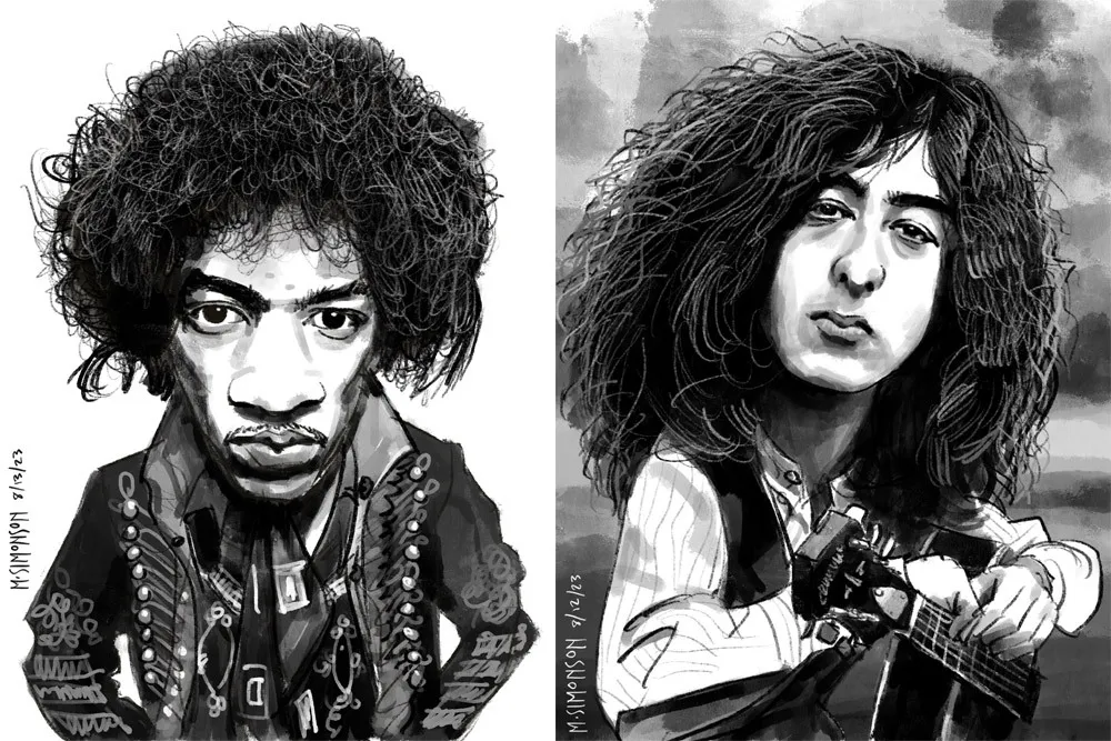
Jimi Hendrix and Jimmy Page.
It takes me anywhere from an hour to three hours to do one of these. I’m working in both black and white and color, depending on the source photo. And, yes, these are based on specific photos, or several photos in some cases. Some of them may be recognizable—even iconic.
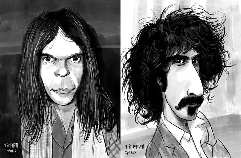
Neil Young and Frank Zappa.
By the end of July, I was doing a full caricature every day. This went on for almost two weeks. Since then, I’ve been doing several a week. I’ve done almost 30 of them now. Mostly rock musicians so far, but I have a long list of possible subjects in other areas, too.
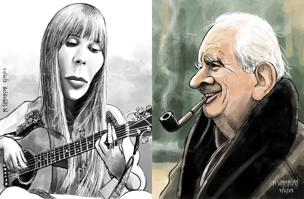
Joni Mitchell and J.R.R. Tolkien.
Rediscovering Myself
I can’t believe how good it feels to reconnect with this. As an artist, knowing that you’re capable of doing something yet not doing it for years—decades even—is painful. It feels like a waste. Of course, I’m doing other things, like making fonts, which is also creatively fulfilling. In fact, I’ve often wondered if getting so busy making fonts was the reason I wasn’t drawing as much. Apparently not.
In my “1979” article, I cast a dim eye on the digital world—the world of screens and pixels—and advocated a return to doing physical things, like drawing on paper. And I have been doing that. But, ironically, getting back into drawing on paper—specifically the habit of drawing daily—led directly to finally getting some use out of my iPad Pro and Apple Pencil. In hindsight, it was all about getting back to drawing, regardless of whether it’s on a screen or not.
Anyway, all of this is a roundabout way of saying that I’m going to start sharing my caricature work online. To be clear: I’m just doing this because I enjoy doing it. It’s a side project. I’m not looking to start a new career or anything like that. Fonts are still my main gig. I just want to share something else I enjoy doing, and I hope others will enjoy seeing it.
If you’re interested, I’ll be posting the work on my secondary Instagram account (not my regular Mark Simonson Studio account, which is for official, font-related stuff). Update: I’ve also created a new website to showcase my non-type-related work: marksimonson.art.
Before digital type and desktop publishing took over the world in the late 1980s, there was metal type and phototype. But if you were on a tight budget, you could set type yourself using various “dry transfer” products, Letraset being the most famous. But Letraset wasn’t the only one.
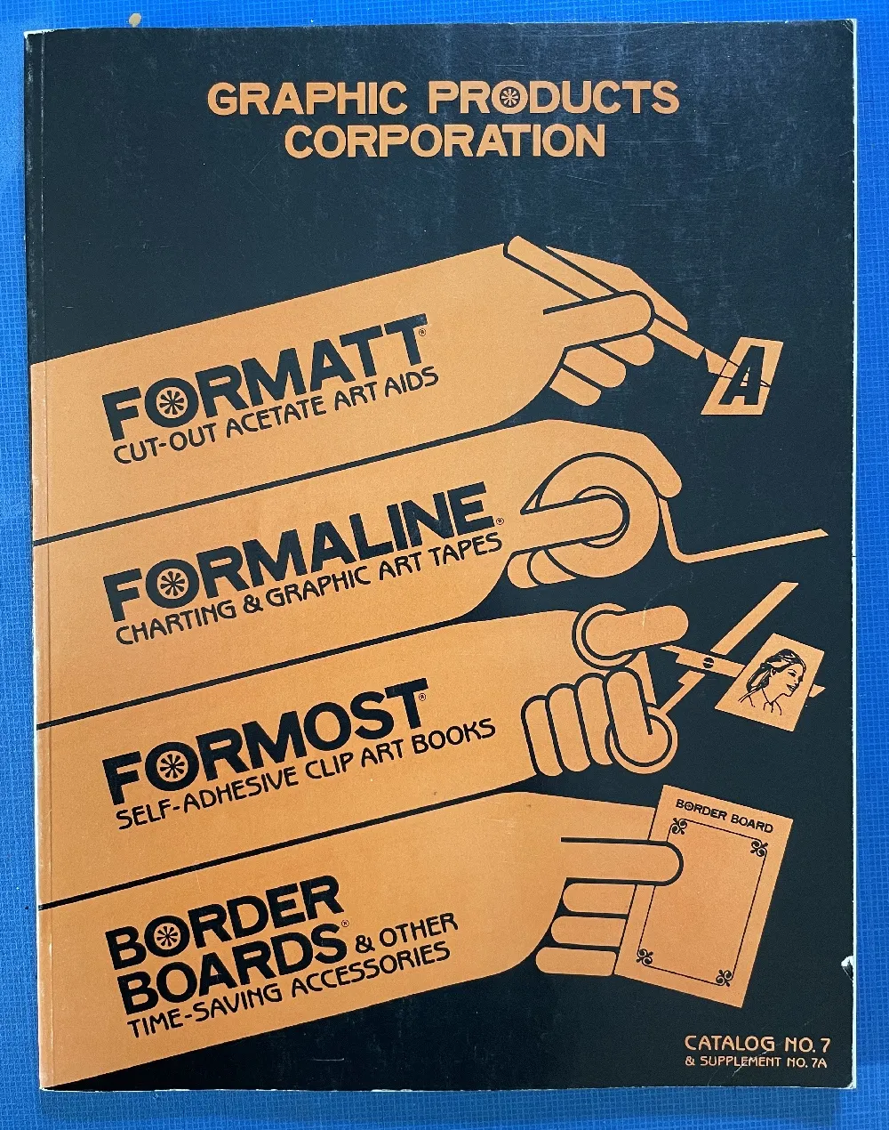
I used Formatt sheets a lot in the late 70s and early 80s. I’ve still got a few catalogs (No. 7 from 1981, No. 8 from 1986, and pages from what I believe is No. 6 from 1976) and a few sheets of type.
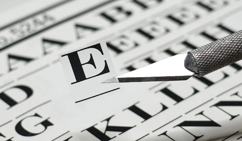
Unlike Letraset and other “rub down” type products, Formatt was printed on a thin, translucent acetate sheet with low-tack adhesive backing on a paper carrier sheet. To use it, you cut out the letters with a razor blade or X-acto knife and positioned them on a suitable surface and then burnished it down. I usually used illustration board and then made a photostat for paste up, but you could put it right on the mechanical if you wanted.
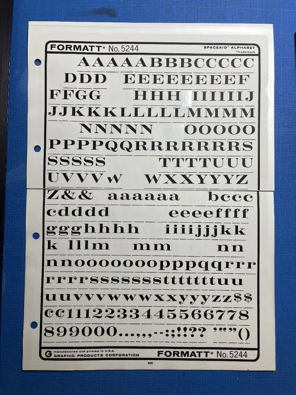
The sheets had guides below each character to aid in spacing and alignment. Although I always spaced it by eye, the guides were essential to keep the characters aligned to each other. I would draw a line for positioning the guidelines using a non-repro pen or pencil before setting the characters down and trim away the guidelines after.
Formatt was not as high in quality as Letraset, but it was cheaper and offered typefaces—especially older metal typefaces—not available from any similar product. But they also carried more recent faces, such as those from ITC. They carried about 250 different typefaces in the catalogs I have. I only bought Formatt type sheets in order to get certain typefaces that weren’t available elsewhere (other than from typesetting houses, which were not in my budget at the time).
In addition to type sheets, they also produced a whole range of pattern sheets, rule and border sheets and tape, color sheets, decorative material, etc. A lot of the graphic material seems to have come from old metal foundry sources. Besides the type sheets, I used their border sheets and tapes a lot, too.
I also made my own “Formatt” sheets sometimes back in the early 80s. I had access to a process camera, which could make high-quality photographic copies of black and white originals, colloquially known as “photostats” or “stats.” Normally you would use white RC (resin-coated) photographic paper with it, but it was possible to get clear acetate photostat material that had a peel-off adhesive backing. Using this, I made copies of pages from old metal type specimens, allowing me to set display type using otherwise unavailable typefaces.