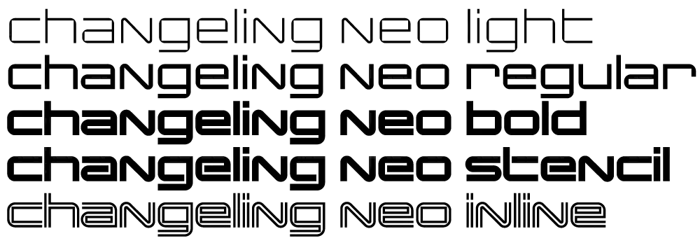
In 2003, I released my interpretation of China, an old VGC face, which I called Changeling. I redesigned many of the characters for more even type color. I also added lowercase-style variants to nearly all the uppercase forms, for endless “unicase” combinations, alternate forward- and back-slanting characters for A, M, V, and W, and a more complete character set. I spaced it to emulate the “tight, but not touching” style of spacing popular in the ’70s. Finally, I created four new styles—Light, Regular, Stencil, and Inline.
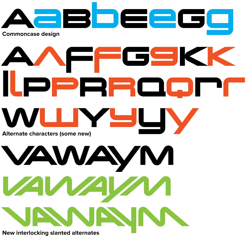
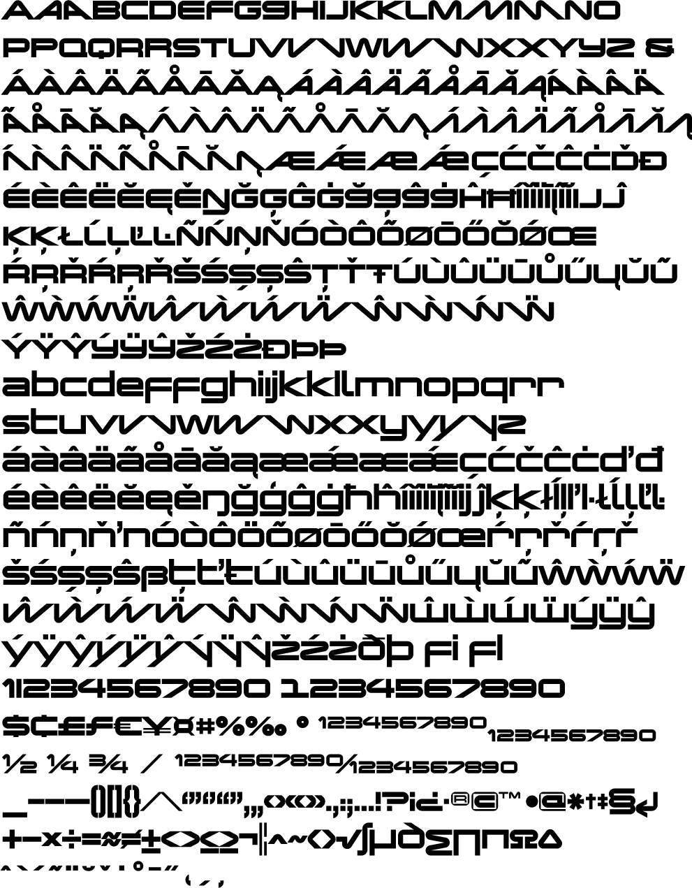
Changeling Neo (2008) builds on this with even more alternate characters (including a few from VGC China I had previously left out), extensive language support, and lots of improvements in fit and finish. Changeling Neo is available exclusively in the OpenType format. Alternate characters are accessed using OpenType Stylistic Alternates and Stylistic Sets features. Standard characters that were “hijacked” in Changeling (to make room for alternate characters) have been reinstated. Changeling Neo also includes support for fractions, superscript and subscript, as well as tabular figures.
For more information, I’ve made two PDFs you can download:
Changeling Neo is available now.

Refrigerator dates back to 1988 as one of my earliest PostScript typefaces. The concept was very simple: A blocky, condensed sans serif with rigidly geometric forms. I was inspired partly by Neville Brody’s Industria, but very quickly it veered toward more of a mid-20th century vernacular appearance. It wasn’t based on anything specific. Rather, it seemed to come from memories of block-style lettering from when I was young.

Refrigerator Deluxe (2008) extends the family from a specific vernacular style to an anthology of vernacular styles through the extensive use of alternate characters, nearly doubling the character count. (The alternate characters are accessed either through OpenType Stylistic Sets or the Glyph palette, depending on your software application). These range from squared off, closed shapes, with a minimum of angled strokes, to open, stylized shapes with more of an Art Deco feel. Using different combinations of these alternates, Refrigerator Deluxe can take on an endless variety of appearances from basic block to high style.

Also new in Refrigerator Deluxe is the addition of a fourth weight (Regular), improvements in many small details, like spacing, kerning, hinting (for better on-screen display), character design refinements, extensive language support (most Western and Central European Latin-based languages), fractions, case-sensitive forms, and lots of “f” and “t” ligatures.
For more information, I’ve made two PDFs you can download:
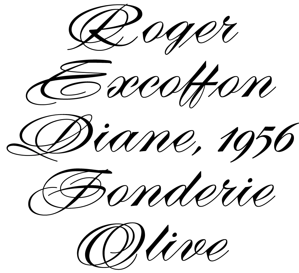
I recently partnered with Mark Solsburg of FontHaus, who has lately become fascinated with twentieth century French type foundries and type designers, to create a faithful digital revival of Diane, a typeface designed by Roger Excoffon. It was released in 1956, around the same time as his more famous Mistral and Choc. For reasons that aren’t clear to me, Diane seems to have never become as popular as his other faces, especially in the U.S. Finding full specimens of the font turned out to be quite a challenge. In many cases, only the caps and lowercase are shown.
With Mark’s help, I was able to get hold of source material from the University of Groningen in the Netherlands, D. Stempel GmbH metal type services in Frankfurt, Germany, as well as from some type specimen books that I already had in my possession.

As I researched and studied the face, many curious facts came to light. The caps in earlier specimens of Diane are completely different from specimens published later, suggesting that the face was redesigned at some point, perhaps in the mid-1960s. So we are left with two different sets of caps.


The original had very elaborate, swirly strokes, characteristic of Excoffon’s gestural designs for posters and logos. Later on, these appear to have been replaced by a set of simpler, more traditional script caps. The original caps are criticized in one source I found (“Practical Handbook on Display Typefaces”, 1959) as being “exquisite” but “not highly legible”. Perhaps this is what led to the simpler caps being introduced.

Even more curious, the caps shown in the Olive specimen “3 Scriptes” that accompanied its release in 1956 are noticeably different from the ones found in existing Diane metal fonts. The only conclusion I can make is that Diane, as it was shown in the “3 Scriptes” specimen, was not yet finalized when this was published. (Some of these earlier character designs are included in my revival.)

Changes appear to have been made in the lowercase as well. Several characters have non-connecting incoming strokes in the 1956 version. In the later version, the strokes all connect. The lowercase o also differs, with the original “3 Scriptes” specimen showing a loop inside the counter, apparently dropped in the released version.
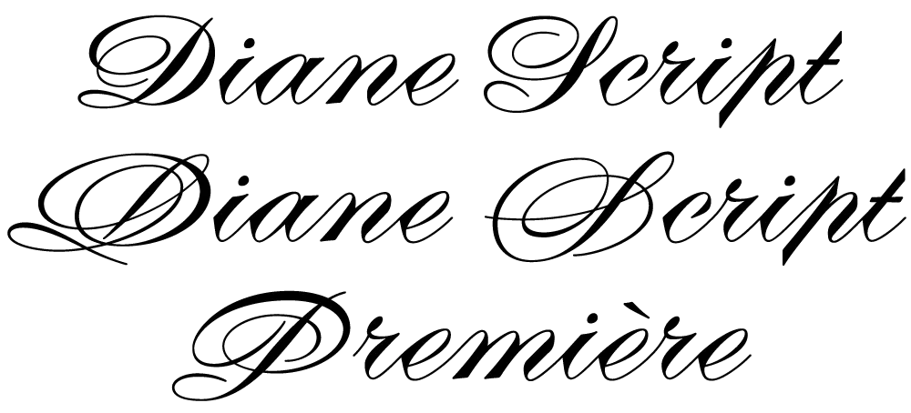
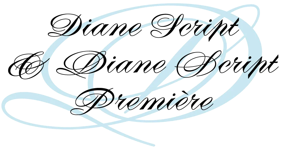
In my digital revival of Diane, I’ve included many of these differences. Diane Script Première includes the beautiful caps from the original version, while Diane Script features the later, simpler caps. Both faces include the non-connecting lowercase characters and the earlier lowercase o as alternate characters. Diane Script Première includes three of the “unfinished” caps from the “3 Scriptes” specimen as alternates.

Of course, metal foundry faces had nowhere near the number of characters that modern digital faces do, so it was necessary to design quite a few new characters to match Excoffon’s original ones. This proved to be a fairly straightforward process, with one exception: the ampersand.
 and Diane Script Premiere (right).")
As hard as it is for me to believe, it appears that Diane never had an ampersand. None of the specimens I’ve found so far has shown one. I still hold out the possibility that one exists, and intend to add it if it turns up. In the mean time, I have come up with two that I am satisfied with. The first is a simpler design to go with the simpler caps in Diane Script. In the second, I tried to capture the energy and exuberance of Excoffon’s original caps. Studying Excoffon’s gestural design work was very helpful for this. Diane Script Première includes both ampersands, with the simpler one as an alternate.

Diane Script and Diane Script Première are not the first attempt to revive Diane digitally. However, in my research, I discovered a detail that previous attempts have gotten wrong: the alignment and spacing of the caps in relation to the lowercase. Unlike most typefaces, Diane’s caps actually sit slightly below the lowercase baseline. The most easily found specimens of Diane show the caps and lowercase separately, so this fact is hidden. Luckily, my source material included a few obscure specimens in which the correct relationship can be seen.

Several of the lowercase letters have disconnected outgoing strokes, intended to connect to the following letter. However, when it falls at the end of a word, the disconnected stroke is conspicuous and unnecessary. In the metal typeface, this was apparently an acceptable compromise. But in OpenType format, we can have it both ways. When such a character falls at the end of a word, the orphaned stroke is omitted automatically. (An OpenType-savvy application and/or operating is system required for this feature to work.)
In reviving Diane, I’ve sometimes felt more like a detective than a type designer. I’m very happy with the way it turned out and hope my efforts will bring new life to Roger Excoffon’s masterpiece.
Diane Script and Diane Script Première are available now from FontHaus.

Ginger is the most recent Filmotype font I’ve digitized. (See also Zanzibar and Glenlake.) It’s the first in a range of Filmotype “G” series fonts—condensed sans serifs whose names all start with “G”—that have many Futura-like features that are unusual for the style. I was interested in this range of typefaces even before I knew about Filmotype. Few of them have ever been digitized before. I plan to do all of them eventually (sooner than later, I hope).
To bring Ginger into the 21st century meant designing dozens of new characters to expand its limited character set. Caps, lowercase, numbers and a few symbols and punctuation marks might have been okay back in the 1950s, but today’s fonts are global citizens and have to play as well in Prague as they do in Peoria. In designing the new characters, I tried to imagine how Ginger’s designer would have designed them. (We know who designed some of the Filmotype fonts, but not Ginger. Over the years many of the records of who did what were lost.)

Like all the new Filmotype revivals (available from Font Bros), Ginger has been remastered to high standards and is a modern font in every way. It is available in OpenType format, which means you can use the same font on either Mac or PC, and includes many OpenType goodies, such as an alternate lowercase “a”, arbitrary fractions, case-sensitive forms, and extensive language support.


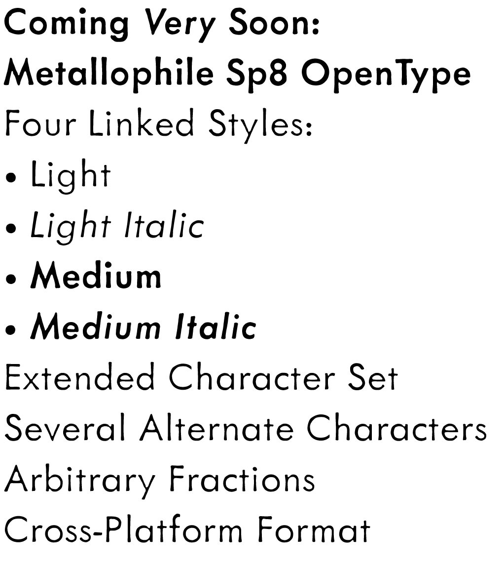
I released the Light and Light Italic styles of Metallophile Sp8 in 2003. The original plan was to add more weights later, but later never seemed to come. When I started getting requests from customers for more weights, I realized that had to change.

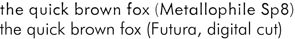
And now it has. Introducing Metallophile Sp8 Medium and Medium Italic. These, like the original Metallophile Sp8 fonts, are based on a classic sans serif hot metal face, Spartan, set at 8 points.
My concept was based on the observation that digital versions of classic typefaces look quite different from their counterparts in metal type. The metal faces, printed on plate-finish paper using letterpress printing, had a warmth and texture that was lost in the precise mathematical world of digital typography. It was not only the imperfections of ink on cast metal, it was also the proportions and spacing, which were particular to the size of type. In digital type (with some exceptions), one size fits all. In metal type, every size was custom tailored. 8 point digital Futura looks quite different than 8 point metal Futura, especially in print.
There have been some attempts in digital type at simulating the look of classic metal typefaces, such as ITC Founder’s Caslon, but rarely has it been tried with more modern sans serifs. Metallophile Sp8 Light was an attempt, but without more weights it was limited in its usefulness.
The original metal Spartan Light was paired (or “duplexed”) with Medium as a boldface on the old Linotype casting machines. With that in mind, I decided Metallophile Sp8 Medium would be the best boldface for Metalophile Sp8 Light.
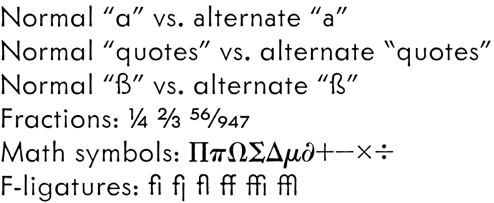
As part of this process, the entire family was moved to the OpenType format, with a greatly enlarged character set, including extensive language support, a full set of math characters (based on the standard “pi” sorts of the metal type days), f-ligatures, a large set of pre-built fractions as well as arbitrary fractions via OpenType. The new fonts also include and alternate two-story lowercase “a” and alternate left quote marks, just like the original metal face. I redesigned the “ß” to give it the more traditional form, but included the more contemporary version I did in the original Metallophile Sp8 fonts as an alternate.
More weights are already in the works, which I hope to release this Summer, but I wanted to get these out as soon as they were ready.
When I released Metallophile Sp 8 in 2003, the plan was to add more weights eventually. Now that I am converting my older fonts to OpenType format, that time has come. These four fonts should be available soon from my usual distributors. More details to come. More weights later this year.