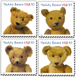
Imagine my surprise when I saw my face at the Post Office. Typeface, that is. A very prominent use of Felt Tip Roman.
Total results: 100.
Imagine my surprise when I saw my face at the Post Office. Typeface, that is. A very prominent use of Felt Tip Roman.
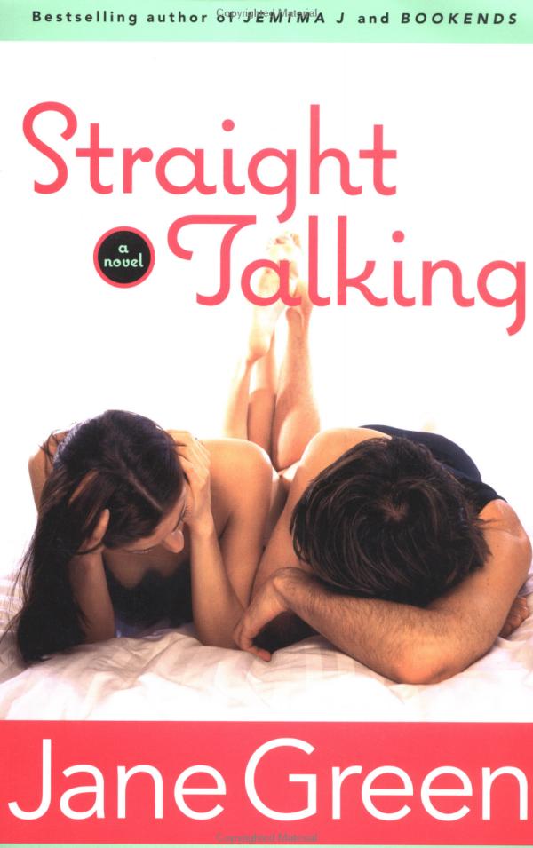
Talk about typecasting: Coquette is used rather coquettishly on the cover of this Jane Green book.
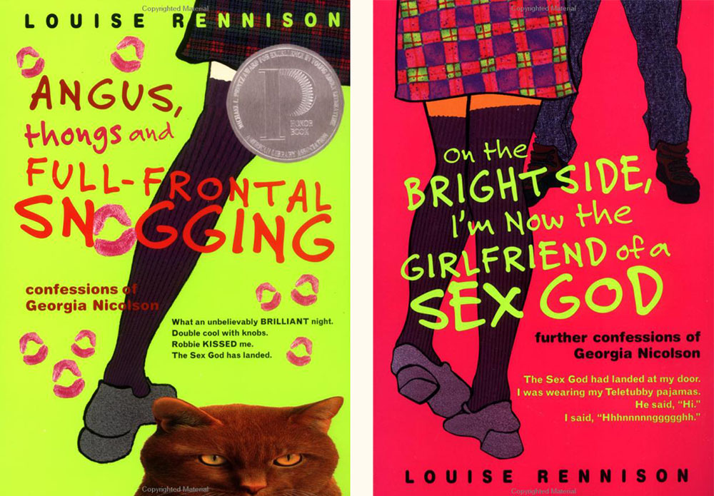
Felt Tip Roman is being used very effectively on this series of young adult novels by British writer Louise Rennison. There are at least five of them, but these two are my favorites.

I recently noticed Coquette used extensively in the book “Everything for Baby” by Adélaïdé D’Andigné and Alain Gelberger, published by Stewart, Tabori & Chang last year. Notice how the baby in the photo seems very interested in the font. Obviously, a budding typophile.
For some reason, a high percentage of sightings of Acme Gothic in use have been in science fiction movies and TV shows. Not what I would have expected at all for what I admit is a somewhat "retro" typeface. Then again, Bank Gothic, released in 1930, is super popular for futuristic sci-fi uses.
Here are the examples I've spotted so far:
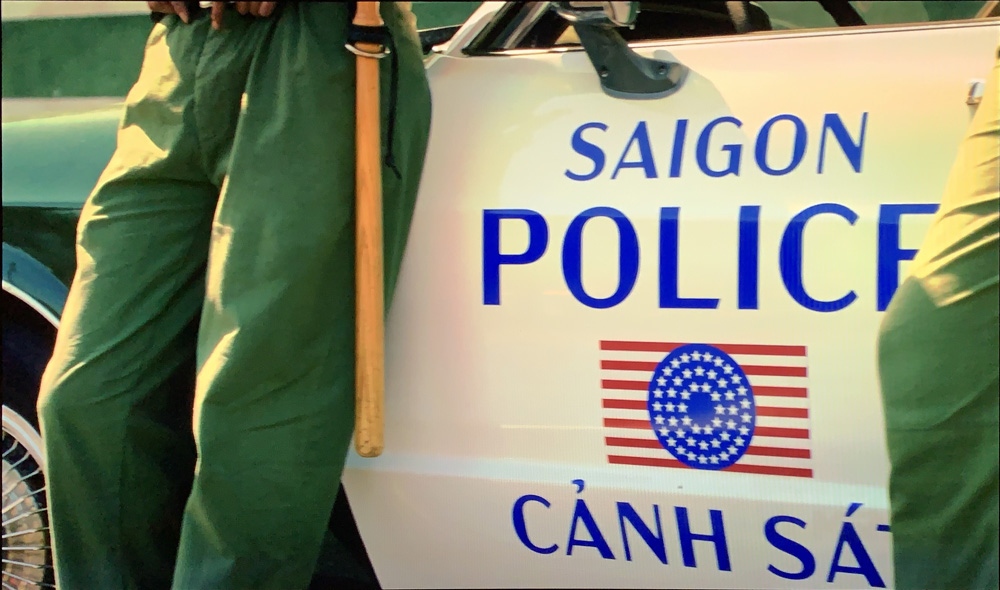
In a brief shot in the HBO series Watchmen, Acme Gothic Wide Regular can be seen on the side of a Saigon police car it its alternate timeline of 2019 where Vietnam is the 51st U.S. state. Lucky thing I included Vietnamese diacritics.
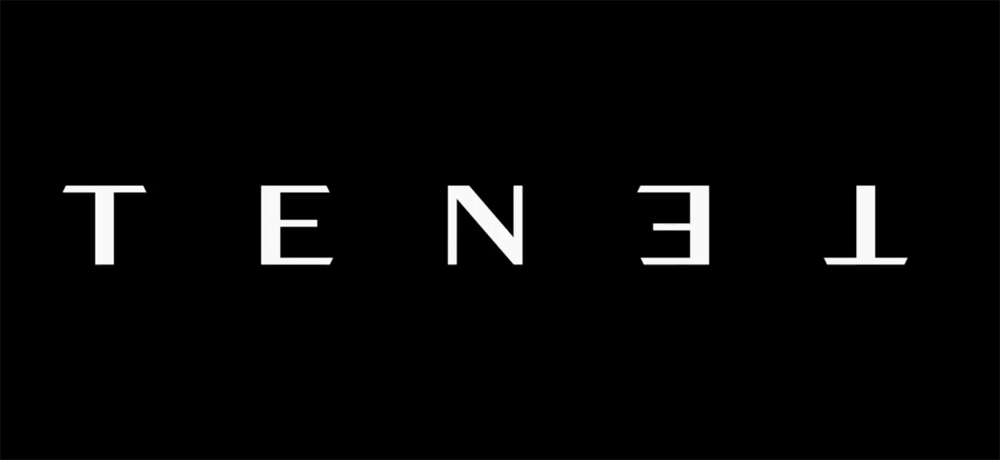
Acme Gothic Extrawide Regular as seen very widely spaced in the first trailer for Tenet. The rotated palindrome concept was dropped for a straight treatment after it was discovered that there was a bicycle company called Tenet that had already used the same idea in their logo. Happily for me, they kept the Acme Gothic for the revised branding.
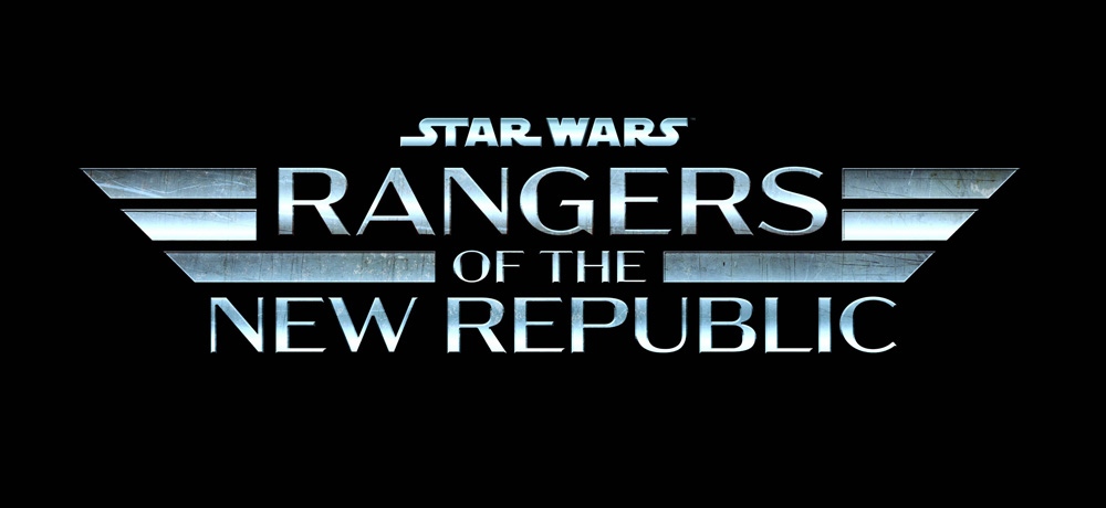
In what appears to be a spin-off of the Mandalorian Disney+ series, the logo for Star Wars: Rangers of the New Republic features Acme Gothic Extrawide Regular like Tenet, but much more tightly spaced with a brushed metal treatment.
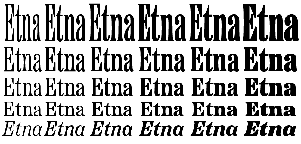
I'm very excited to introduce a brand new typeface family that's been on my back burner for decades: Etna.
It was inspired mainly by the Aetna style of wood type from the 1880s. Etna tames this quirky Victorian design transforming it into a complete family suitable for modern use, adding a full range of six weights and italics, allowing it to work equally well for both text and display.
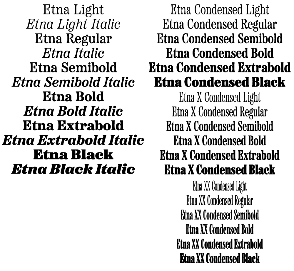
The Etna family also includes three different condensed widths in all six weights intended for display use. These are meant to be used LARGE.
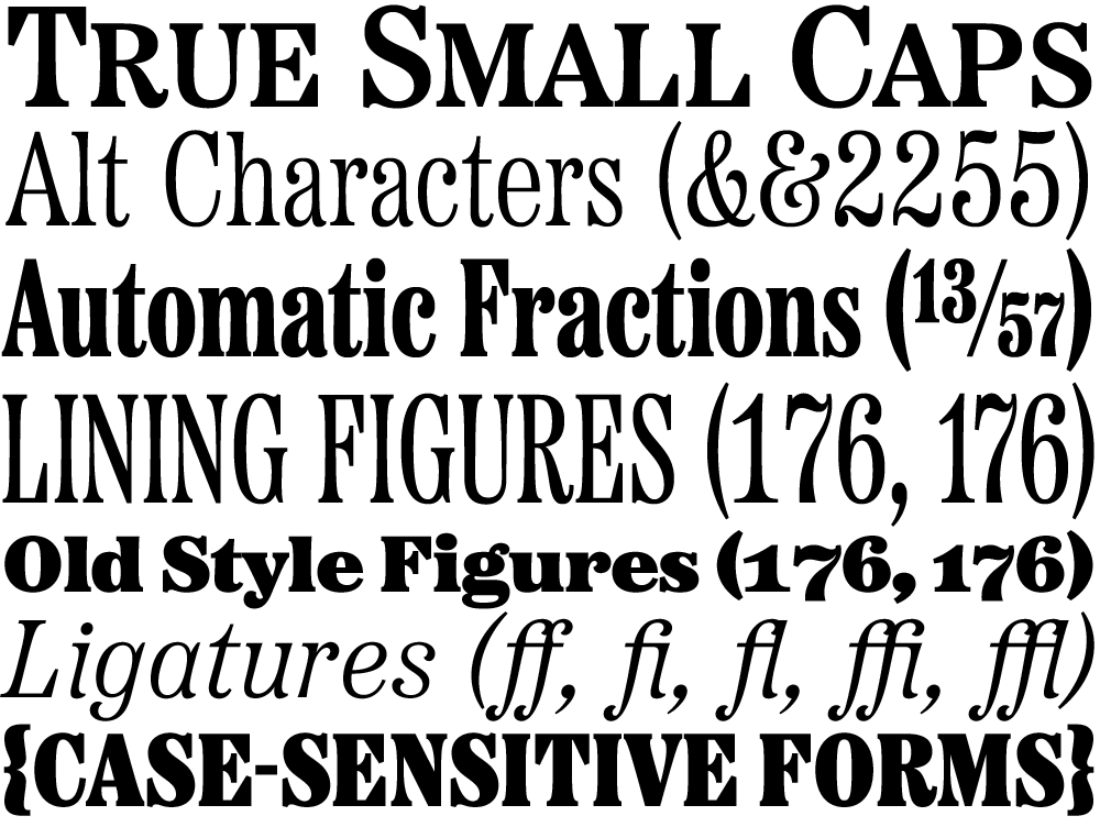
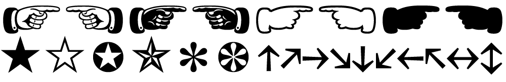
All 30 styles include four different figure styles, alternate characters, true small caps, and a selection of dingbats, including arrows, stars, asterisks, and manicules (pointing hands).
Etna is just rolling out starting today. You'll find a list of places where you can buy a desktop, web, app, or ebook license on the main Etna page on my site. There is also a nice Etna mini-site that tells the complete story of Etna and the history of the Aetna genre.
Thanks to Nick Sherman for designing and coding the mini-site and to David Shields for writing the history section. Also thanks to Nick for suggesting that I add the manicules and many other features. Finally, thanks to Schriftlabor for technical assistance in developing the fonts.
Page 58 of 61