Introducing Etna
I’m very excited to introduce a brand new typeface family that’s been on my back burner for decades: Etna.
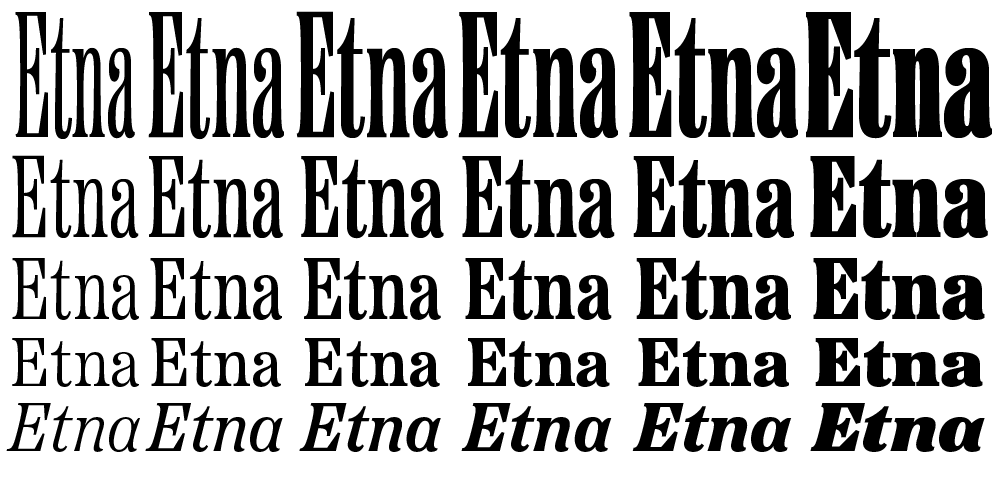
It was inspired mainly by the Aetna style of wood type from the 1880s. Etna tames this quirky Victorian design transforming it into a complete family suitable for modern use, adding a full range of six weights and italics, allowing it to work equally well for both text and display.
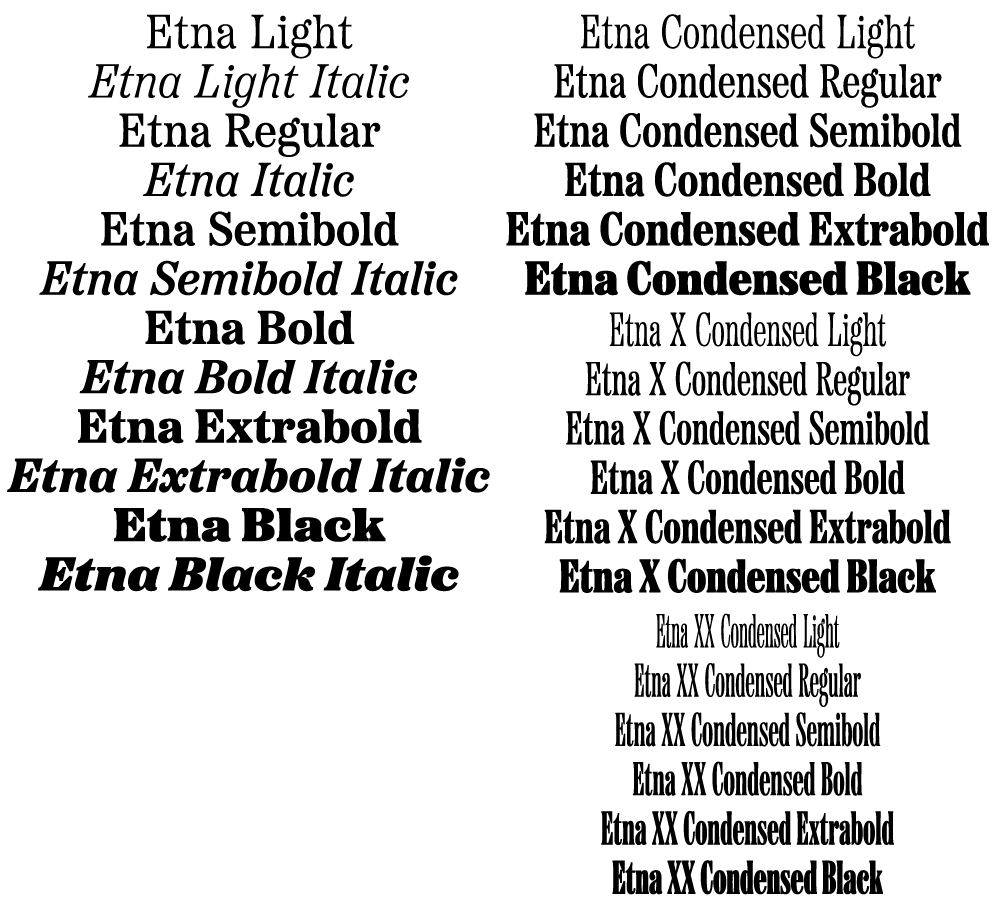
The Etna family also includes three different condensed widths in all six weights intended for display use. These are meant to be used LARGE.
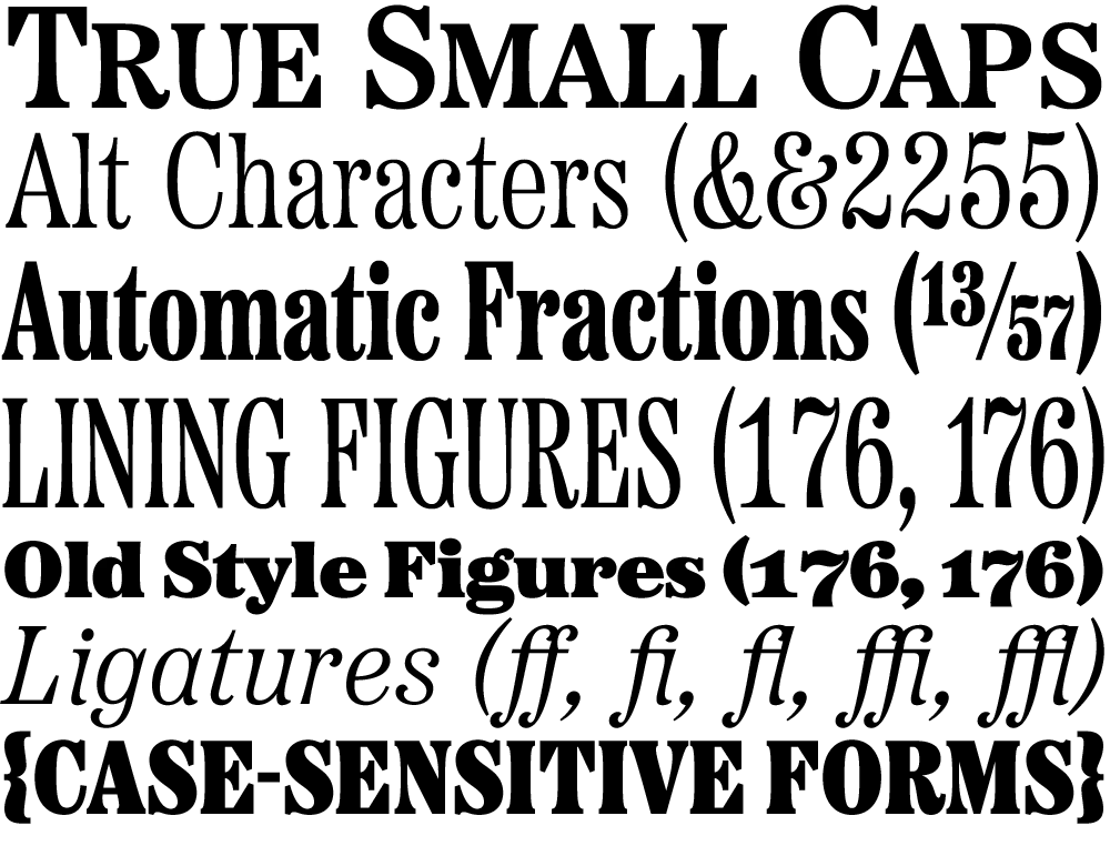
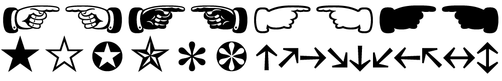
All 30 styles include four different figure styles, alternate characters, true small caps, and a selection of dingbats, including arrows, stars, asterisks, and manicules (pointing hands).
Etna is just rolling out starting today. You’ll find a list of places where you can buy a desktop, web, app, or ebook license on the main Etna page on my site. There is also a nice Etna mini-site that tells the complete story of Etna and the history of the Aetna genre.
Thanks to Nick Sherman for designing and coding the mini-site and to David Shields for writing the history section. Also thanks to Nick for suggesting that I add the manicules and many other features. Finally, thanks to Schriftlabor for technical assistance in developing the fonts.