Acme Gothic Sightings
For some reason, a high percentage of sightings of Acme Gothic in use have been in science fiction movies and TV shows. Not what I would have expected at all for what I admit is a somewhat “retro” typeface. Then again, Bank Gothic, released in 1930, is super popular for futuristic sci-fi uses.
Here are the examples I’ve spotted so far:
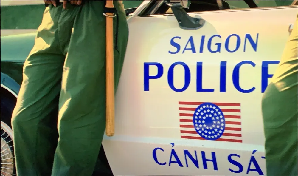
In a brief shot in the HBO series Watchmen, Acme Gothic Wide Regular can be seen on the side of a Saigon police car it its alternate timeline of 2019 where Vietnam is the 51st U.S. state. Lucky thing I included Vietnamese diacritics.

Acme Gothic Extrawide Regular as seen very widely spaced in the first trailer for Tenet. The rotated palindrome concept was dropped for a straight treatment after it was discovered that there was a bicycle company called Tenet that had already used the same idea in their logo. Happily for me, they kept the Acme Gothic for the revised branding.
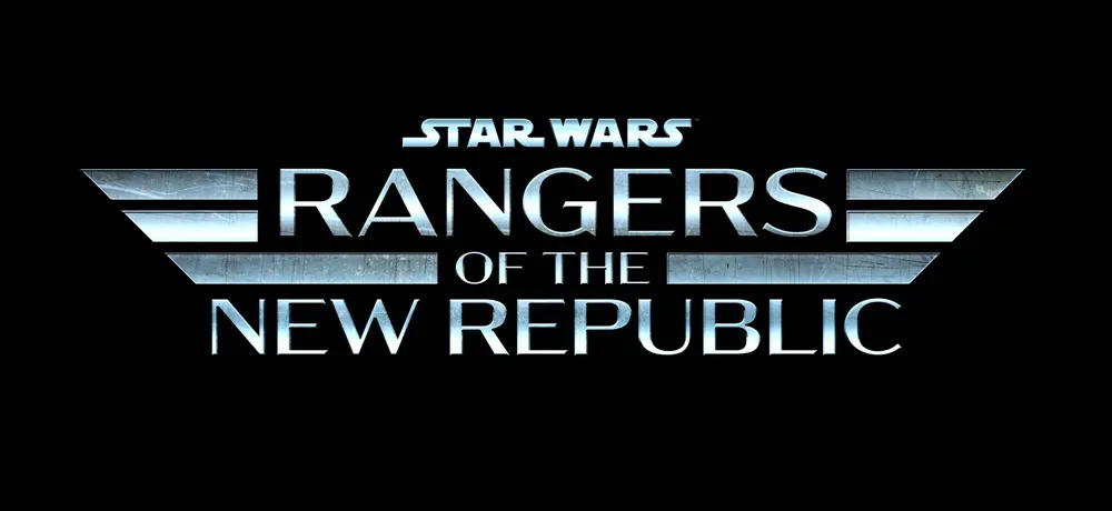
In what appears to be a spin-off of the Mandalorian Disney+ series, the logo for Star Wars: Rangers of the New Republic features Acme Gothic Extrawide Regular like Tenet, but much more tightly spaced with a brushed metal treatment.