.jpg)
MyFonts has been doing interviews of typeface designers for the last year or two in their Creative Characters series. Yesterday, they posted one featuring yours truly.
Total results: 100.
MyFonts has been doing interviews of typeface designers for the last year or two in their Creative Characters series. Yesterday, they posted one featuring yours truly.
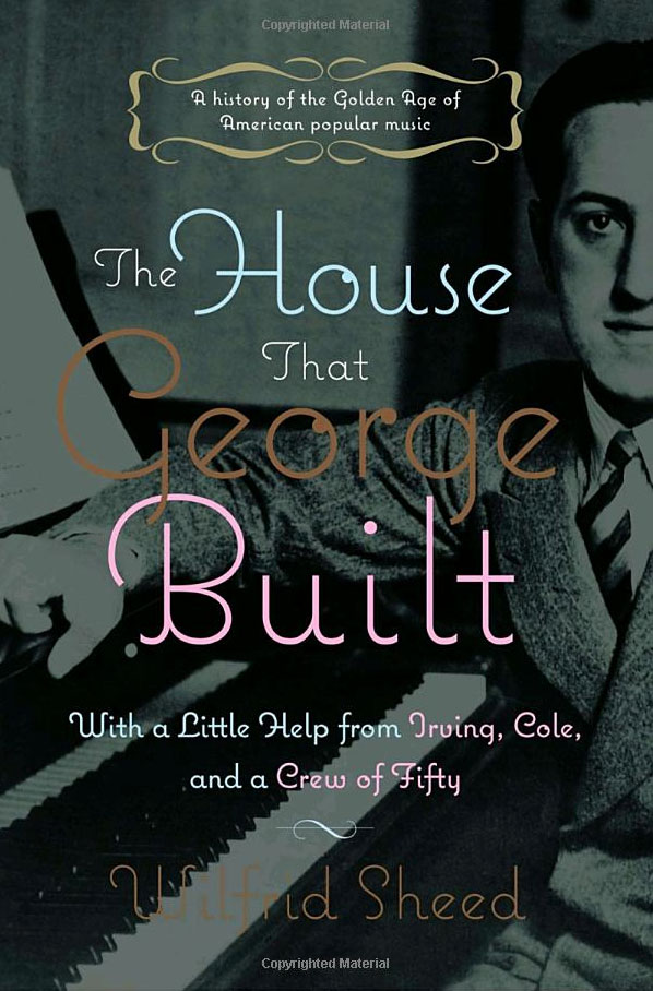
The cover of this book about George Gershwin is one of the nicer uses of Coquette that I’ve seen. (Thanks to Jeff.)
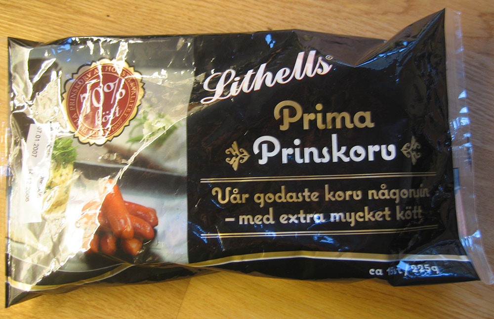
A line of meat products in Sweden is sporting Coquette on its packages. (Thanks to Peter at Fountain type foundry for the tip and the photo.)
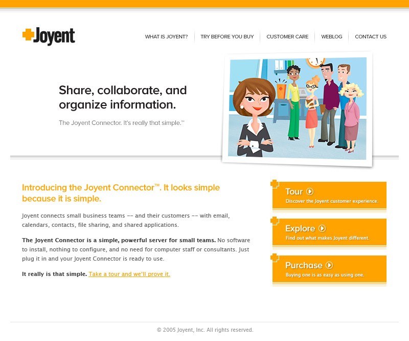
One of the first prominent uses of my recently released Proxima Nova is at Joyent.com where it is part of their corporate identity. Notice they are using the alternate lowercase a.
(Thanks to Stephen Coles for telling me about this.)
<>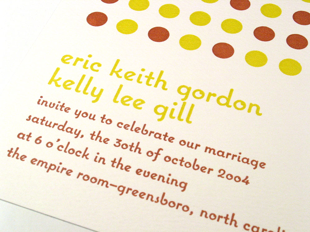
While I was at TypeCon in New York, one of the attendees walked up to me and handed me a copy of this wedding invitation on which he had used Coquette. (I think this was the first time I have been recognized in public by someone who had used one of my fonts. Oh, wait, I was wearing a name tag.) Anyway, what is really cool about the invitation is that it was printed letterpress.
Designer David Nix used Coquette on a promotion created for duty-free shops in Los Angeles and San Francisco airports.
Page 57 of 61