Mark’s Notebook - Page 56
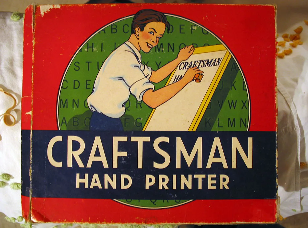
Seen in an antique store in Detroit Lakes, Minnesota on June 28, 2002.
David Steinlicht is a graphic designer and illustrator here in St. Paul. He also does some very funny cartoons on his website, allsmall.net. Not to be missed is his series called On My High Horse, which is a bit like a blog in cartoon form (though I’m sure David would never call it that).
Dan Picasso (yes, that’s his real name) is an illustrator who divides his time between Marathon, Texas and Minneapolis. He’s something of an old car buff (he owns a ’56 Olds 88 that looks like it just drove off a showroom floor) and does his illustrations the old-fashioned way, with an air-brush, paint and paper.
Alfredo Zelcer was my boss when I worked as a designer on TWA Ambassador magazine many years ago. His website is a recent development and shows just a tiny glimpse of his talent. **Update:**Alfredo died in May 2011. His site has disappeared so I’ve removed the link, but his profile is still up at Facebook.
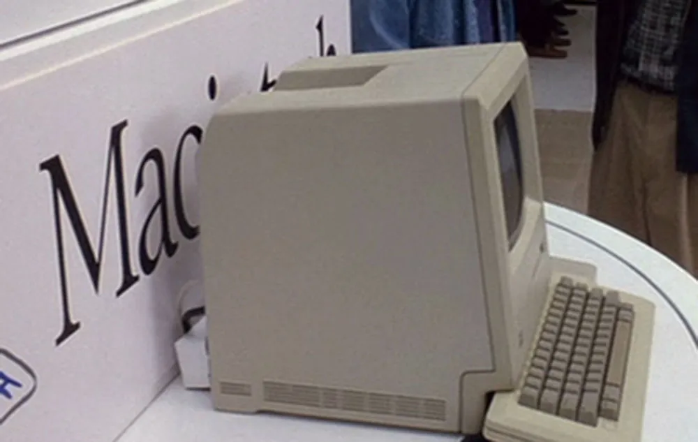
The 1999 made-for-TV movie The Pirates of Silicon Valley is a fictionalized account of the rise of Apple and Microsoft in the early days of the personal computer industry. In one scene, Steve Jobs and Bill Gates are in a heated match of ego-wrestling after Steve has given Bill a sneak peek at the Macintosh. It’s 1983, a year before it will be introduced. The top-secret prototype is shown housed in a typically Apple, design-conscious white enclosure, which reveals and conceals the Mac at the push of a button—like one of those spinning secret doors in a Hollywood movie haunted mansion. On the panel behind the Mac, the Macintosh logo is displayed—or is it?
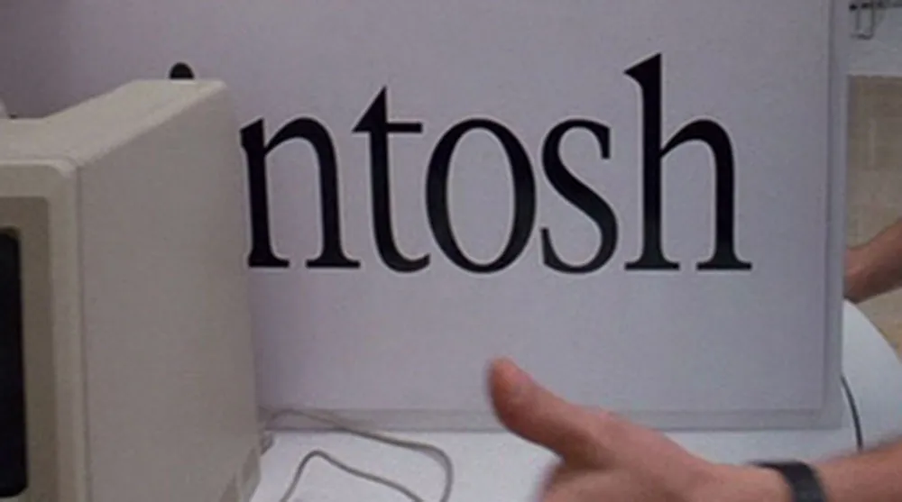
Eagle-eyed typophiles will be appalled to note that this is not the ITC Garamond Light (condensed 80%) that Apple used for 20-odd years on the Macintosh logo, but is, in fact, New York (also condensed 80%), one of the Mac system fonts—the TrueType version, to be exact, which was released in 1991. See if you can spot the differences here:
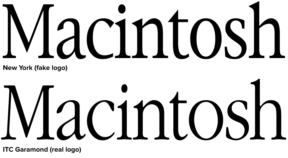
Clearly, New York is indirectly related to ITC Garamond. The bitmap version of New York, which was included on the original Mac, bore a strong resemblance to ITC Garamond, the typeface Apple used as a central part of its corporate identity. The TrueType version of New York, done by Bigelow and Holmes, differs in almost every detail with ITC Garamond, but shares a similar look and feel. So similar that it fooled the people who made Pirates.
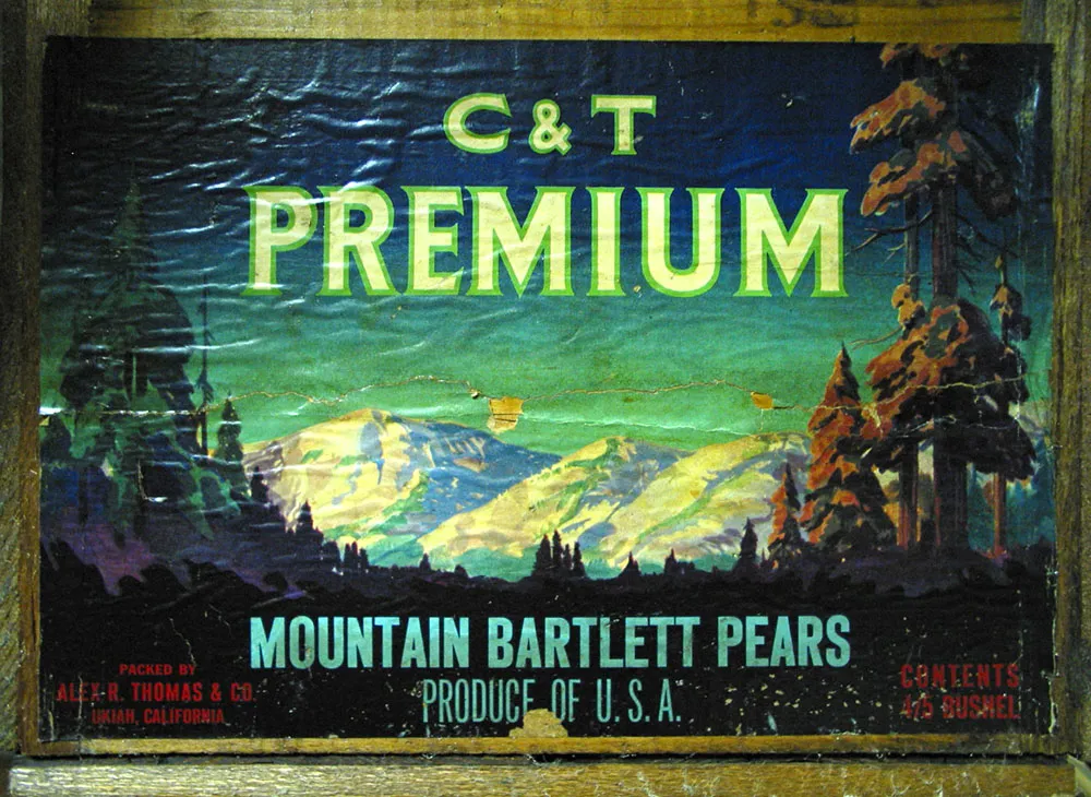
Fruit crate label seen in an antique store in Prescott, Minnesota, July 10, 2004.
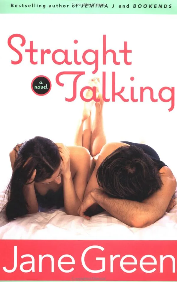
Talk about typecasting: Coquette is used rather coquettishly on the cover of this Jane Green book.
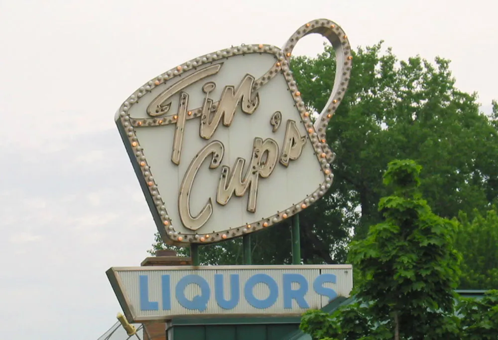
This vintage sign was destroyed in a fire sparked by lightning over the weekend. If my source is correct, they plan to rebuild it from the original plans.
Photo taken June 8, 2002, in St. Paul, Minnesota.
Update: They did rebuild and restore it, but the neon is gone and the color scheme was changed to black with white letters.