Mark’s Notebook - Page 57
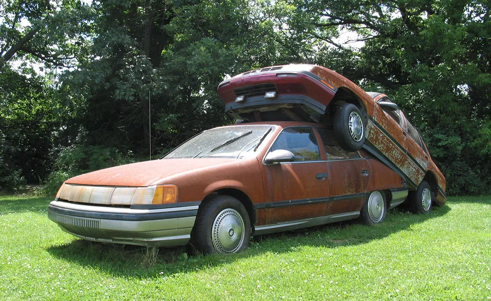
Photo taken July 7, 2003, at the Franconia Sculpture Garden, Franconia, Minnesota.

Here are a few of the people and places on the web that inspire me, in no particular order:
Not only does Coudal Partners site look great, it’s a goldmine of inspiration due mainly to their vast collection of interesting links (Fresh Signals), and their Museum of Online Museums.
Brian Taylor’s Rustboy site chronicles the process of making a computer-generated movie on one’s own. What amazes me more than Taylor’s obvious talent is his resourcefulness. He reminds me that it’s not the tools as much as how you use them. [The Rustboy film was never finished and the site is sadly long gone, but you can see some test footage for the film here.]
Even though I’m not particularly into comics, I will read just about anything by Scott McCloud. His book, Understanding Comics, helps you understand a lot more than comics. I also enjoy following his Morning Improv in which he creates comic strips based on titles submitted by readers.
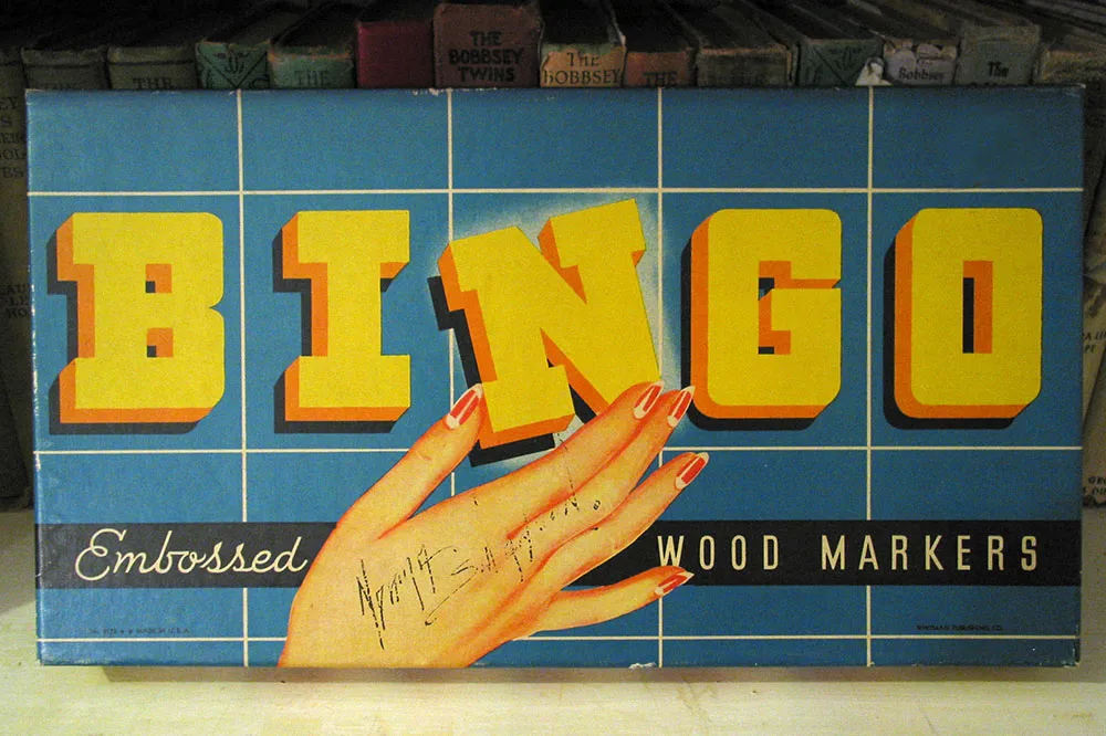
Vintage game box. Seen in an antique store in Prescott, Minnesota, July 10, 2004.
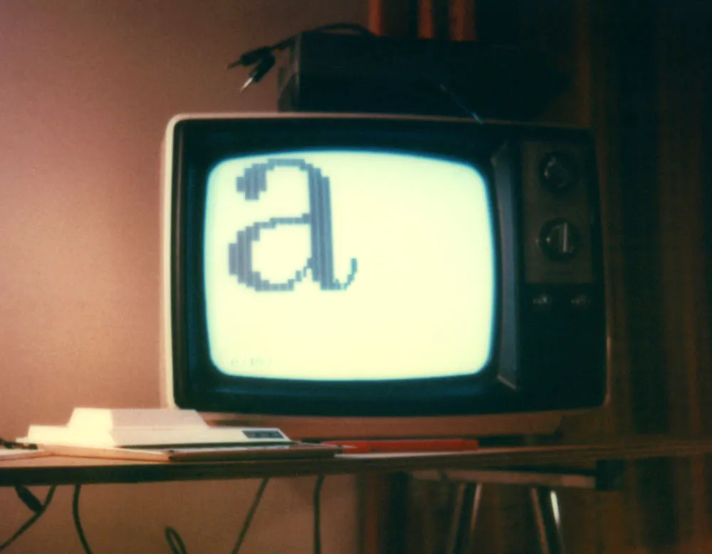
This photo shows my first attempt to create type on a computer screen. It is from about 1980.
The computer is that tiny white horizontal shape in the lower left, a Sinclair ZX80, which I bought mail order for $200. It had a 1mhz processor, 1k of memory, and built-in BASIC. The display is an old black and white television (not included). Programs and data were stored on a cheap cassette recorder (also not included).
The “a” image on the screen was created by programming the computer to display several lines of space and “block” characters in a certain order (which I worked out beforehand on graph paper). This is about as basic as a BASIC program can get.
Unfortunately, it took a good share of the computer’s memory just to do this. I didn’t investigate it further.
Update: I remember now. The thing on top of the TV is the cheap cassette recorder I used to store data. Yet more details: The “table” is made from a piece of plywood (which I still have) and a Crumar electric piano stand (which was sold with the piano to a guy who is now in prison for murder). (Not that it matters.)