Okay, so I admit it. I bought an iPhone about three hours after they went on sale a month ago. I didn’t have to wait in line or anything. I walked in, bought it, and walked out. Like nearly everyone else who has one, I’m very happy with it.
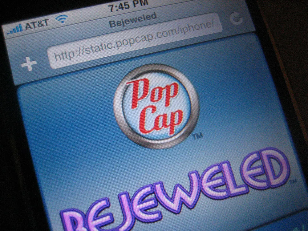
So, I was a bit tickled today when I unexpectedly saw some of my recent work on it: the new PopCap Games logo, which appears on Bejeweled, the first game designed specifically for the iPhone.
I did the job last spring. Here is a comparison of the old version and the new version:
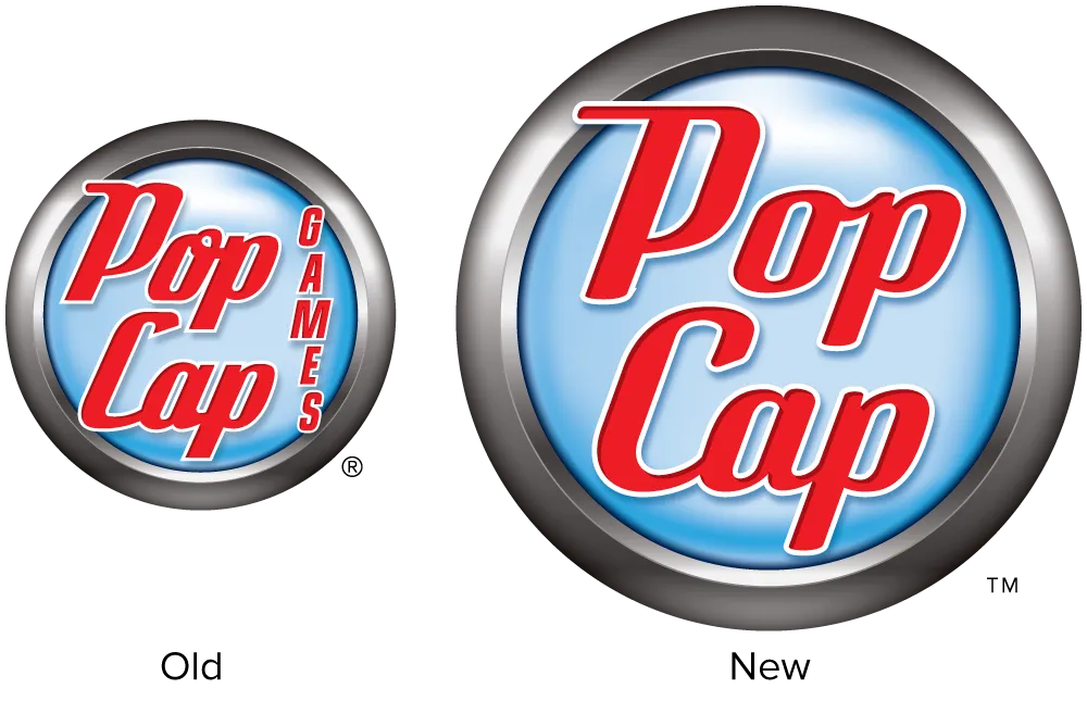
The idea was to make the logo cleaner and smarter without making it noticeably different to PopCap’s customers. Except for the background emblem, practically every detail of the lettering was changed. It would have been fun to completely redo it, but I’m happy with how it turned out.
If you have an iPhone and want to play Bejeweled, fire up Safari and head over the PopCap website. The game will automatically load when you visit the site using an iPhone.
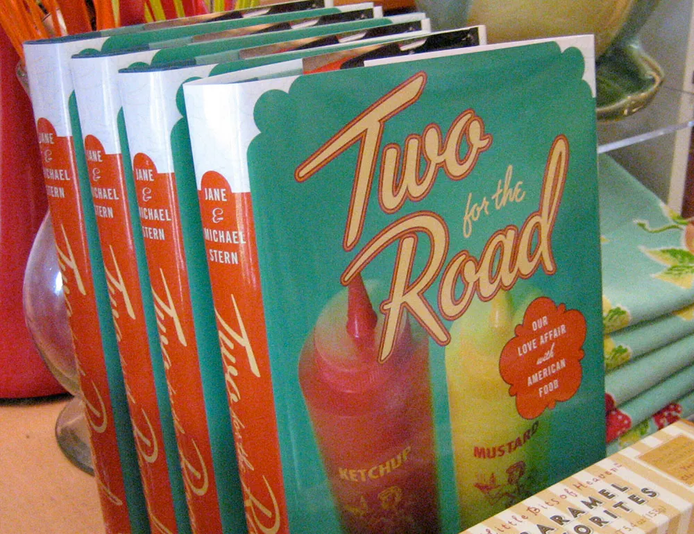
Here’s a fun lettering job I did for the cover of “Two for the Road” by Jane & Michael Stern. The book is a bunch of recipes collected from roadside diners all over the U.S. Art director Martha Kennedy asked me to make the lettering look like something you might see on a sign for a diner. In fact, it’s somewhat based on the sign from a famous diner called Rosie’s.
(This work is actually not that recent, but just I realized that I never posted anything about it here when the book was published last year.)
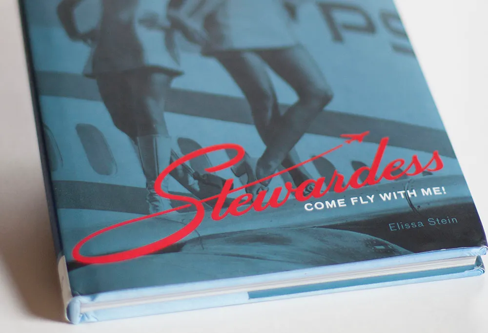
Earlier this year, I completed a lettering assignment for the cover of “Stewardess,” a book by Chronicle Books, which was just published. Designer Ben Shaykin came up with the idea of doing a take off (!) on the old Skyway Luggage logo.
It can be tricky to get things like this to work if you don’t have the right letters, or too many or few letters. It can also be tricky to come up with the letters that didn’t exist in the original logo. In this case, the style was a straightforward script. It would be conceivable to base an entire font on this style, which is not always the case with logos.
I’m happy with the way it turned out. The book itself is a lot of fun to look at (it’s mostly a picture book) and is getting positive reviews.
I recently completed work on a lettering design for the front of a building in Ketchikan, Alaska. The letterforms were based loosely on historical examples from the area. Traditionally, sign makers would fill as much space as possible, using the slats or runs of bricks as a grid on which to build the letters. The shapes of the letters themselves, while following standard styles and practices, often displayed idiosyncrasies unique to each sign maker, unlike today when most such signs are made with off-the-shelf fonts, typed on a computer keyboard, and “output” to a vinyl cutter.
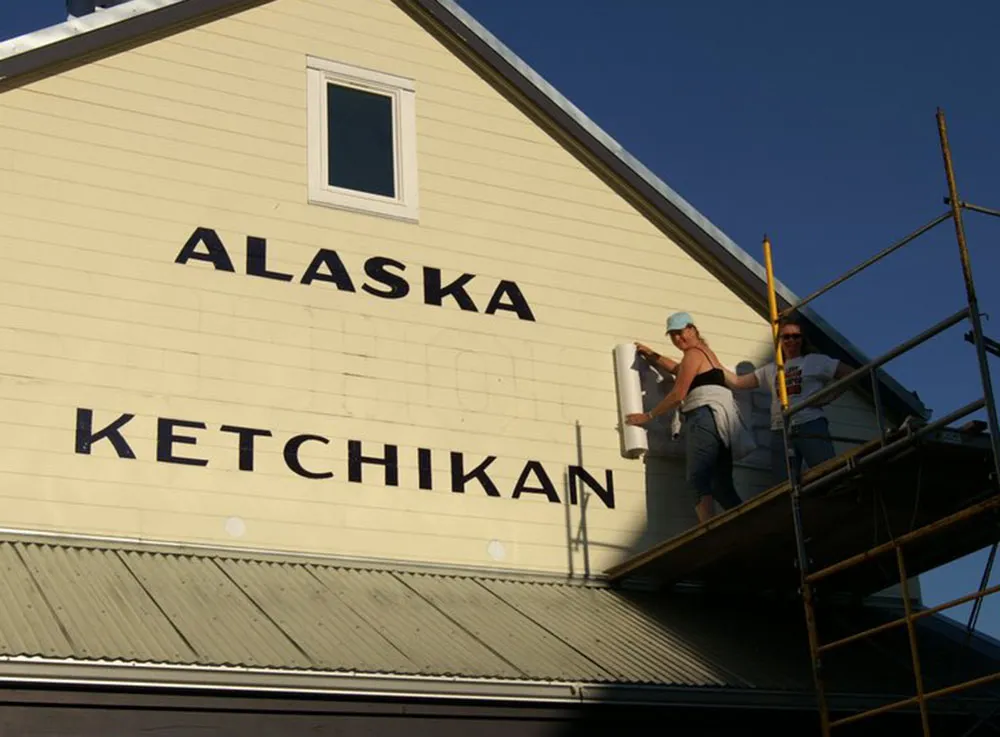
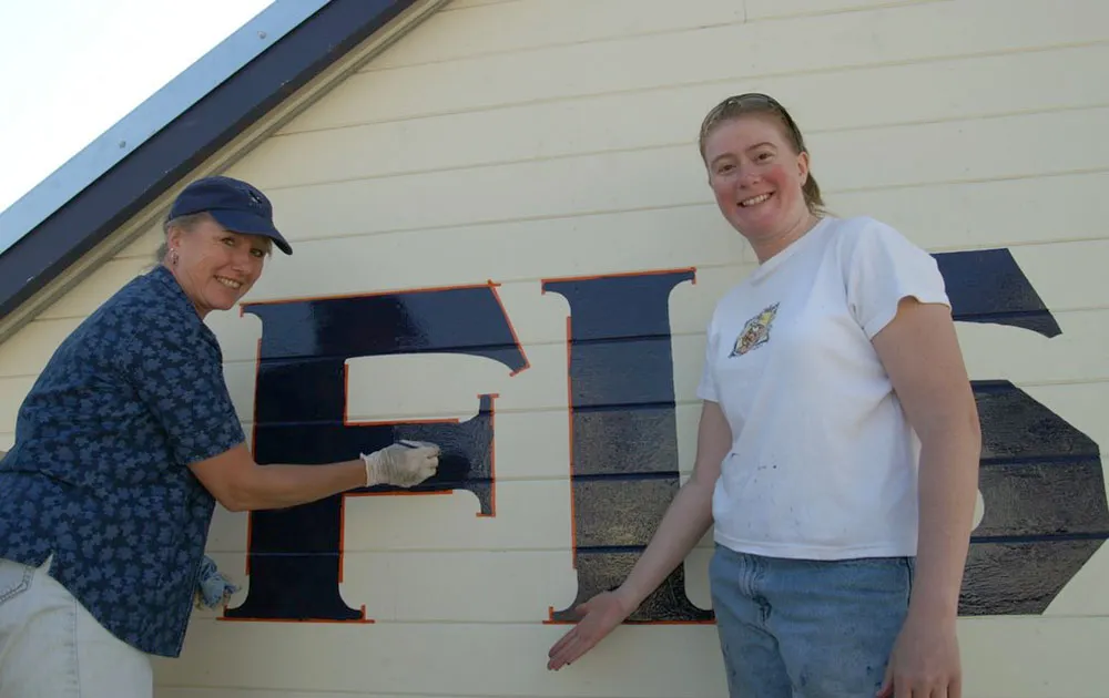
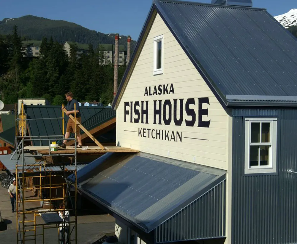
Although I do my final artwork electronically, the letters were designed from scratch with paper and pencil. The finished design was sent to Ketchikan where local sign painters (above) applied my design to the building using traditional techniques—real paint and real brushes. According to the client, the sign has become a “photo op” for tourists.
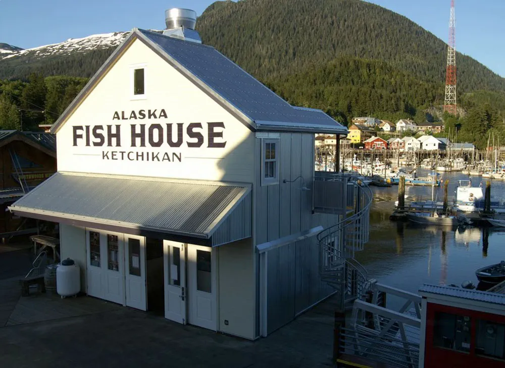
(Photos courtesy Deby Slagle, Alaska Fish House. Used with permission.)
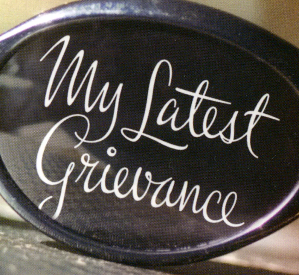
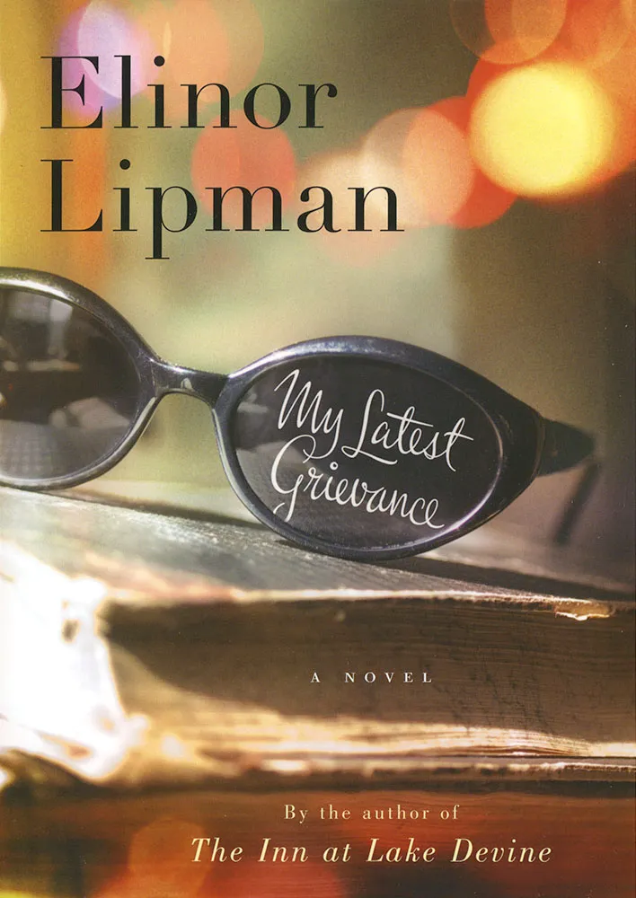
One of my recent lettering jobs was this one for the cover of Elinor Lipman’s new book My Latest Grievance, due out next spring. Houghton Mifflin art director Martha Kennedy wanted something spirited with a handwriting feel. I’m happy with the way it turned out. I’m always a little surprised that I can do this style at all. My actual handwriting is pretty erratic. I know people who can write like this. There must be something about the way their hands work that I just don’t have. Luckily, if I know how I want it to look and take my time, with a little assist from computer technology, I can pull it off. I take heart in the fact that the great lettering artists of the past would have been lost without their photostat cameras and razor blades. These things are never as easy as they look.

I’ve never designed a tattoo before, and not many ambigrams, either.
An ambigram is a form of lettering in which a word or phrase can be read in more than one direction. Or it may be two words combined into one image in which only one can be seen at a time, depending on how you look at it. The master of this art is John Langdon whose 1992 book Wordplay showcased his work. (A new edition is in the works.)
The design above was for a tattoo and was commissioned by a client in Canada. It reads the same if you rotate it 180°. (I don’t know where she had it placed, but she promised to send a photo.)
Ambigrams are partly luck, partly skill. I feel lucky it turned out as well as it did. I hate to think of someone permanently dyeing their skin with a design that didn’t quite work.