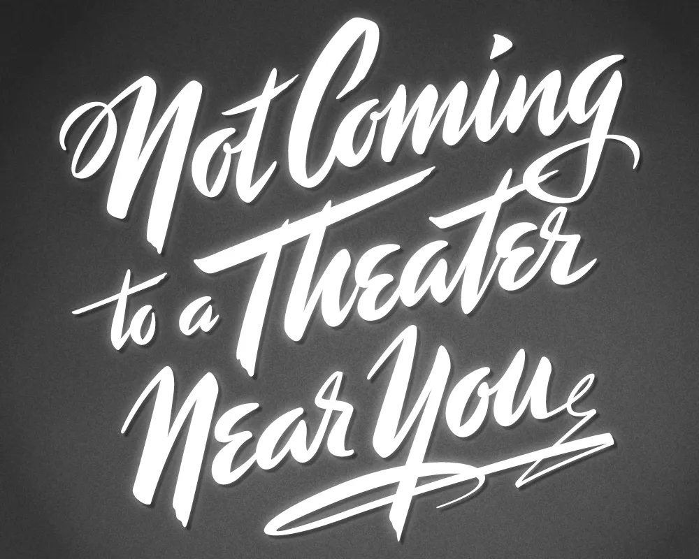
Last year, I did a logo design for Not Coming to A Theater Near You, a website devoted to movies off the beaten path. The designer, Rumsey Taylor, who was redoing the look of the entire site, wanted the logo to look like a title card from a film noire feature. What I came up with is based mainly on the title card from “Mr. Arkadin” (1955).
In spite of appearances, I don’t usually use an actual brush in my lettering designs, but in this case I did. The final art is vector-based, but I worked out the construction of the letters with brush and ink. (I’m not skilled enough at brush lettering to do the final art that way.)
The image above is a “treatment” I did to make it look like an actual title card from an old film, sort of a “serving suggestion.” On the wesite, Rumsey chose a simpler approach. The site redesign looks great, and I was happy to see that he’s using Metallophile Sp8 as a webfont (via Typekit).
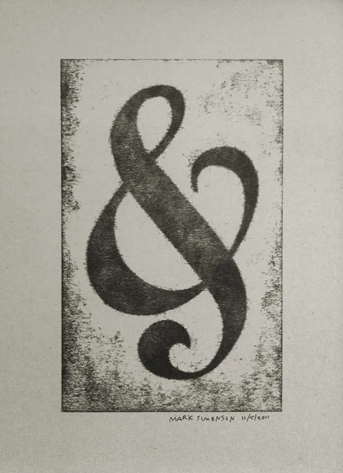
I’ve attended all three of the Hamilton Wood Type and Printing Museum’s annual “Wayzgoose” events so far. Last year’s, held in early November, was enjoyable as always, but I think I prefer the mix of presentations and hands-on workshops of previous years over having only workshops.
Still, it was great how they tied all the workshops around a common purpose—creating a portfolio of prints (including the portfolio itself). You can see one of my prints above, a pressure print from a hand-cut plate based on a free-form ampersand design.
I highly recommend the Wayzgoose if you are a type fanatic like me, into letterpress printing, or both. It’s held in the Fall in Two Rivers, Wisconsin. Attendance is limited, and it fills up quick, so you might want to get on their mailing list to be notified regarding when the next one will be held.
Last Friday, I spent the afternoon frantically trading files with Peter Bruhn (of Fountain type foundry in Sweden) for an exhibition match of Layer Tennis. The basic idea is to pass a layered Photoshop file back and forth for ten “volleys”, about one every 15 minutes. The resulting “volley” image is displayed live for the world to see, with running commentary (in this case by the witty and capable Grant Hutchinson.
What may not have been obvious to some was that the Photoshop compositions were not where Peter and I were spending most of our time (well, maybe in some cases it was obvious). In fact, we were designing, building and generating fonts in FontLab, and then using them in Photoshop. With most of the volleys, we started from the font that had been built in the previous one.
Although the images created in Photoshop were the ultimate public face of the match, I thought it might be interesting to show what was going on behind the scenes with the fonts.
To make it easier to tell what was going on, I’ve color-coded the glyphs:
- Green = new glyphs
- Purple = modified glyphs
- Gray = unmodified glyphs.
Volley 1: “jam” I got the coin toss, so I went first. I created a font with three simple glyphs in a sort of bloopy geometric style.

Volley 2: “your ham” Peter followed up by ably adding several more glyphs in the same style.
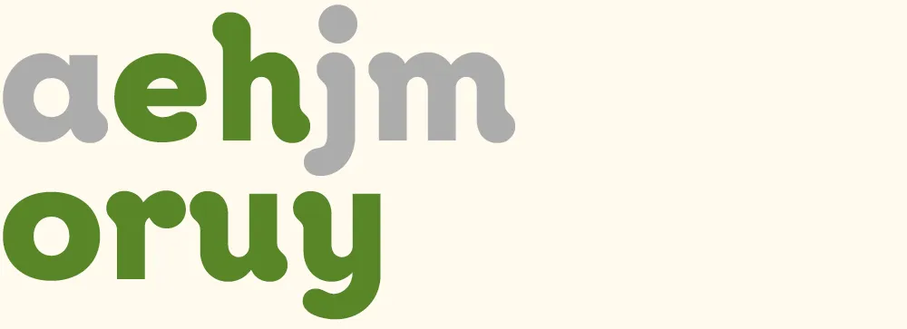
Volley 3: “more homey” I modified all the existing glyphs to create a higher-contrast semi-serif design. (You can see more clearly in this version that the basic construction is that of an upright italic.)
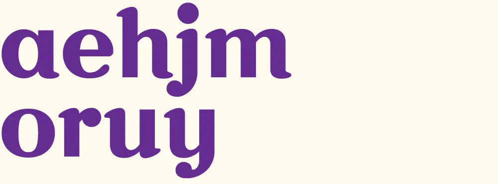
Volley 4: “möre” Peter takes it in a different direction, more like a Bodoni or Didot, and adds a whimsical swash and umlaut. He also takes advantage of the fact that he only really needs to change enough glyphs to spell the word he wants to use in the image, in this case “more”. Both of us adopt this strategy as the game progresses.
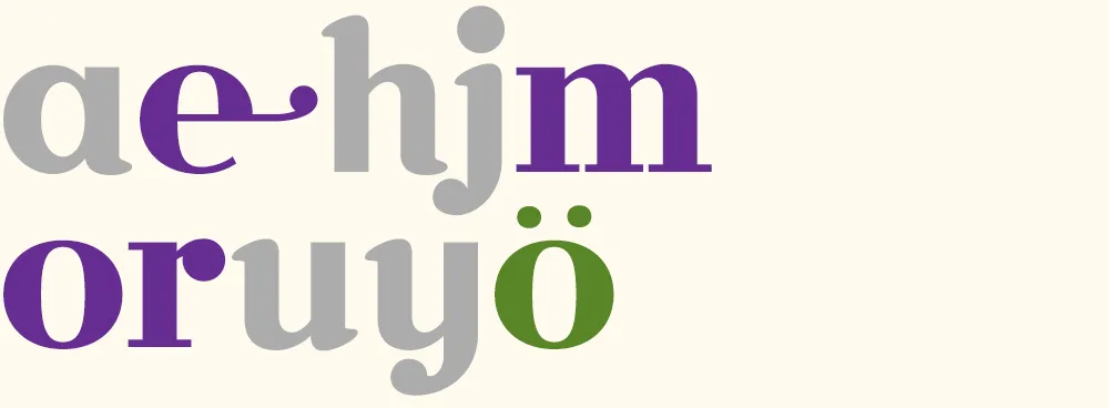
Volley 5: “major surgery” I continue the transformation to a Didone style, conforming several other glyphs and adding a g and an s.
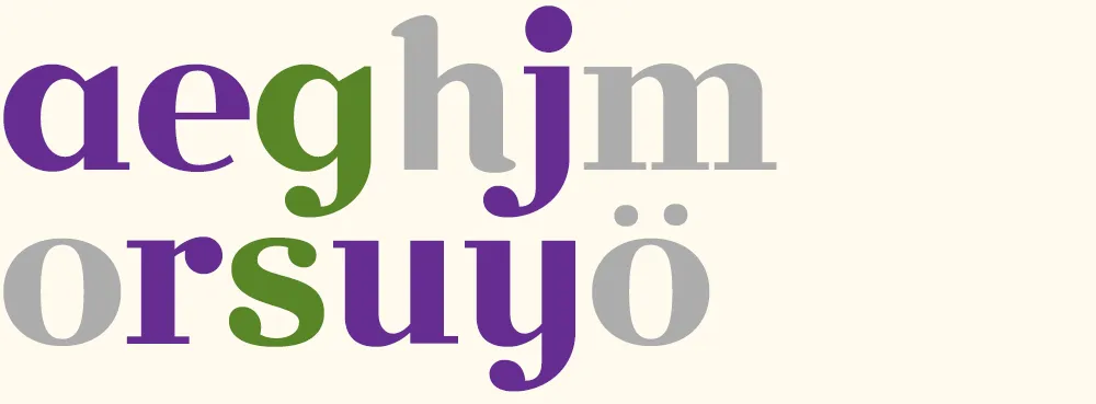
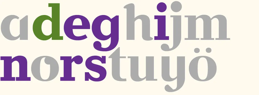
Volley 6: “no sanity” Peter changes the direction, this time deconstructing several glyphs and doing a “serif-ectomy”. Note the nod to my Coquette in the o.
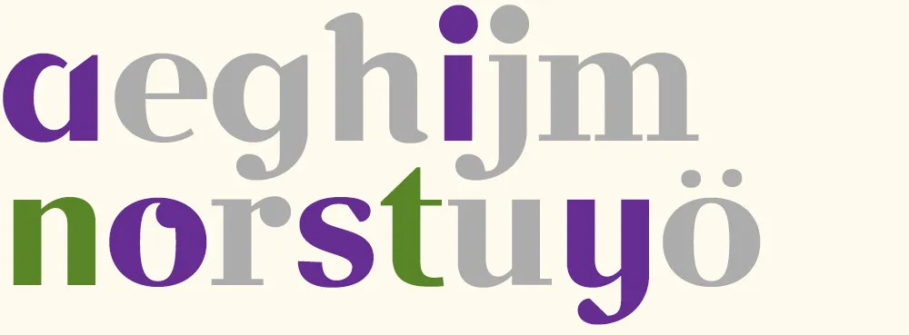
Volley 7: “faster!” I change the style again, albeit in an expeditious manner, by slanting all the glyphs. I add an f and a ! and tweak a few existing glyphs. (Merely slanted glyphs are shown in light purple.)
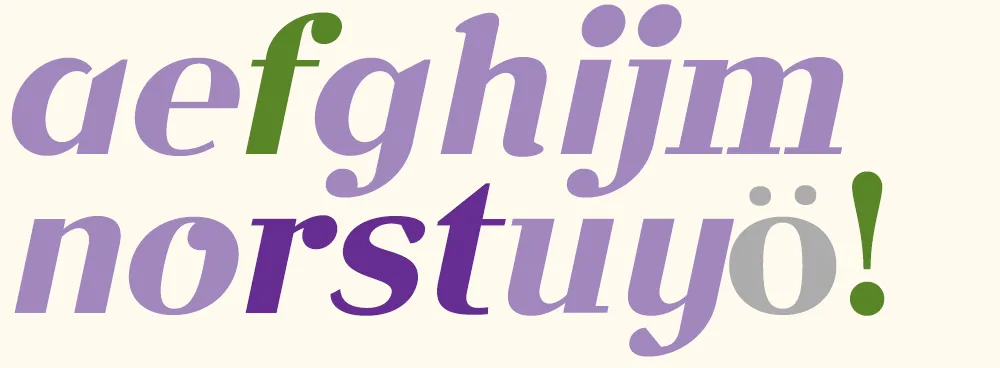
Volley 8: “aefghijm” Peter does something “meta” by printing out and critiquing an unslanted version of font.
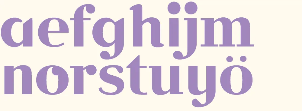
Volley 9: “redesign” I discard my cheap slanting trick from volley 7 and, starting from the font in volley 6, change it into a slab serif for my final volley.
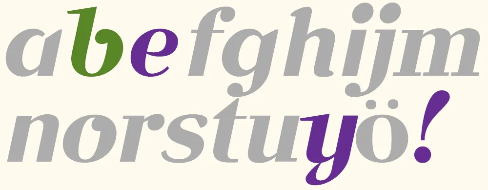
Volley 10: “bye!” Peter takes my slanted font from volley 7 and gives it a more cursive flair, with a reprise of the Coquette reference. According to Peter, the “waving” exclamation point was a happy accident. Works for me.
In the end, we had created ten new fonts in a few hours. Not complete, full-featured fonts, or the best-built fonts in the world, but good enough to set some type. I set them all together to show the sum of what we made:
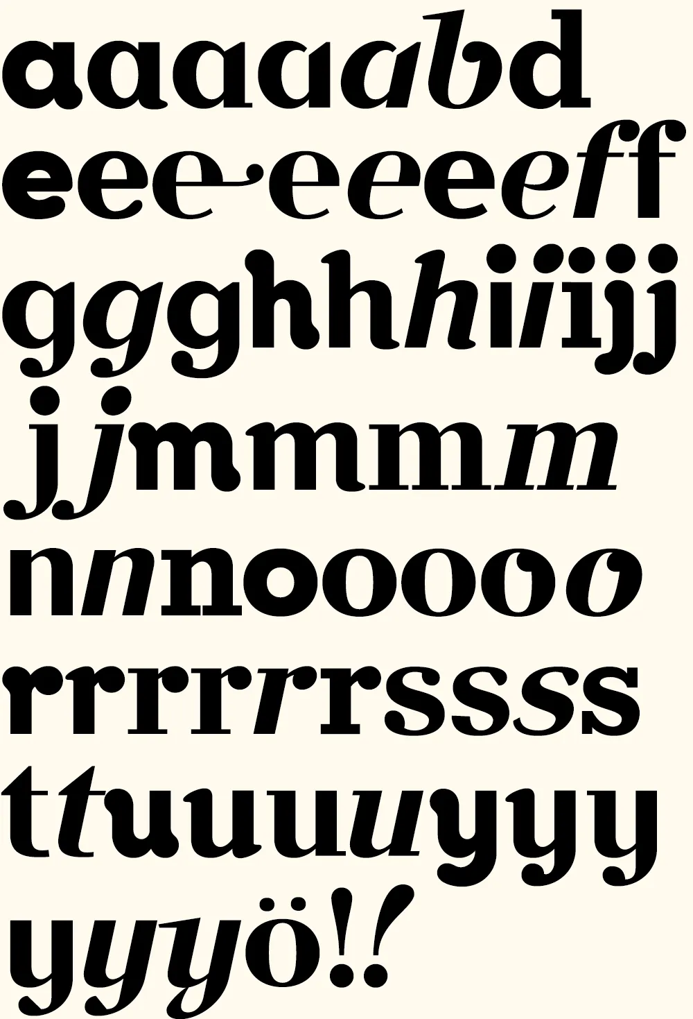
Now comes the hard part: Coming up with a name for it….
(Thanks to Peter Bruhn, and Jim Coudal and Bryan Bedell of Coudal Partners.)
[ ]
]
Just a note to say, this Friday afternoon, I’ll be pitting my type chops against (with?) fellow type designer Peter Bruhn for a “exhibition” game of Layer Tennis. I expect this to be a friendly match, more improvisational than competitive. But we’ll see.
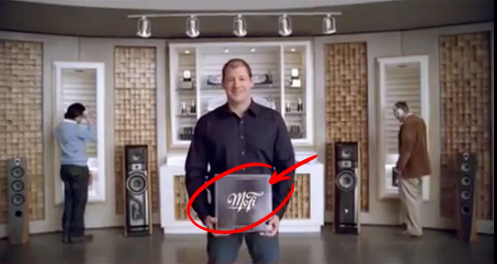
A year or two ago I lettered a logo for a company called Mobile Fidelity — MoFi for short. They do high-end recordings for audiophiles. I got a tip from the designer whom I worked with on the job that MoFi was featured in a recent American Express ad, and that the logo shows up near the end of the ad. Here’s a better look at the logo:
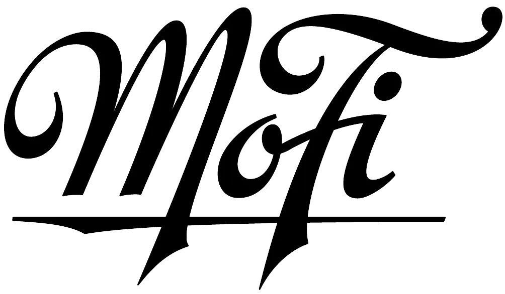
(Thanks to David Collins for the tip.)
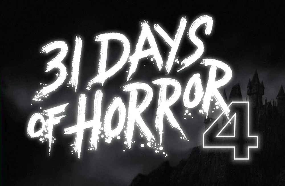
This was a fun one. Rumsey Taylor of Not Coming to a Theater Near You asked me to create lettering for a splash page graphic for the site’s fourth annual horror film festival.
The idea was to emulate classic horror film title screens. Thanks to Steven Hill’s Movie Title Screens Page I was able to find loads of reference. At first I was thinking I would use some kind of blackletter style, but it turns out almost no horror films use that style, unless they involve Dracula or Frankenstein. (More often it’s used for pirate movies.)
In the end I decided to go with the classic scrawled-in-blood look. To get the effect, I wrote out the letters freehand using a Wacom Cintiq and Corel Painter. It took a lot of experimentation and “takes” to get the right look. Once I had the basic lettering, I enhanced it in Illustrator and Photoshop to get the look of an old black and white movie title, complete with light-spill on the brightest areas.
