Mark’s Notebook - Page 6
I’ve made a big update to one of my most popular type families, Mostra Nuova.
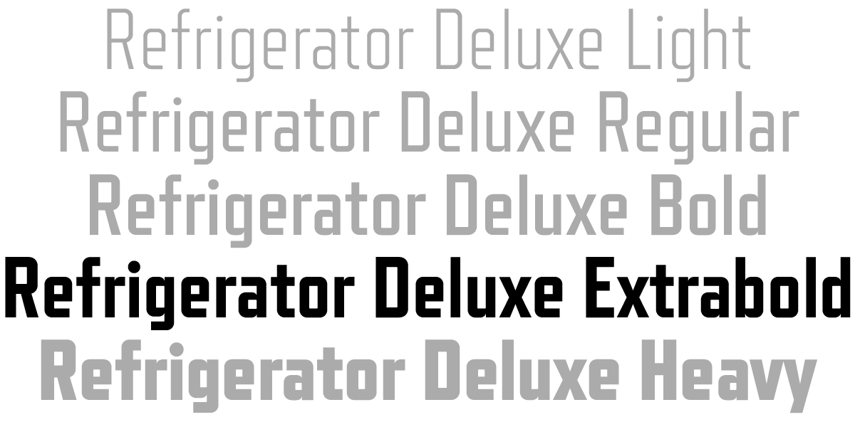
First, I’ve added three new weights: Semibold, Extrabold, and Extraheavy. The Semibold weight was based on a request from a user. He had a good point. There was a big jump in weight between Regular and Bold. Sometimes you need something between those. While I was at it, I noticed that there were similar jumps—maybe not quite as big, but jumps nonetheless—between Bold and Heavy, and between Heavy and Black. You’d rarely need all these at once, but it’s easier now to get just the right weight.
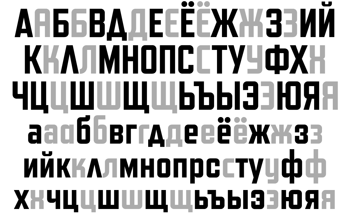
 Second, I’ve added support for Cyrillic. I’ve been doing this a little at a time with my existing type families. So far, I’ve added Cyrillic to Proxima Nova, Proxima Soft, Goldenbook, Refrigerator Deluxe, Changeling Neo, and Felt Tip Roman. It was quite fun to do Cyrillic for Mostra Nuova. I found lots of examples of Cyrillic Art Deco lettering online to get an idea how it should work. But I also got feedback from Russian type designer Ilya Ruderman, to make sure what I was doing made sense to native readers. (I’ve gotten to know the Cyrillic alphabet fairly well over the years, and can sound out words, but I can’t really read it.)
Of course, there are all the same kinds of alternate characters in the Cyrillic as there are for the original Latin characters.
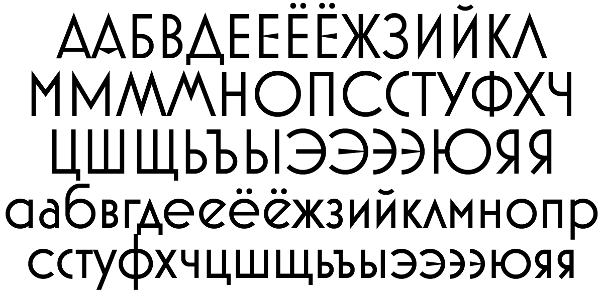 It also features Bulgarian variants. Bulgarian Cyrillic is pretty interesting. A lot of the letters, especially in the lowercase, look more like the Latin alphabet.
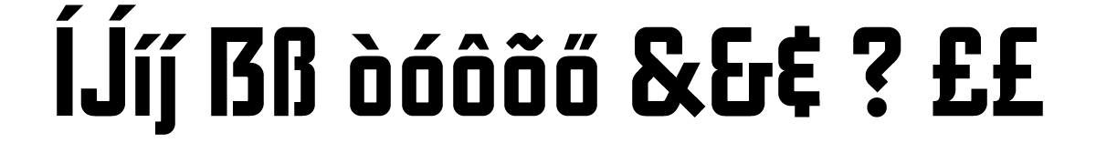
 Finally, based on a user request, I added a narrow alternate D to match the narrow C, G, and c. And, based on no requests at all, I added the capital sharp S for German users who might want it.
 The new version of Mostra Nuova is already available at some of my distributors, and the rest should soon follow.
Goldenbook and Refrigerator Deluxe have become two of my most popular type families in recent years. The last couple of months I’ve been working on big updates for both of them.
I first released Goldenbook in 2003 in three weights—Light, Regular, and Bold. It was based on the logo of the 1930s literary magazine The Golden Book. Over the years, I’ve made improvements to the fonts and added more language support, but this is the first major update.
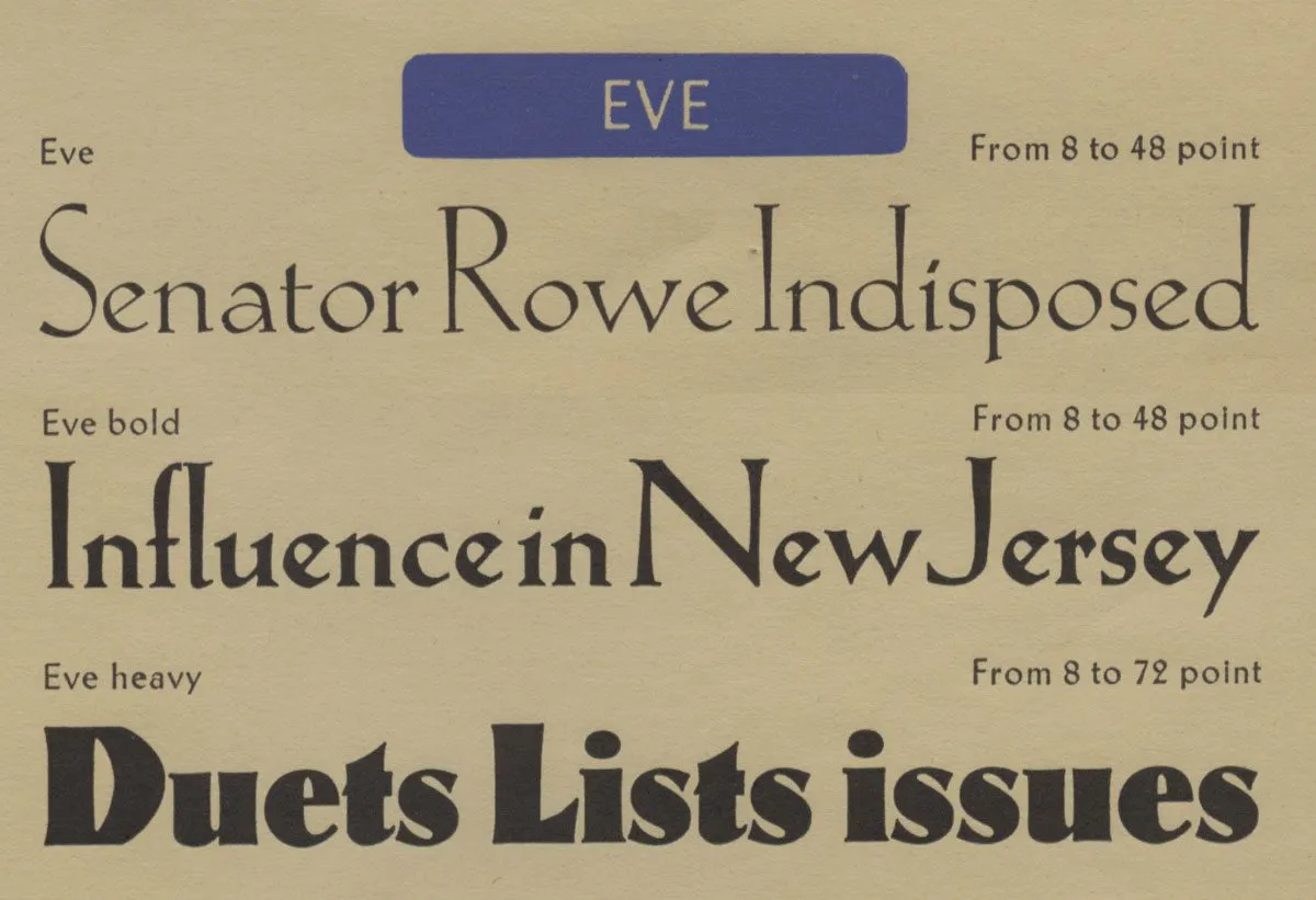 Eve Heavy was the inspiration for adding an ultra-bold weight to Goldenbook.
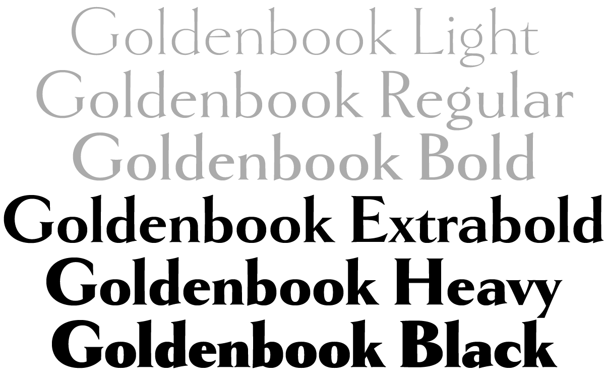
The three weights I did originally were all fairly light. But I’d long thought about going super bold with it, the way Klingspor did with Eve Heavy. It was really fun to see how bold I could go with it. I initially considered raising the x-height as it got bolder, as Klingspor did. This trick works especially well for low contrast designs, like sans serifs, but Goldenbook has enough contrast that I found I could get away with keeping the x-height the same across the weights. The result is three new styles—Extrabold, Heavy, and Black.
 Adding new weights to Goldenbook was not on my to do list. It was something that’d been on my back burner forever, like a lot of things. But I got an email back in December asking whether Goldenbook supported Cyrillic. I had to say no, but the wheels in my brain started turning and the next thing I knew, I was adding Cyrillic to Goldenbook. Once I got going, I figured I might as well do the bold weights while I’m at it.
< figure >
I had a pretty good idea what I thought the Cyrillic should look like, but I’m not Russian, so I got help from someone who is, type designer Ilya Ruderman. Ilya critiqued my designs and pointed out things I never would have noticed (and a few I should have). Thanks to him, I feel confident that Goldenbook will find an audience among Cyrillic users. And it looks super cool.
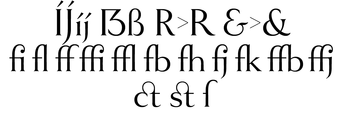 I made many other improvements to Goldenbook, like extending language support to add things like the acute IJ/ij for Dutch and the controversial capital sharp S for German. I also added an alternate long-tailed R (a user request), a more traditional-style alternate ampersand, a full set of “f” ligatures, and the historical ct and st ligatures, and long s.
Refrigerator Deluxe began life in 1988, one of my earliest attempts to make a digital font. I’ve updated it, added new features, and expanded the number of styles over the years, but this new version is a complete overhaul.
 Like Goldenbook, this new version started from a user request to add Cyrillic, but I took the opportunity to make other changes, such as adding a new weight, Extrabold, between Bold and Heavy. Given that I’d started Refrigerator when I was just a beginner at making digital fonts, there were some weird things about the way I constructed it, things I would never do today. So I went through, character by character, and fixed all of it, making optical adjustments and other tweaks to bring it up to my current standards. Most of these changes are subtle and you might never notice, but overall it should be much nicer to work with, and I tried to minimize the impact they might have on existing documents if you are upgrading from the older version.
 Ilya helped me out on adding Cyrillic to Refrigerator Deluxe as well. Just like the Latin characters, the Cyrillic includes numerous alternate characters to change that you can use to change look and feel of the font to your taste. Like Goldenbook, I extended language support, adding things like the acute IJ/ij for Dutch and capital sharp S for German. I also redesigned the diacriticals (accents) and many other characters outside the core alphanumerics.
 Goldenbook 2.0 and Refrigerator Deluxe 2.0 started rolling out to my distributors yesterday, and some of them (Fontspring 1, 2, and YouWorkForThem 1, 2) have already made them available. If you previously purchased a license for any of the existing styles of Goldenbook or Refrigerator Deluxe, you can get a free update for those styles. Check with the place you got the license from to find out how to get it.
For more information, including PDF specimens and licensing info, see the pages for Goldenbook and Refrigerator Deluxe.
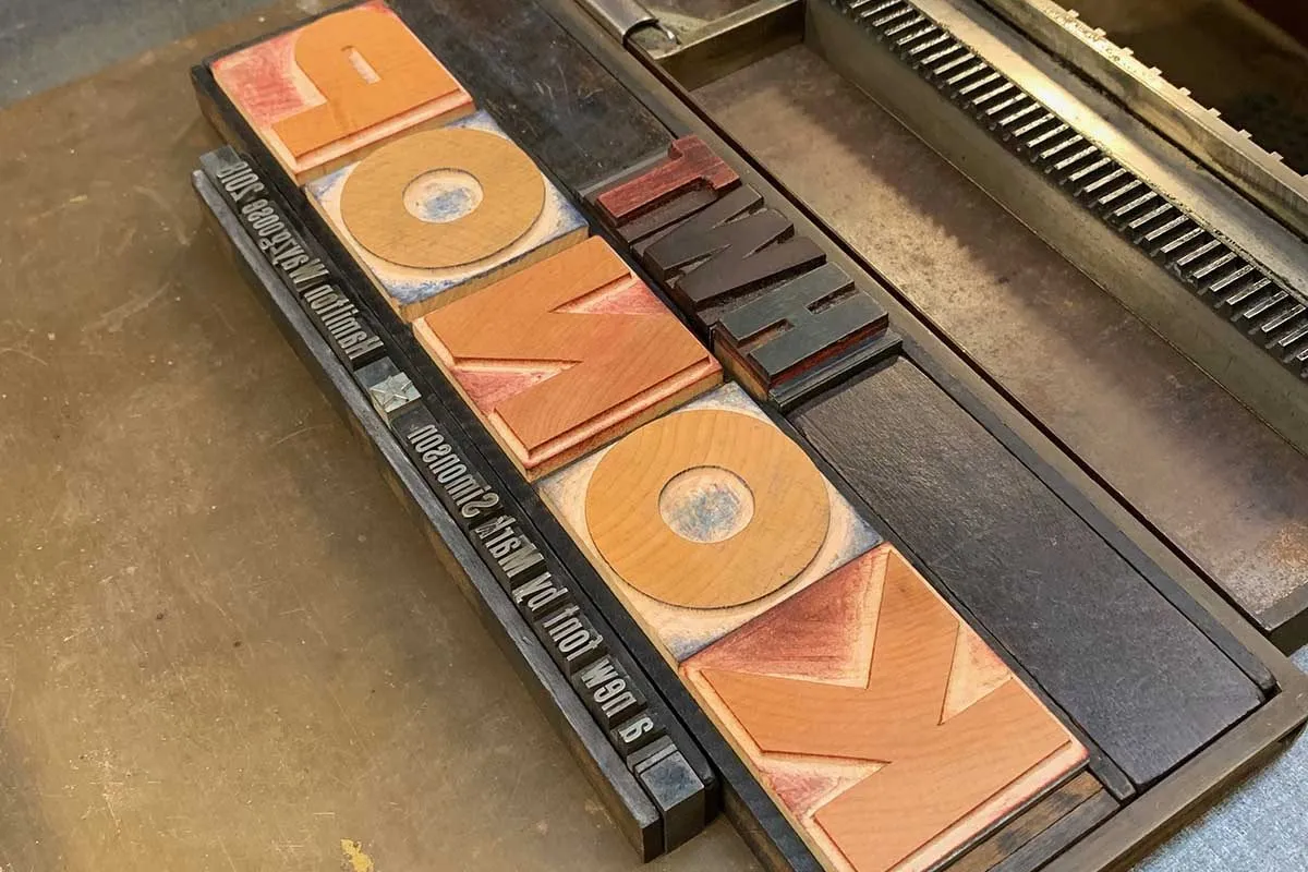
When I was asked in 2014 by Bill Moran, artistic director of the Hamilton Wood Type & Printing Museum, to come up with an original wood type design for The Hamilton Wood Type Legacy Project, I wanted to do something that would take advantage of the unique properties of wood type, but also something that hadn’t been done before.
One thing I’d never seen was a monospaced or fixed-width wood typeface, and I thought this could be an interesting idea. But then I thought, what if the characters were not only the same width, but square? That way, the characters could be arranged vertically or horizontally and in any orientation. To a traditional letterpress job printer, a font like this wouldn’t make much sense. But to a modern letterpress printer, who tends to be more interested in self-expression and artistic effects, it could be an unusual and creative design element.
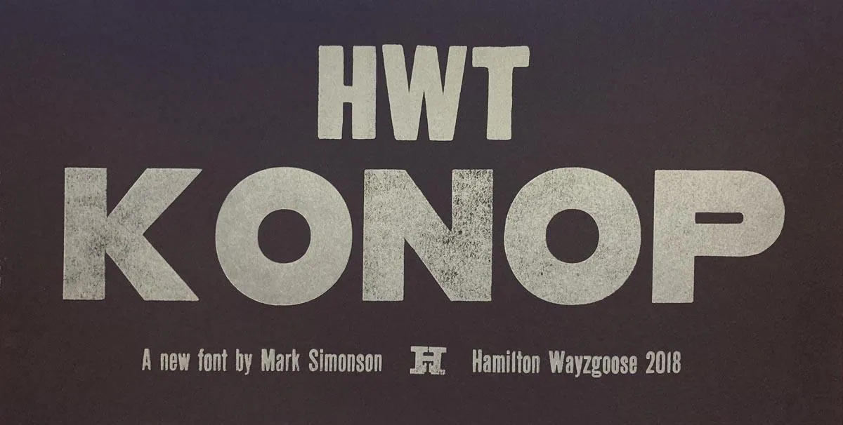
The result is HWT Konop.
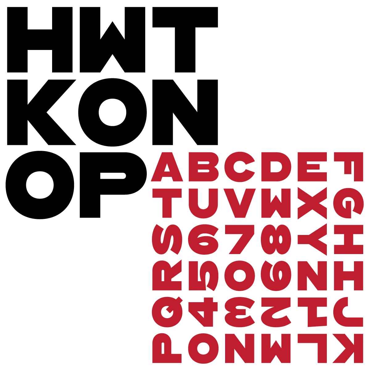
For the letterforms themselves, I decided to use a bold gothic style, reminiscent of gothic wood types but more geometric. Since the characters are meant to be used in any orientation, I set aside some of the usual optical adjustments, such as making verticals thicker than horizontals and making tops smaller than bottoms. This, combined with the distortions needed to get all the characters to fit into squares, results in a quirky but (I hope) charming design.
To provide more design options, I came up with a modular system consisting of three sizes: 12-line, 8-line, and 6-line. These three sizes can be used together like Lego® bricks, with endless arrangements possible. The sidebearings match so that characters always align when the three sizes are used together.
The digital version of Konop replicates the wood type version as much as possible, including the three different size designs. It includes OpenType stylistic sets that allow most characters to be rotated in place, 90° left, 90° right, or 180°, just like the wood type version. I also includes extra characters not available in the wood type version.
Even so, since Konop was designed primarily with wood type in mind, it’s actually simpler and more fun to work with the wood type version than the digital version, if you don’t mind getting your hands dirty.
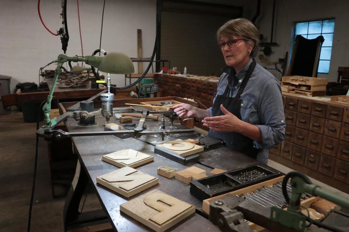
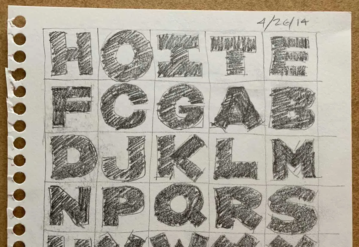
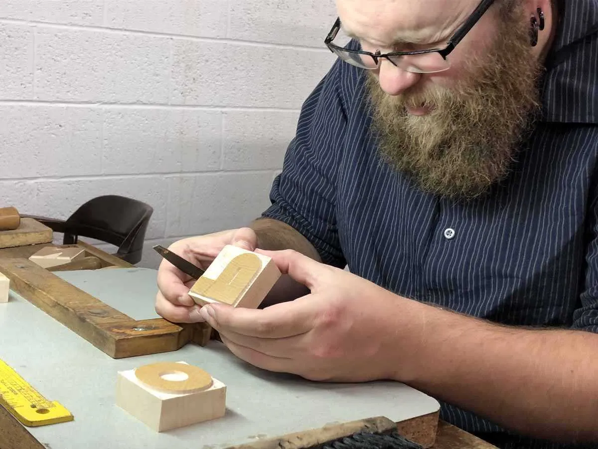
Production on the wood type version is just getting under way. Sample characters were cut last weekend at the Hamilton Wayzgoose by Georgie Brylski Liesch on the pantographic cutter (above) with hand trimming by David Carpenter (below).
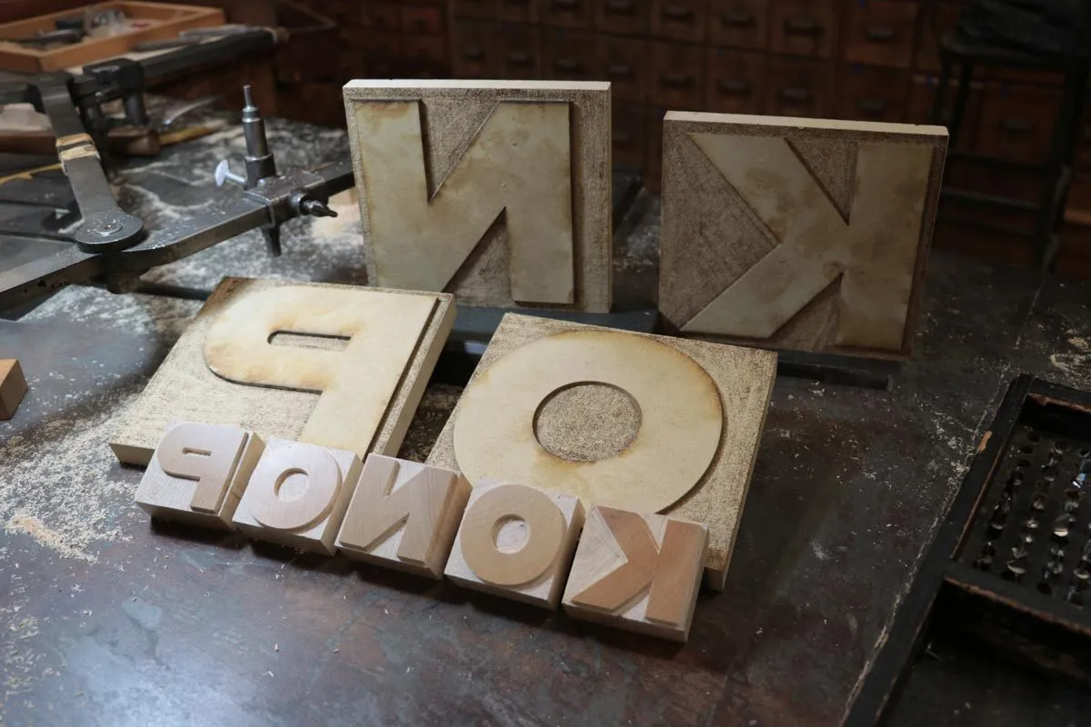
The photo below shows the finished 12-line pieces they cut, with the patterns behind them. The patterns are traced with a guide on the pantograph and a high-speed router cuts the type. The size depends on how the pantograph is set up, but it’s always smaller than the pattern to get the best accuracy. Inside corners and small details are cut by hand.
Here it is (below) on a proofing press along with the first proofs. (The right side on the K isn’t quite right, but the finished fonts will be correct.)
I’m not sure how soon the wood type version will be available for purchase, but you can get the digital version now from P22.
You can read more about HWT Konop here.
(Photos of Georgie, David, and the finished pieces by Bill Moran.)
After years without a proper newsletter, I decided it might be a good idea to send out occasional updates. With a bunch of new fonts coming down the pipeline, these emails will keep you up to date with announcements you may have missed on social media.
I don’t plan to send it out very often—no more than about 6 times a year. It’s mostly to announce new font releases. If that’s still too much for you, you can unsubscribe anytime.
The first issue will be out on Tuesday, September 4. A regular feature of Font News will be sneak peeks of the fonts I’m working on next.
You can subscribe here. If you know anyone who might also like to get the newsletter, feel free to send them to the signup page.
September 6, 2018 Note: I originally called this Letter News. Turns out, Jill Bell (lettering artist, type designer, and long-time friend) has been doing an email newsletter also called Letter News for the last ten years. Oops! Sorry about that, Jill! It’s now called Font News.
At long last, two totally new, original typeface families! The last new one was Bookmania in 2011, which admittedly was a kind of revival, so not totally new and original. For that you have to go back to Lakeside, which I released in 2008—ten years ago! In any case, it’s about time. I have many more in the works, so stay tuned.

Acme Gothic is based on the thick-and-thin gothic lettering style popular in the U.S. in the first half of the twentieth century. There have been typefaces in this genre before, but they were either too quirky (Globe Gothic), too English (Britannic), too Art Deco (Koloss), too modern (Radiant), or too Art Nouveau (Panache). None captures the plain, workman-like, vernacular style of Acme Gothic.
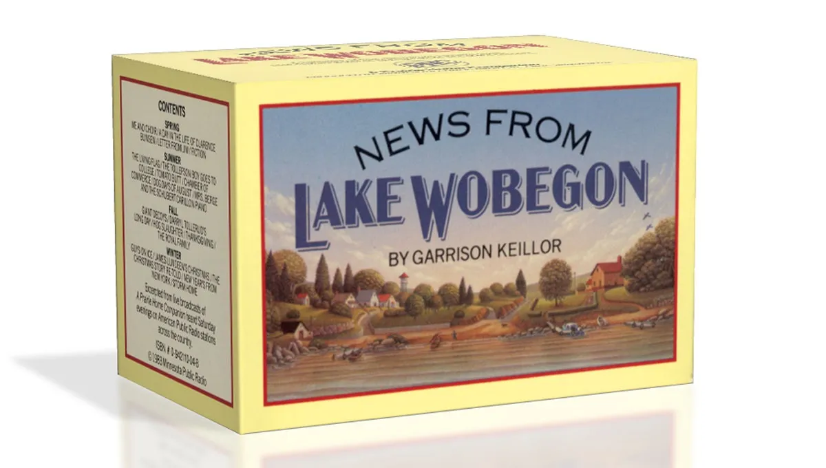
I’ve used the “thick and thin” gothic style in lettering projects as far back as 1982 (the “News From Lake Wobegon” audiocassette package I designed for A Prairie Home Companion). Off and on since the 1990s, I tried turning it into a typeface, but it wasn’t until 2012 that it finally started to come together. My aim was to make a font that feels like a revival of a long-lost metal typeface from the 1920s, but one that never happened to exist.

There are five widths (Compressed, Condensed, normal, Wide, and Extrawide) each with five weights (Light, Regular, Semibold, Bold, and Black) for a total of 25 different styles. Acme Gothic has extensive language support, covering most Latin-based writing systems.

Acme Gothic also includes both small caps and raised small caps (accessed through an OpenType stylistic set) both of which can be found in vintage examples of this lettering style.

Parkside is a script typeface inspired by typefaces and lettering of the 1930s and 1940s. Unlike metal typefaces from that era, it takes advantage of modern digital typography, where letters may overlap and automatically change shape to flow better with surrounding letters.
The idea for Parkside came to me in the mid-1990s, around the same time that I was first working on Coquette (released in 2003). You could say that Coquette and Parkside are cousins. Unlike Coquette, Parkside is a connecting script, with more contrast and less geometric forms. But it shares many of the same stylistic ideas, especially in the capital letters.

There are six weights: Hairline, Thin, Light, Regular, Bold, and Black. Parkside has extensive language support, covering most Latin-based writing systems. Parkside uses OpenType magic to automatically select letter variations that seamlessly connect to the letters coming before and after.
I first released Coquette in late 2001. It had three weights: Light, Regular, and Bold. I’ve updated it a few times since then, most significantly in 2010 with the OpenType version and expanded language support.
For a long time, even before the initial release, I’ve wanted to add more weights, especially on the bold end of the range. And there was certainly room for another weight on the light end. I’m therefore very pleased to announce the addition of three new weights to Coquette: Thin, Extrabold, and Black.

I took the opportunity to add a few more features to the family.
First, I’ve filled out some gaps in the character set. Previously, Coquette had only the fi and fl ligatures, a holdover from the pre-OpenType days. Version 2.0 now has a complete set of f-ligatures. You might have also noticed that Coquette was missing all those random math characters that are part of the standard character sets in most fonts. It now has them. I don’t imagine they’ll be of much use (which is why I left them out in the first place), but they are there if you need them now.

I’ve also added some OpenType features that I thought would be useful.
The first is arbitrary fractions. If you type number-slash-number and apply the OpenType Fraction feature, you will get nicely formatted vulgar fractions. (It seems unfair to call them vulgar. I think they look quite tasteful.) As a side effect of adding this feature, Coquette now includes superscript figures.

The second OpenType feature is support for a few alternate characters. Over the years I’ve noticed that sometimes designers don’t seem to like the little blobs I put on some of the characters, such as the b and o, so they remove them. Coquette 2.0 includes these alternate forms. The other modification I’ve seen is with the lowercase s, which has a stylized script form. Coquette 2.0 includes a more conventional lowercase s as an option. All of these have the effect of making Coquette look a bit more plain, but sometimes that’s what you want. (I didn’t make an option to remove all the blobs. It’s just not Coquette otherwise.)

There is also an alternate ampersand. It’s smaller than the default one—about the same height as the figures—and has a simpler design. You can use it anywhere, but it works better than the default when set next to caps.

So, that’s it. I’m really excited about this new release of Coquette. I’ve been wanting to do it for a long time. It should be available from your favorite online font store by the time you read this. More information here.