Mark’s Notebook - Page 34
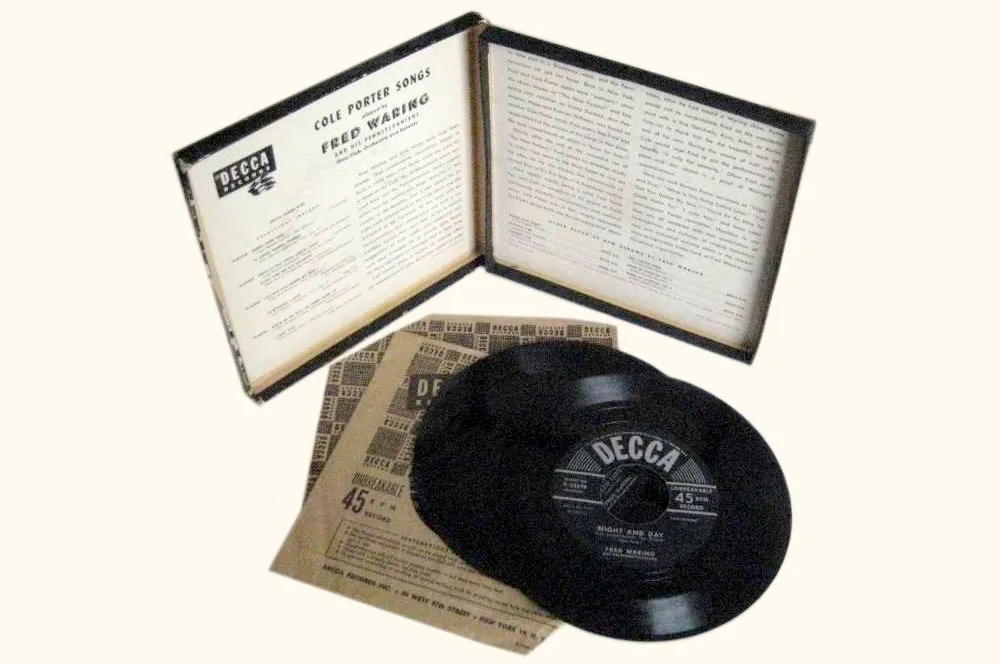
Ever wondered why albums are called “albums”? At one time, a record album was literally an album that contained records.
A few years ago, I ran across a handful of them in an antique store. They were all from around 1949 or so and contained 45 r.p.m. discs. A lot of the records were missing, but I had to buy them because they had the most amazing cover designs. I wonder who designed them?
")
")
")
The first two are Fred Waring albums on the Decca label and the third is a collection of opera duets on RCA Victor. They remind me of the new wave album covers of the early Eighties used by groups like The Art of Noise. Or maybe it’s the other way around. I love how “45” is put in quotes on the RCA album—as if it’s not really 45 r.p.m.
")
This Columbia Records Benny Goodman Sextet album seems to have some Joan Miró influence. Spaced out Bodoni Italic, dotted lines, bee-bop cartouches—what’s not to like? Notice how they advertise that the records are “unbreakable.” This must have been a big marketing issue at the time.
")
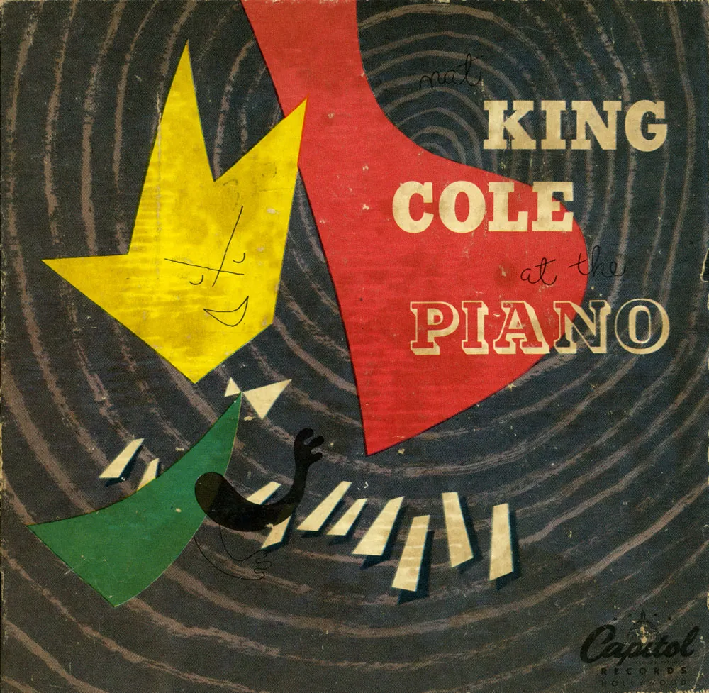
The last two are Nat “King” Cole albums released by Capitol Records. They both feature bold, lively abstract designs in which Cole is represented by a crown. In the first one, it even looks kind of like him. The piano is reduced to a big red shape (the lid) and a few small white ones (the keys) with emanating sound waves tying it all together. The second one uses sound waves again, but shown more like a stream of air flowing around the musicians. Whatever. It’s cool.
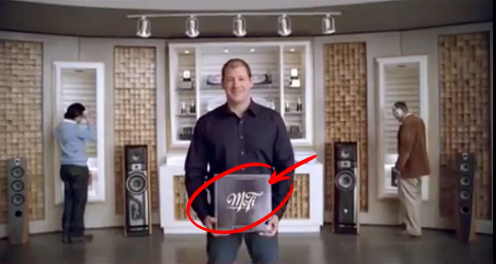
A year or two ago I lettered a logo for a company called Mobile Fidelity — MoFi for short. They do high-end recordings for audiophiles. I got a tip from the designer whom I worked with on the job that MoFi was featured in a recent American Express ad, and that the logo shows up near the end of the ad. Here’s a better look at the logo:
![]()
(Thanks to David Collins for the tip.)
In honor of Valentine’s Day, Extensis has posted a silly little game called TYPEmatching wherein you attempt to find romantic match ups between common typefaces.
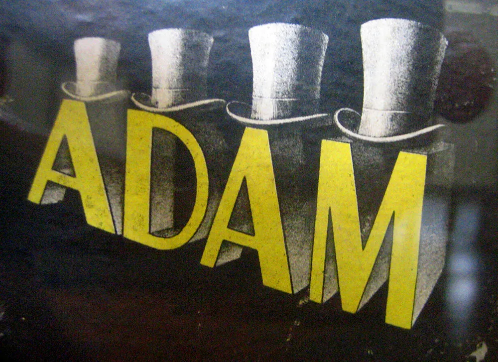
Logo on a hat box, seen in an antique store in Oneonta, New York, July 7, 2007. Those are some snappy caps.
I haven’t been posting much to Notebook lately because I’ve been, well, busy. The thing I’ve been busy with is this:
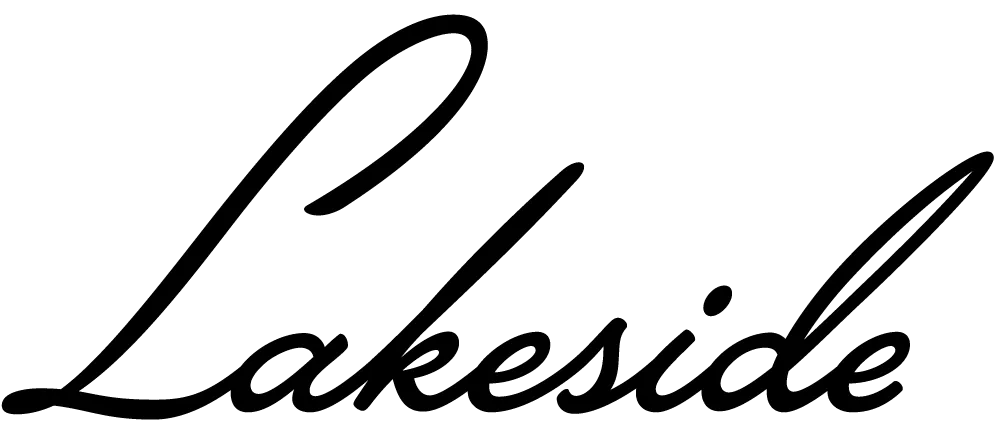
Lakeside is a script face I’ve been working on for the past two years. It was initially commissioned by an independent filmmaker for use in some film titles. It’s based on the hand-lettered titles of the classic 1944 film noir classic “Laura.”
An unusual feature of Lakeside is that it has three styles of capital letters suited to different uses:
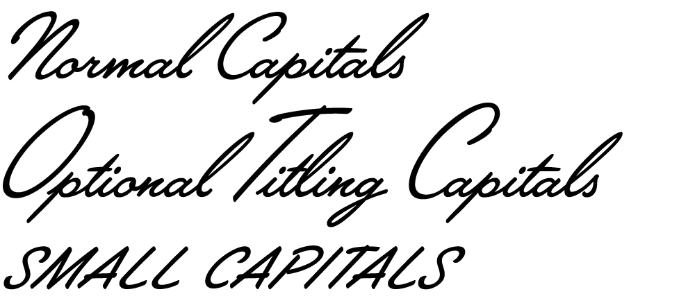
There are normal caps for, er, normal use; over-sized caps for a fancier appearance; and smaller, plainer caps for all-caps settings—something not normally possible with a script font like this.
Lakeside takes advantage of the OpenType format to put a virtual lettering artist at your fingertips. Here is the font with OpenType Contextual Alternates turned off and then on:
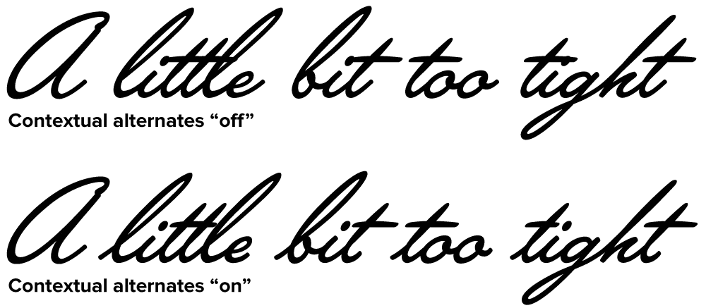
Notice how each letter tailors itself to its position within a word, using a different form depending on whether it comes at the beginning, middle or end. Notice also how the crossbar on the lowercase “t” seems to “know” about adjacent letters and adjusts its width appropriately. (It’s not actually “a little bit too tight,” it’s just that those words are good for showing how the magic works.)
For more information, see the Lakeside Specimen Sheet (496k PDF) and the Lakeside User Guide (1mb PDF).
Licenses for Lakeside can be purchased at Font Bros. Other venues will be added soon.
(Note: Last year I mentioned this font on Notebook when it was still under development. At that time, it was to be called “Launderette.” Unfortunately, that name was taken—twice—so I chose the name “Lakeside” instead.)
Ever notice how the font name “Arial” looks like a certain other word sometimes? (Via DaughterNumberThree)