Mark’s Notebook - Page 33
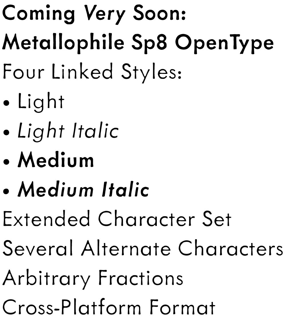
When I released Metallophile Sp 8 in 2003, the plan was to add more weights eventually. Now that I am converting my older fonts to OpenType format, that time has come. These four fonts should be available soon from my usual distributors. More details to come. More weights later this year.
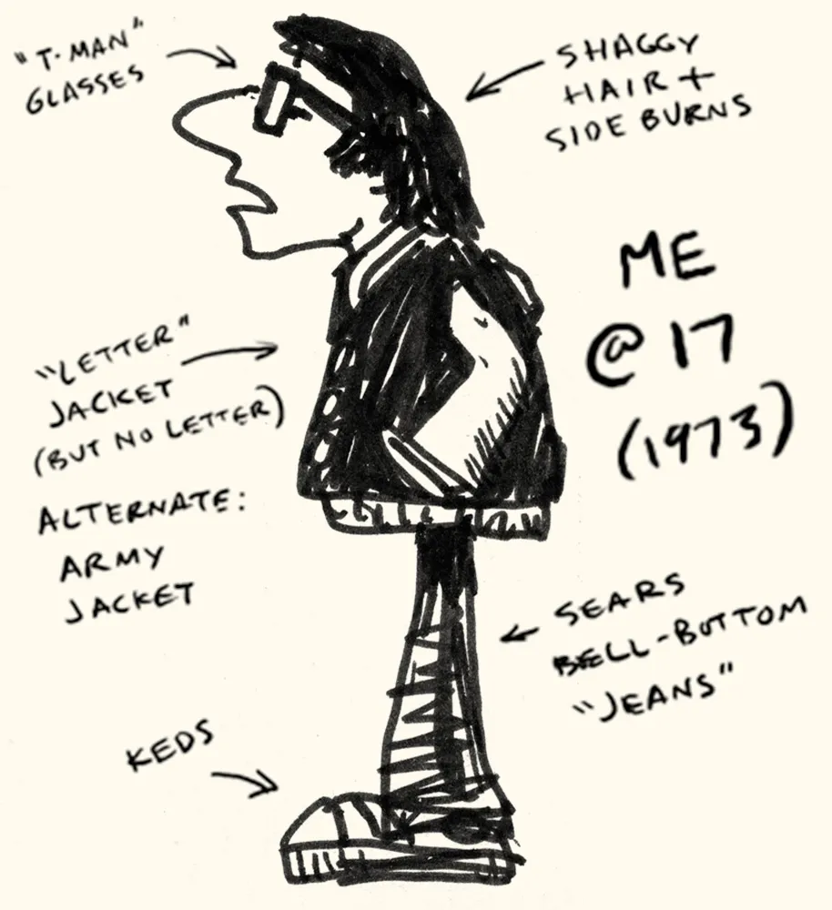
drawn.ca had an item the other day about a meme that’s going around: draw yourself as a teenager. I decided to cheat and post a drawing of myself as a teenager that I drew when I was a teenager. I’ve added explanatory notes.
At the time (about 1973) I had this idea to draw a comic that featured me and my friends and teachers. It never got beyond a few sketches.
Looking through the list where the meme started makes me feel very old. People in their early twenties laughing at how dumb they were as teenagers only a few years ago. A few years ago, I was pretty much the same as I am now, but I remember the feeling.
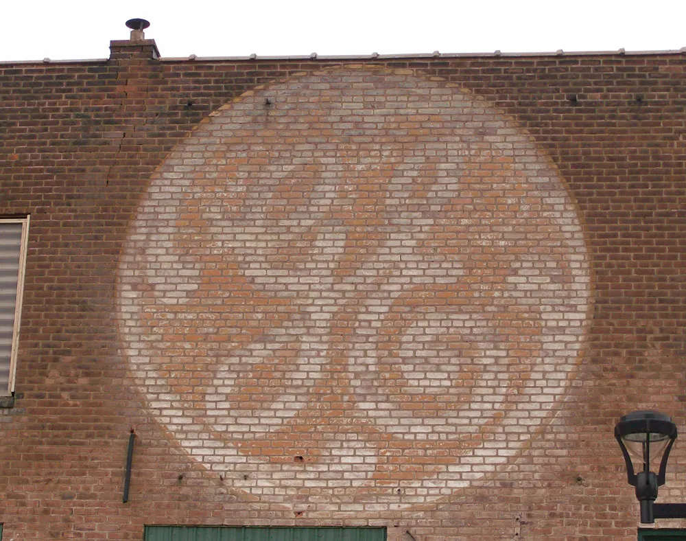
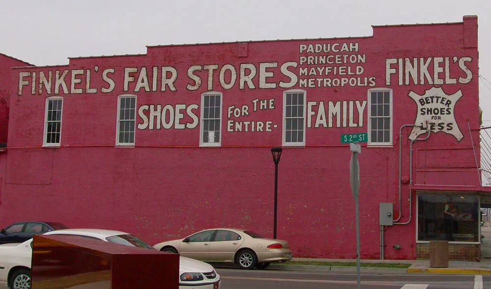
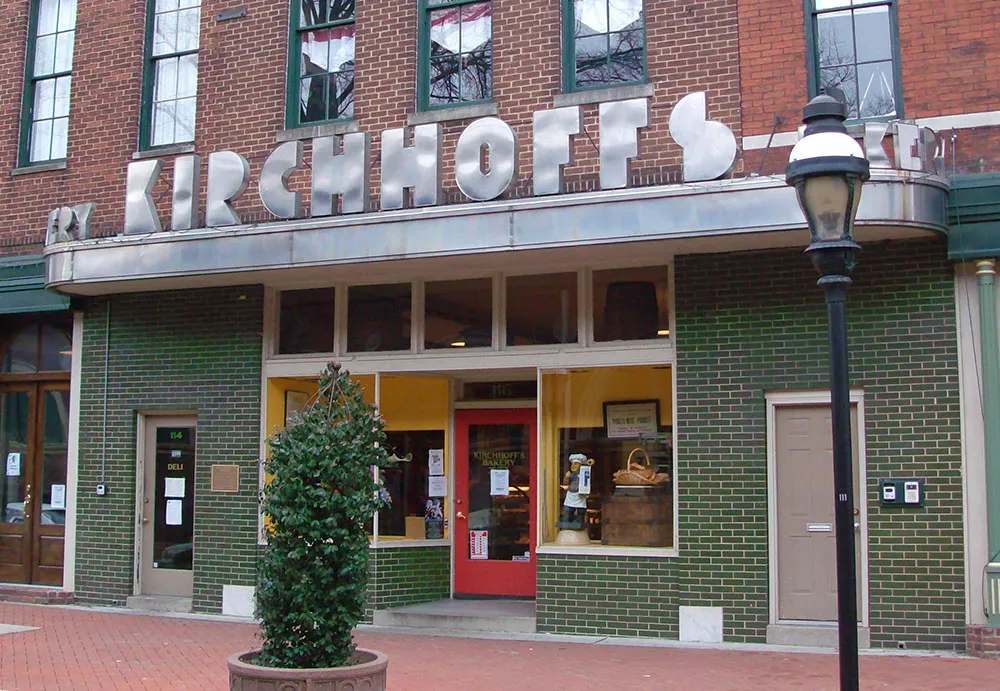
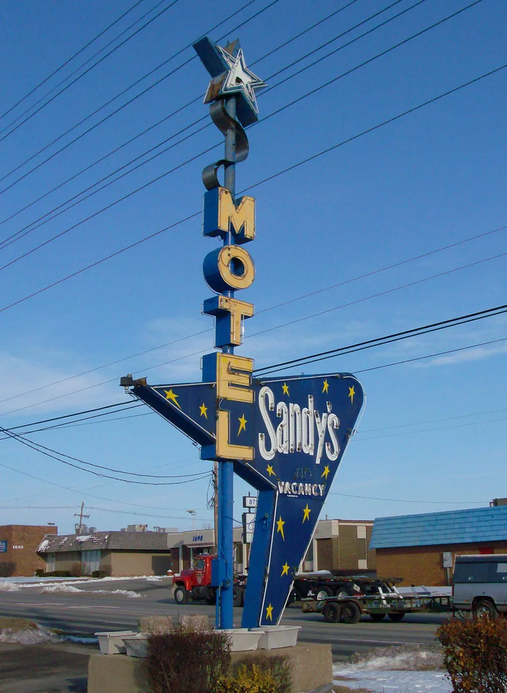
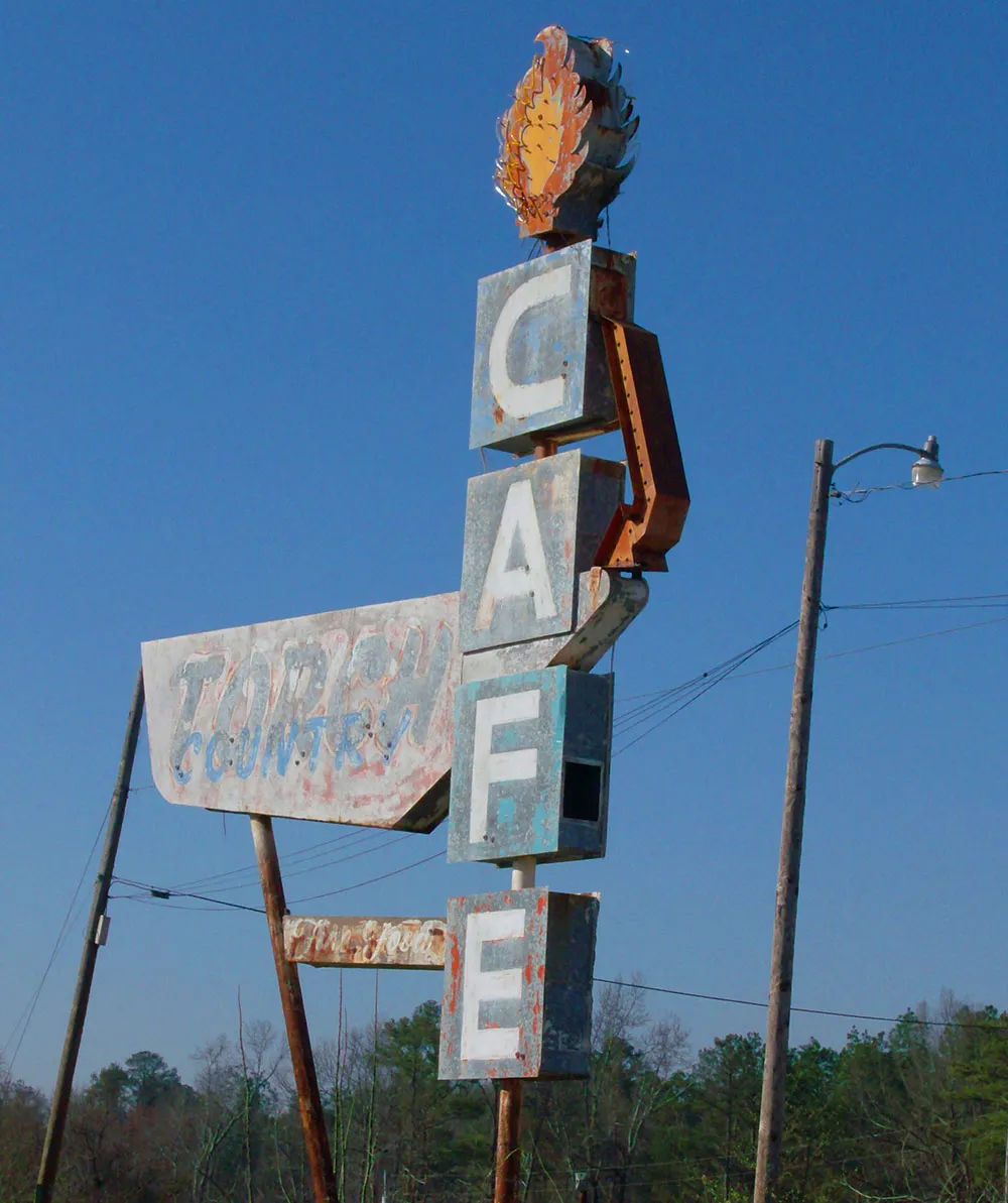
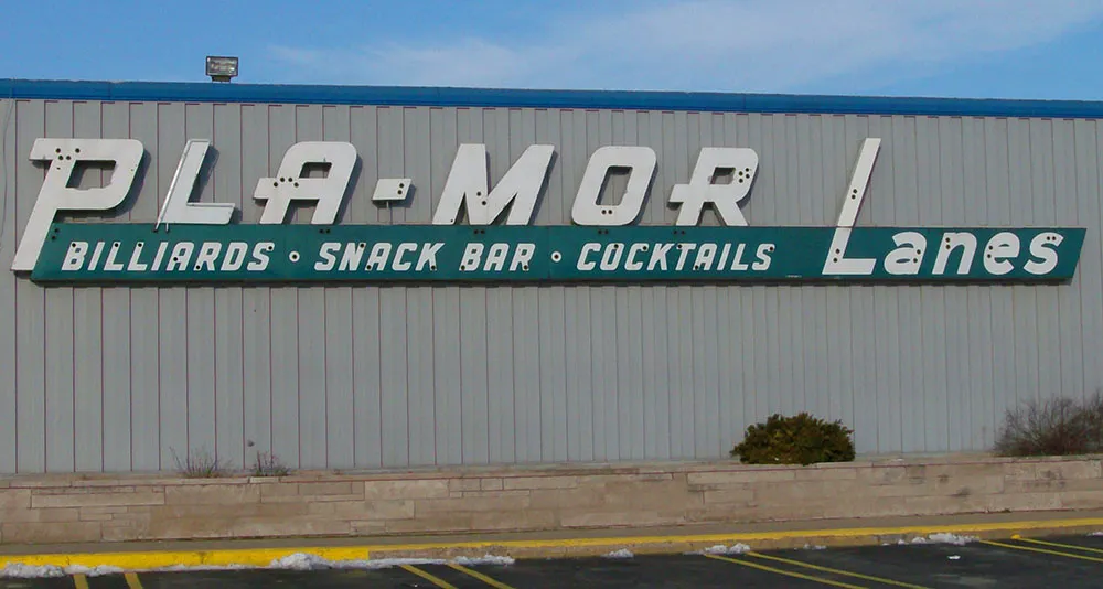
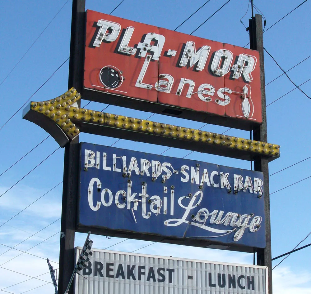
Mike Meyer is a sign painter based in Mazeppa, Minnesota. I first knew of Mike’s work from the beautiful hand-painted signs he did for a restaurant in St. Paul called Andy’s Garage. (Unfortunately, the original location where I saw them in St. Paul is closed now, but his signs can still be seen at the Minneapolis location in the Midtown Commons.) Last year, Mike discovered my site and we began corresponding by email a bit. Recently, he sent me some photos of cool signs he took on a trip through the south. With his permission, here are a few of them:

Today I found a photo on Flickr taken by Joe Pemberton, one of the founders of Typophile.com, of his computer monitor displaying a freeze frame from the making-of section of the DVD “The Call of Cthulhu” showing director/producer Andrew Leman, who also makes typographic props and contacted me years ago in response to my Typecasting article, wearing my winning design from the 2002 Typophile t-shirt contest.
Would it surprise you to learn that I am a pack rat? When it comes to things like books and printed material about type, this can be a good thing, as it gives me a rich resource library I can tap whenever the need arises (and it frequently does). When it comes to other things, like old computer software, it is a complete waste of time and space.
It’s not hard to see how it happens. When it is new, software is not cheap (it didn’t used to be, anyway). So, even if you are not actively using it, it feels like it still has value. And how can you tell exactly when a piece of software is no longer useful and the chances of ever running it again are nil? It’s easier to just put it on a shelf and forget about it.
Well, time passes and it becomes much easier to see how little it’s worth to you. But then the question becomes: What to do with it all? I couldn’t bear to chuck it all in the trash (it’s a sickness, I know). Surely there must be somebody somewhere who would be happy to take it off my hands? And so there is: Dan’s 20th Century Abandonware (a.k.a., D2CA). Update: That site is gone now, but the collection can now be seen at Daniel’s Legacy Computer Collections. Same guy.
A few weeks ago, I shipped eight cartons of old Mac software to Dan as a donation. Some of it dates back to the first year of the Mac’s existence (Andrew Tobias’ Managing Your Money). Some of it I bought with high hopes, but never really used (Think Pascal). But most of it simply went obsolete (TOPS networking software).
As he promised, Dan posted a formal thank you on his home page—complete with photos and a listing of everything I sent. Now, if I ever feel a pang of regret, I can go to Dan’s site and still see all my old stuff, comforted that it has found a loving home, instead of an existence of guilty, dusty neglect in my basement. My hat (if I had one) is off to Dan for graciously and willingly accepting my donation.
Of course, this was just the stuff I don’t need any more.
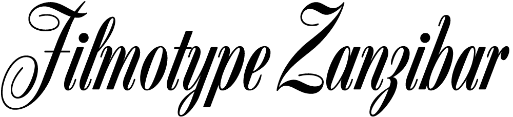
Zanzibar is the second Filmotype font I’ve digitized. (The first was Glenlake.) At first glance, I didn’t think much of it. But when I started looking more closely, I realized I’d never seen anything quite like it and decided I needed to do it.

That “Zanzibar” is nearly an anagram of “bizarre” seems fitting. The surviving people from Filmotype (later Alphatype) have not been able to tell us who designed this gem, so we have no record of the designer’s intentions. Released in the early 1950s, it seems somewhat inspired by the work of Lucian Bernhard (Bernhard Tango, 1934) and Imre Reiner (Stradivarius, 1945). At first, it appears to be a formal script, but there are no connecting strokes. It would be better described as a stylized italic, similar to Bodoni Condensed Italic or Onyx Italic, with swash capitals.
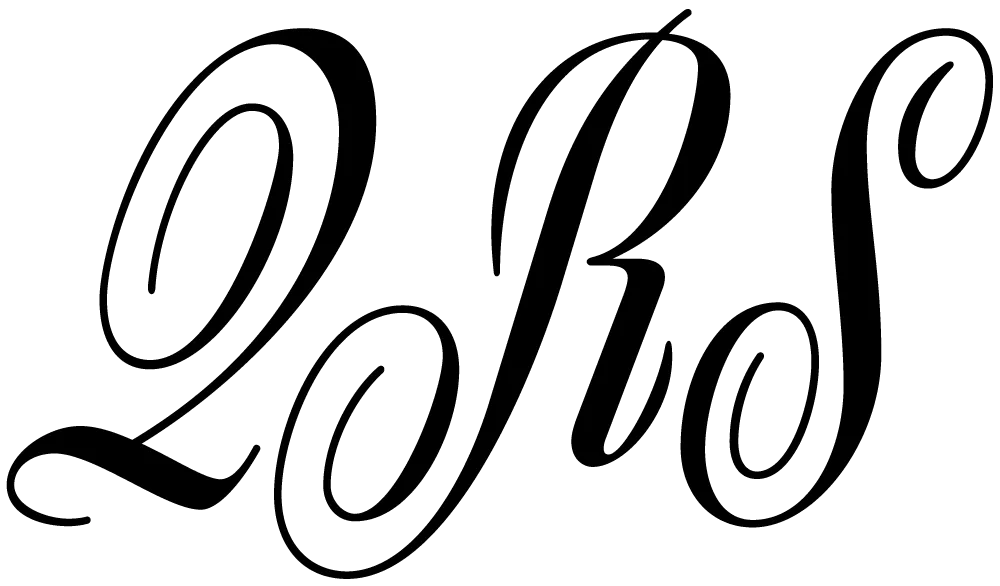
About those capitals: If they were plans for roller coaster tracks, they would either be unsafe or very exciting to ride. I have rarely seen such a whimsical combination of spirals and angles. Perhaps the happy result of one too many martinis?
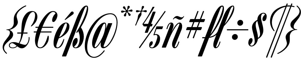
The overall effect—a mix of hairlines, swelling strokes, and dots—reminds me of musical notation. I kept this in mind as I filled out the missing characters. Film font designers had it easy. The original design included only caps, lowercase, numbers, and a minimal set of punctuation and currency symbols—about 70 characters. The digital version contains over 400 characters, including support for most Latin-based languages, math symbols (you never know), user-defined fractions (OpenType support required), and all the usual characters you expect in a modern font.
I also added a few alternate characters to address a design flaw in the original. The lowercase b, h, and k all have a little hook at the top that goes to the left. Unfortunately, when one of these characters follows an f or l, it causes an unsightly collision. Moving them apart only makes it worse. To address this, I created hookless versions of all three that come into play automatically when you enable the OpenType Contextual Alternates feature in your layout or graphics program.