Mark’s Notebook - Page 32
A couple of weekends ago, I attended the “Back to the Fifties” car show in St. Paul. This was the first time for me, despite the fact that we live within walking distance of the Minnesota State Fair Grounds, where the show takes place every year. Since the cars are always cruising around our neighborhood when the event is held, we never felt a pressing need to pay the admission fee. But this year, I decided to get a closer look.
I was glad I brought my camera. I realized what a great opportunity it was to snap photos of car nameplates—the stylized chrome lettering that adorns automobiles. The Fifties was an especially inventive period for “brightwork,” as it is called. For practical reasons, script styles were most often used—it meant that the nameplate could be molded in a single piece of metal. It was a treasure trove.
Here are some gems that I found:


 nameplate.")


 nameplate.")


July 9 Update: I just posted these photos (and a few more) on Flickr where you can see them a bit larger.
In Indiana Jones and the Last Crusade, there is a funny scene in which Indy’s father breaks a vase over Indy’s head. As soon as he does it, he looks horrified—not because he’s mistakenly attacked his own son, but because he notices that it was a priceless Ming vase. Upon closer examination, he is relieved to discover the vase is a fake.
Now that the fourth (and last?) Indiana Jones movie is out, I made a similar examination of the use of type in the series, but I was not quite as relieved. For the most part, the type usage in each of the movies is correct for the period depicted. With one exception: The maps used in the travel montages.
Whenever Indy is traveling great distances, which happens in all the films, there is a montage of the airplane or boat superimposed over an animated map showing the route. It’s an old-fashioned convention, an homage to the movies of the Thirties and Forties. Unfortunately, the typefaces would be more at home a few decades later.
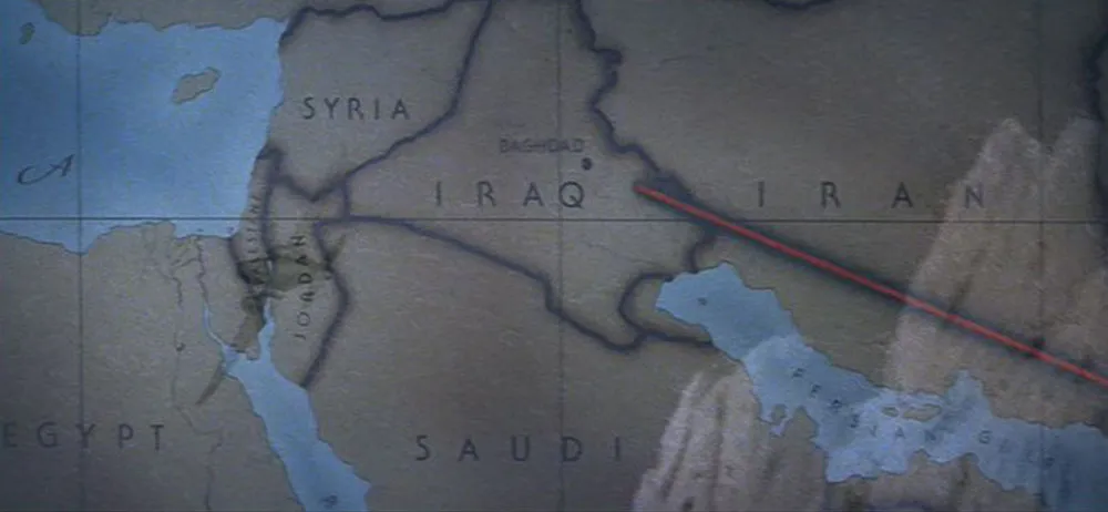
In Raiders of the Lost Ark (1981) which is set in 1936, we see ITC Serif Gothic (designed in 1972). The wide spacing feels right, and it does have an art deco feel, but it’s 1970s art deco.
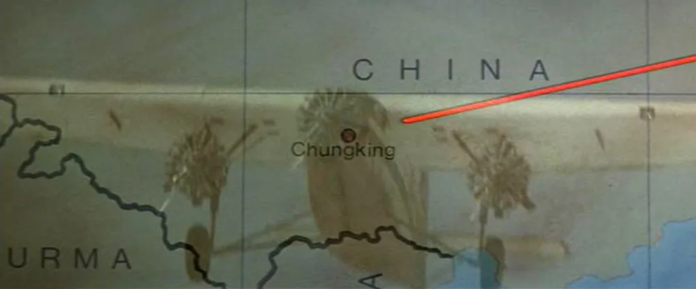
Indiana Jones and the Temple of Doom (1984) strays even further in the anachronistic type department by using Helvetica (1957), which looks even less plausible than Serif Gothic.
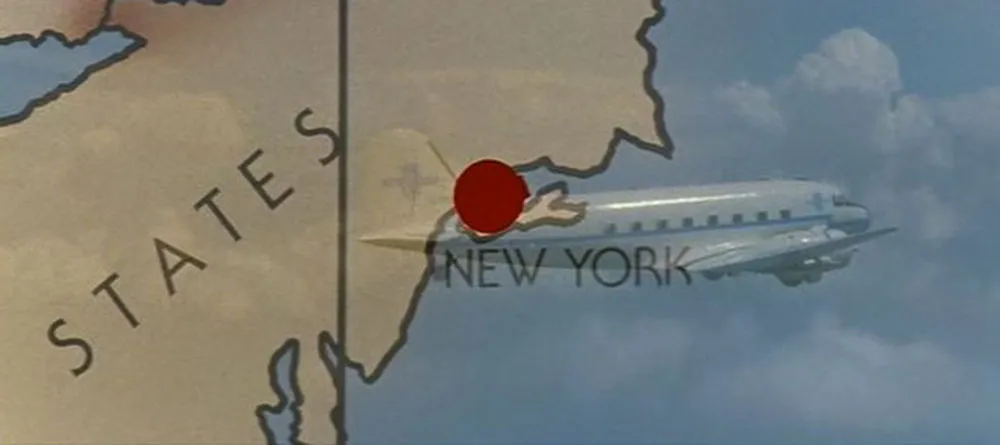
The third installment, Indiana Jones and the Last Crusade (1989), goes back to the formula used in the first film in many ways, including the use of ITC Serif Gothic again on the map. Not appropriate for a film set in 1938, either.
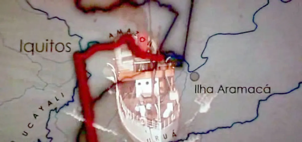
Did they finally get it right in the fourth film, Indiana Jones and the Kingdom of the Crystal Skull (2008)? Not quite. They didn’t use Serif Gothic this time, or even Helvetica (which would just have been released in 1957, the year in which the film is set). Instead, they used Century Gothic, a font that didn’t exist until 1989. This wouldn’t necessarily be a problem since Century Gothic’s caps are very similar to Futura, which would be perfectly appropriate for 1957. Unfortunately, Century Gothic is also a clone of Avant Garde (1970), a typeface with very large lowercase letters, a quintessentially Seventies characteristic. (More about Century Gothic here.) So, not the best choice.
Pangrammer Helper 2.0 is a new version of the pangram-making utility I created in 2005. The new version adds the ability to keep track of how many times each letter of the alphabet is used in your pangram. (Thanks to Scot Ober for the suggestion.)
In case you don’t know, a pangram is a phrase or sentence that uses every letter of the alphabet at least once. The most common one in English is “The quick brown fox jumps over the lazy dog.” Here are a few pangram links for more examples and information:
P22’s 2004 Pangram Contest Winners
The Pangram Page (dead link)
Pangram Discussion on Typophile.com
NPR Sunday Weekend Edition 2002 Pangram Contest Results
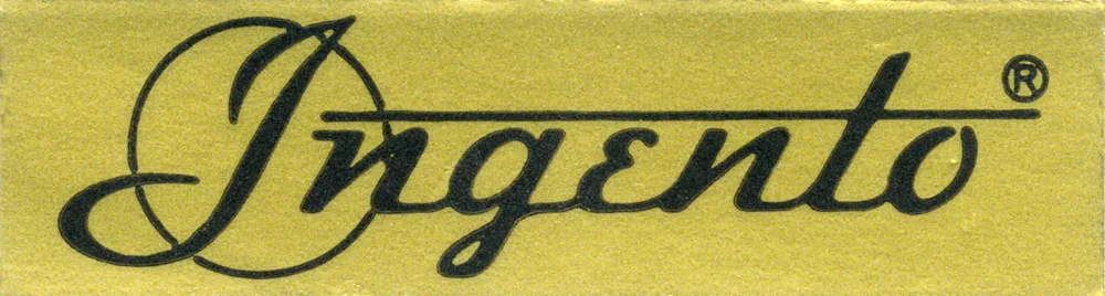
I dragged my old paper cutter up from the basement to use for something I was working on, and the “Ingento” label fell off it onto the floor. I had forgotten what a beautiful logo this is. Just lovely.

I released the Light and Light Italic styles of Metallophile Sp8 in 2003. The original plan was to add more weights later, but later never seemed to come. When I started getting requests from customers for more weights, I realized that had to change.
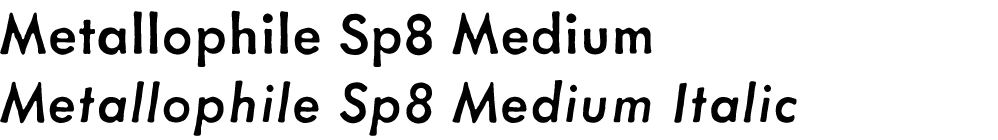
And now it has. Introducing Metallophile Sp8 Medium and Medium Italic. These, like the original Metallophile Sp8 fonts, are based on a classic sans serif hot metal face, Spartan, set at 8 points.
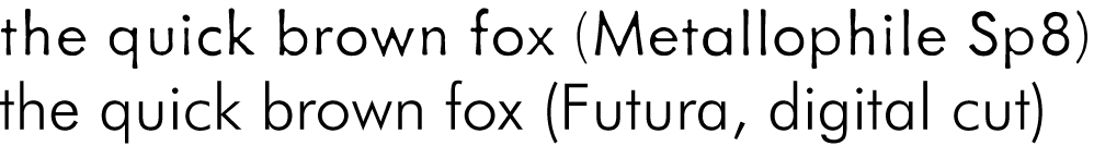
My concept was based on the observation that digital versions of classic typefaces look quite different from their counterparts in metal type. The metal faces, printed on plate-finish paper using letterpress printing, had a warmth and texture that was lost in the precise mathematical world of digital typography. It was not only the imperfections of ink on cast metal, it was also the proportions and spacing, which were particular to the size of type. In digital type (with some exceptions), one size fits all. In metal type, every size was custom tailored. 8 point digital Futura looks quite different than 8 point metal Futura, especially in print.
There have been some attempts in digital type at simulating the look of classic metal typefaces, such as ITC Founder’s Caslon, but rarely has it been tried with more modern sans serifs. Metallophile Sp8 Light was an attempt, but without more weights it was limited in its usefulness.
The original metal Spartan Light was paired (or “duplexed”) with Medium as a boldface on the old Linotype casting machines. With that in mind, I decided Metallophile Sp8 Medium would be the best boldface for Metalophile Sp8 Light.
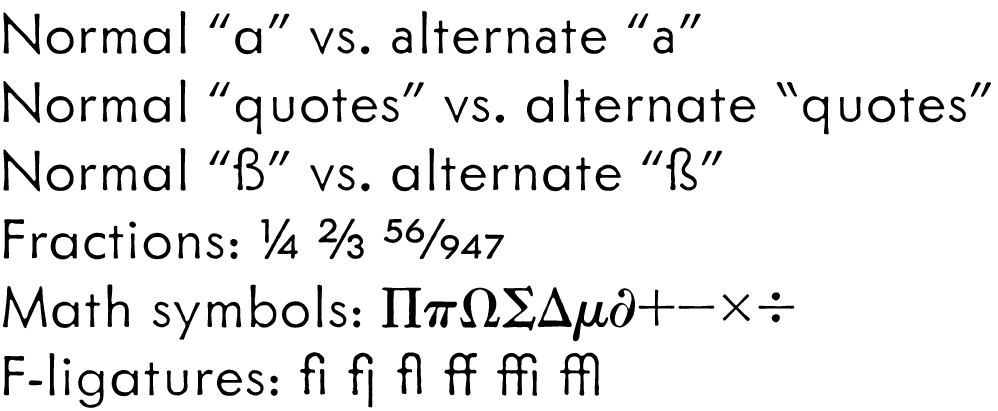
As part of this process, the entire family was moved to the OpenType format, with a greatly enlarged character set, including extensive language support, a full set of math characters (based on the standard “pi” sorts of the metal type days), f-ligatures, a large set of pre-built fractions as well as arbitrary fractions via OpenType. The new fonts also include and alternate two-story lowercase “a” and alternate left quote marks, just like the original metal face. I redesigned the “ß” to give it the more traditional form, but included the more contemporary version I did in the original Metallophile Sp8 fonts as an alternate.
More weights are already in the works, which I hope to release this Summer, but I wanted to get these out as soon as they were ready.