Mark’s Notebook - Page 31
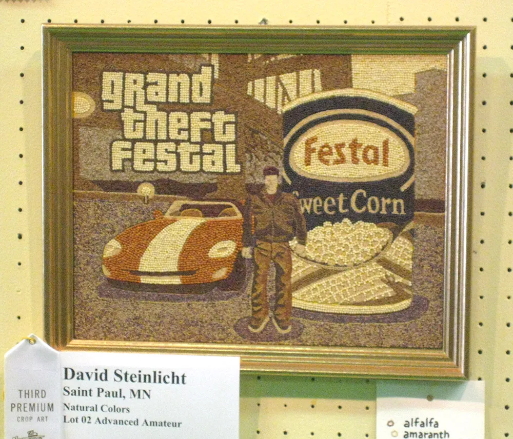
My friend David Steinlicht recently posted a time-lapse movie showing the day-to-day progress of his award-winning entry to the seed art competition at the 2008 Minnesota State Fair. It depicts a scene from the video game Grand Theft Auto (of which he is an avid player) with a can of Festal sweet corn. In seeds. Not your typical seed art subject, but David is not your typical seed artist.
The speed at which the work progresses is highly misleading. To put things into perspective, David includes video of the process in real time after the time-lapse part.
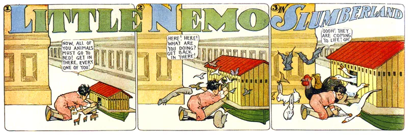
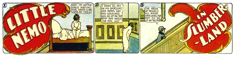
I’m a long time fan of the work of Winsor McCay, including his hand-lettered titles. Blogger “Morpheus” has posted a big collection of title panels from McCay’s Little Nemo comics on his “Meeting McCay” blog. Amazing stuff. (Via Boing Boing)
The Back to the Future series is a long-time favorite of mine. And they did a good job with their period-specific props—lots of hand-painted signs in the parts set in the 1950s and 1880s, just as there would be. Nary a font in sight where fonts should not be. Or so I thought.
Yves Peters (of Unzipped and elsewhere) was recently watching the third installment in the series on TV when he spotted this and alerted me:
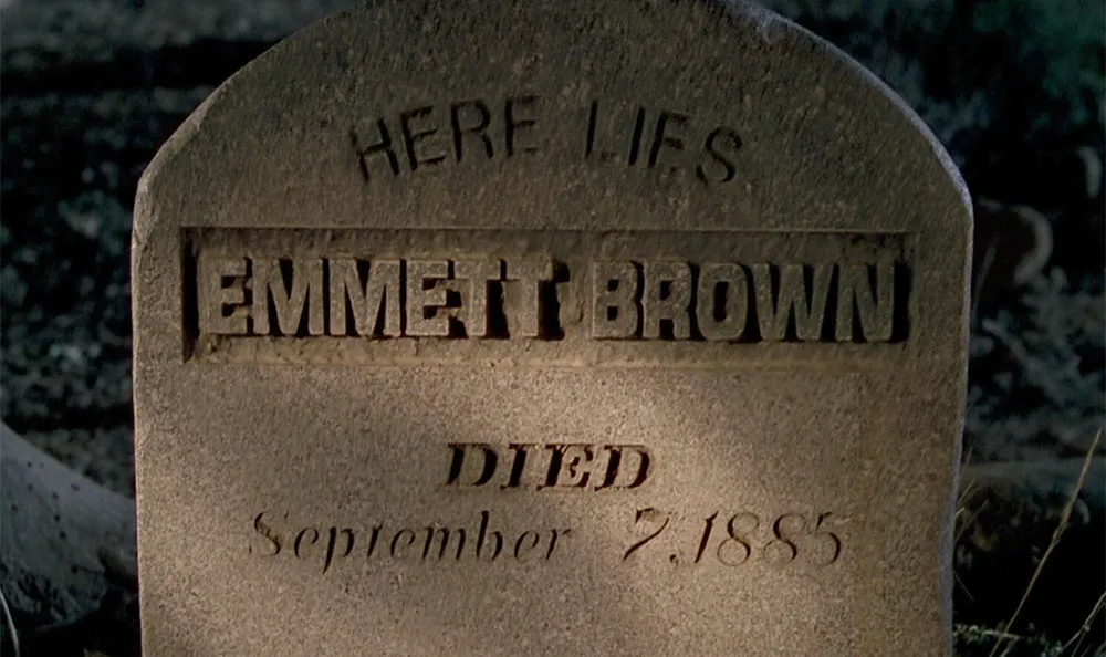
Great Scott!, indeed. It goes by pretty fast and I had to adjust the brightness to see it clearly, but there it is. How did Helvetica (1957, top) and Eurostile (1962, middle) end up on a tombstone in the year 1885? I guess we’ll have to wait for a fourth Back to the Future movie to find out.
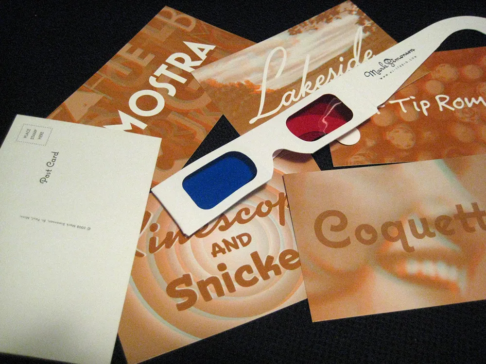
I’ve finally had a chance to settle down after this year’s TypeCon, which was one of the best I’ve attended. As promised, here is the set of 3D postcards I contributed to the goodie bag for those who were not able to attend:
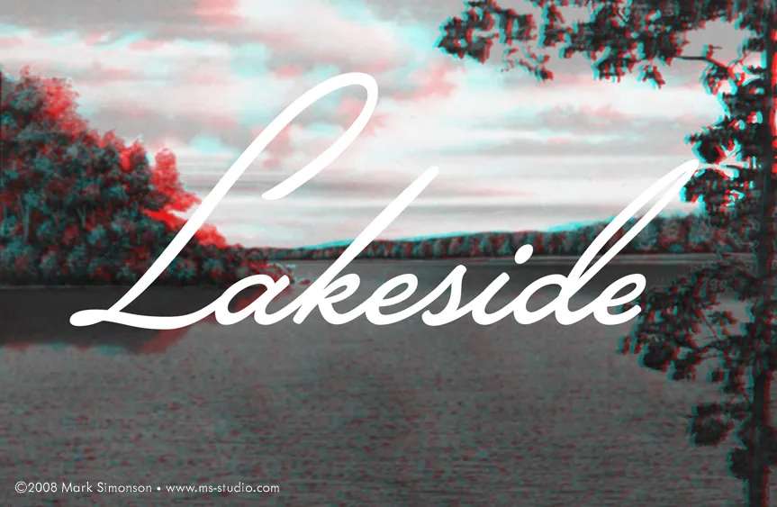
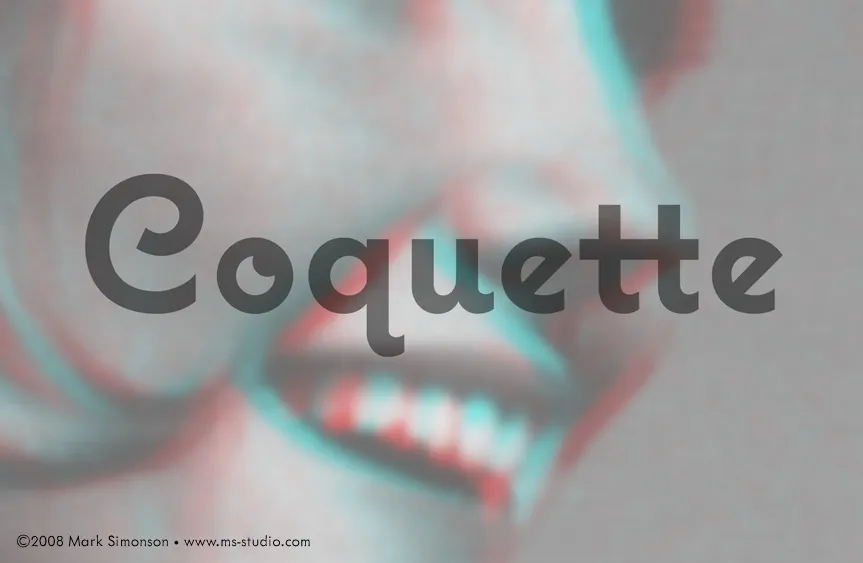
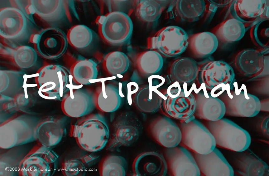
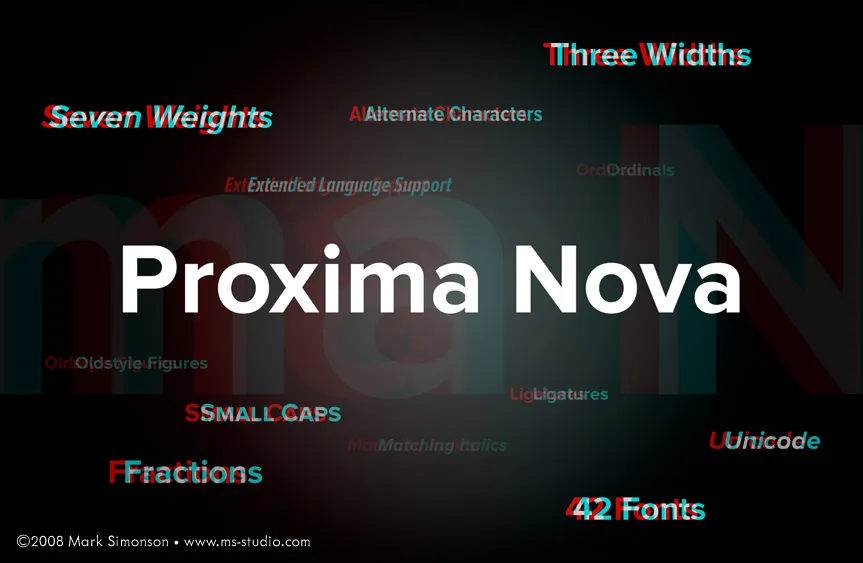
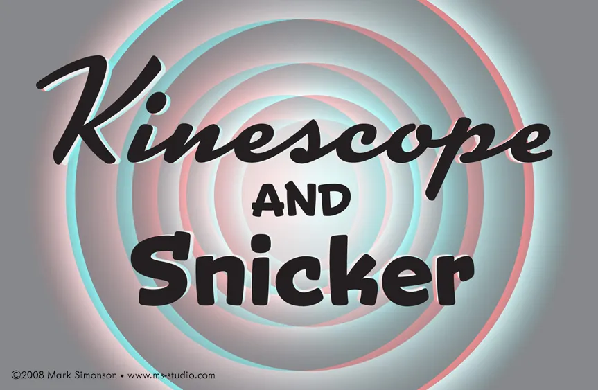
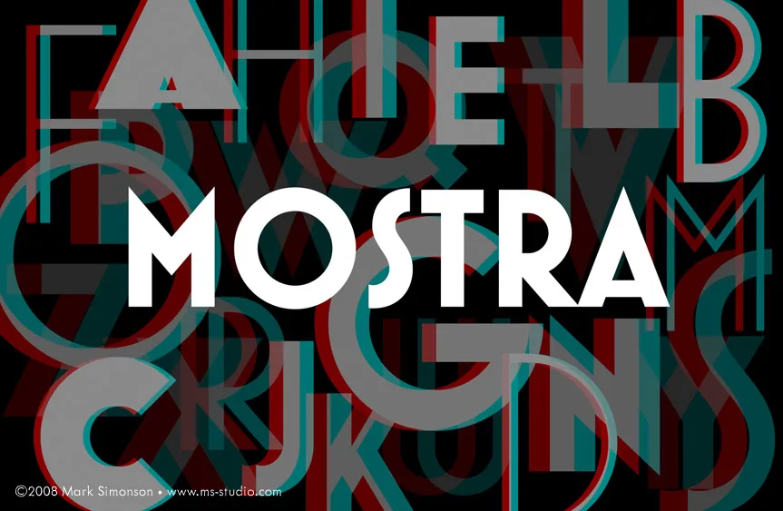
Of course, you will need a pair of anaglyphic glasses with red and blue filters to experience the illusion of depth.
In fact, these RGB images work even better than the printed postcards for the 3D effect, probably because the colors are made with pure light. On the other hand, they are not as easy to mail.
I’m en route this weekend to TypeCon 2008 which is being held in Buffalo, New York, home of Buffalo Wings, Ani DiFranco and P22 (the type foundry). The workshops start on Tuesday and the main program kicks off on Thursday evening.
I’m a 24 Point sponsor this year which, among other things, lets me add something to the goodie bag that each of the attendees receives. Since this year marks my fifth anniversary of attending TypeCon, I decided to make it something special to mark the occasion.
In the middle of 2002, I was just barely in the font business, selling a few fonts a month on MyFonts.com, which had just started up about a year before. I did a graphic on my website to promote one of my fonts, Refrigerator. It was an “anaglyphic” image, meaning that if you viewed it with a set of those goofy glasses with the red and blue filters like they used for 3D movies in the ’Fifties, the image would appear to have depth. Here is the image:
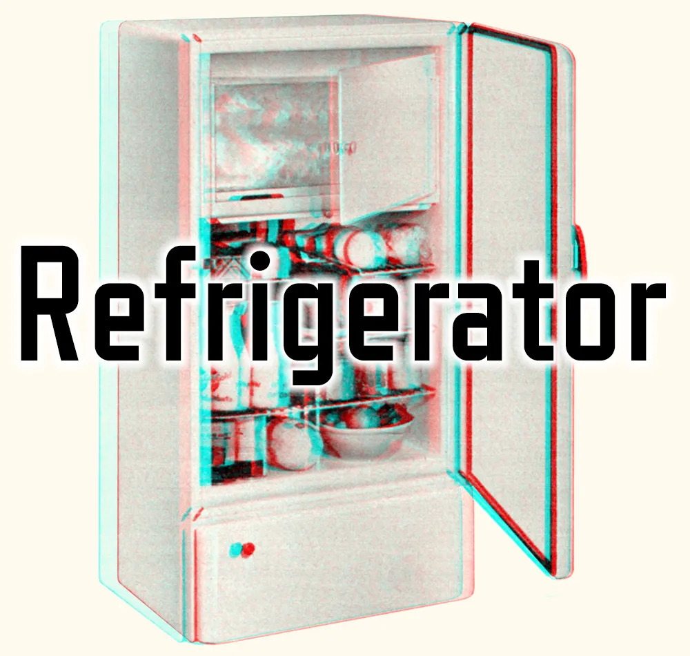
I don’t know whether it got anyone to buy a font, but not long after I posted it, I got an email from a guy named Stuart Sandler wanting to know how I did it. I sent him a full explanation of the process (which I posted here later in How to Make 3D Anaglyphs). He thanked me and, by the way, would I be interested in getting involved with TypeCon 2003, which was to be held in Minneapolis?
Stuart was (and is) the proprietor of the Font Diner, at the time operating out of Fridley, Minnesota, and was also on the board of SOTA, the organization responsible for TypeCon. My type design activities at the time were limited. I worked alone and didn’t really know anyone in the business. Getting involved with TypeCon 2003 opened a whole new world to me. I met type designers and developers from all over the world and for the first time had an inkling that I might actually be able to this for a living.
And now, five years after my first TypeCon, I’m a full-time type designer. And I can trace it all back to that 3D picture of a refrigerator. So, to commemorate the occasion, I have produced a set of six 3D postcards (glasses included) for each of the attendees of TypeCon this year.
Before the end of TypeCon, I will post the images on my site so everyone else can enjoy them. (You’ll have to provide your own glasses, though.)
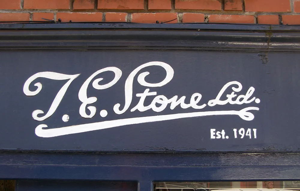
UK reader Aled Williams sent me this photo of a beautiful hand-painted sign on a hardware store in Bristol. Just lovely.
Update (7/12/08): More photos from the same neighborhood by Jon Tan on Flickr.