Mark’s Notebook - Page 3
Skin & Bones is an unusual font release for me. It’s not only a revival, it’s a designer-authorized revival. It was originally designed by Douglas F. Jones and released as a 2” film font in 1972 by VGC (Visual Graphics Corporation, now defunct). I got to know Doug by email in 2017 after a friend of his saw him mentioned in a Notebook post of mine from 2013. He agreed to do an interview as a follow-up to that post. You can read the interview here, which I recently published in anticipation of the release of my revival of Skin & Bones.
While we were doing the interview, I noted that there was no official digital version of Skin & Bones—and the free, unauthorized version which has been around for a while is not only very poor, but incomplete. It’s missing the alternate characters that Doug designed for the 1972 film font. When I proposed doing a proper, fully-modern digitization of Skin & Bones, Doug was all for it.
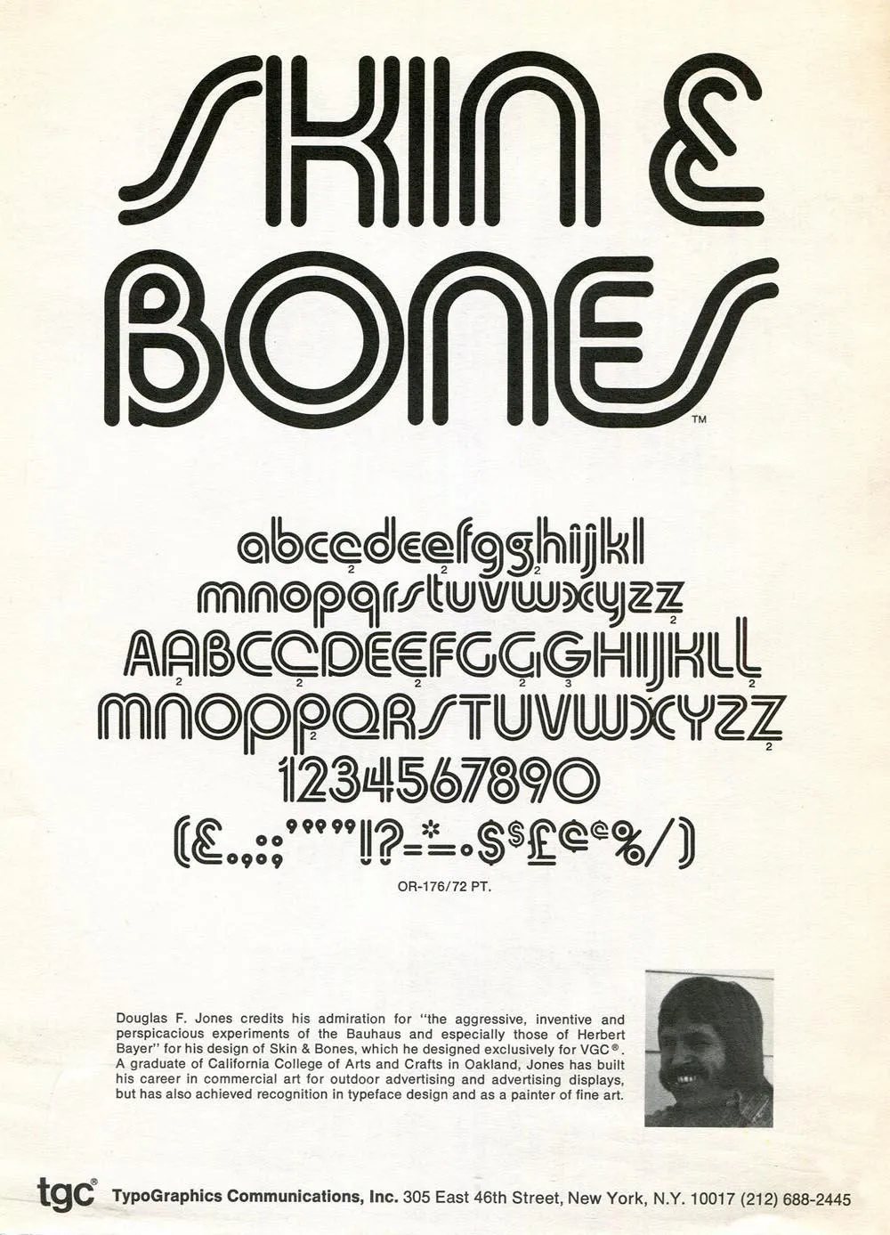
Doug no longer had any of the original artwork, so my digitization is based mainly on available samples from vintage VGC catalogs, promotional brochures, and even the unauthorized Chartpak lettering sheets.
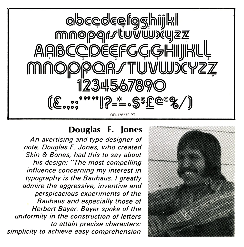
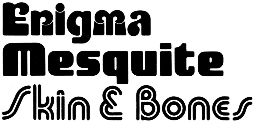
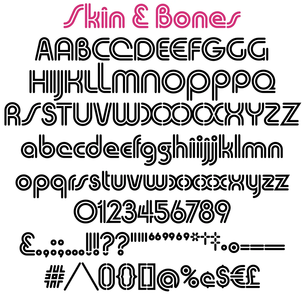
VGC film fonts had a pretty limited character set by modern standards—uppercase and lowercase (sometimes with alternate characters), figures, basic punctuation, and a few symbols (usually $, ¢, £, an asterisk, and an ampersand). (You can see the entire character set in the image above.) Often, there weren’t even accents or “foreign” characters, which kind of made sense at the time since the primary market was the U.S., Canada, and Britain. The unauthorized version did have a few accents and as well as Æ, æ, Œ, œ, and ß, but they weren’t very good and didn’t follow the design logic of Skin & Bones.
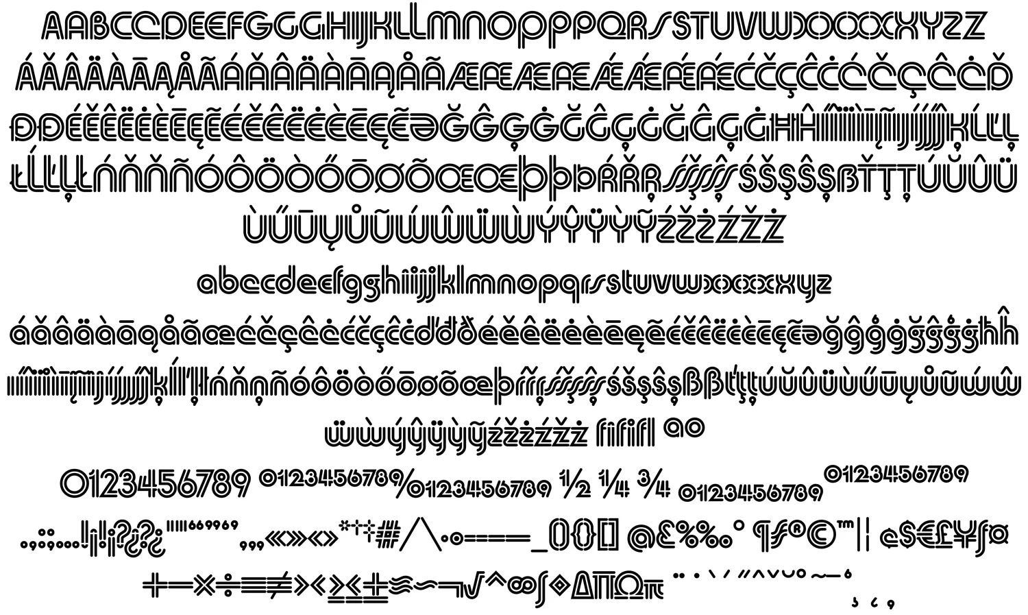
After I digitized the existing characters as faithfully as I could and got Doug’s approval, I expanded it to modern standards. This included designing a full set of diacritical characters to cover most Western-, Central-, and Eastern-European Latin-based languages, as well as small figures (for superscript, subscript, and fractions), a full set of punctuation and delimiters (parentheses, brackets, and braces), and the standard range of symbols and currency marks.
Beyond this, I added a few new alternate characters, including variations of Æ/æ/Œ/œ based on Doug’s original alternates for A, E, and e. My most significant additions are the alternate S/s, which follow a more conventional form, rather than the “lazy S” style that Doug used, and alternate full dots on the i, j, !, and ?.
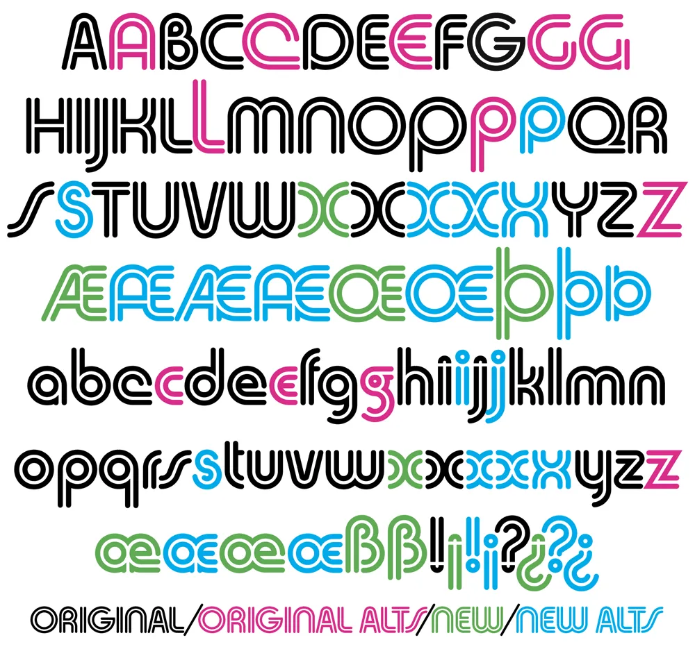
I did make one change to Doug’s original design in the X/x, which I thought (and Doug agreed) could be made more consistent with the design logic of the alphabet. His original X and x are available as stylistic alternates for completeness, plus three new variations I came up with. If you’re setting anything with an X, you’ve got lots of options.
Unlike the original VGC film font, the digital version of Skin & Bones is carefully spaced and kerned so it automatically sets perfectly. It includes support for OpenType features like Named Stylistic Sets (to make it easy to use the alternate characters), Localized Forms, Subscript and Superscript, Fractions, and Ligatures.
To sum up, Skin & Bones is a classic early-seventies Bauhaus-inspired display typeface, expertly remastered and extended for modern use.
The royalties for the sales of Skin & Bones will be shared with Doug, who made a total of $240 after it was originally released by VGC. I expect he will do better this time.
You can purchase the font here.
Jones with his creation, Skin & Bones, in Industrial Art Methods magazine, 1972.
In 2013, I posted an item here about a magazine article I saw as a teenager back in 1972, which helped spark my interest in type design. It was about some recent typefaces released by Visual Graphic Corporation. VGC made the Photo Typositor, a machine for setting headline type. It included photos and short bios of the designers. One of them was Douglas F. Jones, designer of the typeface Skin & Bones.
A few years later, in 2017, someone who knows Doug emailed me with his contact info and said he might like to hear from me. I emailed Doug and asked if he would like to do an interview as a follow-up to my 2013 blog post.
I meant to publish the interview sooner, but in our exchange, I noted that there was no official digitization of Skin & Bones, just some crappy free versions, and that I would be willing to do a high-quality, official digitization of his design. I decided to hold off publishing the interview until it was finished.
That task is now completed, and the font will soon be available at Mark Simonson Studio (and Adobe Fonts). Of course, the royalties will be shared with Doug.
In the meantime, here’s the interview….
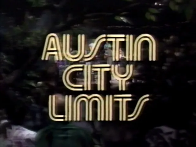
Doug: I designed three fonts for VGC, all published between 1972 and 1976: Skin & Bones, Mesquite, and Enigma. Fonts In Use notes that Skin & Bones has been used by the music program “Austin City Limits” since 1974 and that it was used on the VGC Typositor, one of which is in the printing museum at the Romano Library & Museum in Haverhill, MA.
I became interested in calligraphy and paper sculpture after designing fonts.
Mark: How did you get into designing typefaces? What made you want to do it?
Doug: I graduated in 1962 with a BFA from California College of Arts and Crafts (CCAC) in Oakland, CA (now CCA). Charles Eames, of chair fame, was the keynote speaker at the graduation. He said that we graduates had learned our ABCs at CCAC, and now it is time to go out and learn the rest of the alphabet. Boy, was he right—and I’m still learning! Haha.
After graduating, I got a job designing signs for an electric sign company in Las Vegas. In those pre-computer days, all lettering had to be hand-drawn (including menu boards, ouch!). Just by repetition, one begins to have a feel for letters.
Soon, I began designing my own letters for signs. Then, while working in Las Vegas, I embarked on a project to design a complete alphabet called Skin & Bones, unaware of the amount of work it would entail.
Mark: What was the concept or inspiration for Skin & Bones?
Doug: I was very interested in the Bauhaus and the simplicity of their designs, but don’t be fooled. Simplicity is very difficult! When I was experimenting with Skin & Bones, I was impressed by the fact that a letter with an inline attracts the eye.
Now, the real work began. It is easy to design one letter, but an entirely different matter to formulate 52 letters and have them relate seamlessly one to the other.
Mark: How did you find out about VGC, and what was the process for producing a typeface with them?
Doug: I had submitted some font designs to other companies to no avail. Although some gave me encouragement. I even won a contest from LetterGraphics with an alphabet called “Gnome.” It was only a lower-case font, so they told me in the future to design both upper- and lowercase.
It was about this time that I had heard of VGC, after seeing it in a graphics book. So I decided to submit Skin & Bones as an unsolicited font. They were interested.
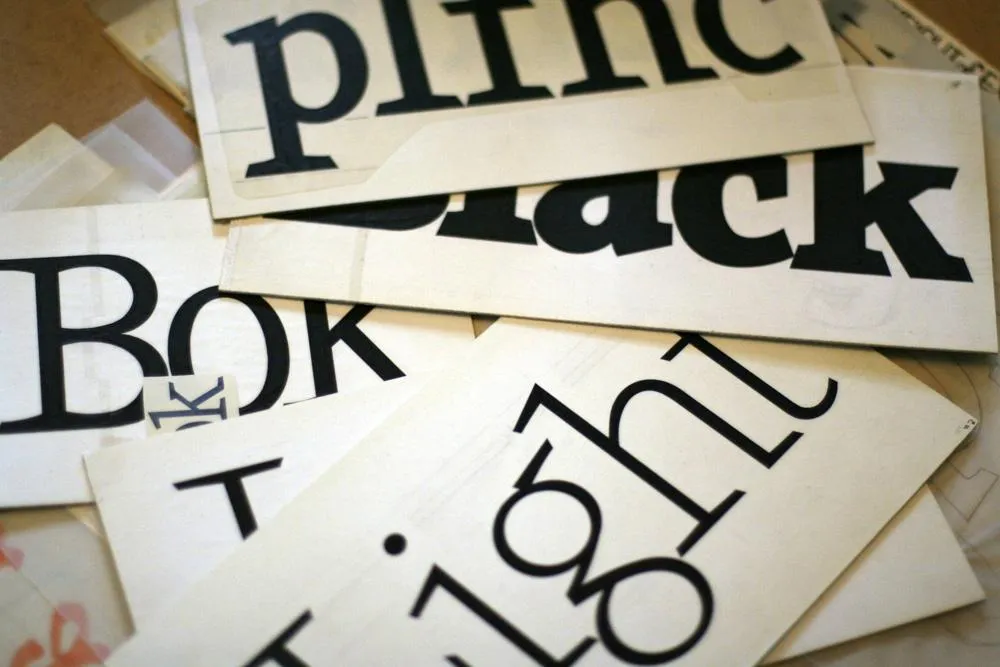
They had a system for judging fonts. The designer is required to submit certain letters: Caps - A E G M O R S and lowercase - a e f g p t y. Then a panel of VGC staff members would evaluate the samples and, if accepted, tell you to proceed. And it was.
The characters had to be inked at a 2” cap height on individual cards (3” x 5”) with 1/4” punched holes in cards to align with register posts. A metal plate with registration posts and cards were supplied to complete the project. As it turned out, I needed 115 separate cards. Foreign accents and ligatures were required for distribution in other countries. When inking was finished, the cards would be sent to VGC to be photographed and duplicated on film to be used in their Photo Typositor machines.
Skin & Bones took six months from concept to final inking. All of the inking was done with a Rapid-o-Graph technical pen. When the entire font was completed, each letter, accent, and punctuation mark had to be “letter perfect.” VGC demanded this!
Mark: Once the font was released, what kind of response did you get? Were you involved in marketing it? Was creating Skin & Bones financially rewarding?
Doug: VGC did all the marketing and agreed to give designers 25% of the gross sales. There was a bumpy start at first and it took a while before I got my first royalty check. But it didn’t last long before things went south.
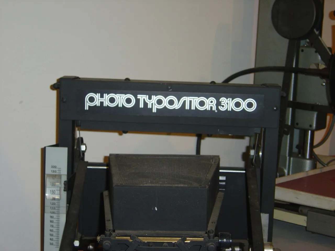
Skin & Bones in use on the VGC Photo Typositor. (Source: www.flickr.com Tamye Riggs. License: All Rights Reserved.)
When I was working in Phoenix, I saw a ripoff of Skin & Bones in Chartpak rub-down lettering. When I notified VGC, they were aware of it and told them to “cease & desist,” which they did. It was an awful reproduction—rough. This was about 1974. I didn’t receive any royalties from Chartpak.
About this time I saw S&B showing up in magazines and newspapers. I have clippings from Time and Newsweek, Spalding basketballs—even Kobe Bryant used it. No royalties. Lucas Samaras (artist) used it for title pages in his book. And, of course, Austin City Limits. No royalties. I even saw it two weeks ago in an ad in a paper in Berkeley, CA.
In all, I received $240 in royalties. VGC had problems securing sales with the advent of computers. Ultimately, VGC went out of business and the fonts all fell into public domain. All the designers, including myself, were deprived of any future royalties from the sales of our fonts.
Mark: Well, now that I’ve agreed to digitize Skin & Bones, maybe that will change.
Doug: As it stands right now, nothing has happened or will happen concerning any royalties, so we have nothing to lose by re-releasing Skin & Bones and seeing what comes of it.
* * *
Here’s a sneak peek at the newly digitized Skin & Bones:
Stay tuned….
Viroqua’s ancestor, Excalibur, hand inked.
I released Kandal in 1994. It’s one of my earliest typeface designs, going all the way back to an earlier design in 1978, which I submitted it to International Typeface Corporation (ITC) under the name “Excalibur”. It went through a couple of iterations before the one I submitted, variously influenced by the work of Hermann Zapf and Jim Parkinson. I honestly had very little idea what I was doing—a case of overestimating what I knew and underestimating how much was left to know. By a large margin. Excalibur was understandably rejected by ITC. It had lots of problems and I resolved to improve my knowledge and skills before trying to submit something to them again.

Fast-forward to 1990. I never did submit any more typefaces to ITC, but I did have lots of ideas and sketches and practice drawing letters. I also got a Mac in 1984 and Fontographer in 1987 and started trying to make PostScript fonts. One of my ideas was to revisit Excalibur, simplifying the design and addressing its many flaws. This became Kandal. I was also working on Proxima Sans, the predecessor to Proxima Nova, around the same time, and a few other ideas, some of which are still on the drawing board.
Kandal has never been one of my popular typefaces. It’s not surprising, given that it was such an early design, made when I had very little experience making fonts. I probably should have pulled it from my library, but I kept thinking I would come back to it and fix it, like I did with Proxima Sans.
Thirty years later, it’s finally happened. The new version is reworked from the ground up, so I decided to give it a completely different name, instead of something like Kandal Nova. “Kandal” was my paternal grandmother’s maiden name and the town in Norway her family was from. The new name, “Viroqua”, is the town in Southwestern Wisconsin where she was born and raised.

Viroqua is an improvement over Kandal in every way I could think of, while retaining its core design concept: A hybrid combining modern proportions, Jenson-like details, and a bit of slab serif DNA. Nearly every character has been reworked or refined. The original italic especially suffered from my lack of experience as a type designer. I basically started over. I’ve got three more decades of experience and I hope it shows.

Viroqua also has a wider range of weights, seven in all, going from Thin to Black.

Viroqua features many typographical niceties missing from Kandal, such as small caps, old style and lining figures (both proportional and tabular), superscript and subscript figures, fractions, and dingbats. Viroqua also supports most Latin-based Western and Eastern European languages, plus Vietnamese.
Viroqua is available now. More information here.
I’m known as a type designer—and fonts are pretty much what it’s all about here on my website, and in my life in general. But I haven’t always been making fonts. At various points of my career (which goes back to 1976) I’ve been a graphic designer, art director, web designer, package designer, product designer, lettering artist, and—very early on—illustrator.
Learning to Do Caricatures
My most active period as an illustrator was for Metropolis, a weekly newspaper in Minneapolis (1976-77). Patrick JB Flynn was the art director. Fairly soon after I started working for them, he asked if I could do caricatures. Caricature was something I dabbled in going back to middle school, mostly in a simple cartoon style. My inspiration came mainly from artists like Mort Drucker (Mad) and Rick Meyerowitz (National Lampoon). But I’d never done a full caricature before. Not really. But, I thought, how hard could it be?
And so I started doing caricatures for Metropolis. I wasn’t that good at first, but I got better. I was actually kind of surprised I could pull it off. Caricature is not the easiest skill—even when you can draw well. And some of my caricatures were better than others.
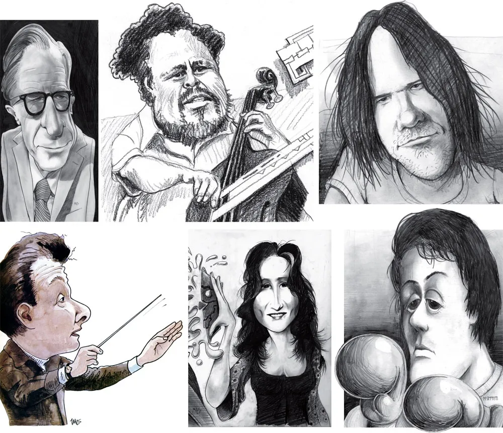
Above, some of my early caricature work. Clockwise f**rom the top left: economist John Kenneth Galbraith, Jr.; jazz bassist Charles Mingus; a “stoned out” Neil Young; Sylvester Stallone as Rocky with “puppy-dog eyes.”; singer Bonnie Raitt; and orchestra conductor Sir Neville Mariner.
After Metropolis, I kind of stopped doing it. I’d also dropped the idea of being an illustrator. It was easier to be an art director, think up the concepts, and let someone else do the drawing. Plus, I didn’t think my caricature style was “in.” It wasn’t the sort of thing I was seeing in the illustration annuals. I associated it with “kid’s stuff” (Mad especially) and felt almost embarrassed by it.
Getting Back Into It
Earlier this year, I made an effort to get back into drawing and other creative pursuits, and get away from staring at a computer screen all day (see my “1979” post from February). I filled up several sketchbooks over the next few months, drawing nearly every day. And then in July, I started doing daily drawings in Procreate on my 12.9” iPad Pro—quick caricature sketches of people I saw on YouTube while watching videos.
Drawing digitally—that is, drawing on a tablet or screen with a stylus—has always been problematic for me, in spite of all the money I’ve spent on Wacom tablets and Cintiqs and iPads over the years. For some reason, I just never took to it, no matter how much I wanted to. It didn’t feel as fluid and natural to me as drawing on paper. So I never did much but doodle, rarely doing a full drawing.
But I had a breakthrough while doing these quick studies. I figured out a technique for doing full caricatures that works for me, like the ones I used to do for Metropolis. In fact, it works even better.
The trick is to keep things really simple. I use the 6B Pencil brush for the line work on one layer, and the Tamar brush—sort of like painting with a sponge—for shading (and color) on a second layer. I’m careful not to change the size of the pencil brush (~60%). I try to draw at actual size as much as possible and stay loose. It all finally clicked for me.
And of course, working digitally is great for drawing caricatures compared to drawing on paper. It’s so easy to fix problems, like when proportions are off or positions of the features aren’t quite right. I’m able to work very quickly, knowing that if I make a mistake, I can immediately fix it. (Although, I might try redoing some of these using analog media now that I’ve worked out the likeness and everything digitally.)
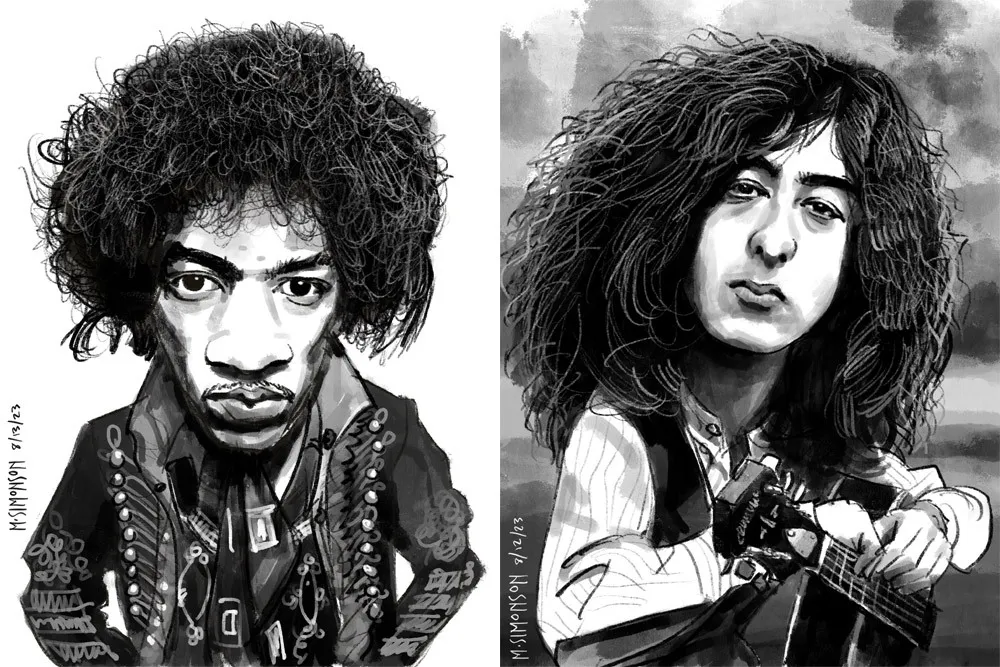
Jimi Hendrix and Jimmy Page.
It takes me anywhere from an hour to three hours to do one of these. I’m working in both black and white and color, depending on the source photo. And, yes, these are based on specific photos, or several photos in some cases. Some of them may be recognizable—even iconic.
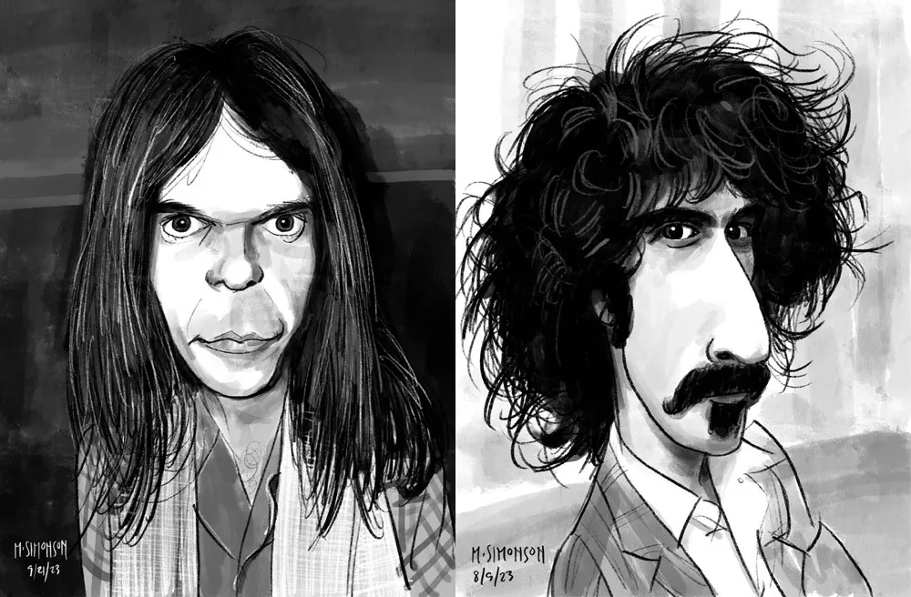
Neil Young and Frank Zappa.
By the end of July, I was doing a full caricature every day. This went on for almost two weeks. Since then, I’ve been doing several a week. I’ve done almost 30 of them now. Mostly rock musicians so far, but I have a long list of possible subjects in other areas, too.
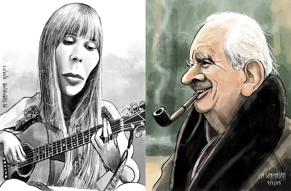
Joni Mitchell and J.R.R. Tolkien.
Rediscovering Myself
I can’t believe how good it feels to reconnect with this. As an artist, knowing that you’re capable of doing something yet not doing it for years—decades even—is painful. It feels like a waste. Of course, I’m doing other things, like making fonts, which is also creatively fulfilling. In fact, I’ve often wondered if getting so busy making fonts was the reason I wasn’t drawing as much. Apparently not.
In my “1979” article, I cast a dim eye on the digital world—the world of screens and pixels—and advocated a return to doing physical things, like drawing on paper. And I have been doing that. But, ironically, getting back into drawing on paper—specifically the habit of drawing daily—led directly to finally getting some use out of my iPad Pro and Apple Pencil. In hindsight, it was all about getting back to drawing, regardless of whether it’s on a screen or not.
Anyway, all of this is a roundabout way of saying that I’m going to start sharing my caricature work online. To be clear: I’m just doing this because I enjoy doing it. It’s a side project. I’m not looking to start a new career or anything like that. Fonts are still my main gig. I just want to share something else I enjoy doing, and I hope others will enjoy seeing it.
If you’re interested, I’ll be posting the work on my secondary Instagram account (not my regular Mark Simonson Studio account, which is for official, font-related stuff). Update: I’ve also created a new website to showcase my non-type-related work: marksimonson.art.
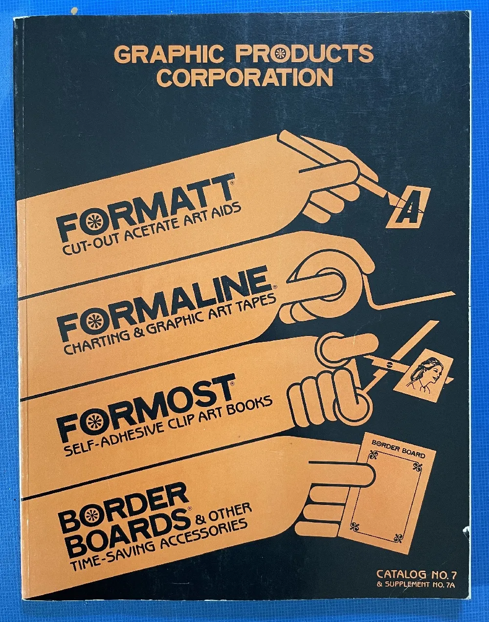
Before digital type and desktop publishing took over the world in the late 1980s, there was metal type and phototype. But if you were on a tight budget, you could set type yourself using various “dry transfer” products, Letraset being the most famous. But Letraset wasn’t the only one.
I used Formatt sheets a lot in the late 70s and early 80s. I’ve still got a few catalogs (No. 7 from 1981, No. 8 from 1986, and pages from what I believe is No. 6 from 1976) and a few sheets of type.
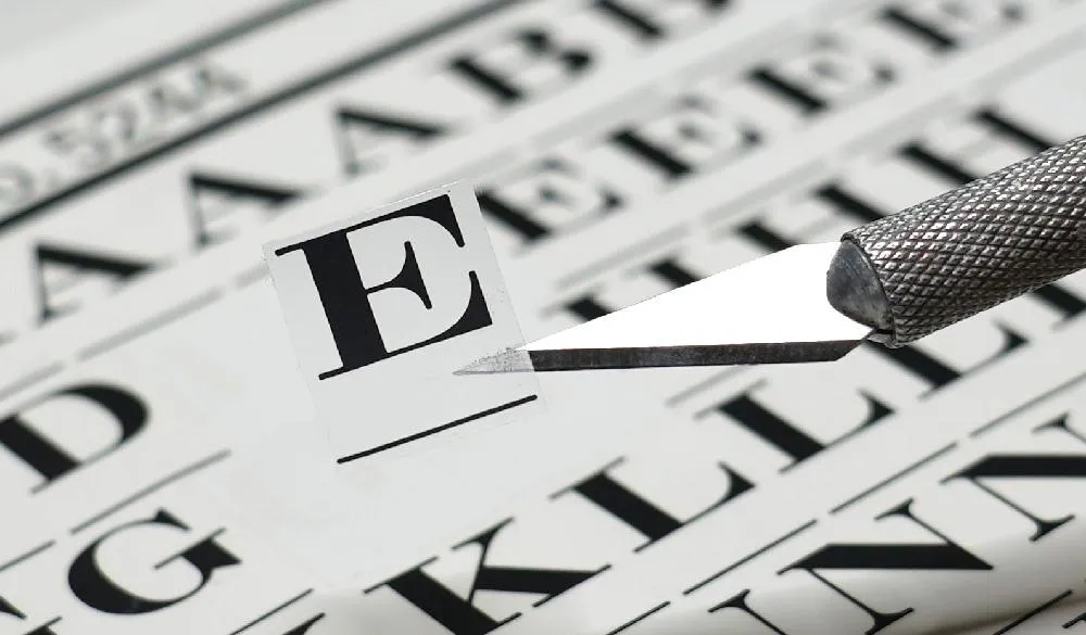
Unlike Letraset and other “rub down” type products, Formatt was printed on a thin, translucent acetate sheet with low-tack adhesive backing on a paper carrier sheet. To use it, you cut out the letters with a razor blade or X-acto knife and positioned them on a suitable surface and then burnished it down. I usually used illustration board and then made a photostat for paste up, but you could put it right on the mechanical if you wanted.
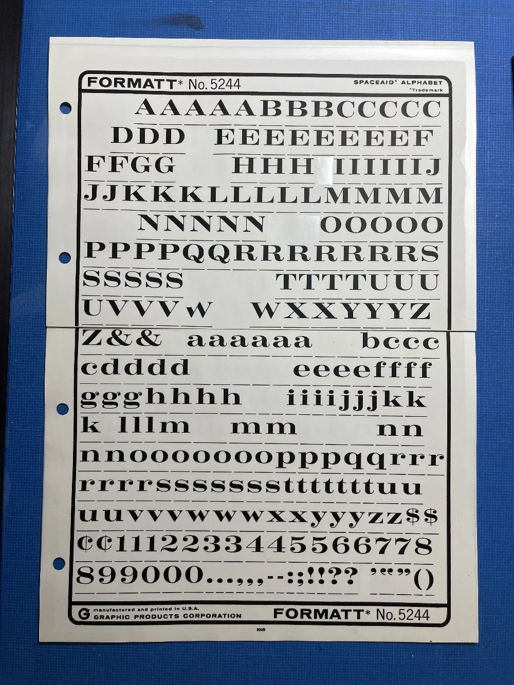
The sheets had guides below each character to aid in spacing and alignment. Although I always spaced it by eye, the guides were essential to keep the characters aligned to each other. I would draw a line for positioning the guidelines using a non-repro pen or pencil before setting the characters down and trim away the guidelines after.
Formatt was not as high in quality as Letraset, but it was cheaper and offered typefaces—especially older metal typefaces—not available from any similar product. But they also carried more recent faces, such as those from ITC. They carried about 250 different typefaces in the catalogs I have. I only bought Formatt type sheets in order to get certain typefaces that weren’t available elsewhere (other than from typesetting houses, which were not in my budget at the time).
In addition to type sheets, they also produced a whole range of pattern sheets, rule and border sheets and tape, color sheets, decorative material, etc. A lot of the graphic material seems to have come from old metal foundry sources. Besides the type sheets, I used their border sheets and tapes a lot, too.
I also made my own “Formatt” sheets sometimes back in the early 80s. I had access to a process camera, which could make high-quality photographic copies of black and white originals, colloquially known as “photostats” or “stats.” Normally you would use white RC (resin-coated) photographic paper with it, but it was possible to get clear acetate photostat material that had a peel-off adhesive backing. Using this, I made copies of pages from old metal type specimens, allowing me to set display type using otherwise unavailable typefaces.
One of the ideas on my back burner for a long time has been to add wide styles to Proxima Nova. Condensed and Extra Condensed have been there since the very beginning, but it was missing styles wider than the normal width. It was an obvious thing to add and would make the family even more versatile.
I did some rough preliminary work in 2012 and 2015, but didn’t put serious effort into it until last September, after I finished Dreamboat. The good thing about setting a typeface aside is that, when you come back to it, you can see the problems much more clearly. One of the things I learned when I was a graphic design student is that it’s easier to redesign something than to design something, and that was definitely the case with Proxima Nova Wide.
One of the things I changed was to make it even wider so that I could add two wider widths—Wide and Extra Wide, just as there are two narrower widths. Including the italics, this adds 32 new styles to Proxima Nova (16 for each width).

Naturally, the new styles include all the features and characters of the existing styles of Proxima Nova. I’ve also made a few improvements and tweaks to the existing styles. All of this amounts to a major release: Proxima Nova 4.0. It’s currently available for sale here or for activation in Adobe Fonts.
You can find more info, test and license the fonts, and download PDF specimens on the Proxima Nova page.