Site Updates
New Site Design
Welcome to the first major redesign of my website since 2013.
The site was long overdue for a refresh, so earlier this year the team of Scott Kellum (design director), Kelsey Scherer (designer), and Roel Nieskens (developer) set about to redesign and rebuild it from the ground up.
Paraphrasing Scott, “The aesthetics felt dated. I also really wanted the new site to highlight the typographic range of Mark’s work instead of leaning on Proxima Nova.”
I met with them in April to discuss directions and suggested bringing back some of the pre-2013 aesthetic, back to something closer to the spirit of my original site design.
In spite of the fact that I was only involved in a few brief early meetings, they managed to pull it off. It feels like something I might have designed myself, and picks up a lot of my early branding—including the black/pale yellow/white color scheme and the spinning starburst on the logo. And yet it feels thoroughly modern. I’m incredibly pleased with the results.
How Did We Get Here?
In 2000, when I launched the website for Mark Simonson Studio, I designed everything myself.
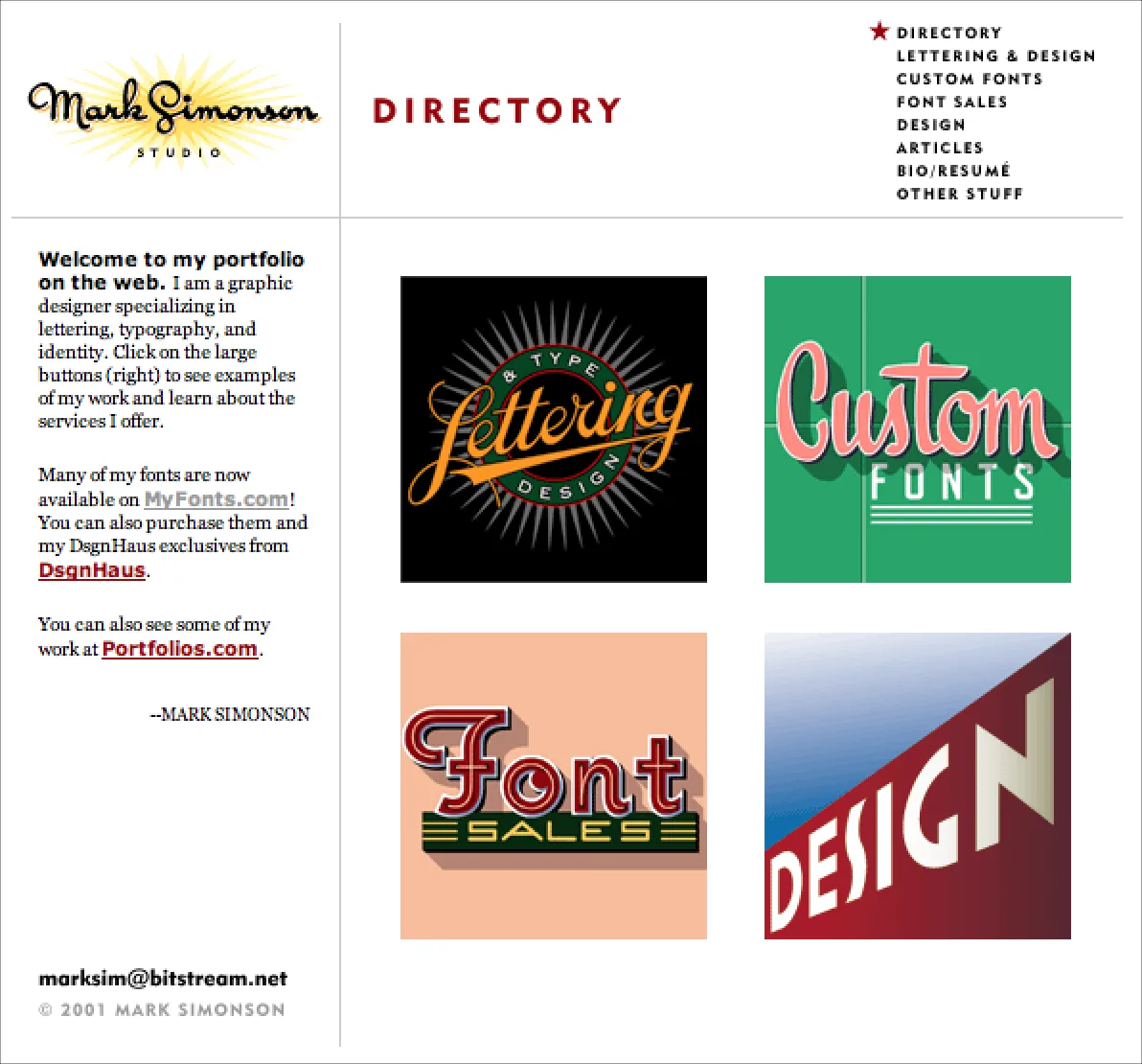
The inaugural design of my site, which I used from 2000 to 2004. Fonts were not yet a full time business for me. Archive.
In the early days, I used a website design app called Freeway. It worked like QuarkXPress or InDesign, but for websites. You could create an entire site with no coding. It was easy to use, but didn’t much give control over the code that it generated, and sometimes you needed that.
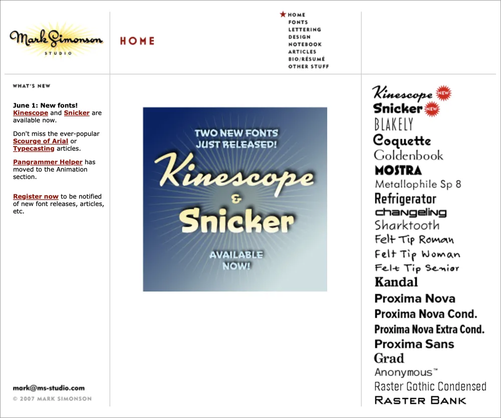
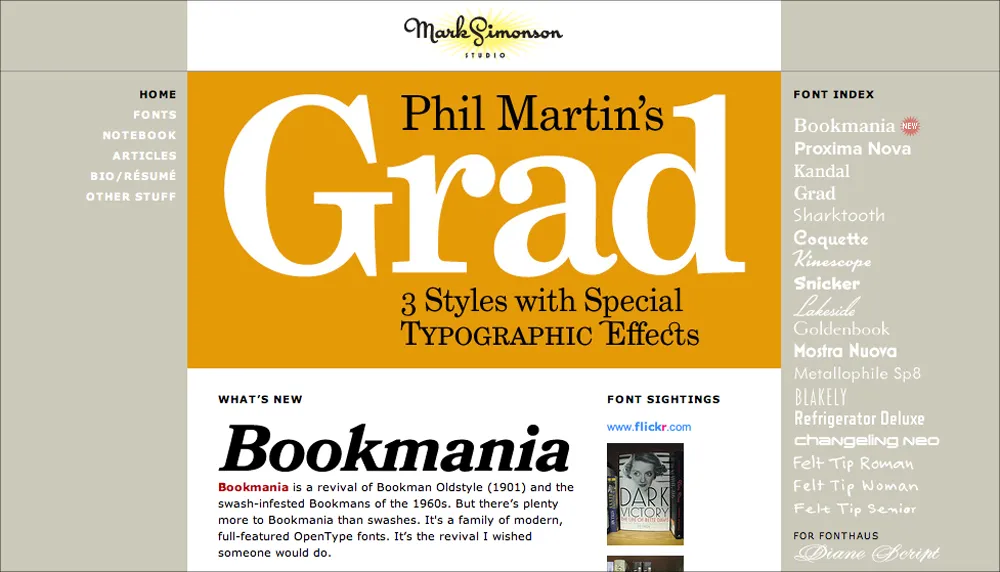
The site design I used from 2004 to 2007. The biggest change was the addition of the font index on the right. Also, I had started Notebook—my blog. Archive.
Nevertheless, I was using CSS and Javascript on the site by 2003 and integrated a cool free content management system (CMS) called TextPattern that I used for Notebook, while continuing to use Freeway for the rest of the site.
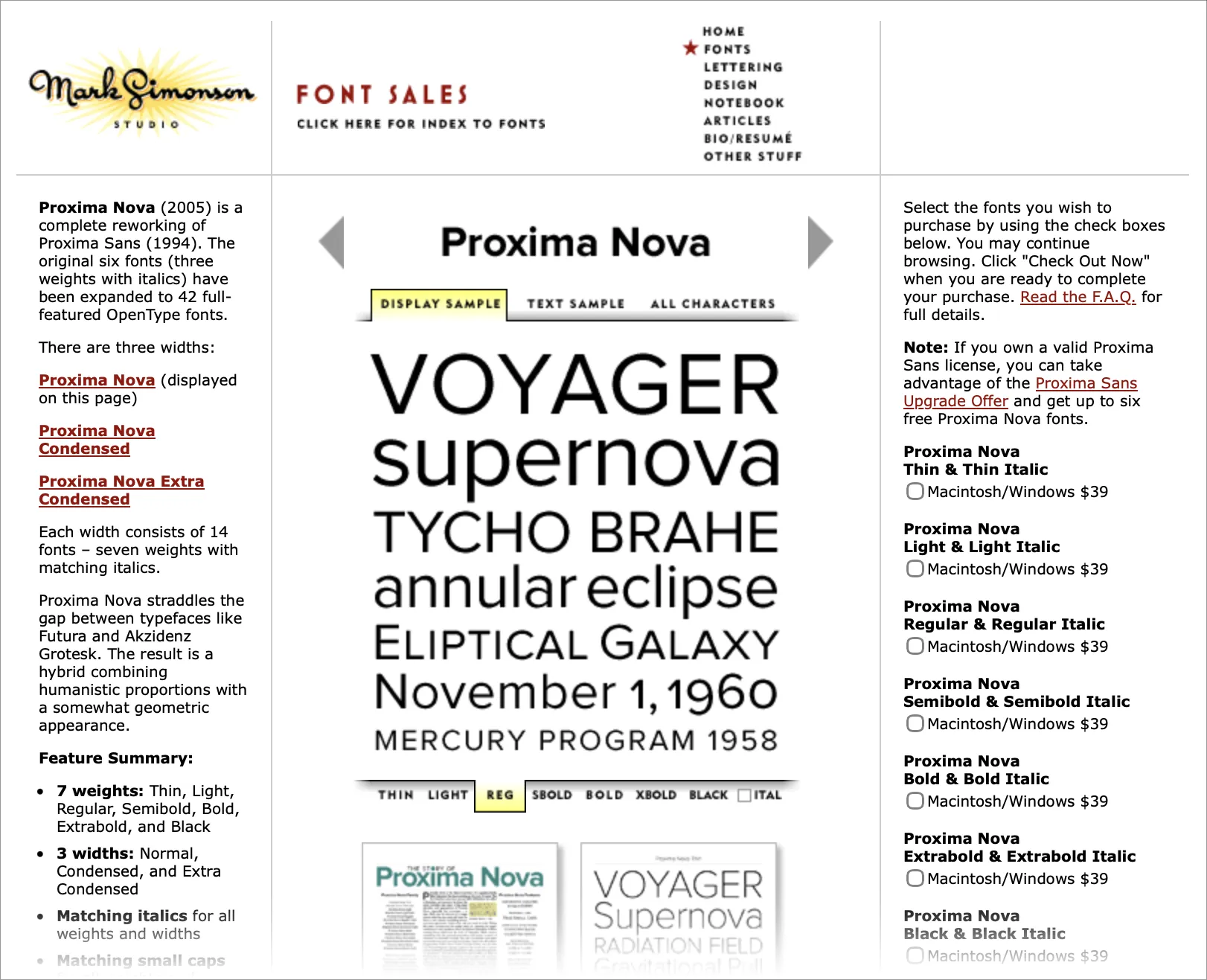
A font page from 2007. The tabbed section in the middle was interactive, letting you easily see different samples and styles, albeit as low-res GIFs. Archive.
In 2007, I redesigned and rebuilt the entire site in BBEdit—hand editing HTML, CSS, and Javascript—after fully embracing the Web Standards movement, popularized by Jeffrey Zeldman’s book Designing With Web Standards, and leaving the ignorant bliss of Freeway behind.
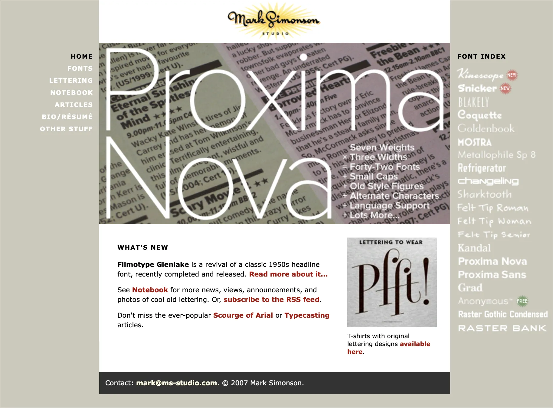
The redesign, which I used from 2007 to 2013. Archive.
But by 2012, I was having trouble finding the time to keep up with the latest web development techniques—things like responsive design and (embarrassingly) web fonts.
My site in early 2013—the last version I designed and coded myself. Archive.
I realized that coding and maintaining the site was becoming a burden, and taking too much time away from my main activity—making fonts. So I hired the web design firm of Paravel (Reagan Ray, Dave Rupert, and Trent Walton) to completely redesign and rebuild the site to modern standards.
It launched in March 2013.
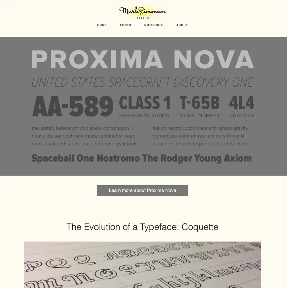
The 2013 redesign by Paravel. Archive.
It looked and worked great, although I felt that some of the spirit and personality of my earlier design was lost. Plus, while Paravel were top-tier web designers, the font banners they created lacked typographic pizzazz.
In 2015, I replaced the original banners with new and improved ones designed by Aesthetic Apparatus in Minneapolis. They added the element of whimsey and playfulness I wanted, while doing a better job of showing off the fonts. A few of them even made it into a Communication Arts design annual.
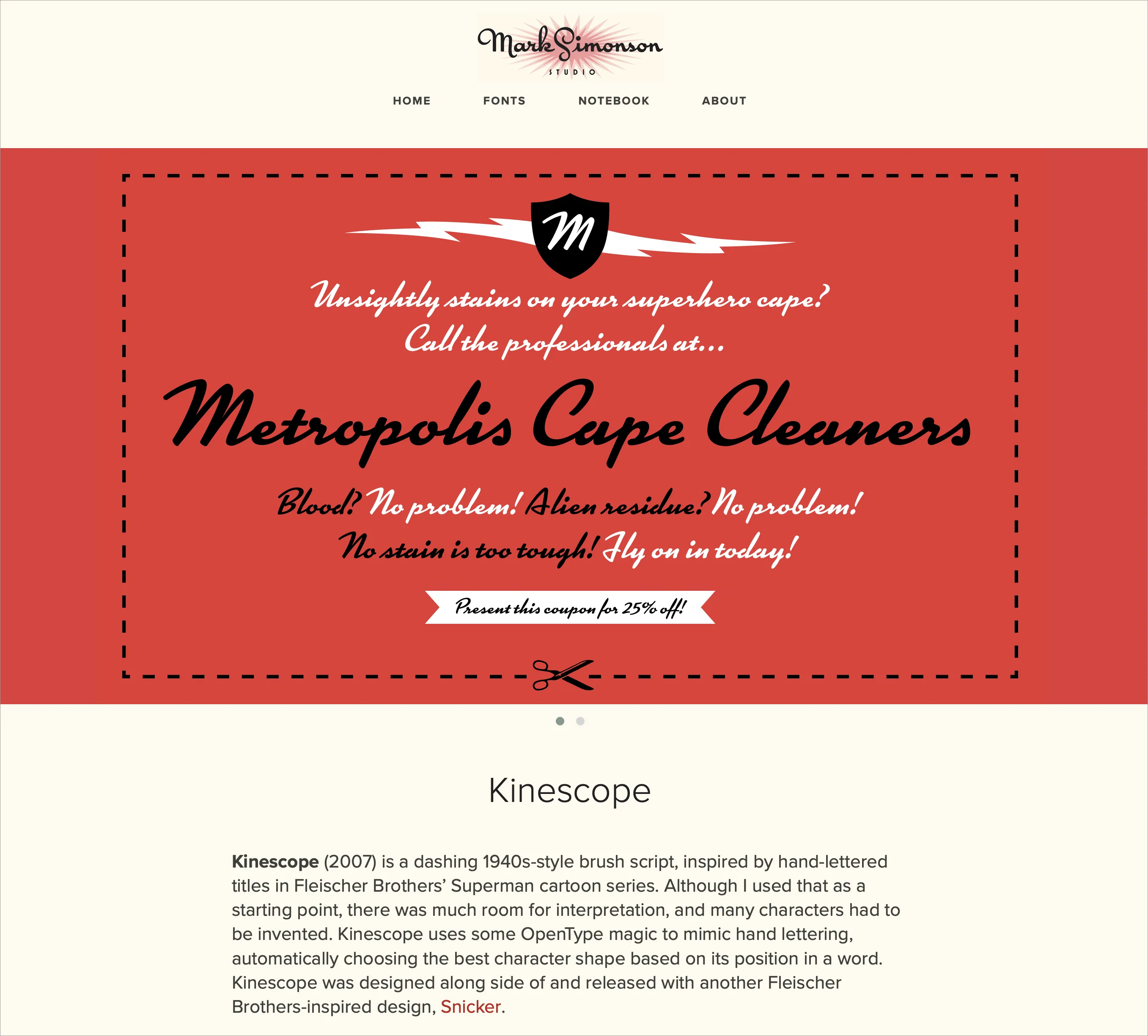
One of the new font banners in 2015. Archive.
The site got small updates and improvements here and there, and cool things like the Etna minisite, designed by Nick Sherman in 2020. He also designed some of the banners and an e-newsletter that, unfortunately, only got sent out a few times.
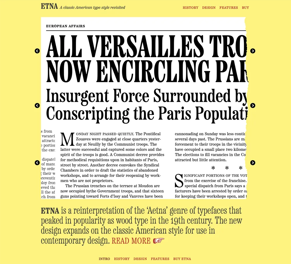
The Etna minisite is the reason Etna and all my fonts since have dingbats.
After I sold my font business to The Type Founders in 2021, they started rebuilding things under the hood, adding the ability for customers to purchase fonts directly (something I had dropped around 2007), providing live, editable previews of all the fonts, and making the site load faster and be easier to find on search engines.
And now I’ve caught up to the present, with the launch of this new look for Mark Simonson Studio on the internet.
I couldn’t be happier with the new design. It feels like home to me already.
 Permalink
Proxima Super Nova
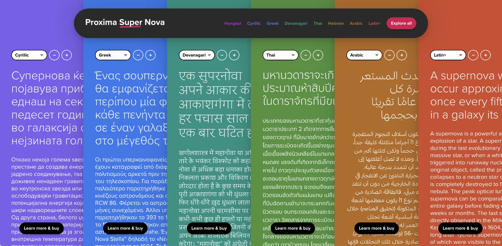
When I decided to sell the rights to my library of fonts to The Type Founders in 2021, one of the big reasons for me was the ever-growing burden of maintaining and developing that library.
As a one-person studio, there was only so much I could do. Proxima Nova had become very popular since I released it in 2005, and I regularly got requests to expand its language coverage.
At first, I did this task myself, adding support for Greek and Vietnamese in 2009 and Cyrillic in 2010. Even though I can’t read languages that use these writing systems, they were close enough to the Latin alphabet that I felt sufficiently confident to design them. But I’ve always felt out of my depth as a type designer even thinking about designing non-Latin fonts.
Still, I could see that adding even more language support would make a lot of sense for such a popular type family. Theoretically, I could hire other designers and production people to help, either as employees or as contractors. But that would mean managing those people, something I know I’m not very good at.
I like working by myself, and I would rather spend my time working on new typefaces.
It was around the time I was thinking about these problems back in 2019 that I was approached by Paley Dreier (now Managing Partner of The Type Founders) about selling my font library. It was something I’d never thought about before, but I eventually realized that it would be a neat solution to my problems. I would be relieved of the burden of maintaining and expanding my existing fonts, giving me time to focus on designing and releasing new fonts—which is what I’ve been doing for the last few years, with the release of Proxima Sera, Dreamboat, Proxima Nova Wide and Extra Wide, Viroqua, Cheesecake, Madcap, Gertie, and Skin & Bones. In fact, I’m currently working on a new sans serif family, the first since Proxima Nova, if you don’t count display faces.
In the meantime, The Type Founders has been working to expand language support for Proxima Nova, with the aid of some really talented type designers from around the world. We’ve dubbed the fruits of this effort Proxima Super Nova.
In addition to most Western and Eastern European Latin, Greek, Vietnamese, and Cyrillic, Proxima Nova now supports Arabic, Devanagari, and Thai (both looped and loopless). More writing systems are in the works, including Hebrew and Hangeul.
Check out Proxima Nova to find out all about it.
If you have any questions, are interested in extended or enterprise licensing, or need additional language support or customizations, get in touch! Send a note to info@marksimonson.com
A big thanks to the following people:
Proxima Nova Thai: Smich Smanloh of Cadson Demak
Proxima Nova Devanagari: Vaibhav Singh and Alessia Mazzarella of Typeland
Proxima Nova Arabic: Khajag Apelian and Wael Morcos
The mini-site: Elliot Jay Stocks (site design and content development) and Roel Nieskens (site development)
Project management and production support: Glenda Bellarosa and Dyana Weissman
Direct Sales Are Back (Plus Live Font Previews)
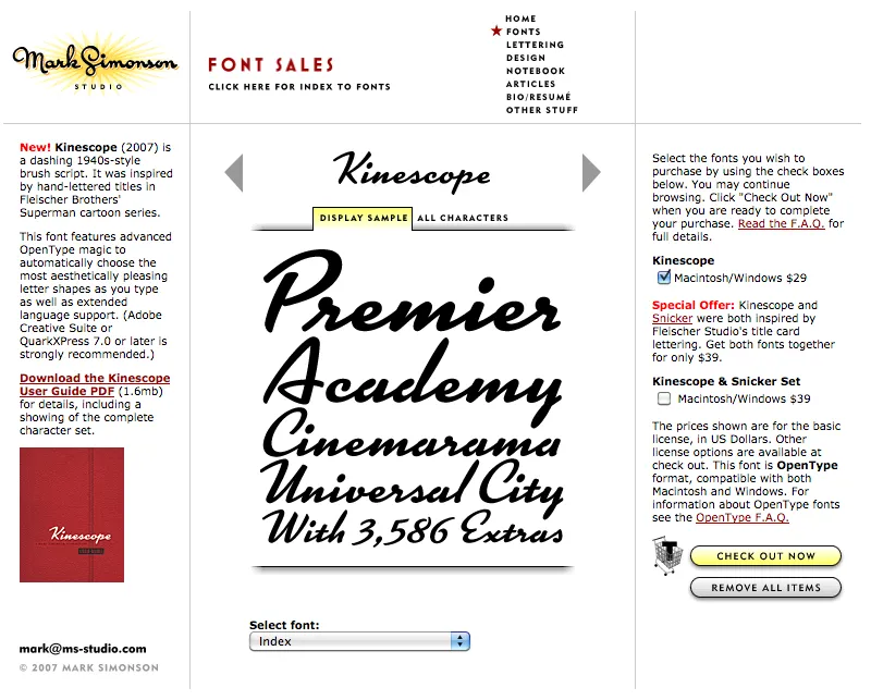
Party like it’s 2007. Note the shopping cart on the right side.
At one time, early in the history of Mark Simonson Studio, I sold fonts directly from my website. This was back in the early 2000s when there weren’t a lot of options.
I started selling fonts on the web in 2000 using third-party sites, first through Makambo (which closed its doors not long after I signed up), followed by MyFonts (2001), FontHaus (2001), Agfa/Monotype (2004), FontShop (2005), and Veer (2005).
In 2004, I decided to also sell fonts directly, using a service called DigiBuy, letting me get a bigger part of the retail font price, but also to simplify the purchasing experience for customers.
It was good while it lasted. Quite often, my site brought in more income than my best distributors for a given month. But in 2007, DigiBuy was shut down. The alternative they offered was tailored for selling shareware software, and was a poor fit for selling fonts. At the time, my distributors were doing well enough for me, so I made the hard decision to stop selling fonts directly and sell only through third parties.
Fortunately, my distributors soon took up the slack. And, to be honest, I was glad to have the burden lifted from my shoulders. When you sell direct, that means doing customer support. As a one-person business, this was taking a lot of my time. The new arrangement let me spend more time working on fonts. It was a fair trade-off.
Fast forward to 2021, and Mark Simonson Studio is now part of The Type Founders. TTF has the resources to bring direct sales back, and that’s just what they’ve done. If you have a favorite vendor, by all means use them. But if you want to get your fonts direct from the source, now you have that option.
The way it works is, each font page has various “buy” buttons. Click on any of these and a slide-over will appear that lets you select license types, term or other options (if applicable), and which fonts you wish to purchase. Note: Click on the styles to add them. Once you’ve made your selection, click on the “Add to cart” button. You can check out immediately or close the slide-over if you want to select other fonts before checking out. Once you’re ready to check out, just follow the instructions.
If you’re not sure what kind of license to choose, this page should help. My standard licenses for desktop, web, and apps can be seen here.
And if the kind of license you want is not one of these standard ones, drop an email to info@marksimonson.com.
Pretty simple. (Well, as simple as it can be.)
But that’s not all: Remember the static style previews I’ve had on my site for the last ten years? Gone, replaced with live, editable font previews for each style. This makes it easy to see if a font will work for, say, a company name or a headline.
Note: A few of the typefaces listed on my site are not available for direct sales, because I did them for another type foundry who own the fonts. These include Diane Script (Fonthaus), the Filmotype fonts, and HWT Konop (Hamilton Wood Type/P22). Links to where you can purchase are provided. And of course, you can’t buy Anonymous Pro because it’s free to use.
Finally, the list of fonts is now in alphabetical order, instead of newest releases first, which should make it easier to find the fonts you’re looking for.