Mark’s Notebook - Page 4
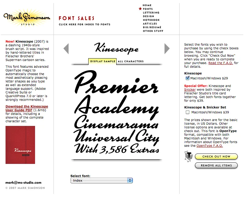
Party like it’s 2007. Note the shopping cart on the right side.
At one time, early in the history of Mark Simonson Studio, I sold fonts directly from my website. This was back in the early 2000s when there weren’t a lot of options.
I started selling fonts on the web in 2000 using third-party sites, first through Makambo (which closed its doors not long after I signed up), followed by MyFonts (2001), FontHaus (2001), Agfa/Monotype (2004), FontShop (2005), and Veer (2005).
In 2004, I decided to also sell fonts directly, using a service called DigiBuy, letting me get a bigger part of the retail font price, but also to simplify the purchasing experience for customers.
It was good while it lasted. Quite often, my site brought in more income than my best distributors for a given month. But in 2007, DigiBuy was shut down. The alternative they offered was tailored for selling shareware software, and was a poor fit for selling fonts. At the time, my distributors were doing well enough for me, so I made the hard decision to stop selling fonts directly and sell only through third parties.
Fortunately, my distributors soon took up the slack. And, to be honest, I was glad to have the burden lifted from my shoulders. When you sell direct, that means doing customer support. As a one-person business, this was taking a lot of my time. The new arrangement let me spend more time working on fonts. It was a fair trade-off.
Fast forward to 2021, and Mark Simonson Studio is now part of The Type Founders. TTF has the resources to bring direct sales back, and that’s just what they’ve done. If you have a favorite vendor, by all means use them. But if you want to get your fonts direct from the source, now you have that option.
The way it works is, each font page has various “buy” buttons. Click on any of these and a slide-over will appear that lets you select license types, term or other options (if applicable), and which fonts you wish to purchase. Note: Click on the styles to add them. Once you’ve made your selection, click on the “Add to cart” button. You can check out immediately or close the slide-over if you want to select other fonts before checking out. Once you’re ready to check out, just follow the instructions.
If you’re not sure what kind of license to choose, this page should help. My standard licenses for desktop, web, and apps can be seen here.
And if the kind of license you want is not one of these standard ones, drop an email to info@marksimonson.com.
Pretty simple. (Well, as simple as it can be.)
But that’s not all: Remember the static style previews I’ve had on my site for the last ten years? Gone, replaced with live, editable font previews for each style. This makes it easy to see if a font will work for, say, a company name or a headline.
Note: A few of the typefaces listed on my site are not available for direct sales, because I did them for another type foundry who own the fonts. These include Diane Script (Fonthaus), the Filmotype fonts, and HWT Konop (Hamilton Wood Type/P22). Links to where you can purchase are provided. And of course, you can’t buy Anonymous Pro because it’s free to use.
Finally, the list of fonts is now in alphabetical order, instead of newest releases first, which should make it easier to find the fonts you’re looking for.
I’ve been using a Mac for all my design, illustration, lettering, and type design work since the mid-1980s. I embraced it fully and enthusiastically, before it was really even ready sometimes. It made so many things easier and faster. Why would you ever go back once you had experienced the power of “undo”?
I grew up in the analog world, the time before ordinary people had access to computers and digital technology. The most high-tech things in my life were television and the space program (which I saw mainly on television).
The kid who could draw
When I was young, I drew a lot. I had my first piece in a public art show when I was in kindergarten. Sometimes, my first-grade teacher would let me stay inside and draw instead of going outside for recess. When I was in 4th grade, all five of my entries in a Post Cereal drawing contest won prizes. That year, I also started taking oil painting lessons. By the time I was in high school, I was very good at drawing, cartooning, and painting. I consistently got A’s in art class, won awards, and was clearly heading for some kind of career in art.
I majored in art and graphic design in college and initially had ambitions to become a commercial illustrator, given my talent for drawing. But graphic design, lettering—and even type design—also appealed to me. In my first job out of college, I was hired as a graphic designer at a small advertising art studio. I also did illustration jobs on the side for local magazines and newspapers in Minneapolis. My career soon veered into magazine art direction, where I hired illustrators, and my illustration career never really took off.
The digital world
After I bought a Macintosh in 1984 and started using it for creative work, I found myself using the analog tools I grew up with less and less. All the tricks and techniques I’d learned as a young artist were becoming obsolete very quickly. I was drawing less, painting less, and, without realizing it, taking those skills for granted. I could still do it if I wanted to, I told myself.
I tried using graphic tablets, attempting to transfer some of those skills into making art on a computer. Whatever the reason was, drawing on a tablet has never felt the same to me. The immense flexibility and power of computer graphics software has always has felt impoverished and ephemeral next to the richness of physical art tools and media.
Even so, I turned my back on the old ways and embraced the digital.
Admittedly, this has worked out very well for me. I wouldn’t have succeeded as a type designer any other way.
But, as time went by, not just my work, but more and more of my life (and almost everyone’s life) became centered on the digital world, especially with the rise of the internet, and the always-on internet. And with the iPhone, the always-with-you internet. And now they want to put it right in your field of vision with VR/AR, and ultimately a chip in your head. The digital world seems hell-bent on supplanting the physical world.
This used to sound “cool” to me. It seemed like the logical path in human-computer interaction. But I’m not so sure anymore.
We’ve been accepting all this, little by little, because of the convenience. Each step of the way, it’s “so much easier” than the old way. Everything in the world at your fingertips. All the music, all the movies, all the shows, all the art, all the time. Make a mistake? Undo! Change your mind? Redo! Dropped your laptop in the lake? No problem. It’s in the cloud!
But at what price?
I’ve become increasingly skeptical of the digital world as a healthy or desirable place to spend time. Not to mention all the tracking and surveillance that has crept in, the psychological damage of social media, and the rise of “subscription” models where you have to pay for an app indefinitely to maintain access to your documents.
I’ve also grown wary of how much time I spend sitting in front of a computer screen, even for doing creative, useful things (as opposed to YouTube, social media, or other time-wasters). As I get older, time is getting more precious to me. Do I really want to spend it sitting and staring at a screen?
Reconnecting
Getting back into drawing has been on my to-do list for a while. Maybe 20 years. I felt like I was letting my drawing talent waste away, rarely using it anymore. I was spending more time watching videos or reading books about drawing than actually drawing. I tried different things over the years (including joining a group that gets together once a month to draw cartoons), but nothing seemed to work in any sustained way. It’s almost like I’d given up, but didn’t want to admit it to myself.
But recently, I heard about a book called *The Artist’s Way,*by Julia Cameron. One of the things she recommends is to write “morning pages” first thing every day. Most of the rest of the book didn’t really seem to apply to my situation, but this “morning pages” thing got to be a habit, and got me thinking more deeply (through the writing) on improving my relationship with “screens” and getting back to drawing regularly.
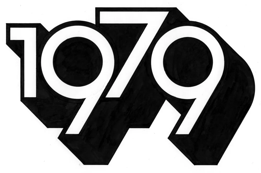
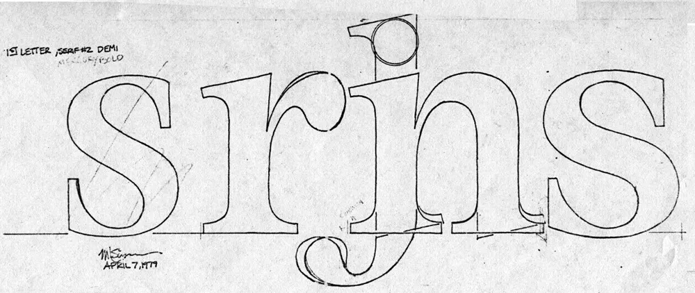
1979
One of these insights revolved around the year 1979. In my mind, that year signifies the twilight of the analog world, just before the dawn of the digital era. Things in my 1979 world were entirely analog.
I was 23 years old. The tools of my craft were T-squares, rubber cement, ink, Zip-a-Tone, technical pens, X-acto knives, ellipse templates, markers, illustration board, dividers, Letraset, photostat cameras, and phototypesetting. I listened to music on a Pioneer turntable and a JVC AM/FM receiver. I watched TV on a 13” Panasonic. Cable TV and VCRs weren’t really a thing yet. My telephone was connected to the wall. If I was away from my apartment, I was unreachable. My apartment was filled with inexpensive furniture I’d made myself (thanks to the books Instant Furniture and Nomadic Furniture). I designed and built my own desk/drawing table. I had a 35mm camera and a Polaroid SX-70. I had books and magazines to educate and entertain myself. And a guitar. If I need a photo reference in order to draw something, I’d go down to the picture section at the Minneapolis Public Library.
It might sound terrible to someone who has never known life without the internet, but I miss it. I miss not being surrounded by things trying to get my attention. I miss the simplicity of the way things used to work. You learned to find your way around. You didn’t need GPS. Doing art was a physical, direct, visceral experience—even commercial art.
Don’t get me wrong, I wouldn’t actually want to live that way now. I love technology and gadgets, and all the things they can do for me. But thinking about what things were like in 1979 reminds me that life is perfectly possible without all our modern “conveniences” and their hidden costs and unseen consequences. For instance, my old drawings and artwork could be lost in a fire or flood. But they may well still be around hundreds of years from now, and they won’t need any special device or software to be seen. Whereas my PageMaker files from 1995 are already virtually inaccessible (I have ways, but you get the point). Not to mention degradation of digital media over time, rendering the contents of disks, hard drives, and SSDs unreadable sooner or later.
I’ve come to realize the value of making physical things, the richness of analog art vs. the weightless, scaleless, ephemeral nature of digital art. I’m obviously not the first person to think this. There are books about it. But the trade-offs of the digital world have been growing larger in my mind.
Drawing again
Another insight from my “morning pages” has been discovering a way to trick myself into drawing again. I have a habit of listening to podcasts or videos. Basically, draw at the same time—piggyback on that habit. It’s so simple, I don’t know why it never occurred to me before. I guess I had in my mind that I needed to devote time to do draw, and only draw. And I could never quite make the time. Something else would always seem more important or easier.
But it worked, and now I’m drawing again every day. The old confidence is back (which I didn’t even realize had gone) and it’s been very satisfying. Lack of undo actually increases the enjoyment. Things are at stake. Getting to the end of a drawing without undo is immensely rewarding.
And I’m spending less time staring at screens. In fact, I thought of a way to remind myself to get into “1979 mode.” During my drawing session the other day, I designed and lettered the year “1979” in a style similar to lettering I was doing back around 1979. And I did it only using tools that were available to me in 1979 (yes, I still have them): pencils (for the sketch and the under-drawing), erasers, illustration board, masking tape to hold the board down, circle template, dividers, ruler, triangles, Ulano Glide-Liner (like a T-square, but attached to the table), Higgins Black Magic ink, a Koh-I-Noor Rapidograph, a fine sable brush, and a bit of white water color paint to fix some mistakes.
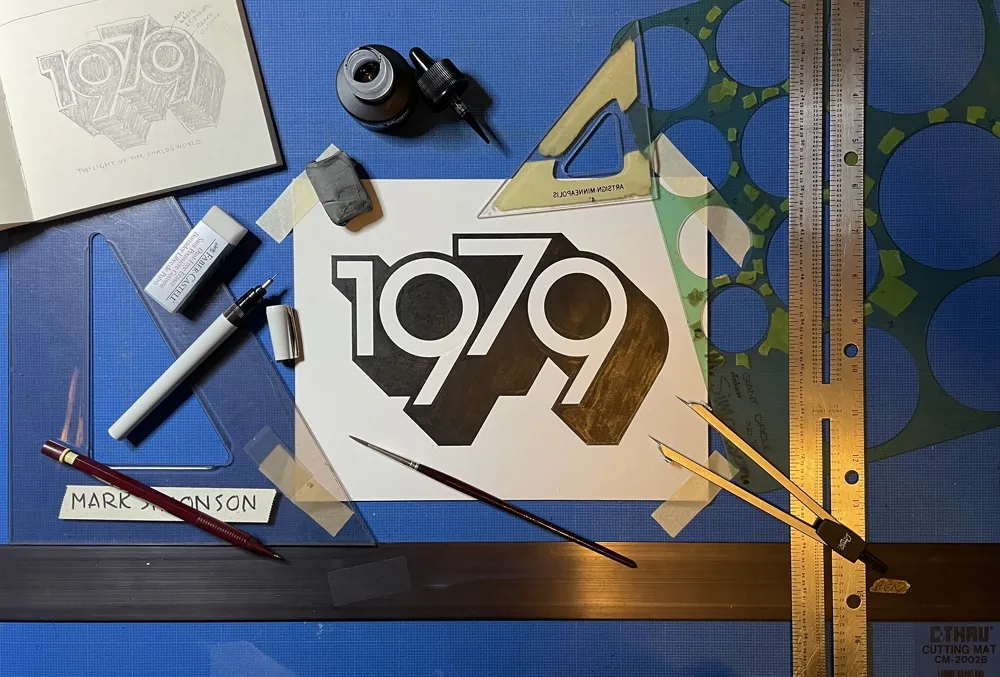
It took about two hours in all—10 minutes to do the sketch and the rest to render it. On my Mac, I could have done the whole thing in a couple of minutes—and with no mistakes. But it would have been much less satisfying when I was finished. And I’d be tempted to fiddle with it endlessly.
So, now I have this little bit of lettering tacked up on my wall to remind me to keep things real, to get my head out of cyberspace once in a while and connect with reality. To remind me I don’t need a computer to draw a picture. I just need some paper and a pencil.
The digital world has its place. You can do amazing things in it (like publishing a blog post). But don’t spend all your time there. It’s not the real world.
It’s been nearly ten years since I last posted an item under the “typecasting” category here. (Although it’s not like I’ve been posting a lot here in any category recently, other than new font announcements.) To refresh your memory, these were articles and blogposts calling attention to anachronistic use of type and lettering in movies and TV shows.
Today I got an email from Steve Heller alerting me that I was mentioned in an interview he did with Eric Rosenberg, who made the typographic props for the recently released movie Babylon. In it, Eric mentions my criticisms of two movies he worked on, The Hudsucker Proxy and *Almost Famous,*and the email exchange we had about it in 2009.
The props Eric made for Babylon are amazing, and would get five stars if I covered it in a typecasting post. Getting a mention in this interview made me think: Why haven’t I posted a single typecasting item since 2013?
The first thing that comes to mind is that maybe I’ve lost interest in the subject. Maybe I’ve made my point and moved on to other concerns. There’s some truth to this.
But I think the real reason is that it just doesn’t happen as often as it used to. You just don’t see as much anachronistic type and lettering in movies as you did when I first wrote Typecasting: The Use (and Misuse) of Type in Movies in 2001 and later my “Son of Typecasting” blog posts.
I have a theory why that is—and I don’t think it’s because of my article. (Although, I like to think maybe it was, a little.)
The real reason came up in my email exchange with Eric back in 2009.
He pointed out that when prop makers had access to Macs and PCs that could set type in the ’90s, thanks to the desktop publishing revolution, it had detrimental effect on props. In those early days, the selection of fonts was small, especially for period-appropriate ones. You ended up using less appropriate fonts, if only because that’s all there was. The result was a wave of typographic anachronisms that got my attention and led to my article in 2001.
But it wasn’t permanent. Things improved. There are hundreds of times more fonts available now and it’s much easier to find period-appropriate typefaces. It’s not like anachronistic choices don’t happen anymore. It’s just become a lot less common. I happened to have noticed it during its peak in the early 2000s.
Nowadays, I don’t see anachronistic type in movies and TV shows anywhere nearly as much I used to. Which is why I haven’t felt a need to write about it for a while. I don’t think that’s a bad thing. Things just got better. A lot better.
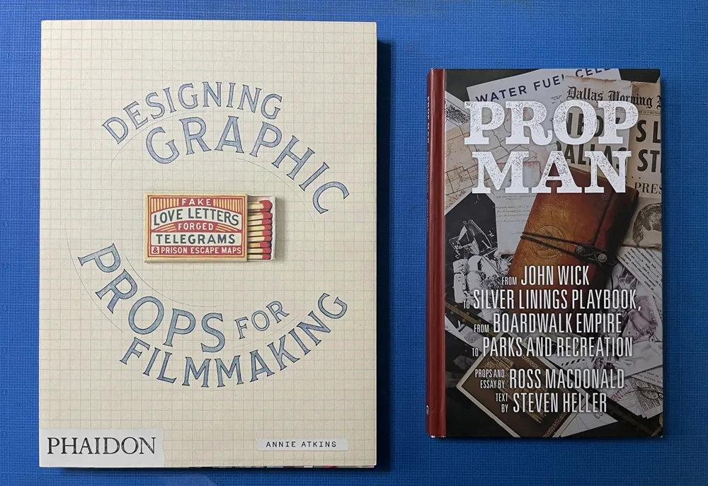
So much so that there are articles and books about people who do this for a living: Annie Atkins’ Fake Love Letters, Forged Telegrams and Prison Escape Maps, which covers in exhaustive and beautiful detail her work on Wes Anderson’s Grand Budapest Hotel, and Prop Man, an overview of the work of illustrator and designer Ross MacDonald with text by Steve Heller.
If anything, we’re witnessing the renaissance of a once overlooked specialty area in filmmaking, replete with superstars.
And anachronistic type in movies? It doesn’t seem to be much of a problem anymore.

I’ve been interested in the classic script style of the early 20th century for as long as I’ve been drawing letters. It was commonly used in logos and trademarks, meant to convey the idea of a signature. Think: Ford. Coca-Cola. Coors. Blatz. Schlitz. Rainier. Campbells soup. Any number of baseball clubs. The style was revived in the 1960s, sometimes evolving into psychedelic or pop-art forms.
There have been fonts from time to time based on this script style, but quite often they have more of a sixties or seventies look. I decided to try my hand, hoping to get closer to the early 1900s feel.
In 2004, I pitched the concept to House Industries. They liked idea, and we made a deal to develop the script, along with a sans and a serif, all with a “sports” theme.
Working with Ken Barber, I was impressed with his commitment to quality and detail. I thought I was an okay type designer at the time, but my experience with Ken significantly raised my standards on all the fonts I’ve done since then. Unfortunately, the project languished due to other priorities at House and was eventually put on hold.
Around 2012, I decided to resume work on the script on my own. At that point, only the lowercase and a few caps had really been drawn, and I was really itching to design the rest of the caps.
In 2017, I showed Ken what I’d been up to with the script. I asked if he thought House was ever going to get the project going again, and, if not, could we amend the agreement to allow me to release it myself? Long story short, House agreed.

With the script fully in my hands, I stepped up the pace to finish it. Five years later, the result is Dreamboat.

Back when I was working on it with House, there was only a single bold weight. To provide more flexibility for designers, I expanded this to six—Light, Regular, Semibold, Bold, Extrabold, and Black. (Dreamboat might be the only script in its genre with such a wide weight range.)

One of the things that bug me about a lot of script typefaces is lack of a solution to situations where you need to set something in all caps, such as roman numerals or acronyms. For that I added small caps.

There is also a stylistic set which raises the cross-bar of the lowercase “t” and extends it for more of a custom look.

To top it off, Dreamboat includes three styles of tails—an element quite often used with bold scripts.
Check out the User Guide to see how it all works. Tip: Many of my vendors have type testers where you can type your own text and see how it looks. The tails work by typing one or more underscores at the end of a word. Just make sure that ligatures are enabled on the site (sometimes they are not).
I never dreamed when I started that it would take nearly 20 years to finish Dreamboat. But, to be honest, I’m glad it did because it was really beyond my skills when I first started working on it. It’s been one of the most enjoyable typefaces to design, and I’m excited to see what people will do with it.
Dreamboat is available at all the usual places for desktop, web, and other uses.
Not long after I released Proxima Nova in 2005, people started asking me: “What serif font would work best with Proxima Nova?” It’s very common to combine serif and sans serif typefaces, usually a serif face for text and sans serif for larger sizes or for emphasis or change of tone in text. I usually suggested a modern, such as Century Schoolbook, or a slab serif, such as Rockwell. None of my suggestions felt like a satisfying answer to me, so I started thinking about designing a serif sibling to Proxima Nova.
After some false starts over many years, trying to add serifs to Proxima Nova somehow, I decided instead to create a serif companion—a face that is not simply a seriffed version of Proxima Nova, but a serif typeface designed to harmonize with Proxima Nova, while having its own structure and identity, similar to the way that Morris Fuller Benton’s Century faces harmonize with his Franklin Gothic and News Gothic.
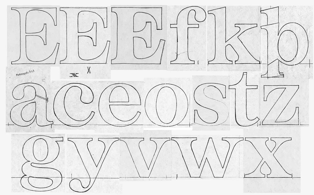
Back in 1979, when I was first dreaming about making typefaces, and around the same time I had the earliest ideas for what would become Proxima Nova, I did some sketches based on the concept of combining the characteristics of several popular serif typefaces—Times, Plantin, Century, and Baskerville—but with proportions similar to Helvetica. The working name was “Metropolis.” Proxima Nova was based on a similar hybrid concept, but with sans serif typefaces. The idea of using something that came out of the same period and the same thinking as my concept for Proxima Nova made sense.

In 2020, I went to work and adapted “Metropolis” as a companion to Proxima Nova, changing some of its details and proportions to harmonize better with its sans serif counterpart. The overall style falls more squarely in the modern category than my 1979 concept, but it retains some old style elements, such as the spurless serifs on the C, G, and S and the structure of the numerals.
The result is Proxima Sera.

Proxima Sera 1.0 contains a subset of the Proxima Nova character set (Greek and Cyrillic are still to come), but it has all the same features—small caps, old style figures, alternate characters, etc. There also is only the regular width. Condensed and Extra Condensed will come later. It has all the same weights, from Thin to Black, plus one more—Extralight.
Proxima Sera works beautifully with Proxima Nova. But, of course, like Proxima Nova, it can stand on its own or play nice with other fonts.
Proxima Sera is available immediately for licensing at most of the usual places.
Have you ever wondered what serif font would work best with Proxima Nova? I’ve often been asked this question, and I never really had a good answer.
That’s about to change.
I’ve been working on something new and I’m going to be talking about it for I Love Typography’s inaugural Font Fashion Week which celebrates the latest trends in type design today. I will be giving a 30 minute online talk on April 5, 2022 to showcase what I’ve been working on and the process that went into its creation, and I invite you to attend (click here to attend). The talk is free and you may share this link with friends and colleagues if you think they would be interested.
Hope to see you there!
Update: It’s Proxima Sera. You can watch the talk on Youtube now or read it alongside my slides.