Mark’s Notebook - Page 25

Typedia (typedia.com), a shared, online encyclopedia of typefaces, just launched today.
It’s the brainchild of Jason Santa Maria, who invited me to contribute when it was in its early planning stage. I helped mostly with the classification system. (I actually have mixed feelings about classification systems in general and I think the tags will be ultimately more useful. But the classifications will at least provide a starting point.)
I’m very excited about Typedia. I’m hoping it will be the online equivalent of resources like Matt McGrew’s American Metal Typefaces of the Twentieth Century or Jaspert, Berry & Johnson’s Encyclopeadia of Type Faces, two books I rely on when I want to know the history of a typeface (see my Son of Typecasting series).
However, unlike a printed book, Typedia will be continuously updated and will grow in its usefulness as more and more people contribute to it.
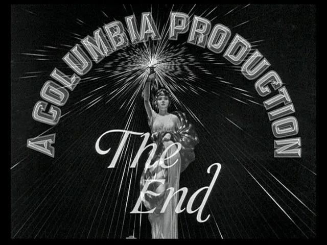
A while back, I posted a link to one of my favorite site’s, Steven Hill’s Movie Title Screens Page, “shillpages” for short. As wonderful as it is, there’s an even better one: Christian Annyas’ The Movie Title Stills Collection. It has a lot of the same material, but it’s much better organized, and also includes end titles and trailer titles.
One thing to keep in mind: Nearly all the titles that were done before the 1960s were hand lettered. Type was just too inflexible and limiting back then, so it was standard procedure to hire a lettering artist. In other words, don’t ask me what “font” was used for The Big Sleep or The Thin Man. Incidentally, if you want lettering, I can help with that.
(A big thanks to Johno of I Love Typography and We Love Typography for telling me about the Annyas site.)
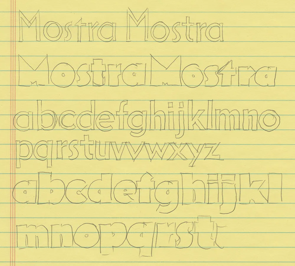
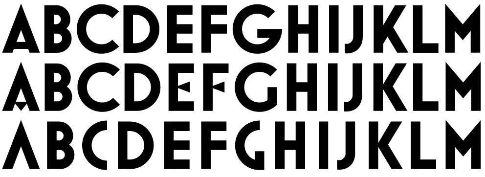
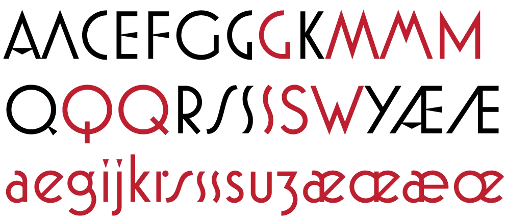
Mostra (2001) was originally conceived as a caps-only font. The source for its inspiration, lettering on Italian Art Deco posters from the 1930s, rarely included lowercase letters. Nevertheless, not long after I released it, I started thinking about what a lowercase for it might look like.
As OpenType fonts grew in popularity and acceptance, an OpenType version of Mostra, with its many alternate characters, seemed inevitable. Separating the alternates across three fonts for each weight was the only practical solution back in 2001. This worked okay, until you wanted to combine alternates from the separate fonts. It’s simply not possible to provide kerning pairs between characters in different fonts. And I did intend for the fonts to be used in this way, not only as separate fonts.
When it came time to develop an OpenType version of Mostra, combining the three fonts into one was the main idea, and it would have been simple enough to go that route, but then I remembered the idea of adding a lowercase. After making some trial designs, I decided it was worth the extra effort.
Of course, it takes time to add all those new characters, and the mind tends to wander. Before I finished designing the lowercase, I had thought of even more alternate characters for the uppercase. And, of course, many of these required analogs for the lowercase as well. Upshot: Lots of new characters.
And then I decided to add a sixth weight. I’d been looking at some hairline fonts for some reason and I suddenly thought, wouldn’t it be great if Mostra Nuova had a hairline weight? Yes, it would.
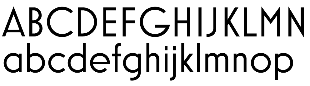
Mostra had 26 capital letters plus 15 alternates. Mostra Nuova has 52 upper- and lowercase letters plus 40 alternates. In the original version, the number of possible letter pair combinations was 650. The number of letter pair combinations for Mostra Nova is 8372. This meant that the number of kerning pairs needed would increase by more than ten fold. Times six weights. This didn’t quite sink in until I was well into kerning. Did I mention that I thought I expected to be done last April? But it was worth it in the end.

Of course, Mostra Nuova has much better language support, covering most Latin-based languages in Western and Central Europe. It also has a special feature so that when you change something to all-caps, things like hyphens and bullets are automatically centered on the height of the caps rather than the lowercase.
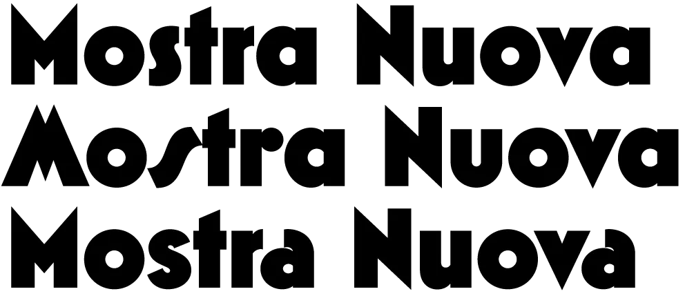
All in all, Mostra Nuova is a much more versatile font than its predecessor. Available now.
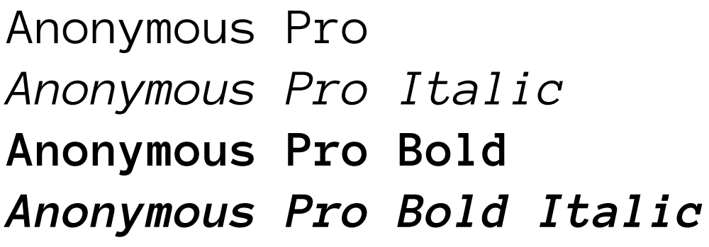
I announced back in April that a new version of my popular free font Anonymous™ would be available soon. That would be today.

Probably more than you ever wanted to know, but it was fun rummaging through my old stuff to piece the story together.
(Thanks, Brian!)
I saw the new Star Trek movie this last night and was thrilled to spot one of my fonts, Changeling, in a supporting role. Here are some examples from a couple of high resolution publicity stills for the movie:
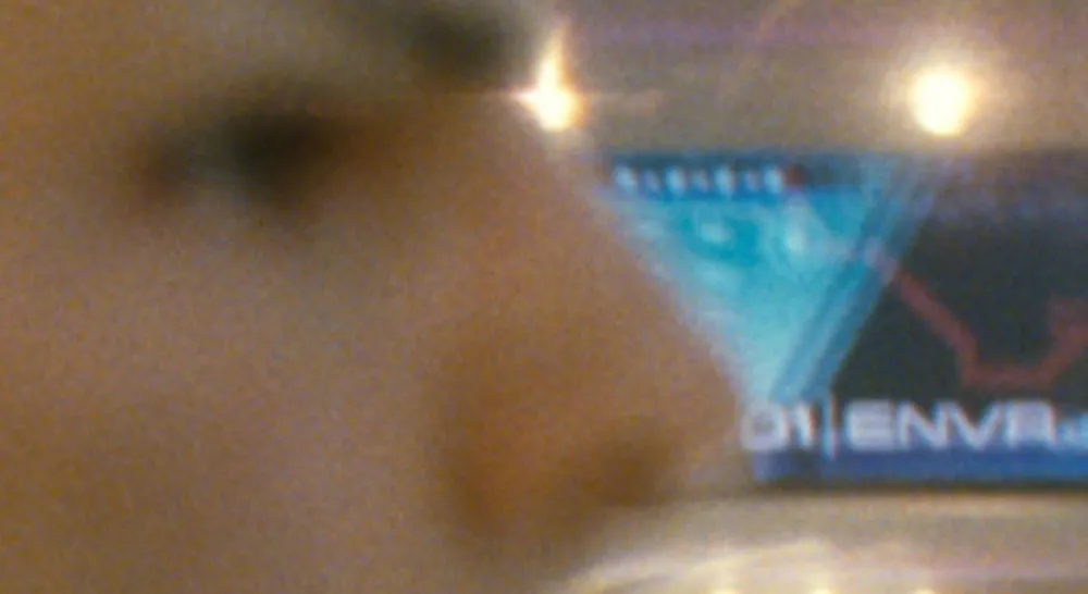
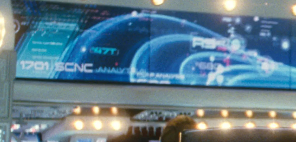
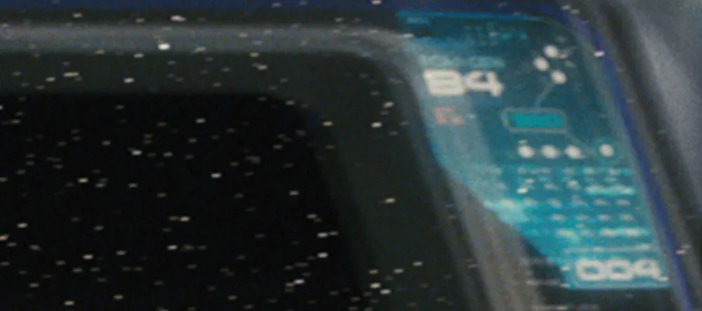
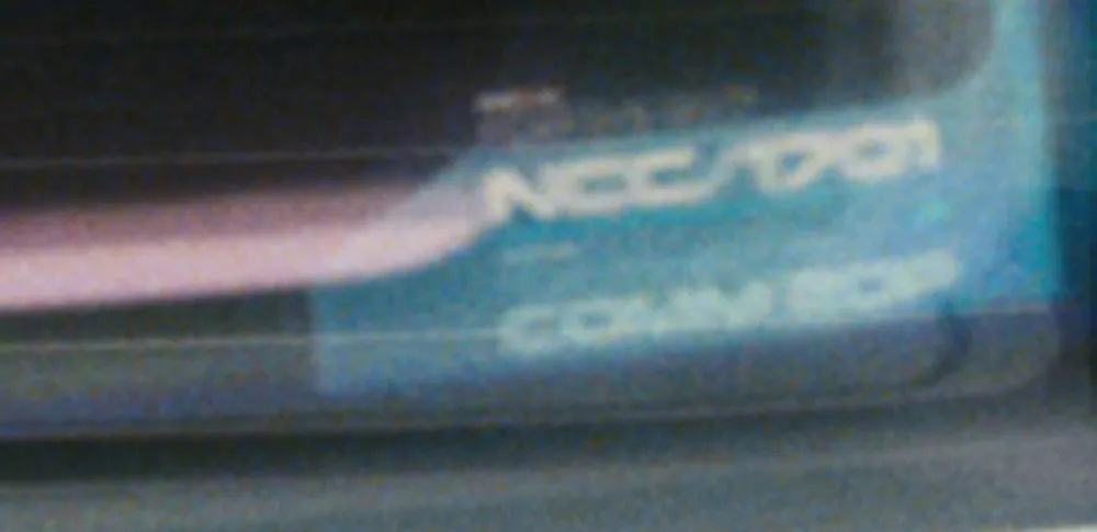
Changeling was a redesign and expansion of an old film font from the seventies called China. I added more weights, more styles, and more characters, as well as modifying the design as I saw fit. One of the more noticeable things I changed was the “4”, which is how I know it’s Changeling that was used in the film.
What’s funny about all this has to do with my choice of the name “Changeling”. It contains all the letters in the name “China” (I added things to it, get it?). A “changeling” refers to something that comes back in a different form, and this was a font coming back in a different form. It’s also the title of an episode from the original Star Trek t.v. show, something I was aware of when I chose the name—the sci-fi connection made me like the name even more, because of the way the font looks. Finally, that particular Star Trek episode was the basis for the first Star Trek movie.
Needless to say, I was in several kinds of geek heaven last night.