Mark’s Notebook - Page 26
Proxima Nova stars in a new animated short film by Brent Barson, sponsored by Veer: “F is for Fail” (and co-starring Adobe’s Arno Pro). The still from the film (above) sums up my reaction. Well done, Brent! (And thanks to Veer, too.)
I’m really honored to have my Lakeside and Filmotype Zanzibar among the 40 typefaces chosen in Typographica’s “Our Favorite Typefaces of 2008”. Thanks so much, Dyana and J.F.
I participate in this annual tradition from the other side of the fence as well. I chose Nick Shinn’s Modern Suite, which blew me away when I saw the specimen book for it at last year’s TypeCon in Buffalo.
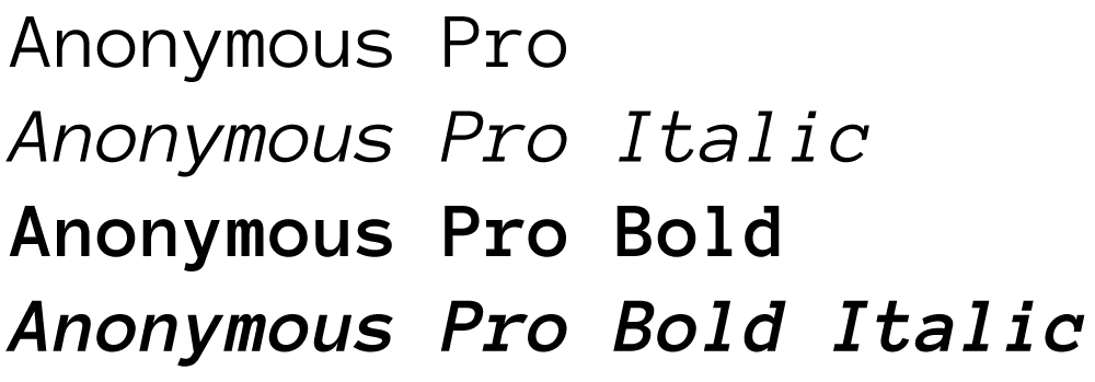
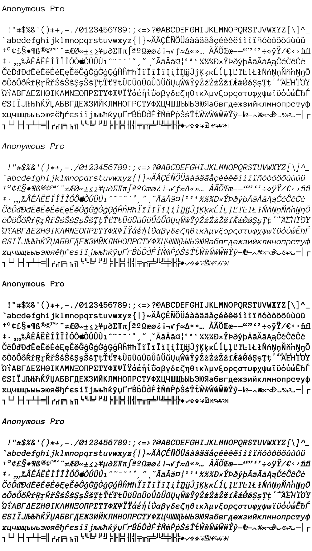
This has been in the works for a while now. I released the current version of Anonymous in 2001, with a few tweaks and updates since, but nothing you could call a major new feature.
In fact, there have been numerous requests for features from users, and many of these have been incorporated into Anonymous Pro, such as:
-
Bold and italics, making it a complete four-style family
-
Expanded character set, covering most Latin-based languages, as well as Greek and Cyrillic
-
Metrics adjusted to make it more similar in size to other fonts
-
Several characters redesigned for better readability and clarity
-
Many small improvements to the overall design of the characters
-
Box-drawing characters—you never know when you might need them
I’m still in final testing, but I expect to release Anonymous Pro soon. [Update: Anonymous Pro is available now.] And, like the current version, it will be free. Here is a sneak peek:
The results of a survey on the meanings of the words typeface and font among both “type industry professionals” and graphic designers, conducted by Thomas Phinney. My opinions on the matter fall squarely with the “type industry professionals” for the most part.
(via Typophile.com.)
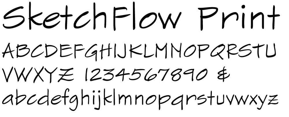
I’ve recently been working on a font for Microsoft called SketchFlow Print. It will be bundled with the next version of Expression Blend, part of Microsoft’s Expression Studio suite. A new feature of the program, called SketchFlow, allows a designer to create a prototype of an application that looks like a sketch, and it comes with fonts to support that look. Christian Schormann, one of the brains behind the app, demoed SketchFlow at MIX09, and you can see SketchFlow Print in use throughout his presentation.
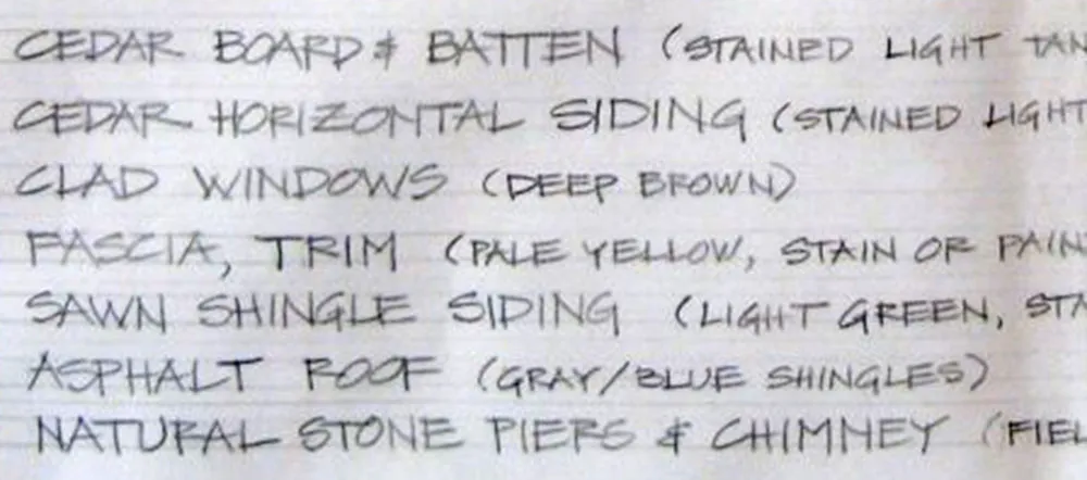
The idea for SketchFlow Print came from Doug Olson at Microsoft, who wanted a typeface in the style of lettering used by architects. There are already many “architect” fonts, but none of them had the natural, lively look he wanted. Doug had worked previously with talented residential architect Michaela Mahady of SALA Architects, Inc., and was taken by her lettering. She agreed to let it be the starting point for SketchFlow Print and provided samples for me to work from.
Typefaces based on handwriting can be tricky because typefaces are unnaturally consistent compared to real handwriting. This problem is sometimes overcome by using multiple variations of common letters, which can then be substituted automatically or manually to avoid obvious repetitions. Fortunately, Michaela’s handwriting is quite neat and consistent already, so we decided to keep it simple and just have one version of each letter. The challenge for me was to make subtle changes to minimize conspicuous patterns or disruptions in the overall texture, without resorting to alternates or draining the life out of it. All of us are pretty happy with the way it turned out.
Sorry for not posting more stuff here lately. I’ve been busy working on fonts (probably a better use of my time anyway). In the mean time, here is another interview with me, this time with Grant Friedman of ArtBistro.com.