Mark’s Notebook - Page 2
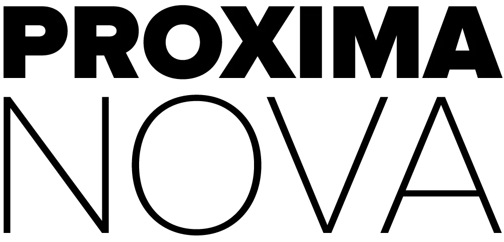
It’s always nice to hear that Proxima Nova has become a go-to for so many people. I designed it to bridge the gap between geometric sans serifs like Futura and workhorse grotesques like Helvetica—something versatile, readable, and a bit more human. Apparently, that combination struck a chord.
From time to time, I get asked if there are fonts similar to Proxima Nova. It might seem a little odd to recommend alternatives to my own work, but over the years, type and graphic designers have been very generous to me — so I’m happy to highlight some of the great work happening in that same space. Every designer benefits from having a diverse library of well-made typefaces to choose from.
I asked my colleagues at The Type Founders to pull together a list of fonts that share some of the same qualities people often look for in Proxima Nova: a balance of geometric and grotesque structure, wide family versatility, and clean everyday usability. In addition, they’ve helped aggregate fonts that pair well with Proxima Nova, that may be of interest. I’ll hand it off to them from here.
Thanks to Mark for inviting us to share this list. At The Type Founders, we spend a lot of time immersed in type, and we regularly get to see which fonts designers reach for as alternatives to Proxima Nova. The following recommendations reflect some of our favorites—versatile, well-crafted typefaces that live in a similar space.
Fonts Similar to Proxima Nova
Franklin Gothic by American Type Founders

Sometimes the classics are classics for a reason. Franklin Gothic was one of Mark’s original references when designing Proxima Nova. Mark van Bronkhorst’s re-digitization brings it into the present day while preserving the warmth and utility that made it so influential.
Forma DJR by David Jonathan Ross

A contemporary revival of a mid-century neo-grotesque, Forma is crisp, rational, and elegantly structured. Where Proxima Nova leans warm and humanist, Forma is cooler and more deliberate. It’s a strong choice for clean editorial work or minimal branding systems.
IvyEpic & IvyGothic by Ivy Foundry


These companion families from Jan Maack each offer a unique spin: IvyEpic is cinematic and modern, while IvyGothic blends historical grotesque flavor with contemporary polish. Both work well for designers who want to add style while staying in the Proxima Nova wheelhouse.
Sundry by J Foundry

Sundry veers more humanist than Proxima Nova, with open counters and relaxed curves. It feels casual but refined, and retains a similar sense of everyday usability.
Datei Grotesk by Kontour

Datei Grotesk is stripped-down and precise, with a mechanical tone and tight spacing. Its minimalism and strength make it ideal for publication or information design, especially where typographic structure carries the weight.
Bruta by &Discover

Bolder and more architectural than Proxima Nova, Bruta channels a squarer, industrial tone. It offers a similar versatility but with more bite—great for impactful layouts that still need balance.
New Hero by Newlyn

Designed for signage and wayfinding, New Hero is clean, sharp, and purposeful. Compared to Proxima Nova, it’s a touch more angular and assertive—ideal for digital interfaces or any application where clarity is key.
Shapiro by OGJ Type

Shapiro blends a neo-grotesque foundation with refined styling and subtle quirks. It feels tailored and polished, especially in display sizes. If Proxima Nova is your body text standby, Shapiro could be your next headline font.
Gibbs by Typetanic

Gibbs is a smart, editorial take on the workhorse sans. It’s ideal for print—book covers, magazines, and longer-form reading—with a tone that feels both contemporary and rooted. It also shares Proxima Nova’s structural clarity and balance.
Draft by Yellow Design Studio

Draft walks a similar line between geometric and grotesque, with slightly narrower proportions and sharp, thoughtful terminals. It’s crisp, modern, and highly usable across UI and editorial contexts alike.
Choosing the Right Alternative
When evaluating a Proxima Nova alternative, consider which aspects matter most to your project:
- Do you need an extensive family with multiple weights and widths?
- Is it the geometric-meets-grotesque balance that stands out?
- Do you want something with similar proportions but a different personality?
It’s worth noting that Proxima Nova includes alternate characters and stylistic sets that can subtly shift its tone. Designers might find what they need within those features before switching typefaces entirely.
Some of the fonts above shine at display sizes, while others are optimized for body text. Each brings its own perspective on utility and tone—just like Proxima Nova.
FAQs: Fonts Like Proxima Nova
What Google font is similar to Proxima Nova?
Fonts like Montserrat and Nunito Sans share some qualities with Proxima Nova and might work well when budget is a concern. They lack the breadth and refinement of premium families, but are often solid choices for web projects.
What about Adobe Fonts?
Adobe Fonts includes strong options like Franklin Gothic and Forma DJR. Both share structural traits with Proxima Nova and offer wide utility within the Adobe platform.
What’s the closest font to Proxima Nova?
Draft by Yellow Design Studio and Gibbs by Typetanic come closest in feel and versatility.
Is Proxima Nova a free font?
No. Proxima Nova is a premium font family, though it is included with Adobe Fonts for Creative Cloud users.
What makes Proxima Nova so popular?
Its balance of friendliness and professionalism, extensive family range, and versatility in both display and text make it a modern classic.
Can I use Proxima Nova as a web font?
Yes. It’s available via Adobe Fonts and direct license from Mark Simonson’s site.
What is the best font pairing with Proxima Nova?
Serif companions like Chaparral, Mercury Text, Minion, Georgia, or Miller complement Proxima Nova’s rhythm and modern tone beautifully.
Closing Thoughts
Thanks for reading—I hope this list gave you some new directions to explore.
Before we wrap up, I’ll offer one personal recommendation of my own: Synergy, a typeface I designed that shares some of Proxima Nova’s practical versatility but with a very different sensibility. Synergy draws more from the Swiss modernist tradition and has slightly more condensed proportions, giving it a more formal, constructed tone.
It’s not meant to be a direct replacement, but if you’re looking for something clean and professional with a little more edge, it might be a good fit.
Typography today offers a wealth of options, and it’s a pleasure to see how designers use and interpret them. Whether you stick with Proxima Nova or branch out to something new, I appreciate you including my work in your process.
Looking for more insights about typography and font selection? Check out my other articles on geometric sans serifs and font pairing strategies.
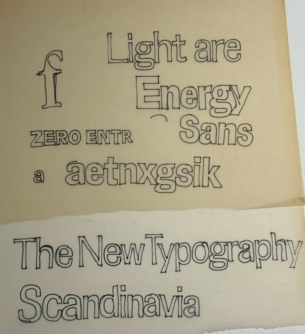
Sketch from about 1981.
Synergy started as an idea I had about 1981. I found a couple of sketches in my collection of typeface ideas going back to the seventies, which I started scanning and organizing in 2009. I don’t remember a lot about this particular idea except that I was aiming for a “Scandinavian” feel (whatever that meant to me at the time) and that the 1970s Allstate logo was an influence.

Early drafts.
I thought it was a promising idea and did a draft of the lowercase in a couple of weights in 2012, then another draft in 2018, which included capitals and a full range of weights from very thin to very bold, using three “masters.” (Masters are used in modern type design to generate intermediate weights automatically from a small set of key drawings.)

Weights and styles of Synergy.
Then, in 2024, I decided to complete the design, adding a set of italics for all weights and features such as small caps and old style figures.
Synergy is basically a neo-grotesque along the lines of Swiss faces such as Univers, but with a two-story “g” more characteristic of British and American models. This wasn’t a deliberate decision, but I think the constraints I gave myself—even somewhat narrow proportions, squarish curves, squared-off stroke endings—steered me in that direction. I think I succeeded in giving it more warmth than this type of design usually has, thanks to some subtle details in the curve endings, and the two-story “g” relieves the monotony in text.

The two-story “g” and subtle details in the curved stroke endings are reminiscent of British grotesques.
I was careful to make sure Synergy works well in text in the middle range of the weights. It also works for display use, and the extreme weights (Hairline, Thin, and Ultra) are intended exclusively for that.

A text sample.
Synergy has nine weights. If that’s not enough, there is also a variable version. It features small caps (with matching punctuation) and old style figures in all styles. It has support for most Latin-based languages and currencies, arbitrary fractions, and a set of matching dingbats.

A small sampling of the character set.
Synergy is available now. More information here.
When I decided to sell the rights to my library of fonts to The Type Founders in 2021, one of the big reasons for me was the ever-growing burden of maintaining and developing that library.
As a one-person studio, there was only so much I could do. Proxima Nova had become very popular since I released it in 2005, and I regularly got requests to expand its language coverage.
At first, I did this task myself, adding support for Greek and Vietnamese in 2009 and Cyrillic in 2010. Even though I can’t read languages that use these writing systems, they were close enough to the Latin alphabet that I felt sufficiently confident to design them. But I’ve always felt out of my depth as a type designer even thinking about designing non-Latin fonts.
Still, I could see that adding even more language support would make a lot of sense for such a popular type family. Theoretically, I could hire other designers and production people to help, either as employees or as contractors. But that would mean managing those people, something I know I’m not very good at.
I like working by myself, and I would rather spend my time working on new typefaces.
It was around the time I was thinking about these problems back in 2019 that I was approached by Paley Dreier (now Managing Partner of The Type Founders) about selling my font library. It was something I’d never thought about before, but I eventually realized that it would be a neat solution to my problems. I would be relieved of the burden of maintaining and expanding my existing fonts, giving me time to focus on designing and releasing new fonts—which is what I’ve been doing for the last few years, with the release of Proxima Sera, Dreamboat, Proxima Nova Wide and Extra Wide, Viroqua, Cheesecake, Madcap, Gertie, and Skin & Bones. In fact, I’m currently working on a new sans serif family, the first since Proxima Nova, if you don’t count display faces.
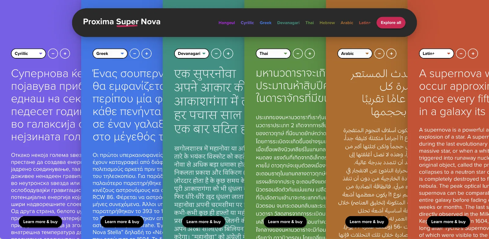
In the meantime, The Type Founders has been working to expand language support for Proxima Nova, with the aid of some really talented type designers from around the world. We’ve dubbed the fruits of this effort Proxima Super Nova.
In addition to most Western and Eastern European Latin, Greek, Vietnamese, and Cyrillic, Proxima Nova now supports Arabic, Devanagari, and Thai (both looped and loopless). More writing systems are in the works, including Hebrew and Hangeul.
Check out the Proxima Super Nova mini-site to find out all about it.
If you have any questions, are interested in extended or enterprise licensing, or need additional language support or customizations, get in touch! Send a note to info@marksimonson.com
A big thanks to the following people:
Proxima Nova Thai: Smich Smanloh of Cadson Demak
Proxima Nova Devanagari: Vaibhav Singh and Alessia Mazzarella of Typeland
Proxima Nova Arabic: Khajag Apelian and Wael Morcos
The mini-site: Elliot Jay Stocks (site design and content development) and Roel Nieskens (site development)
Project management and production support: Glenda Bellarosa and Dyana Weissman
Last week I did a talk for Type Tuesday in Minneapolis where I did a live demo of early font editors on a real Macintosh Plus. I’ve uploaded a video recording of it on YouTube, or you can watch it here.
6/27/24 Update: I’ve also posted a video about the story behind the Mac Plus I used for my Type Tuesday talk:
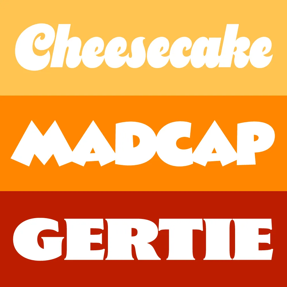
I took a break from my usual practice of working on larger families to create a trio of heavyweight display typefaces: Cheesecake, Madcap, and Gertie. They come from different historical periods—and different periods in my life.
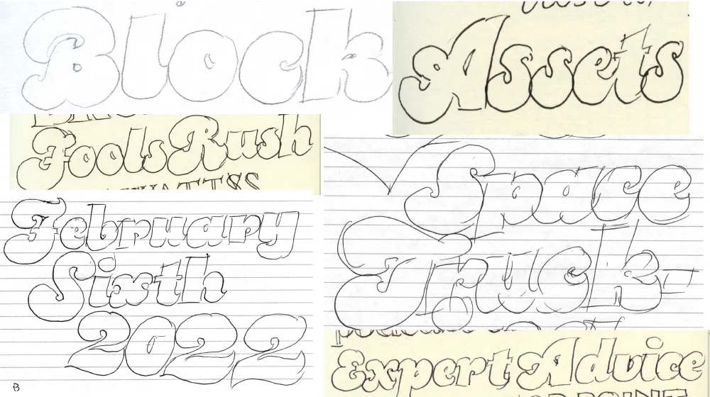
Cheesecake is the most recent design. It bubbled up from my subconscious over the last ten years while I was working on Dreamboat. Like Dreamboat, it’s a “bold script” style, but it has more in common with 1970s lettering and fonts, and is a simpler design without any need for fancy OpenType magic in order to set properly.

I tried to push the weight as far as I could without sacrificing legibility. It has an alternate lowercase “s” (in case you’re not into that old-school cursive form) and a set of matching dingbats and symbols.
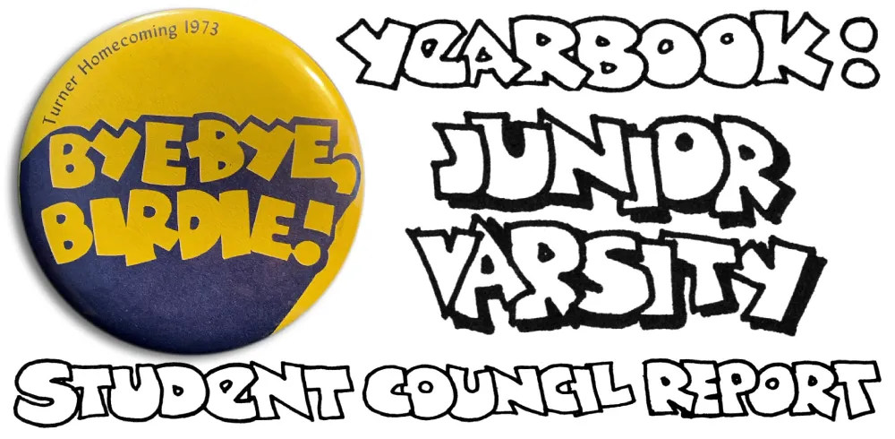
Madcap goes back to my high school years in the early seventies, before I was even thinking about type design. I worked on student publications and often did lettering in a cartoony, all-caps style, with overlapping letters. I was influenced by vintage MAD magazine and Hallmark and American Greetings’ psychedelic period.
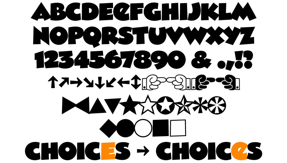
Madcap has a few special features: An alternate lowercase-style E and a set of matching dingbats and symbols.
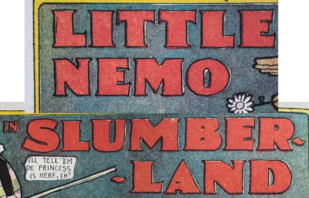
Gertie is a design that’s been in the back of my mind since the late nineties. The inspiration is Winsor McCay’s distinctive lettering in his iconic Little Nemo comic strips from the early twentieth century. Think of it as Copperplate Gothic on steroids. The name comes from McCay’s 1914 animated short Gertie the Dinosaur—the first fully-realized animated cartoon character.

As an all-caps design, it can be awkward to set words and abbreviations that normally contain lowercase like “McCAY” or “4th” or “Co.” So I’ve included a set of raised caps for those situations. And it works with more than one letter in a row. You can also use it for the cents part of prices. Like Cheesecake and Madcap, it includes a set of matching dingbats and symbols.
All three fonts are available now.
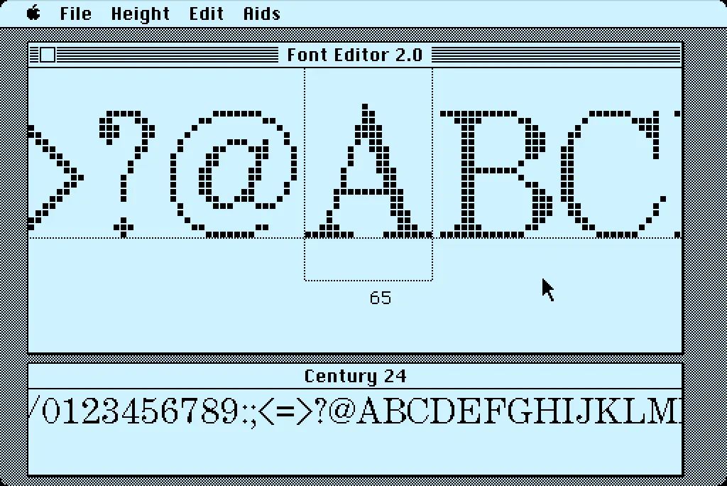
In 1984, I bought one of the original 128K Macs. A big draw for me was how it could display multiple fonts—proportional or fixed-width—anywhere on its screen. I desperately wanted to make my own fonts for it. This was before modern PostScript/TrueType/OpenType fonts, back when there were only “bitmap” fonts—fonts composed of discrete black and white pixels.
That summer, I read about an Apple developer tool called Font Editor 2.0 and sent for a copy of it. It was crude and crashed easily, but it allowed me to make my first Macintosh bitmap fonts. (A little later, AltSys released FONTastic, which was better in every possible way, including being less crash-prone.)
Recently, I fell down the rabbit hole investigating and reacquainting myself with Font Editor 2.0. I wound up making a user guide and a video demo and walk-through. I also prepared some disk images you can use with a real 128K or 512K Macintosh computer or an emulator, such as Mini vMac if you want to try it out for yourself.
I’m planning to make more videos about early font development on the Mac in the near future on my YouTube channel.