Typecasting: The Use (and Misuse) of Period Typography in Movies
Chocolat (2000, Mirimax) wasn’t a bad movie. It managed to get five Academy Award Nominations. But if they gave out Oscars for Best Type Direction, it would not have been among the nominees.
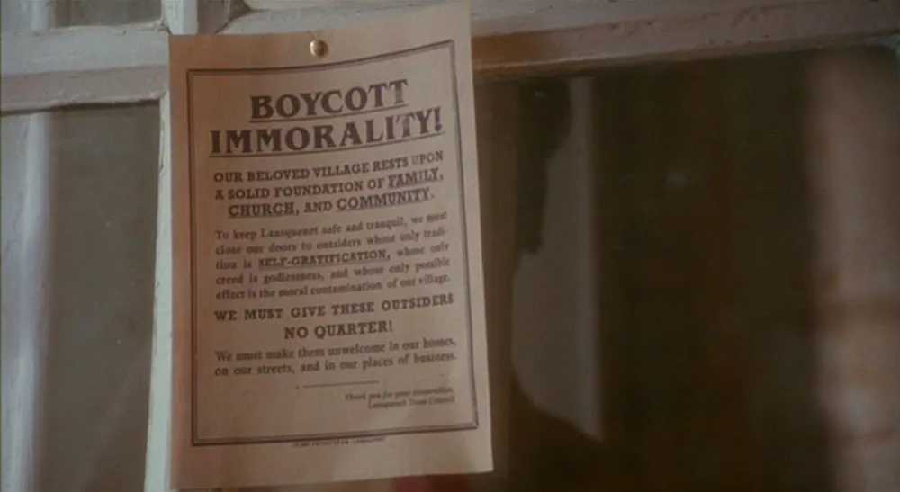
The movie is set in a small town in provincial France, mid-1950s. About halfway through the film, the town’s mayor puts up notices forbidding anyone to eat anything but bread and weak tea during Lent (which of course coincides with the opening of the new chocolaterie). I almost laughed when they showed a close-up of the notice. The headline was set in ITC Benguiat, a typeface which debuted in 1978 and was mainly popular in the ’80s.
Perhaps the mistake is understandable. ITC Benguiat was designed in a quasi-Art Nouveau style. It is likely that Art Nouveau typefaces would still be in use in provincial France of the mid-fifties. But not ITC Benguiat. It didn’t exist.
Noticing little slips like this in movies can happen to anyone with knowledge in any specialized field. A friend of mine in high school was a telephone nut and liked to point out that the kind of phone booth that appears in a scene near the end of American Graffitti (1973) didn’t exist in 1962. To him it was as glaring as if they had had Paul Le Mat driving a Camaro.
It’s probably unrealistic to expect this level of attention to detail in movies. There are more important things to attend to in movie making. Besides, the number of people who notice things like anachronistic type choices is small. I’m sure they seldom complain.
Until now.
What follows is a brief survey of films that have caught my attention over the years for their use (or misuse) of period typography.
At the outset, I should point out that typefaces used in titles don’t necessarily count since they exist outside the world depicted in a movie. For instance, the movie Eight Men Out (1988) used the Emigré typeface Modula (1987) in its titles (designed by M&Co.). The movie is set in 1919. It may be debatable whether it was an appropriate choice, but it would be a matter of taste, not historical accuracy.
Ratings are given from one to five stars indicating how well type is used in the each film:
![]() Nearly perfect use of period typography; errors, if any, are difficult to find
Nearly perfect use of period typography; errors, if any, are difficult to find
![]() Good effort to use period typography; minor mistakes here and there
Good effort to use period typography; minor mistakes here and there
![]() Uneven use of period typography; major mistakes occasionally
Uneven use of period typography; major mistakes occasionally
![]() Little attention to period typography; period-correct type appears only on actual period artifacts
Little attention to period typography; period-correct type appears only on actual period artifacts
![]() No attempt at historically accurate typography; only free fonts from Apple or Microsoft were used.
No attempt at historically accurate typography; only free fonts from Apple or Microsoft were used.
Dead Men Don’t Wear Plaid (1982, Universal Pictures) In this case the movie is a parody of the film noir genre so the titles are part of the world the film portrays. The choices here, Newport (1932) and Brush Script (1942), fit the period, but the style of the credits feels wrong. In the forties, movie titles were usually hand-lettered on cards shown in sequence.
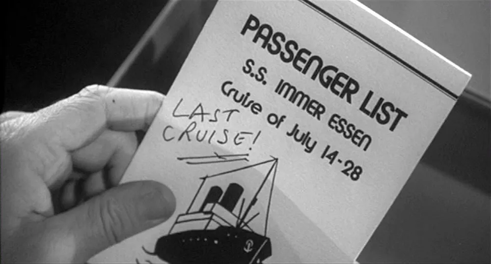
Apart from the titles, careful attention is paid to get details right. They even hired veteran Hollywood costume designer Edith Head (for which she won an Oscar) and created sets and lighting to blend with existing footage from classic films. The movie got a lot of praise for its attention to such details, but of course nobody mentioned the use of Blippo, a pop-art typeface from the early seventies, on the cruise brochure.
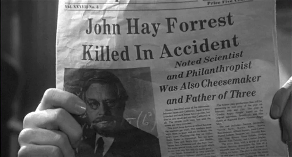
The newspapers seen in several scenes are also problematic. They look more like children’s readers than real newspapers.
On the other hand, the use of signs (especially the hand-lettered one in the medicine cabinet) is right on target. All in all, a very funny film, but spotty in its use of type. ![]()
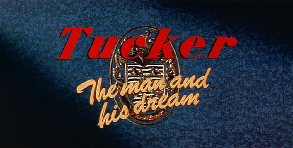
Tucker: The Man and His Dream (1988, Lucasfilm, distributed by Paramount Pictures). This was Francis Ford Coppola’s paean to Preston Tucker, the too-far-ahead-of-his-time automotive genius of the 1940s. If Tucker had had his way, all cars would have had seat belts as standard equipment by 1950 and we’d all be driving cars with steerable headlights. Three of them. In any case, this is a fine film, lovingly crafted, which does a credible job of recreating the post-war forties.
There’s not a lot of type in this film, but what there is is right on the money, including the titles, which seem as if they have been taken from an actual forties-era film. There are a lot of great signs (like the giant TUCKER factory sign), but there is one that isn’t quite right.
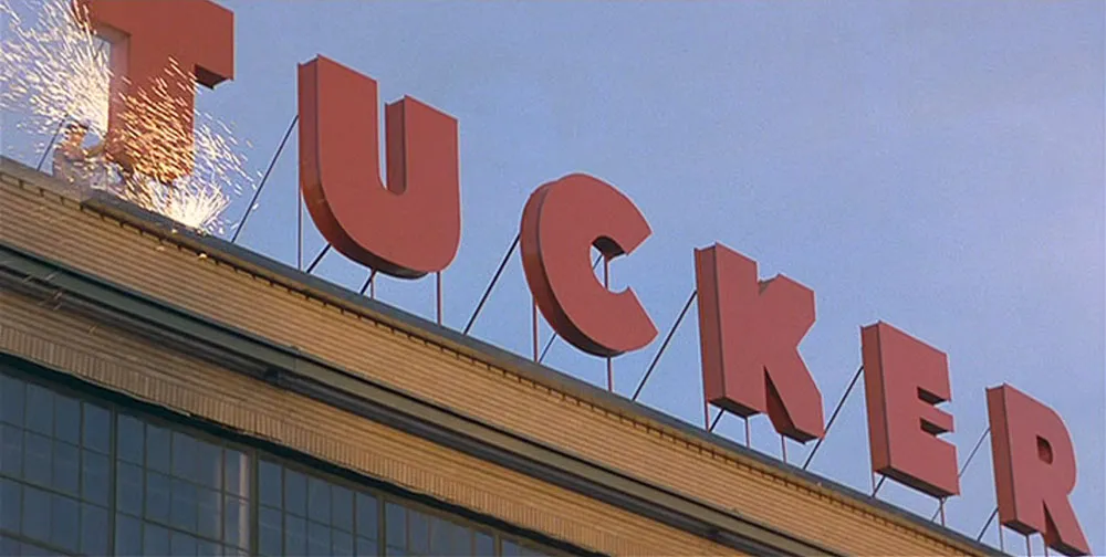
Tucker’s workshop on his family’s farm has a sign (below) set in large, three dimensional… Helvetica. Don’t know how they missed that one.
Although Helvetica (1957) is part of a long line of sans serifs that have been around since the late 1800s, it was not common to see such letterforms on American signs until at least the 1960s, especially in the generic way it is used in the movie. ![]()
Dead Again (1991, Paramount Pictures). Kenneth Branagh and Emma Thompson play a modern-day couple who are reincarnations of an ill-fated pair, one of whom was executed for murdering the other in the late 1940s. The titles feature a montage of close-ups of newspaper clippings chronicling the sad tale of the earlier couple.
The clippings are fairly well-done and even appear to be printed with letterpress, as most newspapers were until the 1970s. I noticed a few oddities, of course. First, while all the typefaces used were consistent with the era, the text type in the clippings was Caledonia, a book typeface that would be a very unlikely choice for a newspaper. Newspapers generally used (and still use), well, newspaper typefaces. The other thing is that although some of the headlines appear to be set with wood type—still a common practice in the forties—they are all very nicely kerned.
Technically, it was possible to kern wood type by physically cutting away parts of the type, but it would be a rather impractical practice at a newspaper. ![]()
Ed Wood (1994, Touchstone Pictures). I love this movie, but not for its use of type.
It starts out well, perfectly matching the lettering style of a real 1950s Ed Wood movie in the opening credits, but as soon as signs and newspapers start appearing, things just go downhill. Close-ups of newspapers feature headlines set in various members of the Helvetica family next to vintage headlines apparently taken from real newspapers (mostly Erbar Light, 1934).
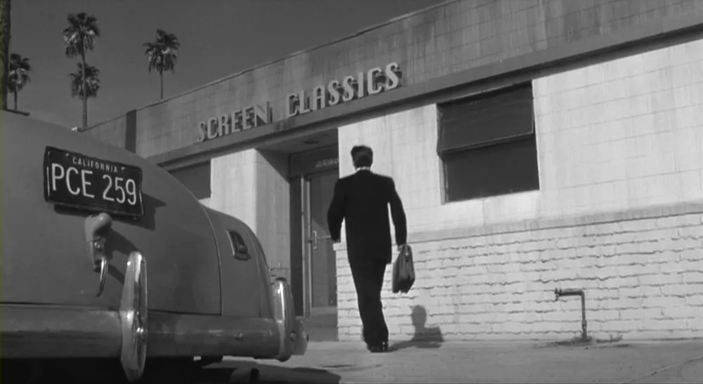
Even more implausible, some of them are optically distorted—a practice that didn’t become common until the advent of digital typesetting, and in fact would have been practically impossible in 1950s newspaper printing. Another glaring anachronism is the sign on the “Screen Classics” building which is set in Chicago, the original Macintosh system font (TrueType version, 1991). This is very strange to see, as the sign is composed of large, apparently hand-constructed three-dimensional letters mounted on the building.
Just as odd, the same logo is hand-painted on a window of a door inside the building. I’ve always thought that Chicago had an oddly Art Deco quality to it. Apparently some people think it is an Art Deco face.
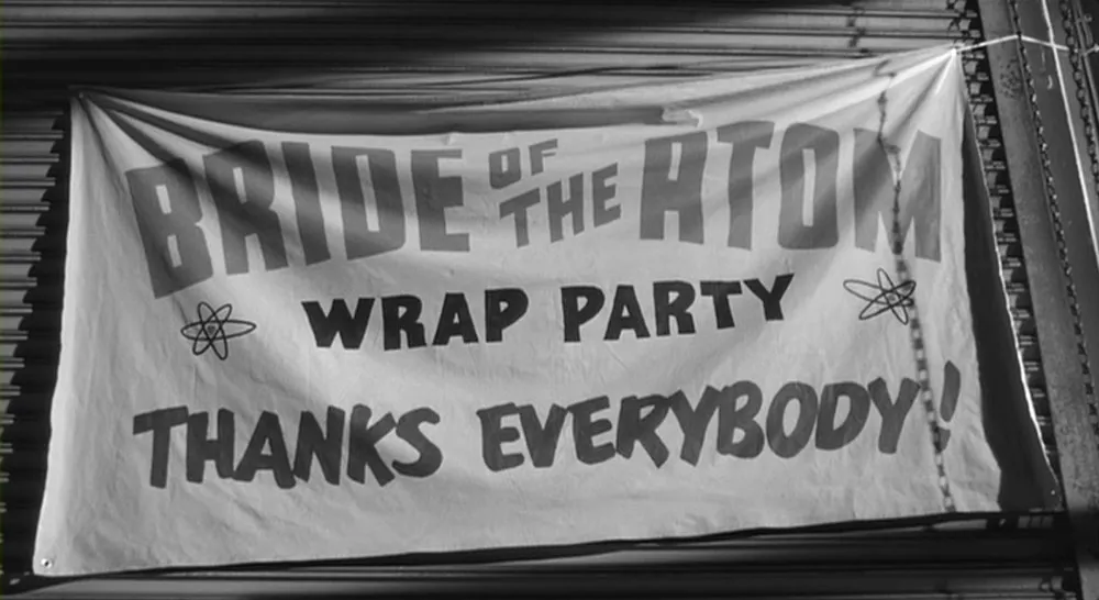
On the bright side, there are hand-lettered banners in a few scenes that are just exactly right. ![]()
The Hudsucker Proxy (1994, Warner Bros.). I’m a big fan of the Coen brothers’ movies and this is a favorite of mine. Typographically, though, their films are a mixed bag. One complication with critiquing the typography in this movie is that it’s difficult to say exactly what decade it’s supposed to be. According to the story, it’s set in the late fifties, but it often looks more like the forties, or even the thirties. Nevertheless, much of the typography is, at least technically, out of place. For the most part they’ve chosen typefaces that look the part but didn’t actually exist fifty years ago. A good example is the Hudsucker corporate logo which looks like it’s from the thirties or forties, but is actually set in Bodega Sans (1991).
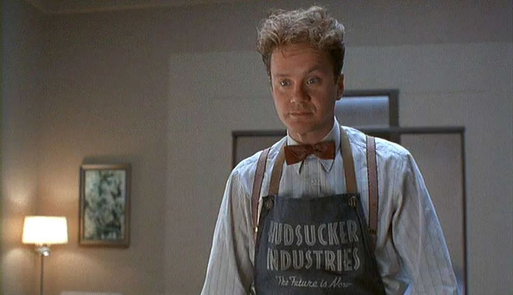
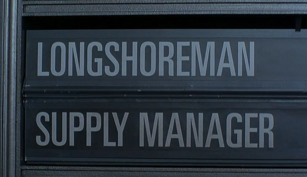
Also used a lot in the film is Univers, a sans serif face that—although released in 1957—was not a common sight until the late sixties, especially for such a pedestrian use as a mechanical job board, for example. ![]()
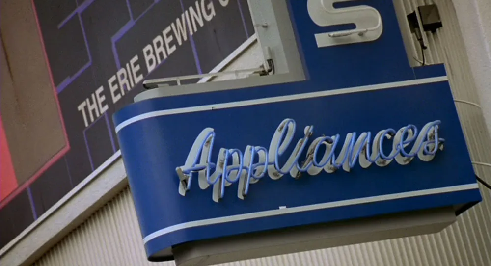
That Thing You Do (1996, 20th Century Fox). This is a fun movie to watch. Although I was only eight in 1964, this movie really seems to capture the look and feel of the period.
There really is a lot of attention to typographic detail: record labels, industry trade magazines, newspapers, even product packaging for cold remedies. Everything looks just the way it should.
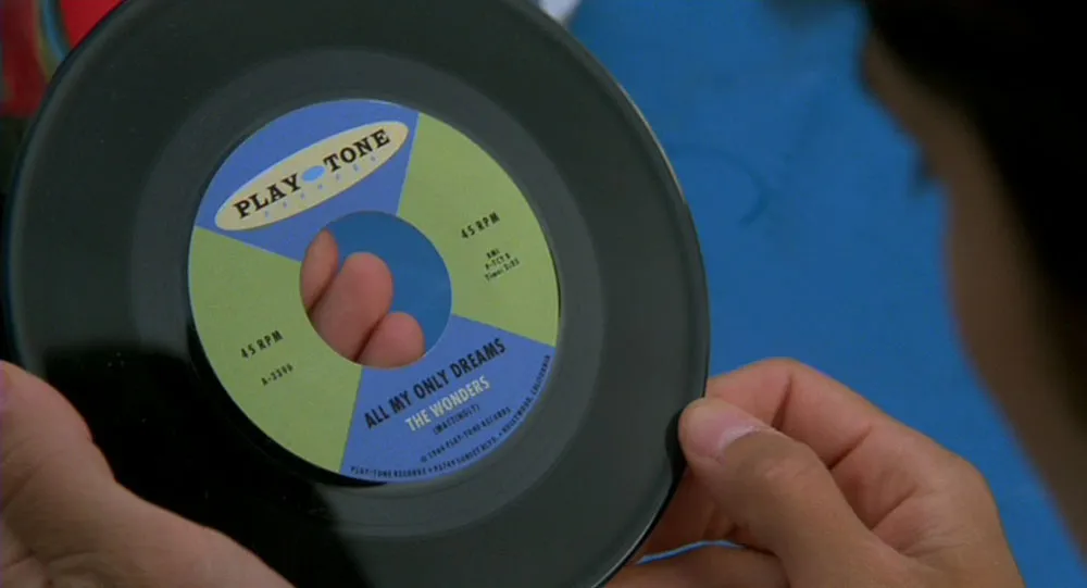
Somebody did their homework on this one (or spent a lot of time in vintage collectible shops). The Patterson’s appliance store looks like it belongs in the Smithsonian, it’s so accurate. I was only able to find one bit of type out of place: Early in the film, a billboard flashes across the screen briefly which has a few words set in Helvetica Bold.
Even this is only slightly implausible. ![]()
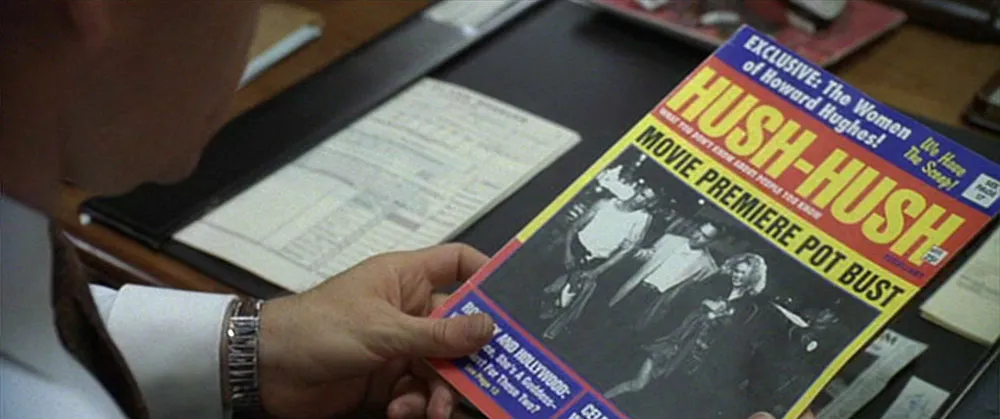
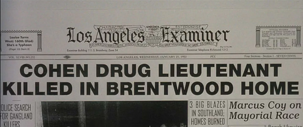
L.A. Confidential (1997, Warner Bros.). A highly regarded film, tightly written, well-acted, beautifully filmed, but pretty mediocre in its use of type. This one is set in the early ’50s, but the type was clearly not. “HUSH-HUSH,” a Hollywood gossip magazine, is featured prominently sporting a logo set in Helvetica Compressed (1974).
A newspaper dated 1953 has headlines set in Helvetica Black (1959) and Univers (1957)—typefaces which weren’t commonly available in the U.S. until the sixties.
Another newspaper has the word “EXTRA” emblazoned across the top in an optically expanded ITC Kabel Black (1976).
Granted, there are vintage bits of typography and signage here and there, but it appears that when it came to creating typographic props from scratch, they pretty much just guessed. ![]()
Pleasantville (1998, New Line Cinema). This is a film that seems to be obsessed with details, as if they expected it to be viewed under a microscope by nit-pickers like me.
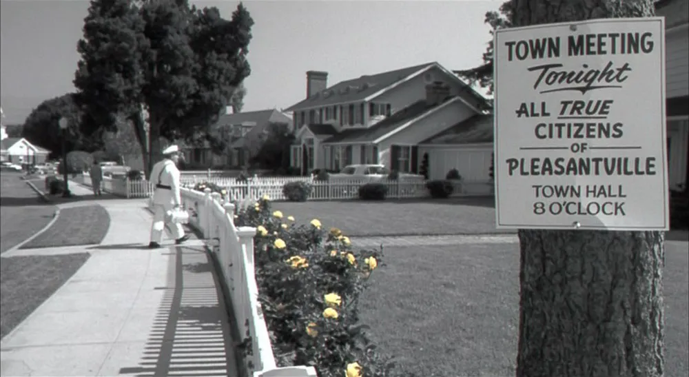
It seems almost too perfect in its period details—not the way the fifties actually looked, but the idealized way television portrayed it. There is actually very little type in this film. I thought I caught a slip up in an early scene—Comic Sans (1995) used in a pseudo-fifties-era promo spot on a quasi-Nick-at-Nite network—until I realized it was supposed to have been done in the present (presumably by designers trying not-quite-successfully to do a retro look).
If it was intentional, it was a very subtle use of type. There are a lot of nicely done hand-painted signs and banners and nothing much to complain about, at least typographically. ![]()
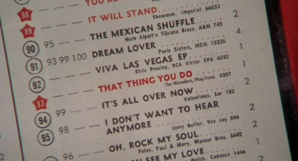
Almost Famous (2000, Dreamworks SKG). This is Cameron Crow’s fictionalized (and entertaining) account of how he started writing for Rolling Stone magazine. It’s supposed to be 1973, a year I remember very well. I have to say they did a very good job of capturing it, but then, it wasn’t that long ago. Still, there are ample opportunities for type flubs in a movie about a guy who writes for a magazine. Surprisingly, not a lot of type is shown on screen, and what little is shown is correct for the period (the pre-ITC version of Kabel Black for instance). Except for one little thing near the end of the movie. Had I not been an avid Rolling Stone reader back in the seventies, I might have missed it. There is a montage which includes a close-up of a stack of RS just dropped off at the newsstand. It features aspiring young writer Will’s triumphant first cover story.
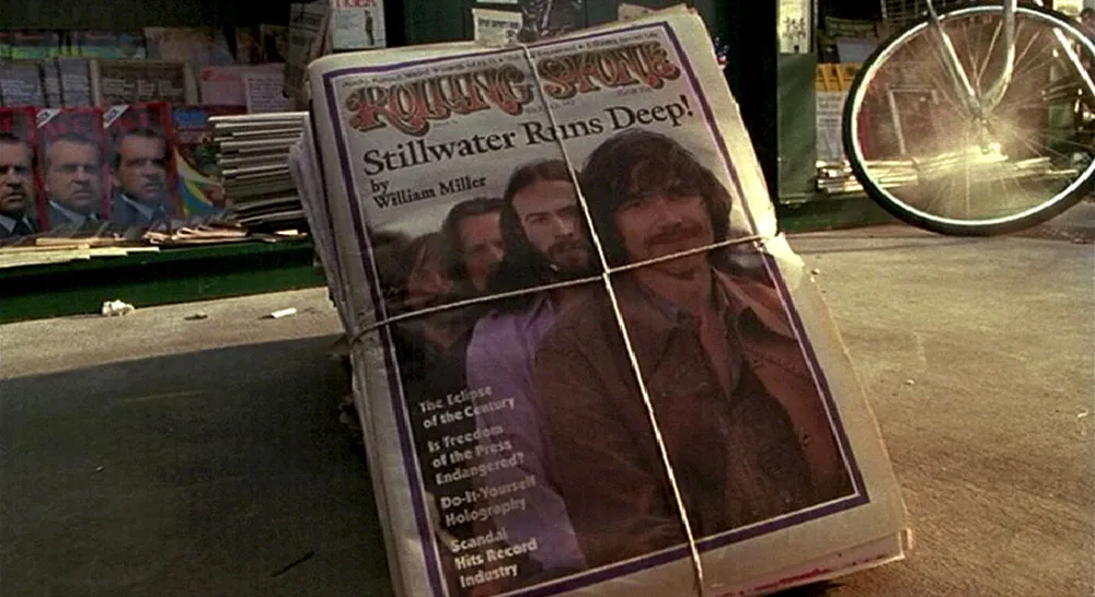
The logo and photo look fine, but the main headline is set in ITC Galliard (1978). In addition to the fact it’s five years too early, as far as I know it’s never been used on the cover of RS. [Reader Tim Horrigan also points out that RS was folded over with a smaller cover before 1974, and that the overall design is uncharacteristic for the magazine during that period. —MS] ![]()
* * *
Anachronistic typography in movies is certainly not one of the world’s pressing problems. At worst, it reflects badly on a film in a subtle way that suggests careless production values to the typographically aware, even when everything else is well-crafted. Getting the type right is not that hard, especially nowadays when so many historical typefaces are readily available in electronic form. Historical information on typography is easier to find than ever.
I hope to add more examples in a follow-up article. If you have any film/type gaffes to share, drop me a line.
Update 7/1/2004: In lieu of a follow-up article, I’m posting more examples in the new Notebook section, filed under Son of Typecasting.
See also:
Translations:
¿Habla usted español?