Introducing Refrigerator Deluxe

Refrigerator dates back to 1988 as one of my earliest PostScript typefaces. The concept was very simple: A blocky, condensed sans serif with rigidly geometric forms. I was inspired partly by Neville Brody’s Industria, but very quickly it veered toward more of a mid-20th century vernacular appearance. It wasn’t based on anything specific. Rather, it seemed to come from memories of block-style lettering from when I was young.

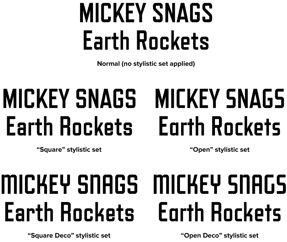
Refrigerator Deluxe (2008) extends the family from a specific vernacular style to an anthology of vernacular styles through the extensive use of alternate characters, nearly doubling the character count. (The alternate characters are accessed either through OpenType Stylistic Sets or the Glyph palette, depending on your software application). These range from squared off, closed shapes, with a minimum of angled strokes, to open, stylized shapes with more of an Art Deco feel. Using different combinations of these alternates, Refrigerator Deluxe can take on an endless variety of appearances from basic block to high style.

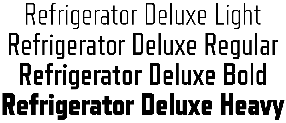
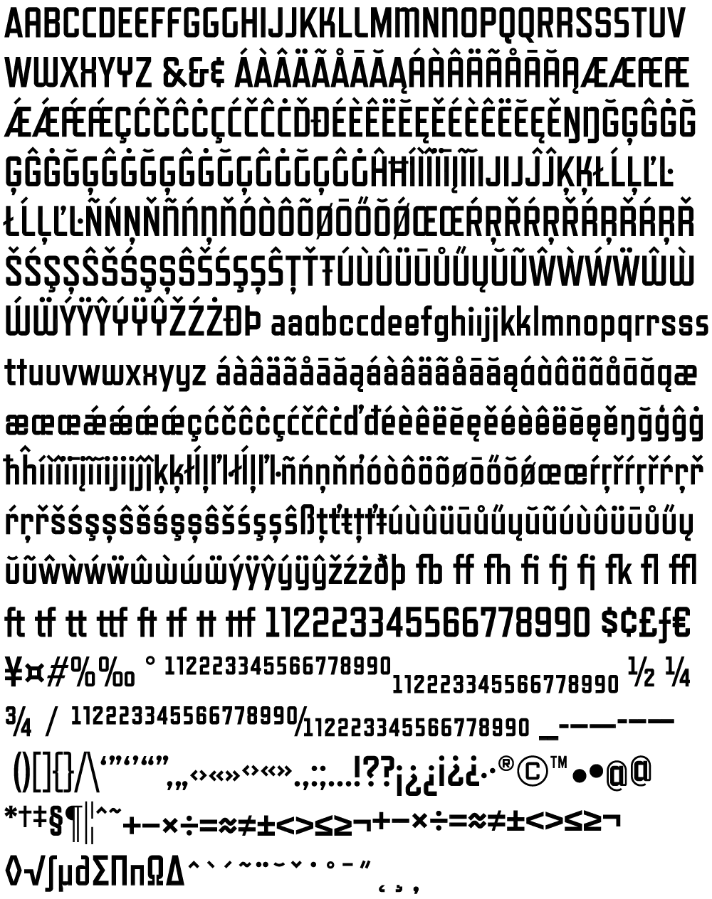
Also new in Refrigerator Deluxe is the addition of a fourth weight (Regular), improvements in many small details, like spacing, kerning, hinting (for better on-screen display), character design refinements, extensive language support (most Western and Central European Latin-based languages), fractions, case-sensitive forms, and lots of “f” and “t” ligatures.
For more information, I’ve made two PDFs you can download:
