Seen in Centralia, Washington, on November 8, 2012.
Total results: 100.
Seen in Centralia, Washington, on November 8, 2012.
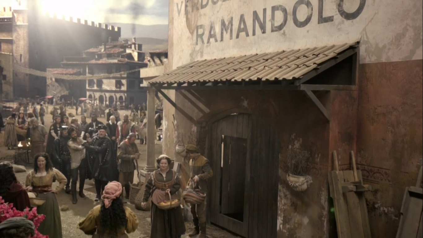
Reader Ivan Filipov sent me this curiosity from the FOX/Starz TV show Da Vinci’s Demons. I haven’t seen the show, but this is definitely a typographic anachronism.
First of all, the typeface Gotham (released in 2002) has no place in Renaissance Italy. Gotham is based on mid-twentieth century American vernacular styles. In the Renaissance, the prevailing style, if it were painted on a wall, would have been something more along the lines of the versal hand (for example, something resembling Goudy Lombardic).
That said, the idea that a large painted sign would appear on a building, as shown here, is almost more anachronistic than the choice of Gotham. Signs like this didn’t really exist until the nineteenth century after the industrial revolution and the rise of commercial enterprise and advertising.
Almost no one in the Renaissance could read, so such a sign would be rather useless in any case. If there were a sign at all, it might possibly be in the form of a small inscription near the entrance of the building, or more likely a sign with some kind of symbol or picture.
Anyway, this is definitely wrong for the period. Kind of makes me think of The Flintstones. One star.
(Thanks to Paul Shaw for providing some background on this.)
In the late seventies, personal computers were starting to emerge and generate interest among some people. I was mildly interested, but I had no idea what I would do with one. Suggested uses were things like: storing recipes, an electronic address book, or maybe play computer games like Star Trek. Mostly it seemed to be about writing programs in BASIC to, say, store recipes. Anyway, none of this really got me excited enough about computers to actually buy one.
All that changed when I came across a copy of a book by Ted Nelson called Computer Lib / Dream Machines. He wrote the first edition in 1974. The copy I bought was the 1980 edition. In it, Nelson presented a vision of computers as tools to enhance and expand human intelligence and creativity. One of the big ideas he talks about in the book is hypertext, a term he coined. Hypertext is, of course, one of the foundations of the Web, as in HTML, or Hypertext Markup Language. When you click on a link, that’s a kind of hypertext.
But, to Nelson, hypertext was much more than simple links to other documents. He envisioned a new kind of non-linear, dynamic form of literature, with variable levels of detail and hierarchy, tailored to the variable needs of authors and readers, all made possible by computers, which could do things that would be impossible on the printed page. After reading Computer Lib, I had to have a computer. I wanted to be part of this future.
Of course, it didn’t happen right away, this vision of Ted Nelson. When the Mac came out, everyone (including me) was astounded by its point-and-click graphical user interface. However, as I recall reading in one of the computer magazines of the day, Nelson was unimpressed. While he agreed that it was a good start, he criticized the Mac’s WYSIWYG presentation of text and graphics as being too limited, too static and bound to the ink and paper media of the past. The desktop publishing revolution, as amazing as it was for the print publishing world, fell far short of what was possible with this new digital medium.
In a few years, we got the World Wide Web. But, as Gerry Lieonidas tells in his talk (below), we are still in many ways stuck in print-oriented concepts, just as Ted Nelson was complaining back in 1984. When I saw Gerry’s talk earlier this evening, it immediately made me think of Ted Nelson and these ideas that got me excited about computers in the first place.
Gerry, I think you’re onto something.
Above: Gerry Leonidas on The Newest New Typography from Clearleft on Vimeo.
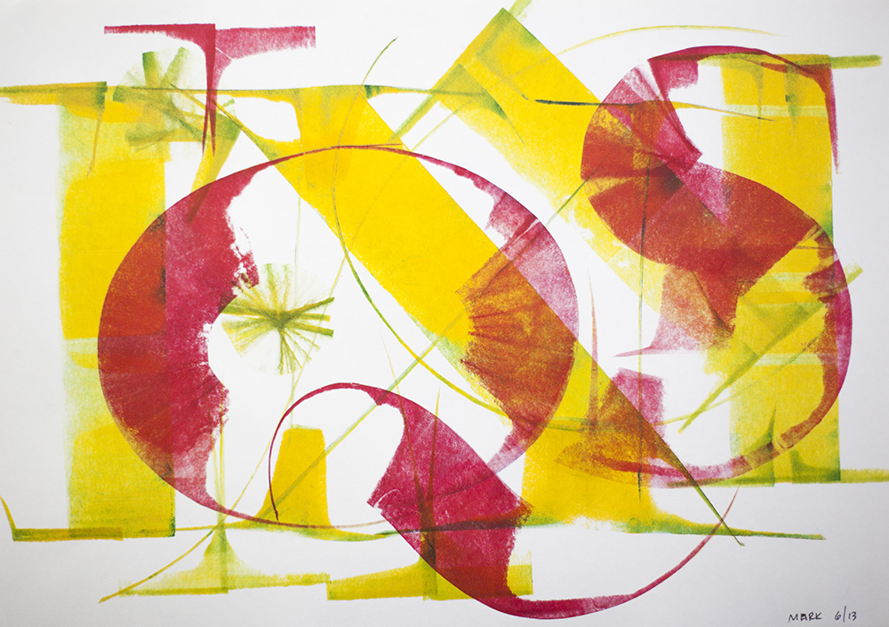
Most of the calligraphy I’ve done was way back in college when I was studying graphic design, and very little since then. I’m just not that into it, which may seem strange coming from a type designer, but to me they are completely different things. Being good at one doesn’t necessarily make you good at the other; sometimes quite the opposite, I think.
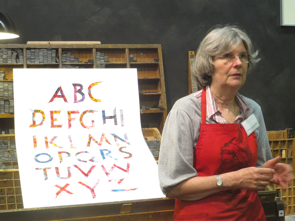
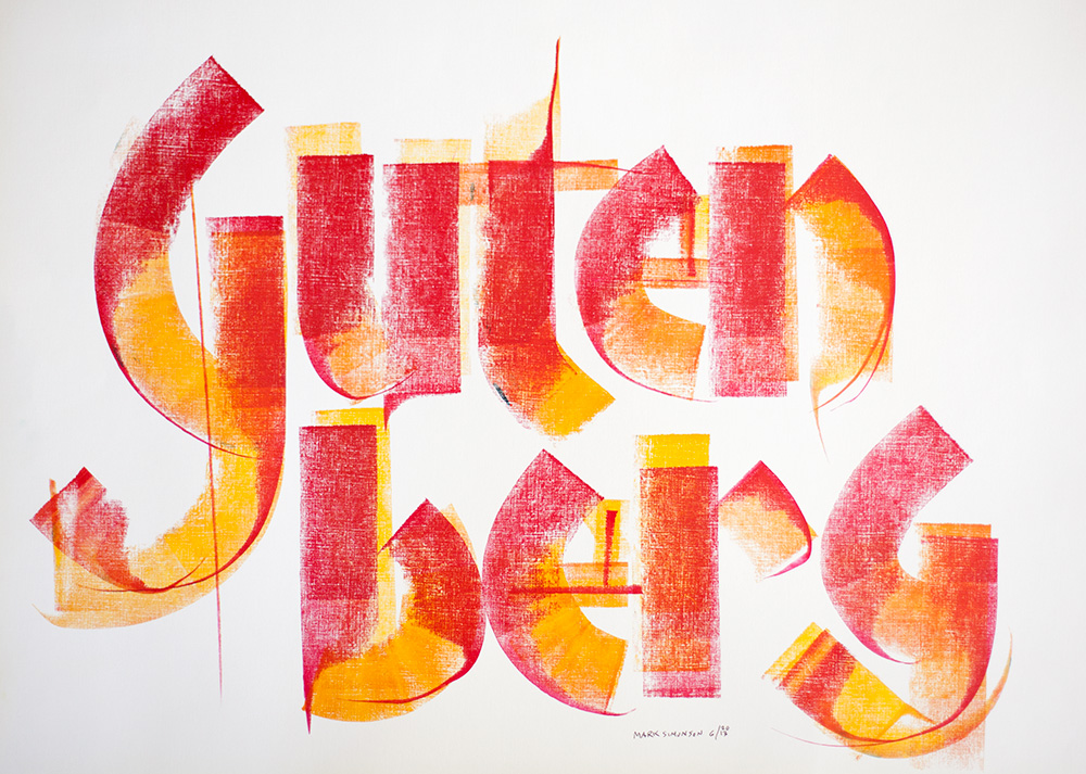
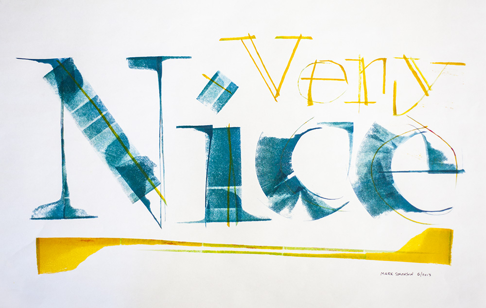
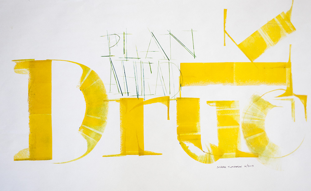
In spring of 2013, I went on a tour through Europe with about a dozen other type and printing geeks called Travels In Typography. When we visited Mainz, Germany, home of Johannes Gutenberg, father of movable type, we had the pleasure of meeting Gundela Kleinholdermann (pictured above), who is a volunteer at the Gutenberg Museum’s Druckladen (“print shop”). Her specialty is what she calls roller calligraphy. Instead of the usual brush or pen, she uses inking rollers, the kind you use to ink a letterpress proofing press.
Inking rollers come in all widths, but what they have in common is that only a narrow strip of ink across the width of the roller touches the paper at any one time, not unlike the edge of a broad-nib calligraphy pen. But instead of inking plates or type, Gundela makes letters. And she’s amazingly good at it. With some of the examples she showed us, it was hard to believe they were made with such an unlikely tool.
The technique involves manipulating the roller as you move it across the paper, turning it, dragging it and—this is the tricky part—lifting one end of the roller to get a tapered effect. You can also touch the paper without rolling to create a line. There are no rules, just whatever works. You can tell that Gundela has been practicing and experimenting with this for a long time. She’s a virtuoso roller calligrapher.
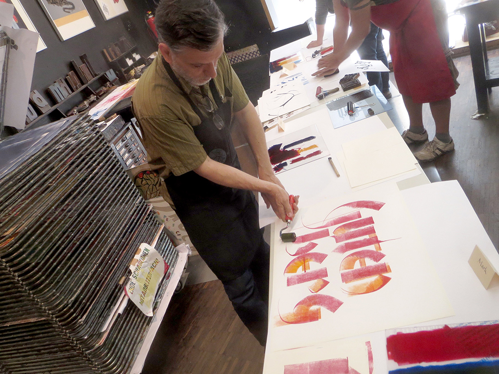
After showing us the basic techniques, we got a chance to try it ourselves. As I said, I was a bit reluctant at first, but it started coming back to me. For someone who was “not into” calligraphy, I really had a lot of fun with it.
A version of this article appeared on the Hamilton Wood Type & Printing Museum website in April, 2014. Thanks to Bill Moran for encouraging me to get off my ass and write this.
Proxima Nova version 2.008 is a major update. I’m in the process of getting it out to my distributors and it should be available from all of them within a couple of weeks.
New styles
Proxima Nova Medium. This is a new weight, available for all widths and styles. It sits between Regular and Semibold. It actually goes back to 2006, less than a year after Proxima Nova’s initial release. It was a custom weight requested by a UK magazine publisher. I’ve finally decided to officially invite it into the family.

For customers who have licensed an “all weights” or “complete” package, you should automatically get the new Medium styles when they become available at your vendor. The addition of Medium increases the size of the Proxima Nova family to 48 fonts in eight weights. Because of this, the prices of the “all weights” and “complete” packages will go up a bit accordingly.
New glyphs

Design changes
Making design changes to an existing and widely used font is not something I take lightly. That said, there were a couple of things I felt I had to change.

First, I slightly shortened the stroke at the top of the lowercase f to eliminate the need for ligatures. Unlike some fonts, the ligatures in Proxima Nova don't connect in any way. Instead, they substitute an alternate f with a slightly shorter stroke at the top to avoid colliding with the i and l. Unfortunately, it is frequently the case that ligatures are not used when fonts are used on the web, and it really bothers me. But rather than try to get everyone to fix their websites, I decided it would be simpler to fix my admittedly problematic design of the f and use the alternate f instead, eliminating the need for ligatures entirely.
Second, I slightly shortened the tail of the lowercase j for similar reasons.
Both of these are cases where the me of today wonders what the me of yesterday was thinking. But they are subtle changes, I hope, and I hesitate to even call attention to them in case someone somewhere prefers the old f or j. I expect most won’t even notice the difference, and Proxima Nova will simply look nicer more of the time.
Other improvements
Specimens
You can see the new fonts in more detail in the updated downloadable Proxima Nova specimens:
Proxima Nova Overview. The story of Proxima Nova, basic style showings, full character set and technical information. 12 pages. 622 KB PDF.
Proxima Nova Full Specimen. The overview, plus complete text and display specimen for all styles of Proxima Nova, including the full character sets. 156 pages. 5.2 MB PDF.
A few weeks ago, I went with my family to the Minneapolis Institute of Arts (a.k.a. MIA) to see the Delacroix show. While we were there, we took in another exhibit about Japanese woodcuts from the 20th century. The Delacroix show was pretty great, but the woodcut exhibit made more of an impression on me.
It was a rather small exhibit and not a lot of people were there. Part of what I liked about it was that they had Japanese popular music from the twenties and thirties playing in the background. It wasn’t traditional Japanese music, more like western jazz music with a Japanese flavor. It felt like stepping into another world, giving a bit of context to the prints.
One print in particular caught my eye.
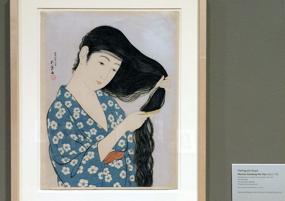
This was “Woman Coming Her Hair”, a print from 1920 that many will recognize as an image Apple used in early promotional materials for the Macintosh. Here’s the MacPaint manual (which I still have) that came with my first Mac in 1984:
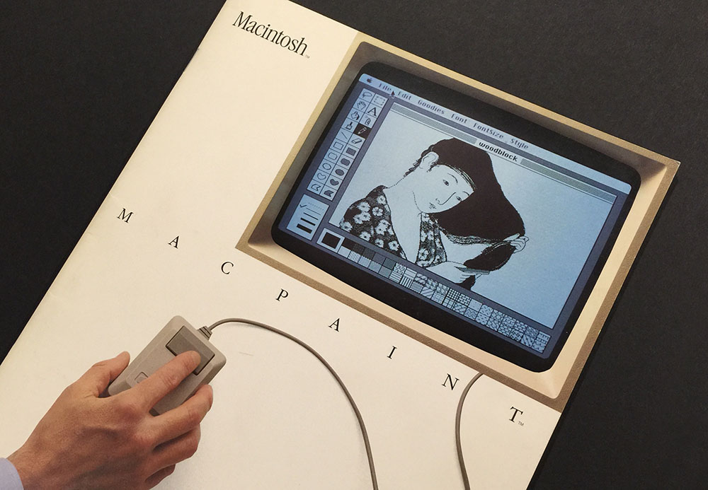
Susan Kare, the artist who created graphics and fonts for the original Macintosh, gave a talk at the Layers Design Conference last year and the video of it was made available recently. Among other things, she tells the story of how that Japanese woodcut was chosen and recreated in MacPaint.
Oh, and—what do you know?—today is the 32nd anniversary of the Macintosh. Happy birthday, Mac!
Page 54 of 61