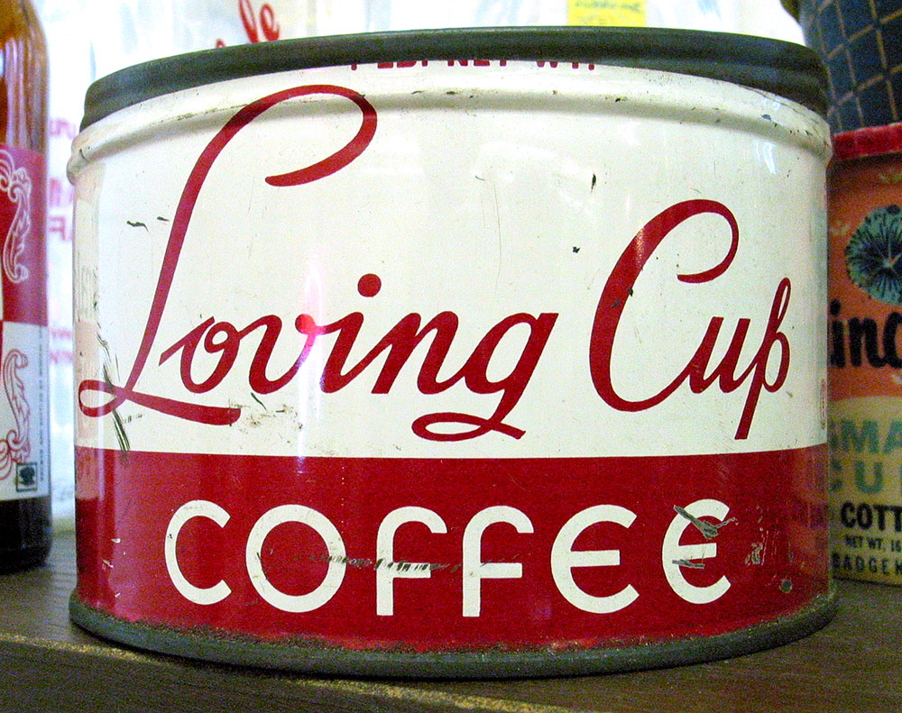
Some nice lettering seen in an antique store in Hixton, Wisconsin on July 29, 2004.
Some nice lettering seen in an antique store in Hixton, Wisconsin on July 29, 2004.
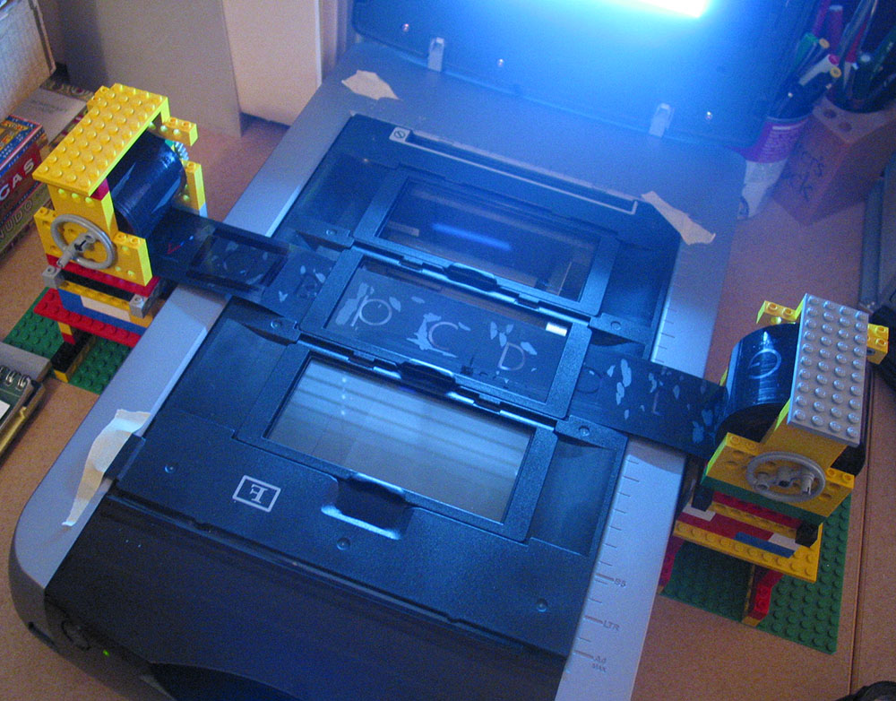
One of the font projects I’m working on is the revival of some of Phil Martin’s display typefaces from the 1970s. These were originally distributed as 2-inch film fonts for the VGC Typositor headline setting machine. The master negatives exist in the form of small spools of 2-inch wide negative film around 50 feet long. They are in very good condition, considering they are up to 35 years old, and I wanted to make sure they stayed that way when it came to scanning them.
The film could pass through a standard film holder on the scanner, but I needed a way to hold up the feed and take-up spools on either side. I pondered this for a long time, and when it came time to actually start scanning, it hit me: Legos!
I am a life-long Lego® fan and, while they are certainly a fun toy, I have sometimes found practical uses for them. As you can see from the photo, I constructed “towers” on either side of the scanner to support the film spools. Gear pieces from an old (and probably collectible) Lego Technics set fit perfectly inside the spools, holding them firmly on axles. Cranks fashioned out of wheel pieces allow the film to be moved back and forth.

Here’s the really clever bit: To keep the film spools in tension (so they stay where I want them and don’t unravel), I devised a simple ratchet mechanism which allows the spools to turn freely in only one direction—away from the other spool. It can be easily flipped out of the way when I want the spools to roll free.
It could look nicer, but a lot of our Lego pieces are otherwise engaged in other projects built by my daughter and me, so I had to scrounge for pieces among the dregs that met the bare minimum requirements.
It occurs to me that if I had the Lego Mindstorms system, which allows you to add motors, light sensors, etc., I could control the whole thing from my computer and completely automate the process. Sounds fun, but this is simpler and gets the job done.
Now all I have to do is scan all the fonts (only about seven or eight hundred more characters to go) and then I’ll be all set to start building the fonts.
I wonder if I should add mini-figures…?

For over ten years, Grad has been trapped inside Phil Martin’s old DOS computer. Now it’s out.
Phil Martin designed over 400 typefaces from the late 1960s through the 1980s, most of them released as film fonts for the VGC Typositor and licensed exclusively to franchised typesetting houses. Grad is Phil’s first and only foray into digital type. He designed it around 1990 for his own use. He conceived it as a redesign of the classic Century Schoolbook. Unfortunately, Grad only existed in an old and obsolete font format.
In early 2004, Phil approached me with the idea of doing an outline version of Grad for general release. I set to work using laser prints of Grad provided by Phil and samples of the original ATF Century Schoolbook. The result is a family of three OpenType fonts with advanced typographic features such as real small caps, ligatures, old style numerals, swash alternates and more.
See more info about it here.

Some spicy lettering from the cover of “Herb Alpert’s Tijuana Brass / South of the Border” (released in 1964), a record album I picked up in an antique store. It looks like it might have been done by Ed Benguiat—it’s very much in his style, particularly the “wedged-in” layout. The design credit just says “Apple Graphics.” The arrow is a nice touch. Just in case you’re bad with directions, I guess.
The record was absent, so I guess I’ll miss out hearing “Hello, Dolly!” sung with a Spanish accent.
 Lately, I have been watching the first (and only) season of The Jestons on DVD with my 10-year-old daughter. She likes them a lot. I remember many of them from when I was her age, some more than others.
As with anything you enjoyed watching as a kid, it isn’t the same watching it as an adult. The stories are pretty dumb (no big surprise), so I’ve mainly been looking at the way they were drawn and animated.
I wanted to be a cartoonist for a while when I was a kid. I spent a lot of time drawing cartoon characters from TV shows, comics, and such. I especially was influenced by the stylized characters of Hanna-Barbera and Jay Ward cartoons.
As I’ve been watching The Jetsons, I’ve been doodling characters, trying to see how they were constructed, how they got them to look they way they looked. The formula they used was pretty simple and efficient (it had to be for a weekly show) and I found myself drawing pretty good likenesses very quickly.
The other thing I did recently was read a book about comic book artist Wally Wood (Against the Grain: Mad Artist Wallace Wood, published by TwoMorrows Publishing). Although most comic book aficionados know him for his science fiction and war comics, I am most familiar with Wood’s drawings in Mad magazine, particularly from the late fifties and early sixties.
My uncle, who is about ten years older than me, was a Mad reader in the fifties. As a kid, I used to go straight to his collection when we’d visit my grandparents. The thing I remember most about them was Wally Wood’s drawings, especially his drawings of jazz-crazed hipsters, with their shiny black shades and goatees.
The story of Wally Wood is a sad one (he took his own life in 1981) but his influence and the beautiful work he produced lives on.
So. What’s Wally Wood got to do with The Jetsons? Nothing at all. But it explains the drawing.
Last Friday I attended the opening of a show at the Minneapolis College of Art and Design showcasing the work of illustrator Mary GrandPré. I hadn’t seen Mary since the mid-eighties when I was the art director at Minnesota Public Radio and she was at the beginning of her career as an illustrator.
Mary is best known now for illustrating the Scholastic editions of the Harry Potter books. Her success as an illustrator is even greater than I had realized—she also did concept drawings for Antz and character designs for Ice Age.

The illustrations she did for me were always wonderful, and not all that different from the much more refined style she’s known for now. (She did the cover for the first Wireless catalog for me in 1983, shown above.)
She asked me for advice back then about whether she should develop a definite style or try to diversify and do many different styles. I urged diversification. Thank goodness she ignored my advice.
Page 47 of 61