Technique
Pangrammer Helper, RoboFont Style
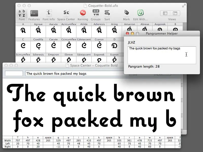
Almost ten years ago, I made a little program called Pangrammer Helper. It’s a little tool to help compose pangrams, which are sentences containing every letter of the alphabet. It was built in Flash and was designed to run in a web browser.
Type designers are especially enamored of pangrams, as you can imagine. Fellow type geek and friend, Craig Eliason, has been using it for several years to compose entries for his Daily Pangram site.
Recently, a new font editing app called RoboFont was released, and I’ve been starting to use it in my work. One of the neat things about it is that it’s fully extendable—that is, if you are willing to do a little Python programming, you can add features to it.
Last week, the Robothon 2012 conference was held in The Hague. It was all about type design and technology. I wasn’t able to attend, but videos of most of the talks have been made available on Vimeo, and I’ve been watching them the last couple days. Two of them in particular, one by Tal Leming about Building Stuff and another by Frederick Berlaen introducing RoboFont, inspired me to rewrite my Pangrammer Helper in Python so it could work inside RoboFont.
It took less than a day to do it, and it works great. You can use it by itself, and it works a lot like the old Flash version (a bit simplified), or, if you have RoboFont’s “Space Center” window open (the window were you work on your font’s spacing), the text also appears there as you compose it.
If you happen to be a RoboFont user, you can download version 1.2 of the script here. Just drop it into your scripts folder and you can run it right from the Extensions menu.
Update: Frank Grießhammer (currently working in Adobe’s type department) has contributed some improvements to my script, mainly adding the ability to add non-ASCII characters (as in “Grießhammer”) and an option for mixed-case pangrams. Thanks, Frank! The download link above will download this version (1.2).
 Permalink
My Trusty Old Mac Pro
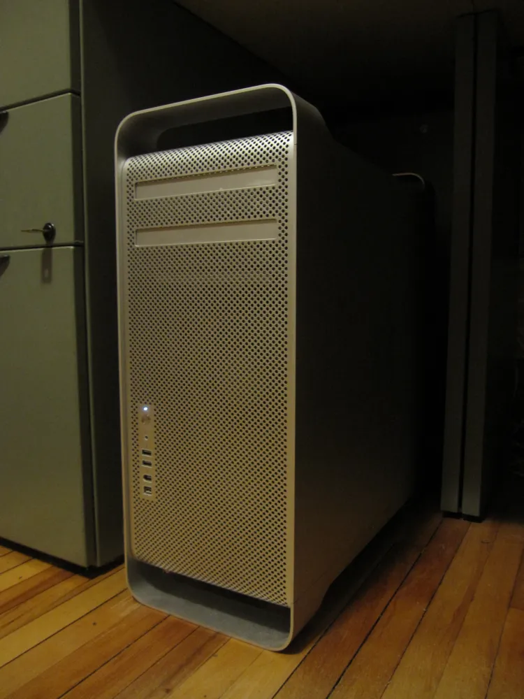
When I bought this computer in 2006, I did’t expect to still be using it in 2012. It hasn’t always been my primary machine, but it’s been in use one way or another all that time.
Apple has used essentially the same case design even longer, going back to the Power Mac G5 in 2003. I had one of those, too, and it was kind of a dog. This one is the first generation Mac Pro, which was released when Apple switched to Intel processors. I chose the mid-range model, with two 2.66 GHz Dual-core Xeon processors, a 250 MB hard drive, and 1 GB of RAM.
It was my main machine for several years, with a 15” MacBook Pro as a secondary machine for taking work on the road. Eventually, having to keep my work sync’d between them was too much trouble and I switched to a 17” MacBook Pro for everything. I retired the Mac Pro to the basement, using it as a server and for watching movies or playing music, and other non-work-type things.
About a year ago, I changed my mind. The 17” was too much of a compromise—not that powerful as a desktop machine, and it rarely left my desk, unless I was traveling. So, I got a MacBook Air and a 27” iMac. What made it possible? In a word: DropBox.
This setup worked great, but recently, the iMac started giving me the worst possible kind of trouble—kernel panics during backups. I still don’t know what the cause is, but I couldn’t trust it as my main machine anymore.
Long story short, I brought my old Mac Pro out of retirement. After upgrading the video card, hard drives, software, display and memory, it’s never run better. It’s smooth and quiet and plenty fast enough for my needs.
One of the things that made me reconsider it was a discussion sometime last year on Hypercritical, John Siracusa’s weekly podcast. Unfortunately, I don’t recall which show it was, but basically Siracusa pointed out one of his reasons for preferring Mac Pros over iMacs and portables: External hard drives usually have cheap power supplies. I can attest to this, having several fail on me over the years. The Mac Pro, however, has a very robust power supply and therefore hard drives you add to it are much more reliable, another thing I can attest to. I had never really thought about this before, and had even tended to use external drives with my Mac Pro. But it made a lot of sense, and now I’m sticking to internal hard drives for everything.
I’m very happy with this setup. I’ve got a really solid desktop machine now, and the MacBook Air is my all-time favorite laptop. And DropBox makes it easy to work with two machines. The most amazing thing to me is that this Mac Pro is so old and yet it has no trouble running the latest software. I’d say it was a pretty good deal.
Not Coming to a Theater Near You
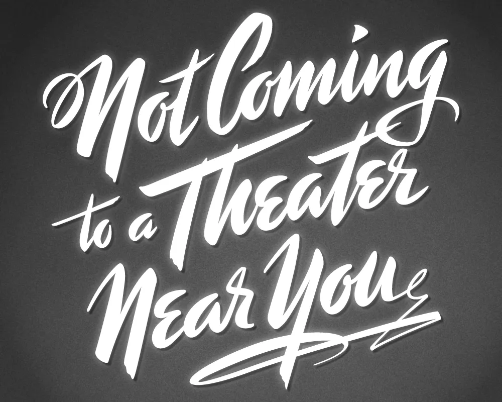
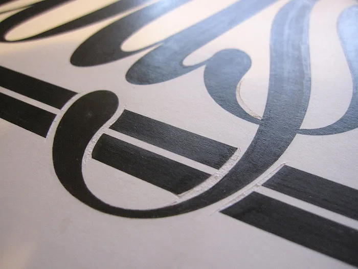
Last year, I did a logo design for Not Coming to A Theater Near You, a website devoted to movies off the beaten path. The designer, Rumsey Taylor, who was redoing the look of the entire site, wanted the logo to look like a title card from a film noire feature. What I came up with is based mainly on the title card from “Mr. Arkadin” (1955).
In spite of appearances, I don’t usually use an actual brush in my lettering designs, but in this case I did. The final art is vector-based, but I worked out the construction of the letters with brush and ink. (I’m not skilled enough at brush lettering to do the final art that way.)
The image above is a “treatment” I did to make it look like an actual title card from an old film, sort of a “serving suggestion.” On the wesite, Rumsey chose a simpler approach. The site redesign looks great, and I was happy to see that he’s using Metallophile Sp8 as a webfont (via Typekit).
Curious About My Lettering Process?
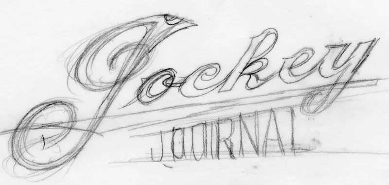
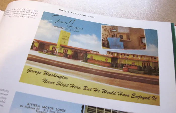
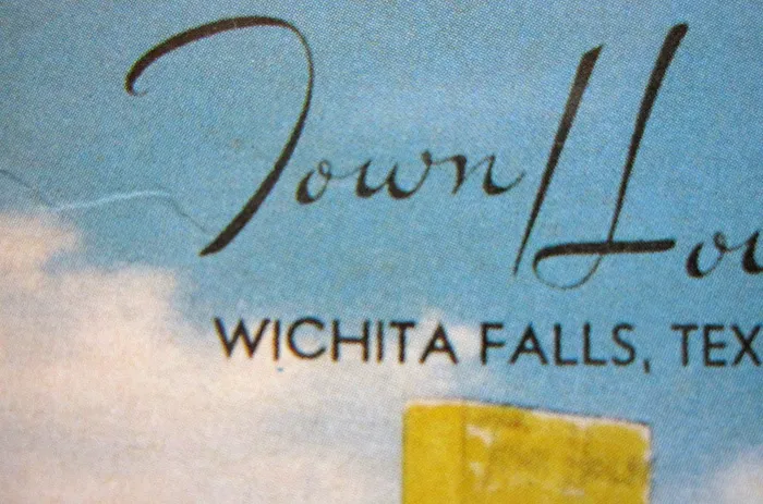
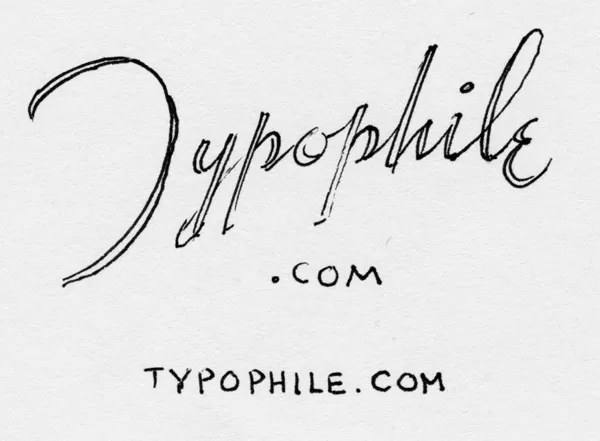
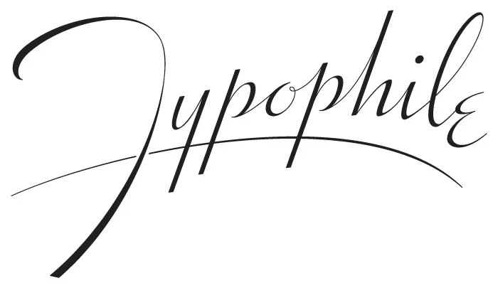
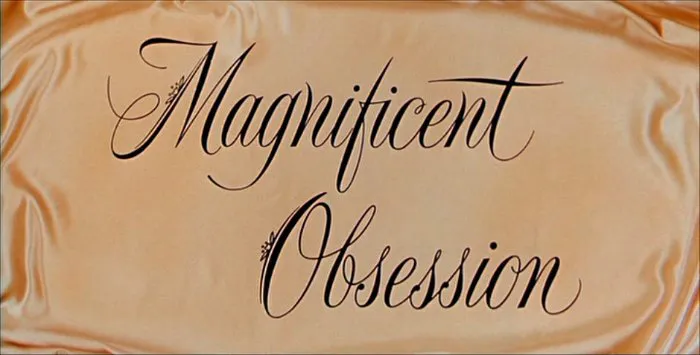
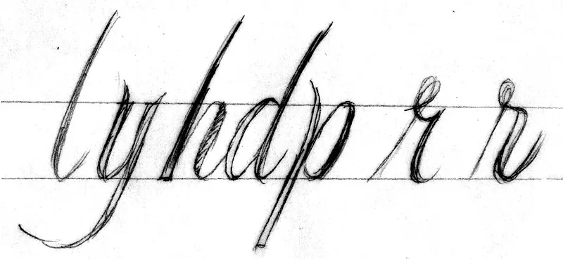
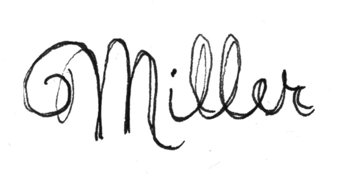
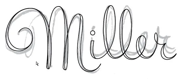
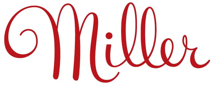
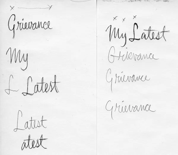
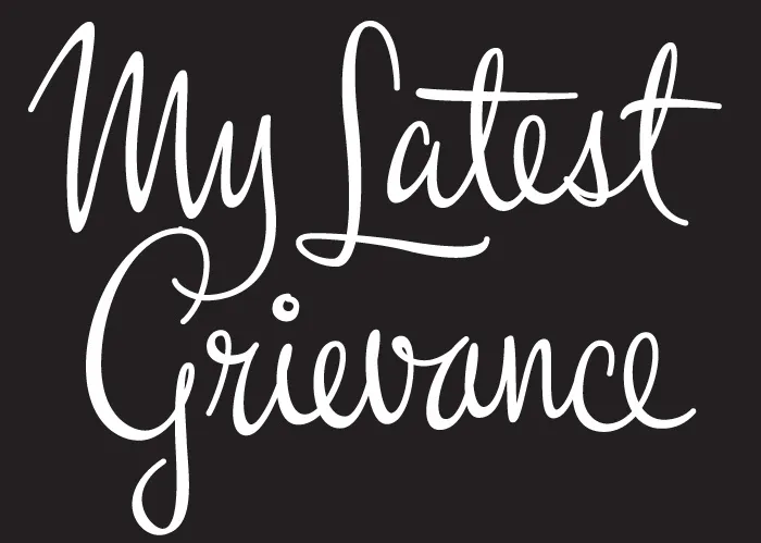
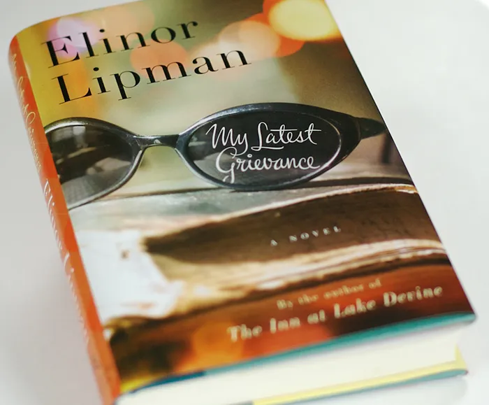
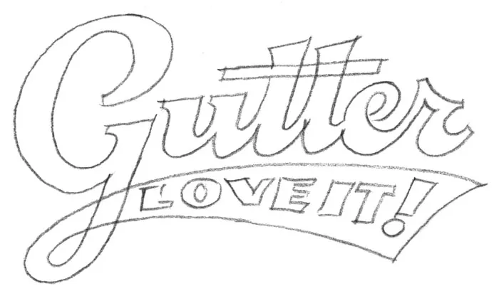
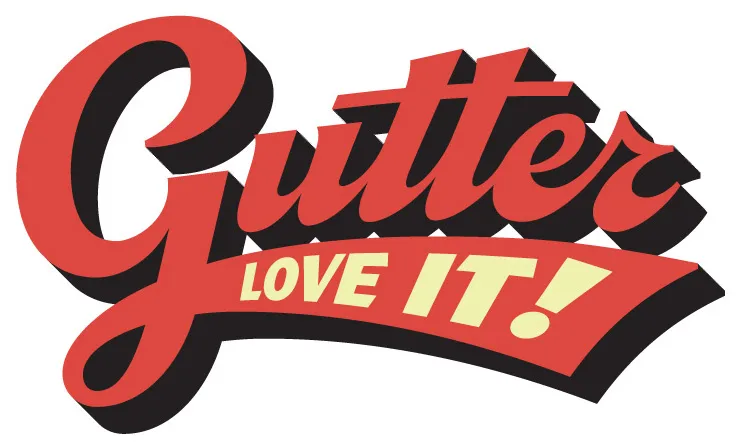
wwword, a website about words, did an interview with me [Update: wwword appears to be no longer operating, unfortunately, but here is a copy of the page on the Internet Archive’s Wayback Machine], where I talked about some of my favorite lettering pieces and how I did them.
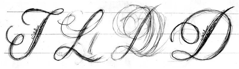
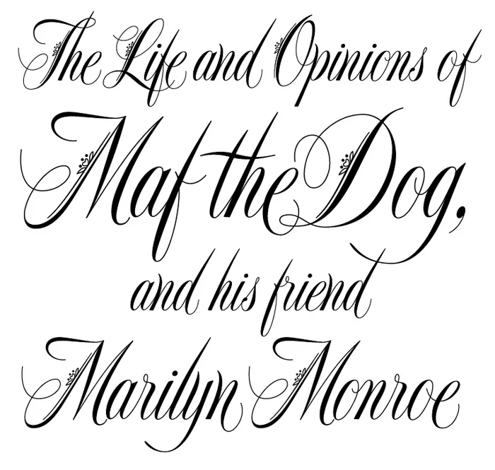
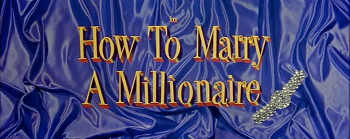
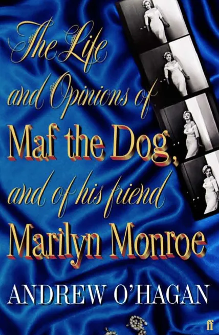
The images that accompany the article are a bit small, so I’ve put larger versions up here….




Beneath the Volley of the Fonts
Last Friday, I spent the afternoon frantically trading files with Peter Bruhn (of Fountain type foundry in Sweden) for an exhibition match of Layer Tennis. The basic idea is to pass a layered Photoshop file back and forth for ten “volleys”, about one every 15 minutes. The resulting “volley” image is displayed live for the world to see, with running commentary (in this case by the witty and capable Grant Hutchinson.
What may not have been obvious to some was that the Photoshop compositions were not where Peter and I were spending most of our time (well, maybe in some cases it was obvious). In fact, we were designing, building and generating fonts in FontLab, and then using them in Photoshop. With most of the volleys, we started from the font that had been built in the previous one.
Although the images created in Photoshop were the ultimate public face of the match, I thought it might be interesting to show what was going on behind the scenes with the fonts.
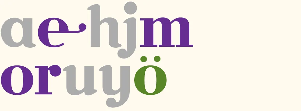
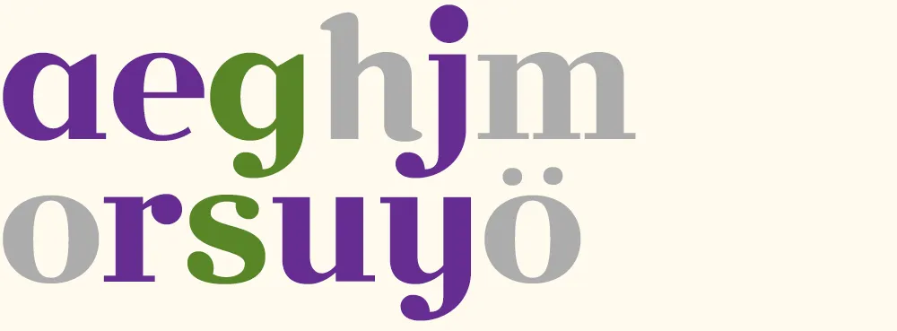
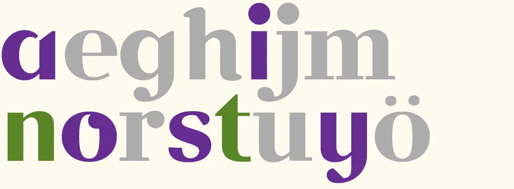
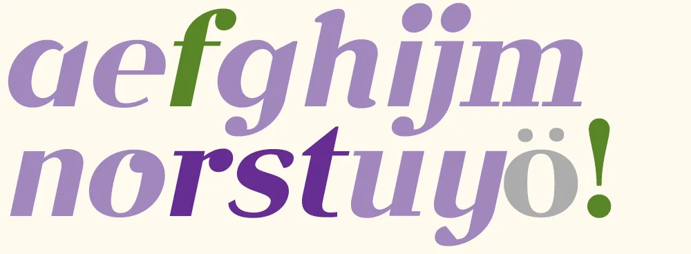
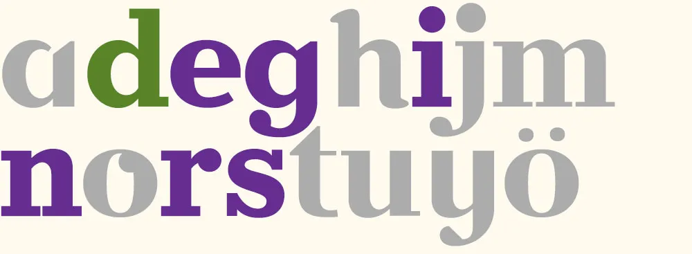
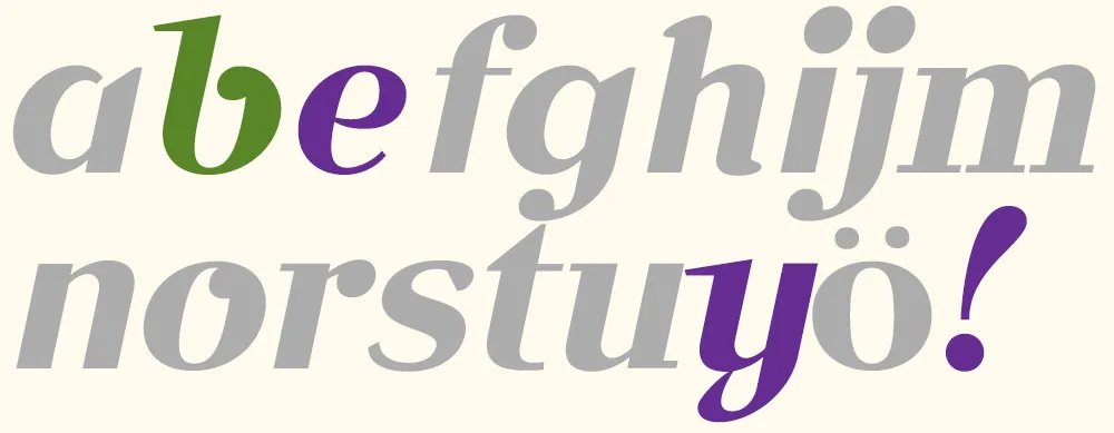
To make it easier to tell what was going on, I’ve color-coded the glyphs:
- Green = new glyphs
- Purple = modified glyphs
- Gray = unmodified glyphs.
Volley 1: “jam” I got the coin toss, so I went first. I created a font with three simple glyphs in a sort of bloopy geometric style.

Volley 2: “your ham” Peter followed up by ably adding several more glyphs in the same style.

Volley 3: “more homey” I modified all the existing glyphs to create a higher-contrast semi-serif design. (You can see more clearly in this version that the basic construction is that of an upright italic.)

Volley 4: “möre” Peter takes it in a different direction, more like a Bodoni or Didot, and adds a whimsical swash and umlaut. He also takes advantage of the fact that he only really needs to change enough glyphs to spell the word he wants to use in the image, in this case “more”. Both of us adopt this strategy as the game progresses.
Volley 5: “major surgery” I continue the transformation to a Didone style, conforming several other glyphs and adding a g and an s.
Volley 6: “no sanity” Peter changes the direction, this time deconstructing several glyphs and doing a “serif-ectomy”. Note the nod to my Coquette in the o.
Volley 7: “faster!” I change the style again, albeit in an expeditious manner, by slanting all the glyphs. I add an f and a ! and tweak a few existing glyphs. (Merely slanted glyphs are shown in light purple.)
Volley 8: “aefghijm” Peter does something “meta” by printing out and critiquing an unslanted version of font.
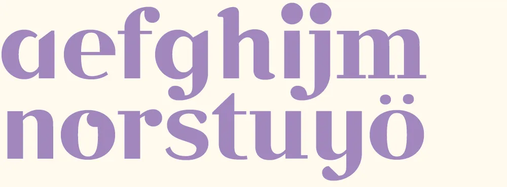
Volley 9: “redesign” I discard my cheap slanting trick from volley 7 and, starting from the font in volley 6, change it into a slab serif for my final volley.
Volley 10: “bye!” Peter takes my slanted font from volley 7 and gives it a more cursive flair, with a reprise of the Coquette reference. According to Peter, the “waving” exclamation point was a happy accident. Works for me.
In the end, we had created ten new fonts in a few hours. Not complete, full-featured fonts, or the best-built fonts in the world, but good enough to set some type. I set them all together to show the sum of what we made:
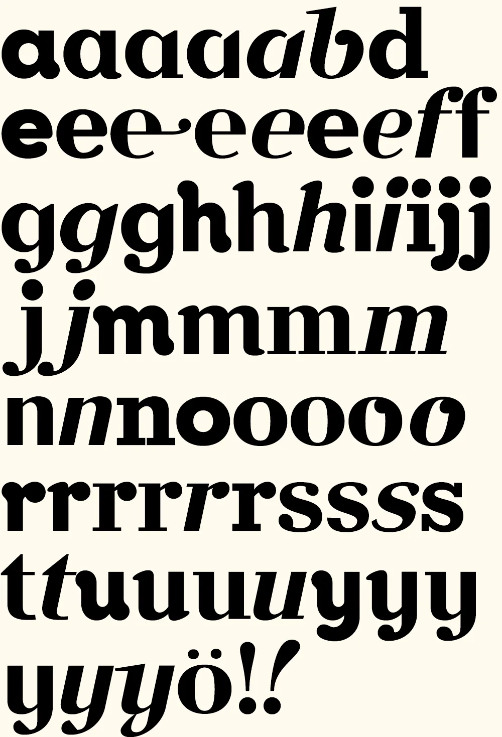
Now comes the hard part: Coming up with a name for it….
(Thanks to Peter Bruhn, and Jim Coudal and Bryan Bedell of Coudal Partners.)
Layer Tennis
[ ]
Just a note to say, this Friday afternoon, I’ll be pitting my type chops against (with?) fellow type designer Peter Bruhn for a “exhibition” game of Layer Tennis. I expect this to be a friendly match, more improvisational than competitive. But we’ll see.