In honor of Valentine’s Day, Extensis has posted a silly little game called TYPEmatching wherein you attempt to find romantic match ups between common typefaces.
Ever notice how the font name “Arial” looks like a certain other word sometimes? (Via DaughterNumberThree)
Here is a cool thing that reader “minusf” wrote to me about recently: A half-hour film made by Chevrolet in 1958 called “American Look.” You can see it, split into three parts, on YouTube the Internet Archive:
It’s pretty heavy on pro-America/pro-Chevy propaganda, but it’s also a revealing glimpse into a world when most everything was still designed with simple art materials like pastel crayons and clay.
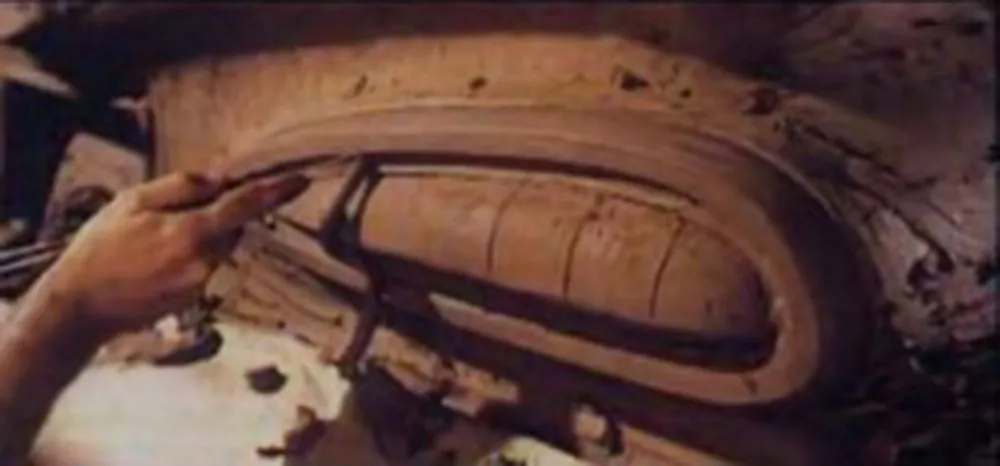
In the third part, they build a design prototype of a ’59 Chevy out of plywood and clay. This was the car my family had when I was a little kid. To me it looked like a scary, angry animal. Little did I know they were going after “sleek and stylish.”
The pre-Fifties world seems to have been erased in the film. People live in thoroughly modern houses, have thoroughly modern furniture and appliances, and work in thoroughly modern buildings. Nothing old seems to exist.
I must have seen a lot of propaganda like this when I was a kid. I fully expected that the world would look like this when I grew up. But in reality, old and new have always lived side-by-side, and probably always will. (I love it when films that are set in the future, like Blade Runner, get this right.)
A lot of the design in the film still holds up well, like the Eames chair. But every now and then they show something that looks utterly old-fashioned—unsurprisingly, anything to do with electronics, appliances and business machines, which have changed radically over the last fifty years. On the other hand, the design requirements for chairs, spoons, and drinking glasses are pretty fixed.
(Thanks to John Blair for finding these videos on the Internet Archive. When I originally wrote this, the videos were up on YouTube, but at some point they were removed. Thanks to John, I am able to link to them again.)
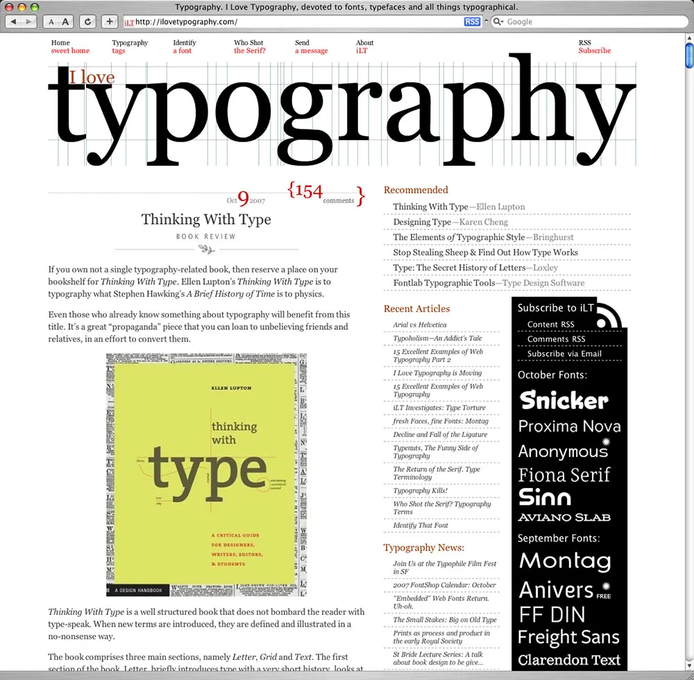
I just recently became aware of a new type-related site called I Love Typography. It’s only been around about two months, but it’s already shaping up to be one of the best.
What’s different about iLT from other type sites is its emphasis on longer articles, particularly ones covering typographic fundamentals. Readers may also comment, but that’s a secondary element. The venerable Typographica promised to do this a few years ago, but, for whatever reason, it didn’t really work out. (To be fair, I still love Typographica. It’s been a little quiet, but things have been picking up.) In any case, iLT’s author, John Boardley, has picked up the baton and run with it. It’s a great start and I wish him best of luck.
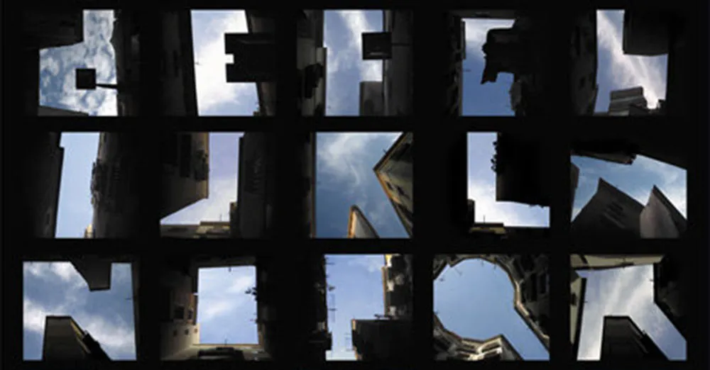
An alphabet made from the negative space between buildings as you look up at them. (From Slanted via Boing Boing.)
Jean-Christophe Loubet del Bayle has just posted an interview with me on the French typography webzine, Planet Typography. (Si vous préférez le lire en français, voici l’interview et le webzine.) (I had no idea I could speak French so well.)