Mark’s Notebook - Page 7
At long last, two totally new, original typeface families! The last new one was Bookmania in 2011, which admittedly was a kind of revival, so not totally new and original. For that you have to go back to Lakeside, which I released in 2008—ten years ago! In any case, it’s about time. I have many more in the works, so stay tuned.

Acme Gothic is based on the thick-and-thin gothic lettering style popular in the U.S. in the first half of the twentieth century. There have been typefaces in this genre before, but they were either too quirky (Globe Gothic), too English (Britannic), too Art Deco (Koloss), too modern (Radiant), or too Art Nouveau (Panache). None captures the plain, workman-like, vernacular style of Acme Gothic.
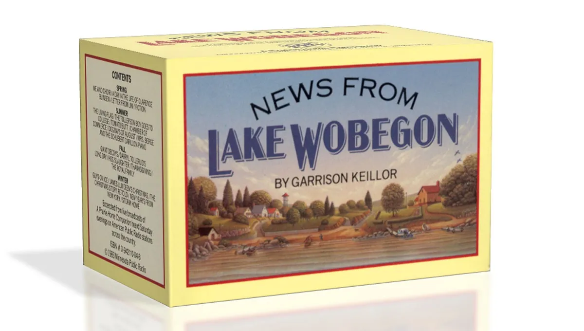
I’ve used the “thick and thin” gothic style in lettering projects as far back as 1982 (the “News From Lake Wobegon” audiocassette package I designed for A Prairie Home Companion). Off and on since the 1990s, I tried turning it into a typeface, but it wasn’t until 2012 that it finally started to come together. My aim was to make a font that feels like a revival of a long-lost metal typeface from the 1920s, but one that never happened to exist.

There are five widths (Compressed, Condensed, normal, Wide, and Extrawide) each with five weights (Light, Regular, Semibold, Bold, and Black) for a total of 25 different styles. Acme Gothic has extensive language support, covering most Latin-based writing systems.

Acme Gothic also includes both small caps and raised small caps (accessed through an OpenType stylistic set) both of which can be found in vintage examples of this lettering style.

Parkside is a script typeface inspired by typefaces and lettering of the 1930s and 1940s. Unlike metal typefaces from that era, it takes advantage of modern digital typography, where letters may overlap and automatically change shape to flow better with surrounding letters.
The idea for Parkside came to me in the mid-1990s, around the same time that I was first working on Coquette (released in 2003). You could say that Coquette and Parkside are cousins. Unlike Coquette, Parkside is a connecting script, with more contrast and less geometric forms. But it shares many of the same stylistic ideas, especially in the capital letters.

There are six weights: Hairline, Thin, Light, Regular, Bold, and Black. Parkside has extensive language support, covering most Latin-based writing systems. Parkside uses OpenType magic to automatically select letter variations that seamlessly connect to the letters coming before and after.
I first released Coquette in late 2001. It had three weights: Light, Regular, and Bold. I’ve updated it a few times since then, most significantly in 2010 with the OpenType version and expanded language support.
For a long time, even before the initial release, I’ve wanted to add more weights, especially on the bold end of the range. And there was certainly room for another weight on the light end. I’m therefore very pleased to announce the addition of three new weights to Coquette: Thin, Extrabold, and Black.

I took the opportunity to add a few more features to the family.
First, I’ve filled out some gaps in the character set. Previously, Coquette had only the fi and fl ligatures, a holdover from the pre-OpenType days. Version 2.0 now has a complete set of f-ligatures. You might have also noticed that Coquette was missing all those random math characters that are part of the standard character sets in most fonts. It now has them. I don’t imagine they’ll be of much use (which is why I left them out in the first place), but they are there if you need them now.

I’ve also added some OpenType features that I thought would be useful.
The first is arbitrary fractions. If you type number-slash-number and apply the OpenType Fraction feature, you will get nicely formatted vulgar fractions. (It seems unfair to call them vulgar. I think they look quite tasteful.) As a side effect of adding this feature, Coquette now includes superscript figures.

The second OpenType feature is support for a few alternate characters. Over the years I’ve noticed that sometimes designers don’t seem to like the little blobs I put on some of the characters, such as the b and o, so they remove them. Coquette 2.0 includes these alternate forms. The other modification I’ve seen is with the lowercase s, which has a stylized script form. Coquette 2.0 includes a more conventional lowercase s as an option. All of these have the effect of making Coquette look a bit more plain, but sometimes that’s what you want. (I didn’t make an option to remove all the blobs. It’s just not Coquette otherwise.)

There is also an alternate ampersand. It’s smaller than the default one—about the same height as the figures—and has a simpler design. You can use it anywhere, but it works better than the default when set next to caps.

So, that’s it. I’m really excited about this new release of Coquette. I’ve been wanting to do it for a long time. It should be available from your favorite online font store by the time you read this. More information here.
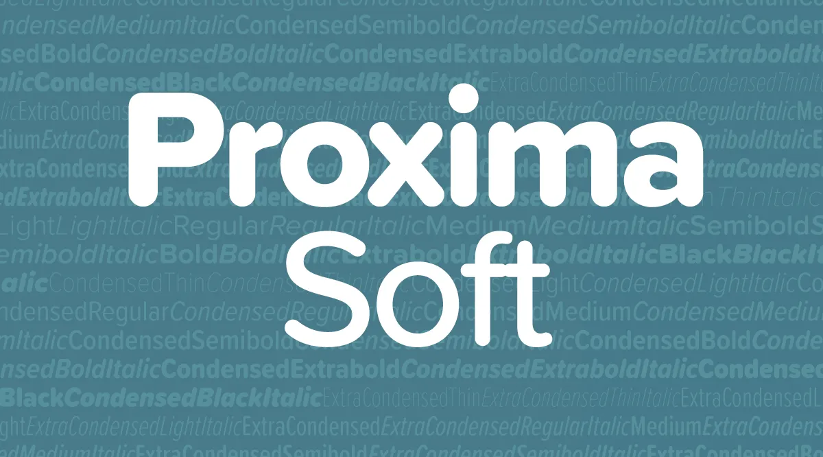
Proxima Soft is an expanded and remastered version of Proxima Nova Soft (2011). Both are rounded versions of my Proxima Nova (2005).

Proxima Nova Soft was originally commissioned by MyFonts in 2010 for use on its website. The following year, after numerous requests, I released it to the general font market. Because MyFonts needed only a few styles (Regular, Medium, Semibold, and Bold), that’s all I did at the time.
Soon, I got requests to do a full family. This was easier said than done. I began work on the full family in 2013. After several false starts, over three years later, it’s finished.
Although the old and new families look similar, there are many small improvements in the design, not just a wider range of styles and more features.

Proxima Soft has the same 48 weights and styles as Proxima Nova—eight weights (Thin to Black), three widths (Normal, Condensed, and Extra Condensed), and both roman and italic for all weights and widths. There is one small difference—no small caps or old style figures. I included these in Proxima Nova, but I’ve never seen them used, so I decided not to put them into Proxima Soft. (I may add them later if people actually do want them.)

A Proxima Nova feature I do see used a lot is the set of alternate characters—a, l, y, and G. Proxima Soft includes them, as well as other Proxima Nova features such as arbitrary fractions, ordinals, and both proportional and tabular figures.

Proxima Soft also contains the same wide language coverage, including support for most Latin-based writing systems as well as Cyrillic, and Greek.
I would have preferred to keep the name Proxima Nova Soft, but there were some problems with that idea. First, there are limits to how long a font name can be. Proxima Nova already pushes the limits in the Condensed and Extra Condensed ranges, and adding the word Soft to every style and weight was not going to work. By calling the new family Proxima Soft, the font names will be exactly the same lengths as in Proxima Nova. Problem solved.
The other perhaps more important reason is that the shared styles—Regular, Medium, Semibold, and Bold—are not identical in design and spacing between the new and old version, which means that documents created with Proxima Nova Soft would have reflow issues if the new fonts were installed in its place, not to mention differences in appearance, especially at larger sizes.
If you liked Proxima Nova Soft, you’ll love Proxima Soft. It’s got more of everything and makes a great companion to Proxima Nova.
Proxima Soft is available at all of my distributors. See the Proxima Soft page for a complete list.
I was interviewed a couple of months ago for a podcast called Cedar Cathedral, which focusses on “artistry, craftsmanship, and the creative life in the Great Lakes” region. Somehow, I missed that they posted it in mid-July.
Steve and Claire Hendershot, the hosts, did a wonderful job. Total pros, not slackers. They actually came all the way from Chicago to my house with a digital audio recorder, professional mic, and everything—none of this Skype nonsense. I think it’s one of the best interviews I’ve done. Definitely the best sounding.
Update: Unfortunately, this podcast is no longer available.
A few weeks ago, I went with my family to the Minneapolis Institute of Arts (a.k.a. MIA) to see the Delacroix show. While we were there, we took in another exhibit about Japanese woodcuts from the 20th century. The Delacroix show was pretty great, but the woodcut exhibit made more of an impression on me.
It was a rather small exhibit and not a lot of people were there. Part of what I liked about it was that they had Japanese popular music from the twenties and thirties playing in the background. It wasn’t traditional Japanese music, more like western jazz music with a Japanese flavor. It felt like stepping into another world, giving a bit of context to the prints.
One print in particular caught my eye.
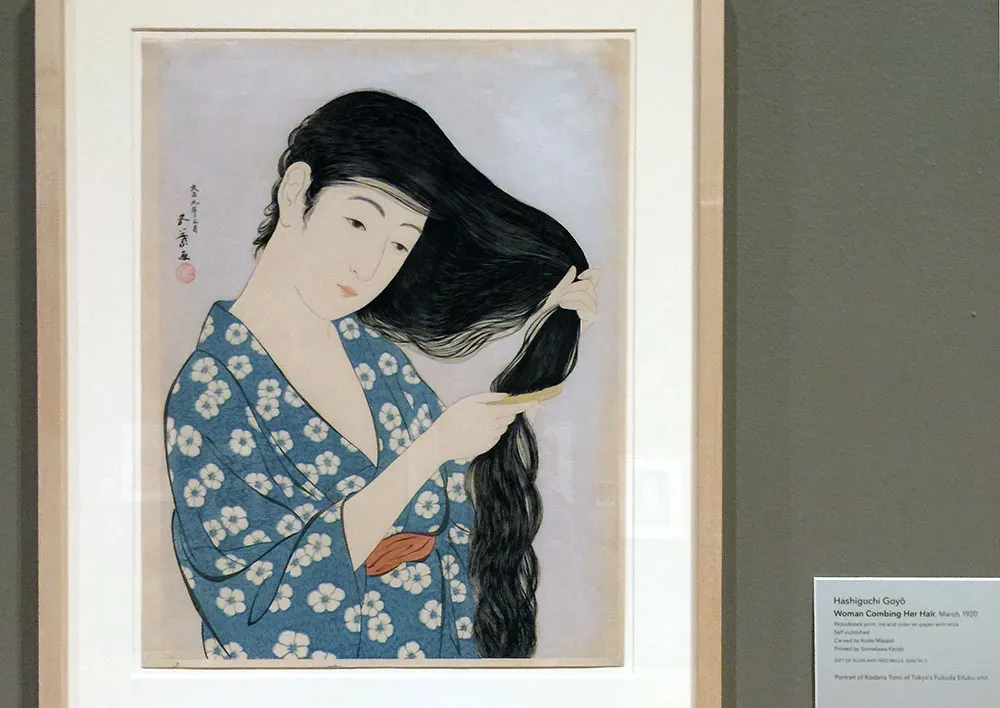
This was “Woman Coming Her Hair”, a print from 1920 that many will recognize as an image Apple used in early promotional materials for the Macintosh. Here’s the MacPaint manual (which I still have) that came with my first Mac in 1984:
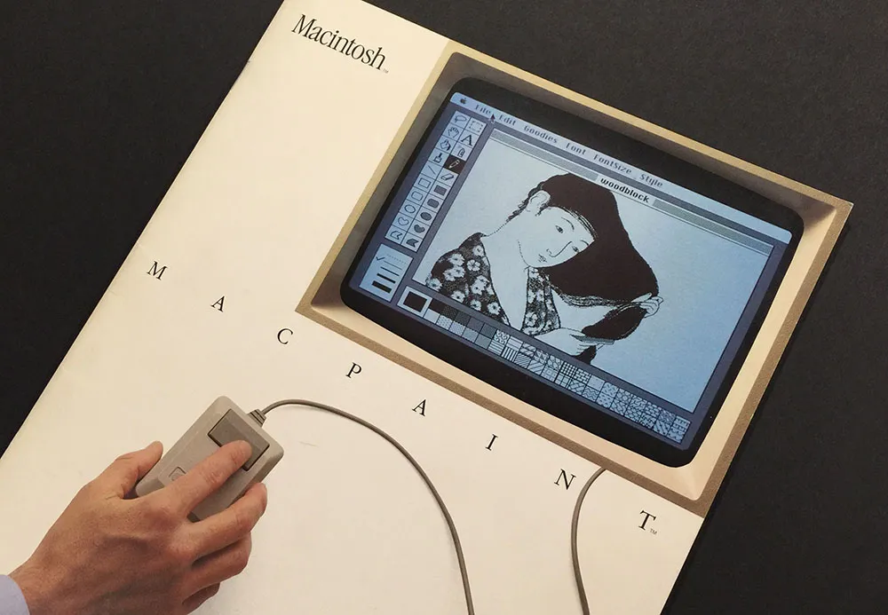
Susan Kare, the artist who created graphics and fonts for the original Macintosh, gave a talk at the Layers Design Conference last year and the video of it was made available recently. Among other things, she tells the story of how that Japanese woodcut was chosen and recreated in MacPaint.
Oh, and—what do you know?—today is the 32nd anniversary of the Macintosh. Happy birthday, Mac!
Proxima Nova version 2.008 is a major update. I’m in the process of getting it out to my distributors and it should be available from all of them within a couple of weeks.
New styles
Proxima Nova Medium. This is a new weight, available for all widths and styles. It sits between Regular and Semibold. It actually goes back to 2006, less than a year after Proxima Nova’s initial release. It was a custom weight requested by a UK magazine publisher. I’ve finally decided to officially invite it into the family.

For customers who have licensed an “all weights” or “complete” package, you should automatically get the new Medium styles when they become available at your vendor. The addition of Medium increases the size of the Proxima Nova family to 48 fonts in eight weights. Because of this, the prices of the “all weights” and “complete” packages will go up a bit accordingly.
New glyphs
- Prime and double prime, superior to “dumb” quotes for things like minutes, seconds, inches, and feet.
- Interrobangs because, well, why the hell not‽
- Small cap ¿ and ¡, which were mysteriously missing before. Okay, not so mysterious. I just forgot to put them in.
- Indian Rupee, a new currency symbol. Pretty clever and well thought out, as currency symbols go.
- Turkish Lira, another new currency symbol. Not as well thought out, in my opinion.
- Russian Ruble, another new currency symbol. It’s okay.
- Optional tabular figure 1 with serifs. This is used when you enable Tabular Lining Figures plus Stylistic Set 9.
- Capital eszett, (ẞ). Some German speakers think this is a stupid idea, some think it is long overdue. It’s there if you want it.
- A few additional Cyrillic characters used in Uzbekistan, Mongolia, and elsewhere.

Design changes
Making design changes to an existing and widely used font is not something I take lightly. That said, there were a couple of things I felt I had to change.

First, I slightly shortened the stroke at the top of the lowercase f to eliminate the need for ligatures. Unlike some fonts, the ligatures in Proxima Nova don’t connect in any way. Instead, they substitute an alternate f with a slightly shorter stroke at the top to avoid colliding with the i and l. Unfortunately, it is frequently the case that ligatures are not used when fonts are used on the web, and it really bothers me. But rather than try to get everyone to fix their websites, I decided it would be simpler to fix my admittedly problematic design of the f and use the alternate f instead, eliminating the need for ligatures entirely.
Second, I slightly shortened the tail of the lowercase j for similar reasons.
Both of these are cases where the me of today wonders what the me of yesterday was thinking. But they are subtle changes, I hope, and I hesitate to even call attention to them in case someone somewhere prefers the old f or j. I expect most won’t even notice the difference, and Proxima Nova will simply look nicer more of the time.
Other improvements
- Better hinting for Windows users. This is mostly an issue on Windows XP, an operating system released in 2001, for crying out loud. Anyway, on all versions of Windows, Proxima Nova will look better.
- Better cross-platform document sharing between the Windows and Mac versions of Microsoft Office. This is mostly related to the non-standard way that the Mac version identifies fonts. If they followed the standard, this wouldn’t be an issue. In any case, it works now, in spite of it all.
- The “bold” style shortcuts now only work with Regular and Regular Italic, yielding Bold and Bold Italic. In earlier versions, Semibold was the “bold” style of Light, and Extrabold was the “bold” style of Thin. Understandably, some Windows users had trouble finding the Semibold and Extrabold styles, not realizing they were hidden behind the “bold” style shortcut. Semibold and Extrabold now are listed in font menus, which should make Proxima Nova easier to use on Windows.
- **Full character sets for the optional fonts.**Proxima Nova Alt and Proxima Nova ScOsf now include the full Proxima Nova character set and language support (including Greek and Cyrillic), not just basic Western Latin.
- **Descriptive names for Stylistic Sets.**This is not widely supported yet, but when it is, Proxima Nova will be ready. So, instead of the sets being listed as Stylistic Set 1, Stylistic Set 2, Stylistic Set 3, and so on, they will be listed as Schoolbook Style, Geometric Sans Style, Alternate Uppercase G, and so on. Really looking forward to support for this, and you should be, too.
Specimens
You can see the new fonts in more detail in the updated downloadable Proxima Nova specimens:
Proxima Nova Overview. The story of Proxima Nova, basic style showings, full character set and technical information. 12 pages. 622 KB PDF.
Proxima Nova Full Specimen. The overview, plus complete text and display specimen for all styles of Proxima Nova, including the full character sets. 156 pages. 5.2 MB PDF.
Additional details You can find more info, test and license the fonts, and download PDF specimens on the Proxima Nova page.