Mark’s Notebook - Page 60
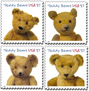
Imagine my surprise when I saw my face at the Post Office. Typeface, that is. A very prominent use of Felt Tip Roman.
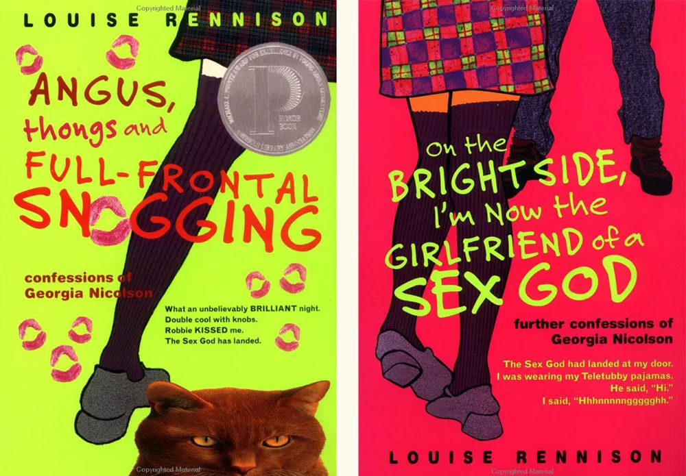
Felt Tip Roman is being used very effectively on this series of young adult novels by British writer Louise Rennison. There are at least five of them, but these two are my favorites.
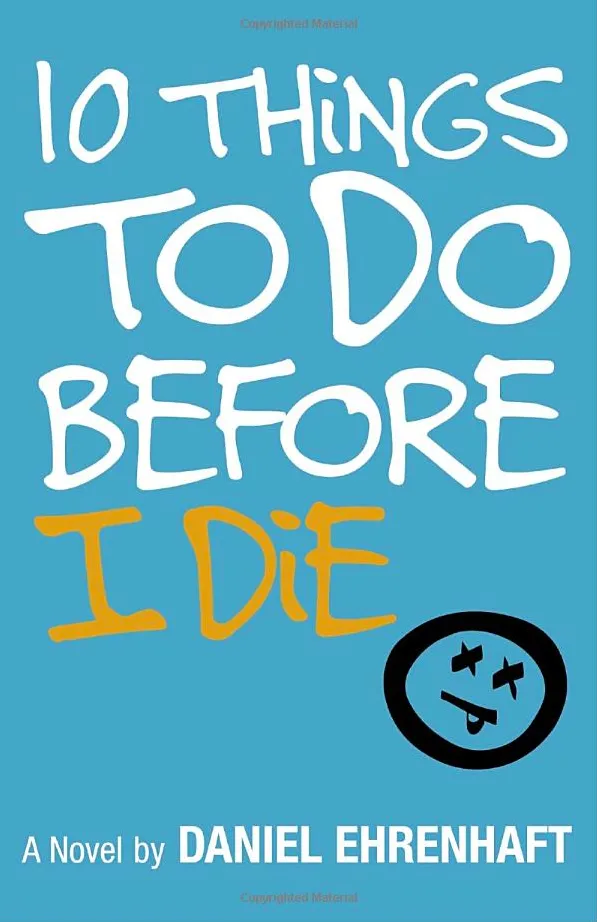
There must be something very “teen angst” about Felt Tip Roman. It keeps showing up on teen fiction titles like this. Looks good, although I see they didn’t like my cap I.
This item was sent to me by Steven Hill last year, and it’s one of my favorite type/film gaffes.
It’s from a thriller called Oxygen made and set in 1999. It stars Adrien Brody as a clever kidnapper with a Houdini fixation. In one scene, he instructs the husband of the woman he’s kidnapped to deliver the money to him at Houdini’s grave and there’s a close-up of the gravestone:
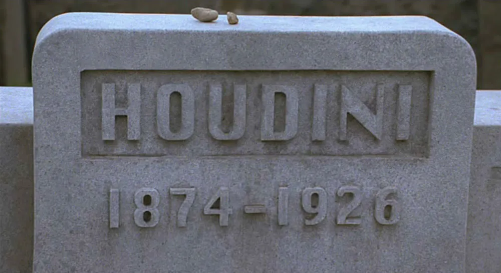
In case you don’t recognize it, that’s the TrueType version of the old Macintosh system font, Chicago, released in 1989.
I also think it’s funny how the numbers for the years are not carved into the marble but, instead they project outward. I don’t know much about cutting gravestones, but I would think you would waste a lot of stone to get that effect. I also wonder how those little pebbles got up there… Mysteries upon mysteries!
Update: According to Victor Caston, it’s a Jewish tradition to place pebbles on the headstone, and Houdini was Jewish. One mystery solved, anyway. Amazing yet intermittent attention to detail.
Further Update (June 25, 2005): According to reader Zaldamo, the real Houdini gravestone features raised letters. (It’s also quite a bit fancier.) I did say I don’t know much about how they make gravestones. One thing is still certain: Apple’s Chicago font didn’t exist in 1926.
This one was news to me: Jean François Porchez, proprietor of Porchez Typefoundrie in France, has a personal weblog called Chez Porchez. He also has a hand in the French type blog Le Typographe.com.
Berlin-based Erik Spiekermann, designer of the ubiquitous Meta, has one called spiekerblog. According to a recent interview on typeradio, he created it so he wouldn’t have to answer so many emails asking the same questions over and over.
Finally, one of the first weblogs I ever knew about was Grant Hutchinson’s splorp blog. As a type designer, he was responsible for a large portion of the old Image Club type library. Image Club is no longer around, but, after several changes of hands, many of their fonts still are available through Agfa Monotype, including his ever-popular Fajita. Grant is now at Veer in Calgary, Alberta, which he helped start up with his Image Club cohorts. [Update: Veer no longer exists, so I removed the link.]