Mark’s Notebook - Page 59
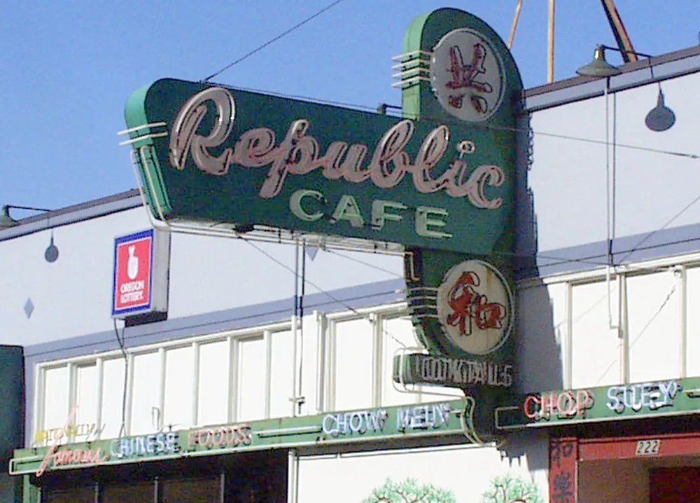
Some vintage signage not far from where I live in St. Paul. It’s nice that they’ve never attempted to renovate it.
Alastair Johnston alerted me to this one. In the 1962 John Ford movie The Man Who Shot Liberty Valance, there are several shots of the print shop and close ups the town newspaper, The Shinbone Star. Here’s one of them:
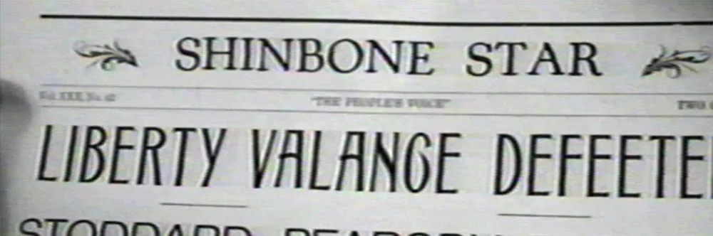
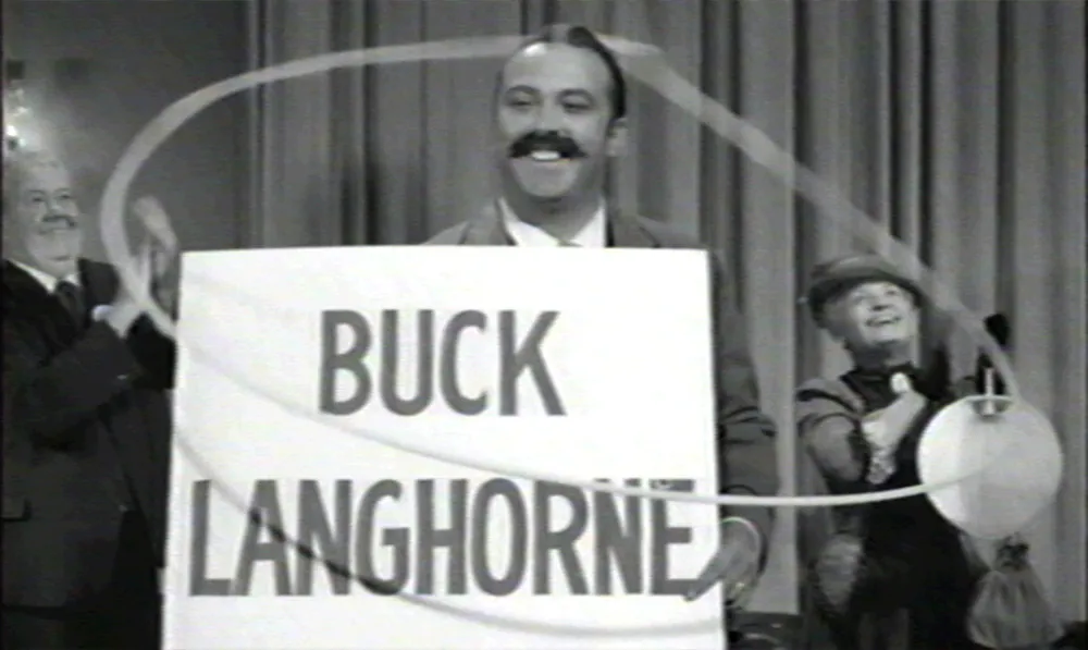
The film is presumably set in the 1880s, but the newspaper’s nameplate is set in Cooper Oldstyle, introduced in 1918. I also thought this mid-20th-century style “sho-card” lettering looked out of place:
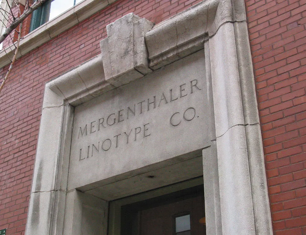
On a recent trip to Chicago, I made my way to Printing House Row and snapped this photo of the entrance to the old Mergenthaler Linotype Co. headquarters:
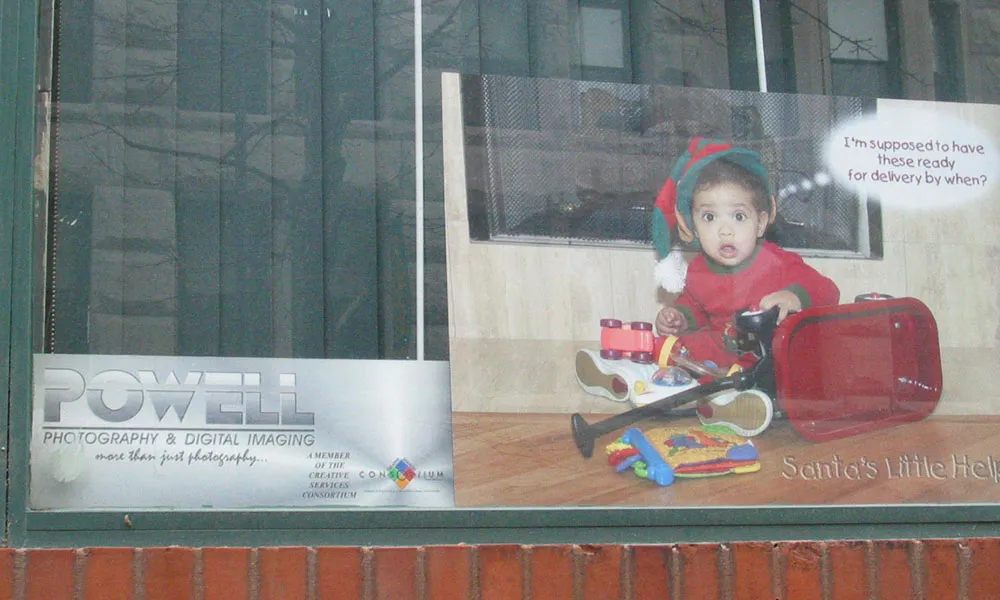
I can’t say exactly why, but it was a little distressing to see these rather tacky ads for a photographer in the window adjacent to the entrance:
I guess I thought it would be a museum or something.