Mark’s Notebook - Page 58
This one is incredibly nerdy, but I think it fits my standards for anachronistic use of type in a movie. Besides, I just love it.
In The Terminator (MGM, 1984), a cybernetic assassin from the year 2029 is sent back in time to 1984 to kill the mother of the rebel leader who will eventually lead humans in victory in a war against the cyborgs, thereby preventing the rebel leader from being born and ensuring the cyborgs’ victory instead. Whatever. As we follow this killing machine on his relentless rampage, we are given short glimpses of what it’s like to see through the eyes of a cyborg:
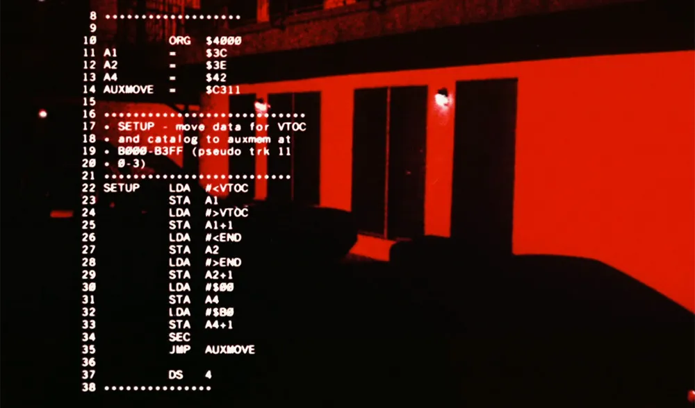
In case you don’t recognize it (and, unless you are a regular Slashdot reader, why would you?), the highly technical looking computer readouts in his vision display are actually source code printouts for an Apple II+ program that ran in a computer magazine (Nibble) in the early 1980s. Plus, it looks like it was printed on a daisywheel printer. Also used were listings of COBOL programs. COBOL was once a popular computer language for writing accounting software.
I remember noticing the out-of-place computer code when I watched the movie for a second time back in 1984, but I always thought it was source code from the Atari Operating System (Atari used the same microprocessor as the Apple II series). A quick check with Google turned up the correct info. This bit of trivia seems to be well-known in certain circles.
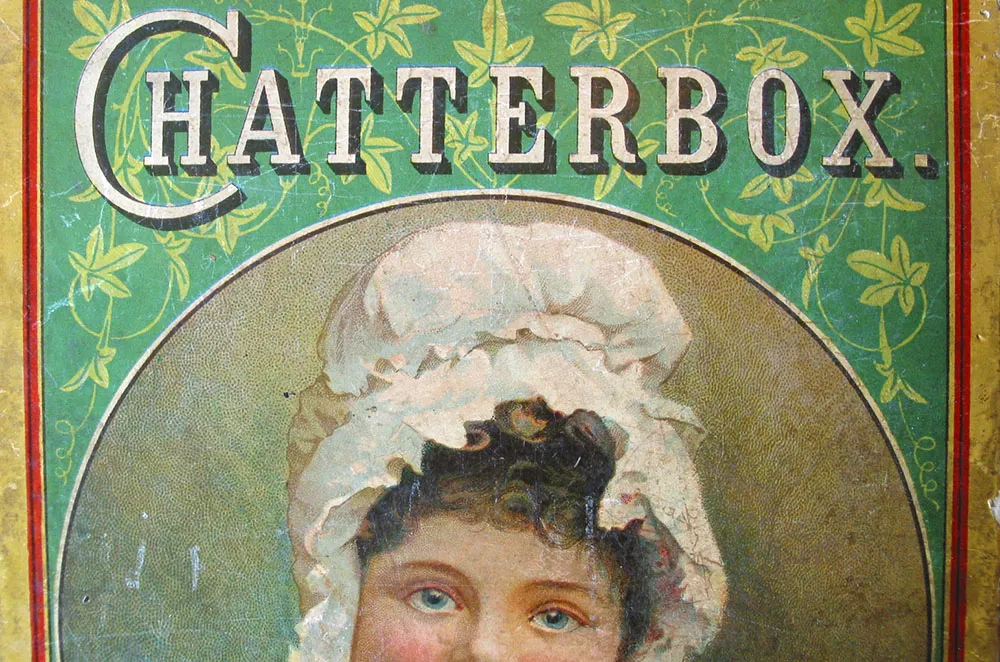
Old magazine cover. Seen in an antique store in Frazee, Minnesota in 2003.
Here are a couple of my favorite type-related places on the web:
Typophile Forums is where most of the action is taking place these days. From newbies to seasoned type designers, they’re all here talking about type. I especially like hanging around the Type I.D. Board, where everybody wins as type nerds from all over the world compete to see who can identify typefaces the fastest.
Unlike Typophile, Typographica is a group blog featuring news and items of interest about type and typography. Fierce debates are sometimes lurking in the comments. Tip: You can always tell what topics are hot by watching the “Commented” box in the right column. Chief editor Stephen Coles promises more substantial features (like my recent interview with veteran type designer Phil Martin) to come.
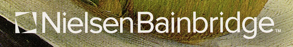
Nelson & Bainbridge picture framing products have been sporting Proxima Sans on their logo for a while now (with custom diamond-shaped “i” dots).
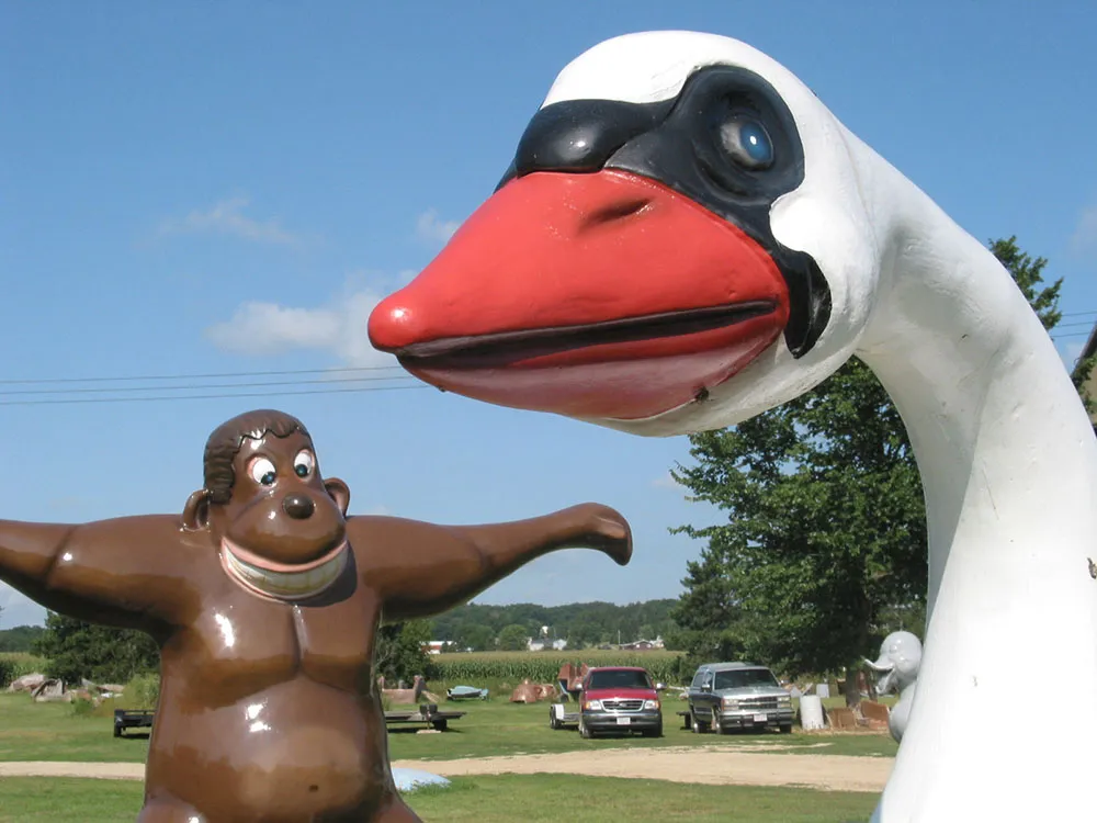
F.A.S.T., Inc., Sparta, Wisconsin, August 2, 2003. I used to see this place every time I visited my grandparents when I was little, and it’s still there. As seen in Zippy the Pinhead.
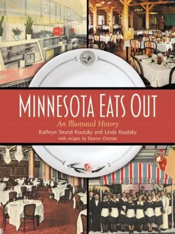
Minnesota Eats Out, by Kathryn Strand Koutsky and Linda Koutsky, was published recently by the Minnesota Historical Society Press. This really enjoyable book features two of my fonts: Blakely is used on the cover and for running heads inside, and Coquette is used throughout for initial caps.