Mark’s Notebook - Page 50
I’ve been getting a number of emails lately from people wanting to know what I think of the recent controversy surrounding some documents shown on 60 Minutes concerning President Bush’s military record which are said to be from around 1972. I’m not going to comment on it here, but I and many others have been expressing our opinions about it on Typographica where Scott Stowell posted an item about it last Friday.
I will say one thing: I don’t know as much about 1970s typewriters as I’d like to. Typewriters are like type in the way that bicycles are like motorcycles. Being an expert on one doesn’t necessarily mean you know much about the other.
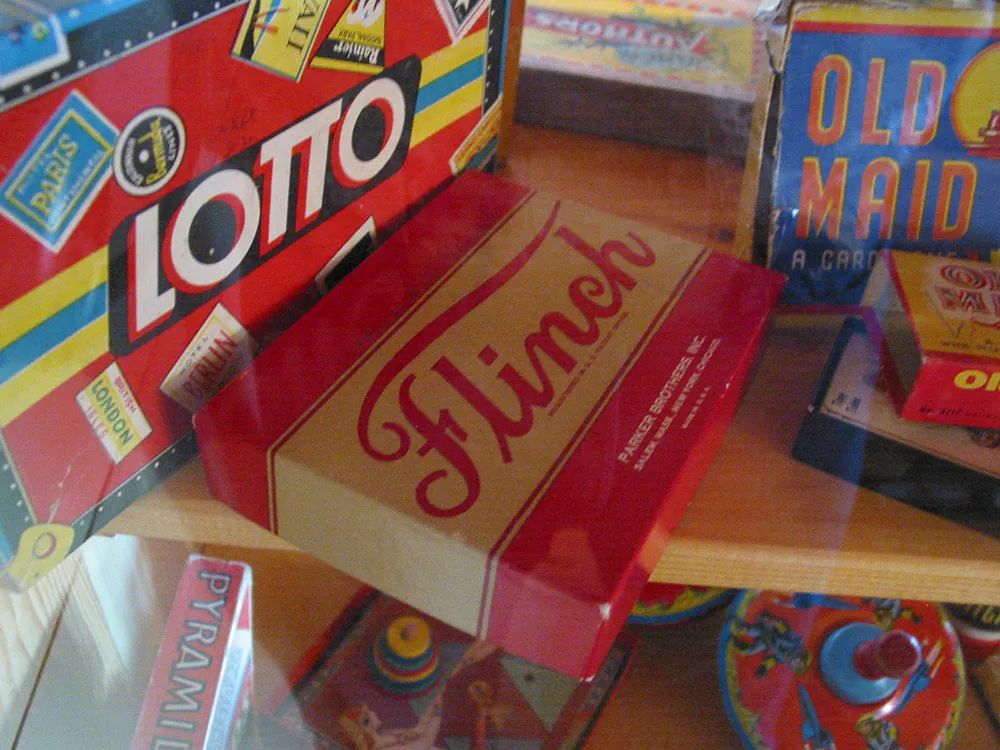
An assortment of vintage game boxes seen in the toy museum at Lark Toys, Kellogg, Minnesota, on August 21, 2004.

Bust of artist Herman Rusch. Photographed at the Prairie Moon Sculpture Garden and Museum, Cochran, Wisconsin, on August 3, 2003.
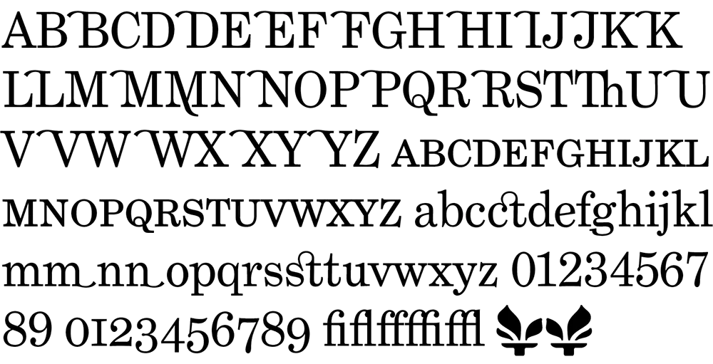
In case anyone’s wondering why I’ve been posting items less frequently lately, it’s because I’ve been working on fonts. The family closest to completion is Phil Martin’s Grad. It consists of just three fonts (plain, italic, bold), but I’ve been getting a little carried away and have added small caps, ligatures, old style figures, swash characters, and even a few dingbats (see above). All of these existed in Phil’s original private version of this face which he used for a couple of newsletters he published in the 1990s. If one had a mind to, one could recreate Re:Language, Millenium Memorandum, or even Phil’s personal stationery. Yes, some of the characters in Grad are…unusual. But that’s Phil for you. Ever the iconoclast.
Some might say that Grad is nothing but Century Schoolbook in drag. There is some truth to that. And I think Phil would even agree. But looking over Phil’s output from the late sixties through the eighties, this is the kind of thing he does best. I have come to the conclusion that Phil is the George Barris of type designers. Phil’s best-known faces were redesigns, customizations, or hybrids of existing—often classic—faces. In the type world, such an approach to type design is sometimes looked down upon. Yet Phil is very good at it. He considers Grad one of his best.
Grad is an unusual font for me to develop. It’s not a design I would have conceived myself. Nevertheless, it’s turning out very nicely. I’m putting everything I know into making it a well-tuned machine that works as well for text as for headlines. In order to accommodate all the extra characters Phil designed, I’m planning to release it in OpenType format. This will mean that things like the real small caps and alternate characters will be accessible from a single font in each style. I plan to also do Grad Condensed at a later date, completing the family.
In the mean time, I have other fonts in the works, including a re-release of Proxima Sans. The new version will have more weights (lighter, bolder, and more in-between) as well as condensed and semi-condensed styles. Plus small caps and other typographic niceties. More information on this as it develops.
For more about Phil Martin, see my interview with him on Typographica or visit his personal website. [Update: Phil died in 2005 and his original site is long gone, but I’ve linked to an archived version on archive.org.]
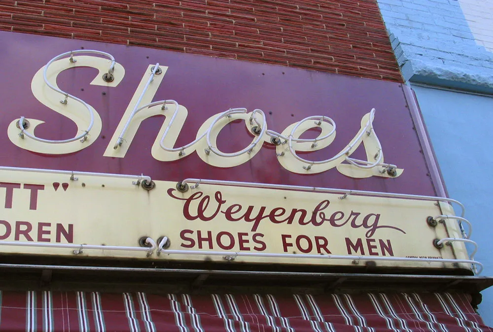
A very-well-maintained vintage metal/neon hand-lettered sign. It looks almost brand new. This sign has been in continuous use since the 1940s. Seen in Beloit, Wisconsin on August 8, 2004.
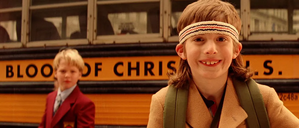
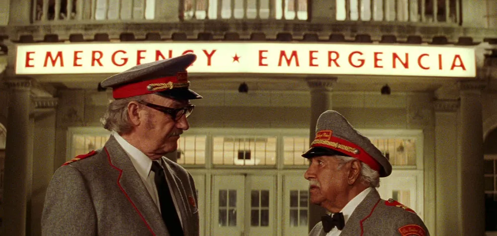
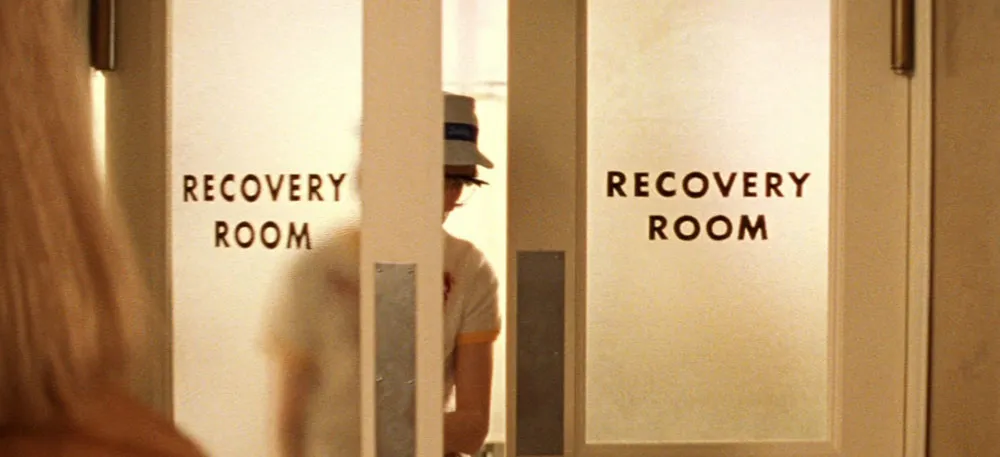
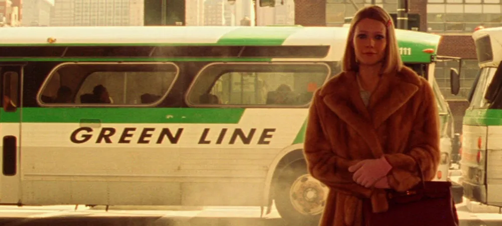
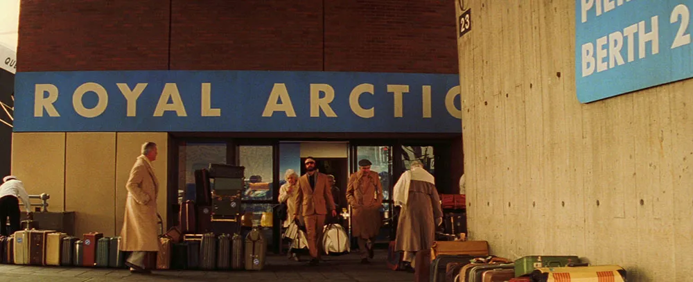
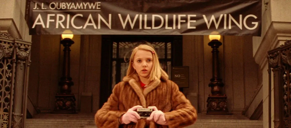
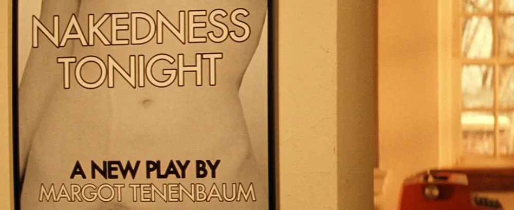
Quite a few people have written me to ask about the type in The Royal Tenenbaums (2001). The type isn’t anachronistic so much as idiosyncratic. Director Wes Anderson seems to have a thing, bordering on obsession, for Futura. The credits are set in Futura Bold—nothing strange about that. But it doesn’t stop there. The Tenenbaums seem to exist in a world dominated by Futura (mainly Futura Bold):
On buses:
At the hospital:
More buses (slanted this time):
For a cruise line (notice it’s called Royal Arctic):
At the museum (Medium weight instead of Bold):
On posters (Margot Tenenbaum seems to favor Medium):
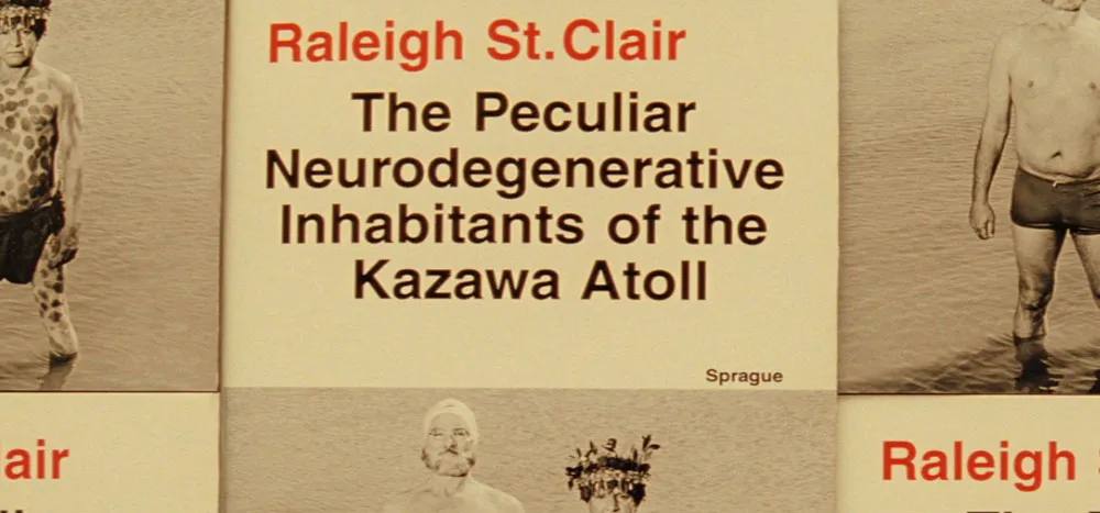
Yet, as much as Futura is used in the movie, a few other typefaces make their appearances. Interestingly, it is usually in connection to someone or something outside the Tenenbaum family and is usually Helvetica:
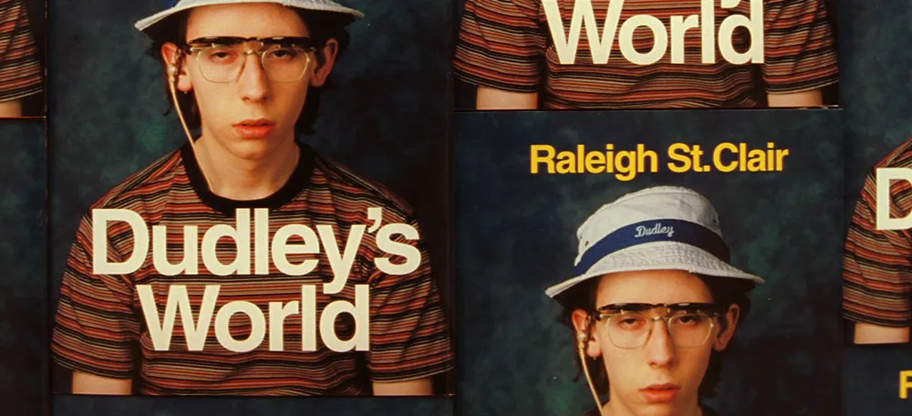
On Raleigh St. Clair’s books:
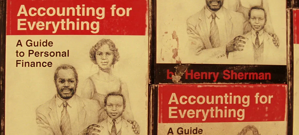
On Henry Sherman’s book:
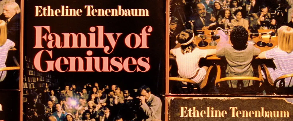
A curious (and possibly significant) exception to this pattern is on the cover of a book supposedly written in the 1970s by Royal Tenenbaum’s wife, Etheline. The typeface is Milano, a quintessentially 1970s choice:
I give The Royal Tenenbaums five out of five stars for its use of type, not because it’s perfectly chosen for the period it depicts (though, as far as that goes, it is), but because Anderson has used type in such an integral way in the film. (I also happen to like Wes Anderson films a lot.)