Mark’s Notebook - Page 49

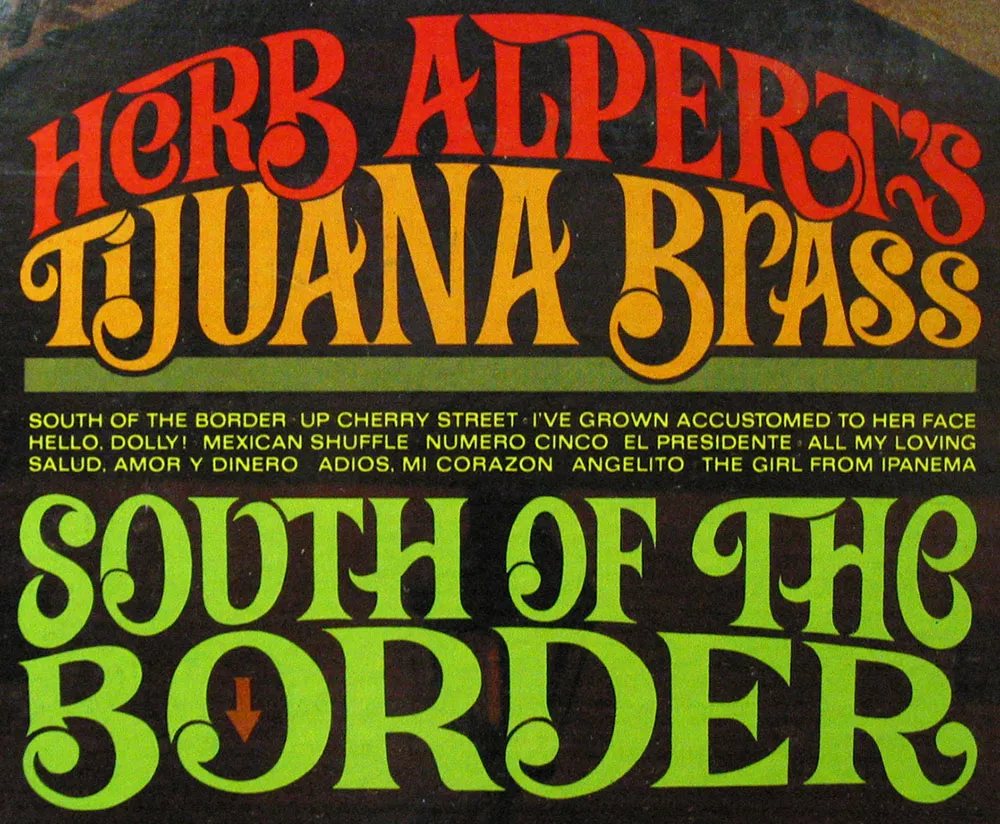
Some spicy lettering from the cover of “Herb Alpert’s Tijuana Brass / South of the Border” (released in 1964), a record album I picked up in an antique store. It looks like it might have been done by Ed Benguiat—it’s very much in his style, particularly the “wedged-in” layout. The design credit just says “Apple Graphics.” The arrow is a nice touch. Just in case you’re bad with directions, I guess.
The record was absent, so I guess I’ll miss out hearing “Hello, Dolly!” sung with a Spanish accent.
 Lately, I have been watching the first (and only) season of The Jestons on DVD with my 10-year-old daughter. She likes them a lot. I remember many of them from when I was her age, some more than others.
As with anything you enjoyed watching as a kid, it isn’t the same watching it as an adult. The stories are pretty dumb (no big surprise), so I’ve mainly been looking at the way they were drawn and animated.
I wanted to be a cartoonist for a while when I was a kid. I spent a lot of time drawing cartoon characters from TV shows, comics, and such. I especially was influenced by the stylized characters of Hanna-Barbera and Jay Ward cartoons.
As I’ve been watching The Jetsons, I’ve been doodling characters, trying to see how they were constructed, how they got them to look they way they looked. The formula they used was pretty simple and efficient (it had to be for a weekly show) and I found myself drawing pretty good likenesses very quickly.
The other thing I did recently was read a book about comic book artist Wally Wood (Against the Grain: Mad Artist Wallace Wood, published by TwoMorrows Publishing). Although most comic book aficionados know him for his science fiction and war comics, I am most familiar with Wood’s drawings in Mad magazine, particularly from the late fifties and early sixties.
My uncle, who is about ten years older than me, was a Mad reader in the fifties. As a kid, I used to go straight to his collection when we’d visit my grandparents. The thing I remember most about them was Wally Wood’s drawings, especially his drawings of jazz-crazed hipsters, with their shiny black shades and goatees.
The story of Wally Wood is a sad one (he took his own life in 1981) but his influence and the beautiful work he produced lives on.
So. What’s Wally Wood got to do with The Jetsons? Nothing at all. But it explains the drawing.

A brainy looking portrait of Tom Selleck seen on a carnival ride at the Minnesota State Fair on August 26, 2004.
Last Friday I attended the opening of a show at the Minneapolis College of Art and Design showcasing the work of illustrator Mary GrandPré. I hadn’t seen Mary since the mid-eighties when I was the art director at Minnesota Public Radio and she was at the beginning of her career as an illustrator.
Mary is best known now for illustrating the Scholastic editions of the Harry Potter books. Her success as an illustrator is even greater than I had realized—she also did concept drawings for Antz and character designs for Ice Age.

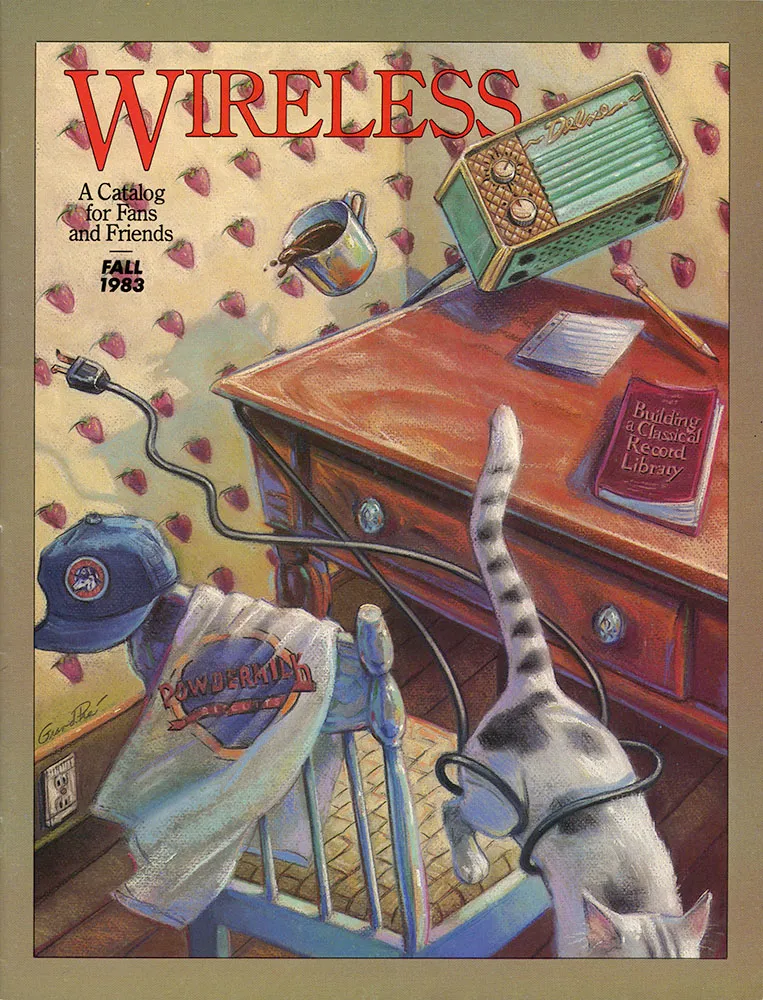
The illustrations she did for me were always wonderful, and not all that different from the much more refined style she’s known for now. (She did the cover for the first Wireless catalog for me in 1983, shown above.)
She asked me for advice back then about whether she should develop a definite style or try to diversify and do many different styles. I urged diversification. Thank goodness she ignored my advice.
I’ve been getting a number of emails lately from people wanting to know what I think of the recent controversy surrounding some documents shown on 60 Minutes concerning President Bush’s military record which are said to be from around 1972. I’m not going to comment on it here, but I and many others have been expressing our opinions about it on Typographica where Scott Stowell posted an item about it last Friday.
I will say one thing: I don’t know as much about 1970s typewriters as I’d like to. Typewriters are like type in the way that bicycles are like motorcycles. Being an expert on one doesn’t necessarily mean you know much about the other.

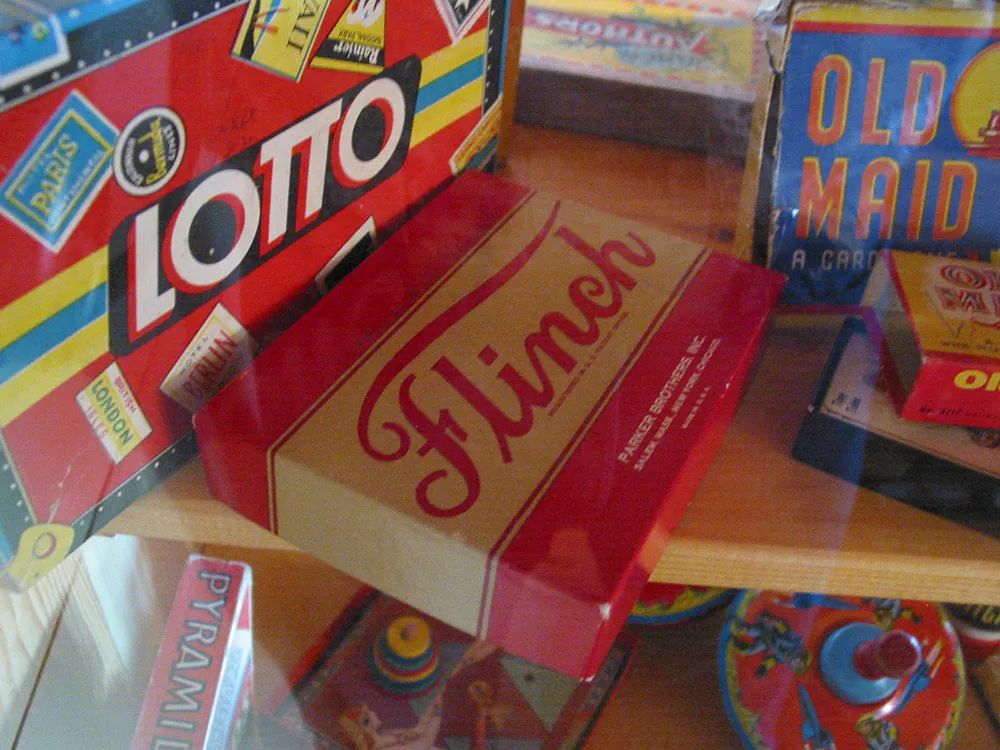
An assortment of vintage game boxes seen in the toy museum at Lark Toys, Kellogg, Minnesota, on August 21, 2004.
