Mark’s Notebook - Page 48
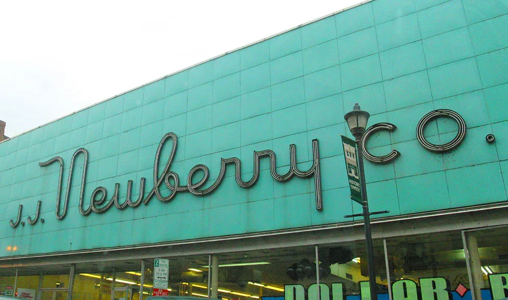

I’ve been meaning to get a photo of this sign ever since I first saw it. Over the holidays, we stopped to eat nearby and I remembered to get a few shots of it. Photos taken December 31, 2004 in Owego, New York.
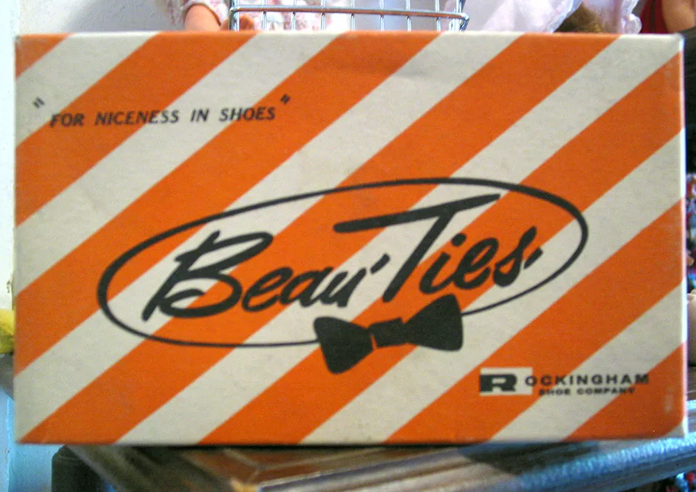
Like it says on the box: “For Niceness In Shoes.” Seen in an antique store on July 7, 2004 in Prescott, Minnesota.
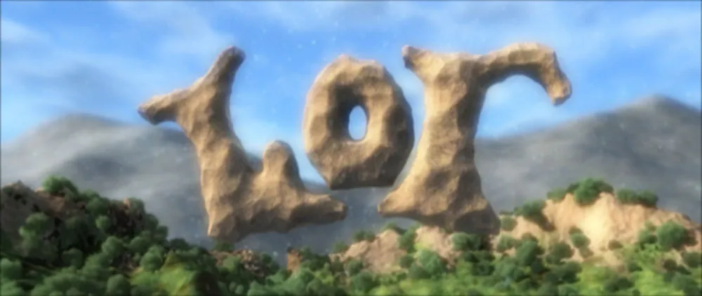
My day was brightened this morning by an email notice that Lots of Robots, Volume Two is up. LOR is an ambitious computer animated feature film being created singlehandedly by the multi-talented Andy Murdock. His artistic and technical mastery are astonishing.
I first learned of LOR in Brian Taylor’s online Rust Boy diary a couple of years ago. Rust Boy is similarly a one-man effort to create a feature film using computer animation. Both of these projects demonstrate just how much creative leverage ordinary computers can provide an individual nowadays when talent and ingenuity are applied (not to mention shear effort and persistence).
I have been following both Rust Boy and LOR with great interest over the past few years. Rust Boy’s Brian Taylor has been making very few diary entries lately, hopefully because he’s been too busy working on the film. A book about the making of Rust Boy was published last year. I bought a copy and would recommend it. The price is a tad high for something like this, but it’s nice to know that you are helping to finance his efforts. Still, it’s very nicely produced and with 3-D pictures and anaglyphic glasses with which to view them.
The Lots of Robots site has had very few updates since I first visited it, except to announce the release of the first DVD. Of course, I bought a copy. The Quicktime sample of the film looks pretty good on Murdock’s site, but it’s nothing compared to seeing it on a big screen with 5.1 surround sound. It’s also fascinating to watch the making-of tutorials (at least to me) and I’m looking forward to ordering the new DVD. There goes another $30, but I know it’ll be worth it.
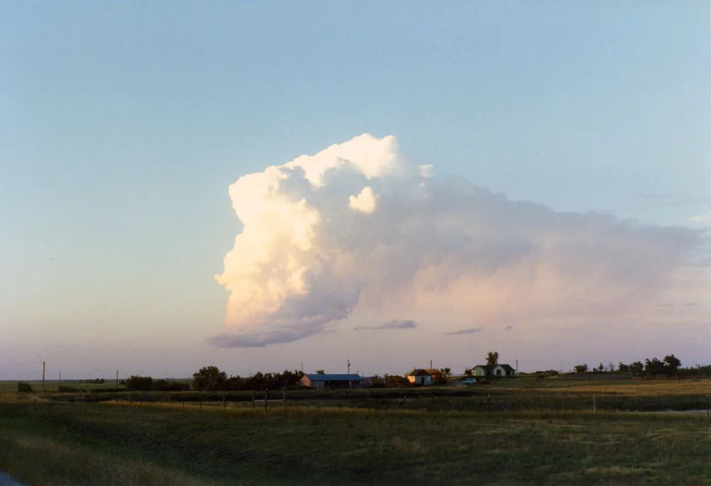
While traveling east through South Dakota in the summer of 1990, I stopped to snap a picture of this strange looking cloud. The flatness of the landscape and the emptiness of the sky gave it an eerie prominence.
Not long after this, we ran into a swarm of insects so thick we had to turn on the windshield wipers.
That evening, as we continued to drive, a cluster of lights zipped unnaturally fast across the sky just after dusk. It was the only time I’ve ever seen anything I would describe as a UFO. By a strange coincidence, we had just visited Devil’s Tower in Wyoming that morning. I don’t believe in such things as flying saucers and alien visitors, but the effect was unnerving.
We stopped at Chamberlain and checked into a motel. In the middle of the night, my partner woke up screaming that there were green and yellow bugs boiling out of the ceiling. As I fumbled to turn on the light (it was pitch black in the room), I happened to put my hand on her face, which she took to be a fox and screamed all the more. I finally found the light and, after a little while, we managed to get some sleep.
It turned out that the UFO we saw was a Russian rocket body breaking up and burning in the upper atmosphere. It was visible all over North America. No explanation for the bugs, except that they clearly fueled my partner’s hallucination. In fact, she had been overdosing on aspirin, which she was taking in massive quantities to overcome the pain of a toothache which started during our trip. Too much aspirin, it turns out, can cause hallucinations, especially of bugs.
And the cloud? They just look like that sometimes.
I discovered Todd Dominey’s What Do I Know [Update: Sadly, it no longer exists] weblog a while back among the hundreds of sites listed on Movable Type’s old Donors’ page (R.I.P.). I thought, “Well there’s an interesting name.” It turned out to be an interesting site, too. I always look forward to reading what Todd has to say. Great links.
I know. Everybody knows about Jeffrey Zeldman’s blog. It’s still one of my favorites. I discovered it when he linked to one of my articles a couple of years ago. He hasn’t been writing much lately due to the fact that he just became a father. I can’t blame him at all, but I hope he manages to drag himself back to his keyboard soon. Closely linked to Zeldman is A List Apart—essential reading for anyone who creates websites.
Illustrator and designer John Martz’s Robot Johnny weblog is a recent addition to my short list. I discovered it when John added my Notebook blog to his links page. Robot Johnny is every bit as fun and interesting as I hope my site is. In fact, it’s a bit eerie how many interests we have in common. I’ve come to realize that on the internet this sort of thing is inevitable.
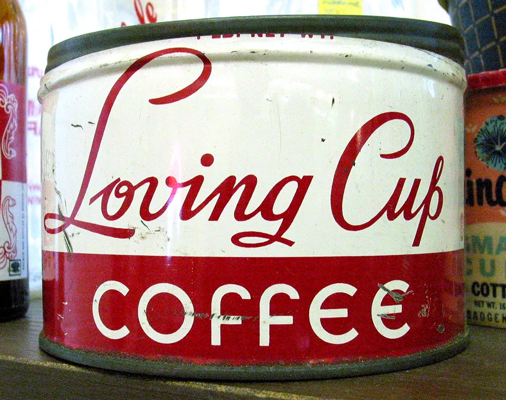
Some nice lettering seen in an antique store in Hixton, Wisconsin on July 29, 2004.