Mark’s Notebook - Page 44

I’ve never designed a tattoo before, and not many ambigrams, either.
An ambigram is a form of lettering in which a word or phrase can be read in more than one direction. Or it may be two words combined into one image in which only one can be seen at a time, depending on how you look at it. The master of this art is John Langdon whose 1992 book Wordplay showcased his work. (A new edition is in the works.)
The design above was for a tattoo and was commissioned by a client in Canada. It reads the same if you rotate it 180°. (I don’t know where she had it placed, but she promised to send a photo.)
Ambigrams are partly luck, partly skill. I feel lucky it turned out as well as it did. I hate to think of someone permanently dyeing their skin with a design that didn’t quite work.
My sharp-eyed daughter noticed this when we were doing our yearly apple-picking this morning. Photographed at Afton Apple Orchard, Afton, Minnesota, October 9, 2005.

One of the first prominent uses of my recently released Proxima Nova is at Joyent.com where it is part of their corporate identity. Notice they are using the alternate lowercase a.
(Thanks to Stephen Coles for telling me about this.)
I’ve always had a rather vague grasp on the history of New York City. So, before taking a trip there this last summer, I rented Gangs of New York (Miramax, 2002), hoping to learn some of it. I realize the film is not perfectly historically accurate, but I really enjoyed watching it. Scorsese did a wonderful job with the story, the characters, and the setting, making me feel like I had stepped into New York City of the 1860s. However, as I’ve come to expect with Hollywood movies, the typography was a bit off base.
For the most part, the type choices in Gangs of New York are plausible in terms of general feel. In many cases, common 19th century wood type designs are used, especially on posters, appropriately enough, though some of these look a bit too distressed, as if they were enlarged from microfilm copies or something. Most of the signs on buildings were right on the money. I thought this one was pretty good:

On the other hand, the movie is riddled with anachronistic type choices. Here are some examples from posters:

Here we see Bernhard Antique (1937) with two overly-distressed-looking 19th century wood types. Notice the straight apostrophe in the bottom line. Straight apostrophes and quote marks did not exist in typefaces until the advent of digital type in the 1980s. It’s a computer thing, not a typographic thing.

More wood type, but the second line (“Harry Watkins”) is set in Aachen (1969).

This one is set in URW Egyptienne (1950s) and ITC Benguiat (1977). Benguiat is a particularly poor choice since it is based on the Art Nouveau style of around 1900. Benguiat shows up on a couple more posters in the movie.

This is better, but not 100% historically correct. The bold font next to the pointing finger is Rockwell (1930s).

Here we have some artificially condensed Americana (1967) with Memphis (1930s). You couldn’t distort type by condensing it like this back then. It was made of wood or metal, after all.

Now this is interesting. Avenir (1988) carved in marble. Few typefaces say “1860s” less than Avenir, which means “future” in French. It would actually be quite an evocative choice for a film set in the early 2000s. It’s very popular these days.
On to the printed ephemera, starting with newspapers:

Good old (actually not so old) Memphis, again, paired with Caledonia (1940). I should point out that the way they set the type here looks right; it’s just the font choices that are wrong. There were typefaces back then that looked generally similar to these to the untrained eye, but not exactly like these. (9/5/13 Update: Eagle-eyed reader Anton Sherwood also spots Windsor (1905) in the small bold text on the left.)

The same comments go for this one. The sans serif is Helvetica (1957) and the serif font is Egyptienne (1956).

This one I love. It’s a civil war draft registration ticket. The heading is set in Futura (1927) and the text is set in Garamond (c. 1920). Now, you might say Garamond should be okay because the original Garamond types were from the 1500s, which predates the 1860s. The fact is, they were only used in the 1500s and similar types were not seen again until they were revived around 1920. I’m not sure about that handwriting at the bottom, either.
So. A great movie, but a bit flawed in the typographic department. Three out of five stars for use of type.

Recently, my family and I paid a visit to West Virginia for my in-laws’ anniversary. While we were there, my partner, Pat, came across a little place called Fill ’er Up with Memories in Berkeley Springs. I wasn’t with her at the time, but happily she had our camera with her and, knowing how I love this kind of thing, took some photos.
The place itself is a kind of museum in which the proprietor, David Weidemoyer, has put on display his personal collection of “petroliana” as well as his wife’s doll collection and an assortment of toys. It’s not a store, but he’s interested in selling some of the petroliana stuff. He’s become more interested in enameled signs.

When I was a little kid, I had a toy gas station very similar to this. It was made of lithographed tin and plastic. I seem to recall spending a lot of time with it. Kids are strange little creatures.


Some oil cans. I love the script lettering on the Artex can. Not a bit of type on any of these—it’s all hand-lettering.

Old gas price sign. Dream on.
(All photos by Pat Thompson, taken on September 4, 2005.)
Okay, I was originally going to post one or two more detailed reports about the conference. But it’s kind of old news now. Suffice it to say, I had a blast and met lots of interesting type people I hadn’t met before—Chester (Thirst & Village), Yves Peters (Typographer.org, etc.), Steve Jackaman (International Type Founders), David Berlow (The Font Bureau), Akira Kobayashi (Linotype), Mario Feliciano (a very talented type designer from Portugal), Peter Bain (Incipit), Gerry Leonidas (Reading/UK), Stephan Hattenbach (MAC Rhino Fonts, Sweden), Carol Wahl, (Type Directors Club), Rodrigo X Cavazos (Psy Ops), Dan Reynolds (Linotype), and too many others to mention—as well as catching up with previous acquaintances again.
Several cool things happened that I have to mention:
The weekend before TypeCon started, I was mentioned in an article about small type foundries in the Sunday New York Times Magazine. I knew this article was coming out because, of course, the reporter talked to me a few weeks before. There wasn’t much about me in the article, but I think I gave the writer some good leads.
My new Proxima Nova was reviewed in a “keepsake” limited edition booklet put together by Typographer.org. (More about it here.)
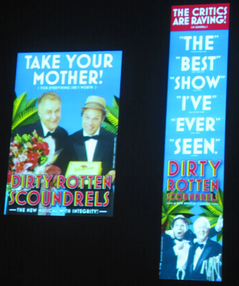
Finally, on Friday morning there was a presentation by SpotCo, a design/advertising studio in New York that does nothing but Broadway publicity work. I hadn’t heard of them before, but recognized some of their work (most famous of which is probably their campaign for “Rent” in the mid-90s). All very nice work. But I did a double-take in the middle of it when they showed the slide shown at right. Mostra Bold on Broadway. How cool is that? I’m not the only one: They used Eric Olson’s Bryant for the Lennon show.
So, that’s it for TypeCon2005. Now back to our regular programming…