Mark’s Notebook - Page 43
The new release of Proxima Nova features a couple of compatibility fixes and more flexible access to alternate characters.
As a side benefit of one of the fixes, the Normal, Condensed, and Extra Condensed styles appear in their own font submenus. This turns out to be a better arrangement than having the whole family all in one submenu. I should have done it this way in the first place.
Alternate characters will now be much easier to deal with. I’ve set up seven “Stylistic Sets” so that alternate characters may be substituted globally in any combination. The new sets are also smarter the the original two in the way they handle the two-story and one-story lowercase “a” in the roman and italic. Again, I should have done it this way in the first place.
The update is free to customers who purchased before December 14, 2005. Customers who purchased after December 14, 2005 already have the new version.
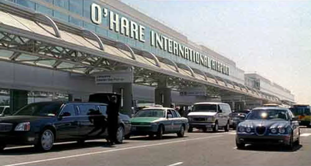
I wish I could claim credit for finding this gem, but I haven’t even seen this movie (I hear it’s very funny, though). The font shown in the airport sign is the old Macintosh system font Chicago. Historically speaking, it’s possible, but an extremely unlikely font choice for a major airport, even one located in Chicago. Matt Soar spotted this and wrote about it on his blog. He also has written about typographical oddities in HBO’s Deadwood and the movie Paycheck. Good eye, Matt! (Update: Matt Soar seems to have deleted those entries from his blog.)
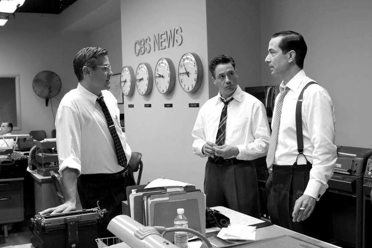
I was very happy to be included in a short article in today’s New York Times Good Film, Shame About the Helvetica about designers who notice anachronistic font choices in films, but I was a bit taken aback when I received an email first thing this morning from the art director of Good Night, And Good Luck. She pointed out that Helvetica was not used in the film, contrary to what was claimed in the article. She said, rather, that the sign shown in the example frame was set in Akzidenz Grotesk, a face which predated (and in fact was the basis for) Helvetica, and that this choice was based on extensive research of CBS’s graphic design during the period depicted in the film.
This is no skin off my nose since I have not made any comments (yet) about the use of type in Good Night, And Good Luck. The comment was made by graphic designer and fellow font flub finder Michael Bierut, who, along with Scott Stowell and myself, is quoted in the article. Judging from the still shown in the article, I might have come to the same conclusion. As it happens, I missed the film when it was in theaters and will have to wait for the DVD release to see for myself.
If what she says is true (and she was very adamant about it), it is very unfortunate that Good Night, And Good Luck was chosen as the lead example in the article. Especially since its art director appears to be one of the rare people working in film who cares about getting the type details right.
Update: Thanks to some detective work by Stephen Coles, as reported at The Design Observer and Typophile.com, it has been confirmed that Good Night, And Good Luck really does use Akzidenz Grotesk.
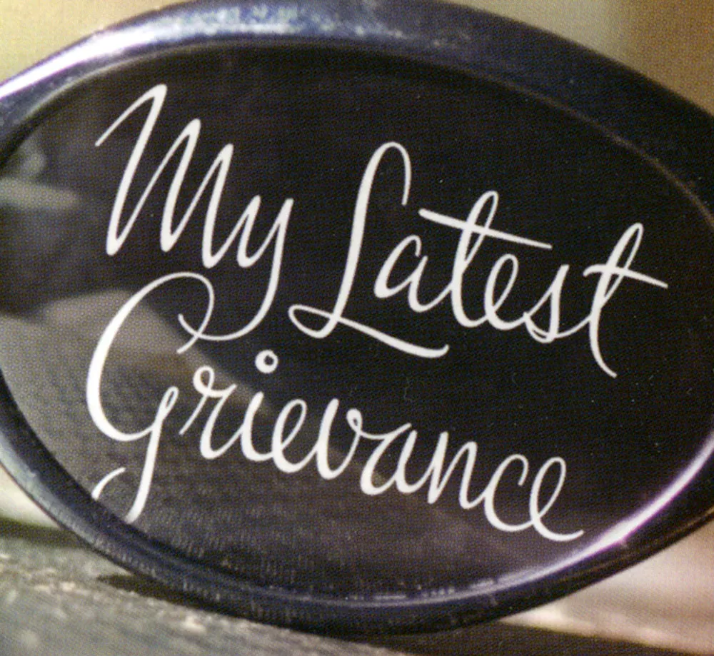
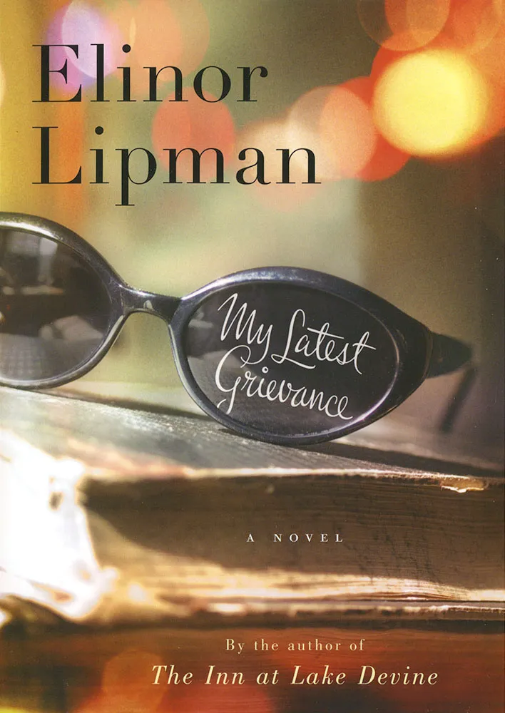
One of my recent lettering jobs was this one for the cover of Elinor Lipman’s new book My Latest Grievance, due out next spring. Houghton Mifflin art director Martha Kennedy wanted something spirited with a handwriting feel. I’m happy with the way it turned out. I’m always a little surprised that I can do this style at all. My actual handwriting is pretty erratic. I know people who can write like this. There must be something about the way their hands work that I just don’t have. Luckily, if I know how I want it to look and take my time, with a little assist from computer technology, I can pull it off. I take heart in the fact that the great lettering artists of the past would have been lost without their photostat cameras and razor blades. These things are never as easy as they look.
In my Typecasting article and Son of Typecasting here in the Notebook section, I hold films under the spotlight and (sometimes) make fun of their use of type. But what about the dedicated few who go that extra mile to create historically accurate typographic props—books, tickets, posters, newspapers, drivers’ licenses, legal documents, and so on—for movies?
Shortly after posting Typecasting on my website a few years ago, I heard from Andrew Leman (www.ahleman.com) who has made a career of forging printed ephemera for movies. He also makes and sells digital fonts based on historical references, many of which were created for use in props. Although it’s not exactly a movie prop, I really love his ElectriClerk which looks like something out of Brazil, and it actually works.
My friend David Steinlicht recently brought to my attention the work of Ross MacDonald (ross-macdonald.com). I’ve known of his work as an illustrator for years, but I had no idea he made props. Turns out, Ross is a letterpress aficionado and actually prints and binds some of his props using traditional printing and bookmaking techniques. Aging is one of his tricks and it’s shocking to read how he abuses some of his beautiful creations to make them look convincingly old and worn.
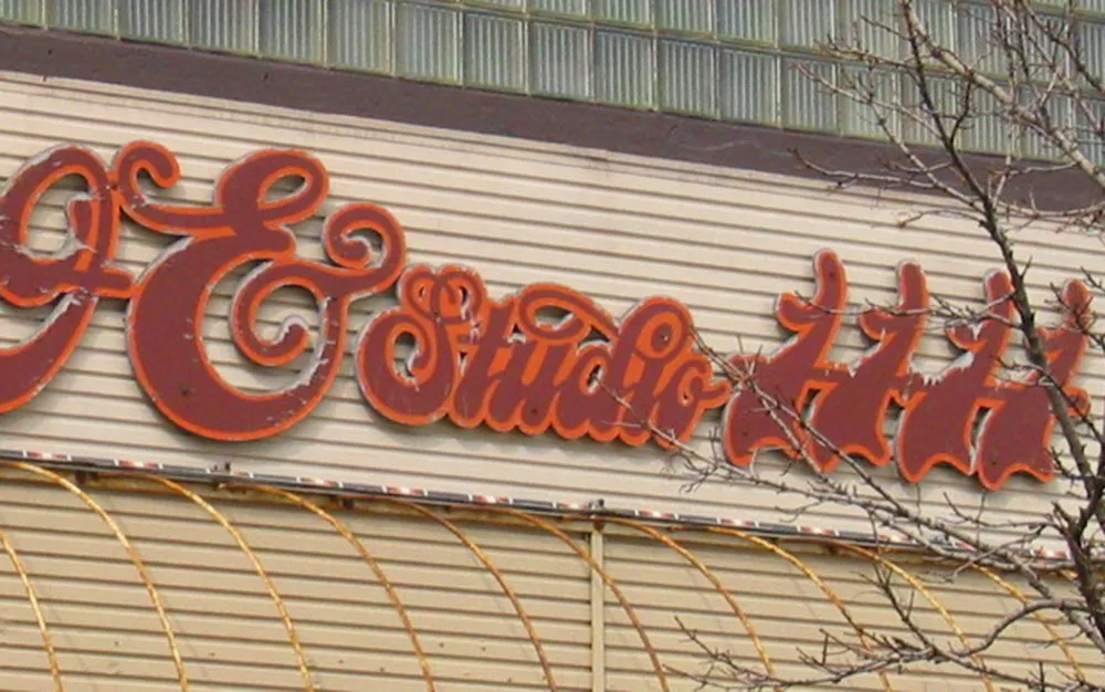
I don’t know what’s in this building, but I like the 1970s-style script lettering on their sign. Those ones look like dancing scimitars. Photographed on April 1, 2005 in Milwaukee, Wisconsin.