Mark’s Notebook - Page 42

For the last couple decades or so, automobile license plate design has become increasingly poor. In Minnesota, we’ve lived with the stylized lake shore design (top left) since the early 1980s. I have never cared for it much. I prefer the way license plates used to look—plain design, two contrasting colors, name of the state and a slogan, with large, easy-to-read numbers. Simple and clear.
States have long seen license plates as a sort of advertisement, as evidenced by the obligatory slogan. New production methods, developed in the 1970s at 3M, a Minnesota company, allowed greater freedom than the old stamp and paint method. The current Minnesota “10,000 Lakes” design was one of the early ones and hasn’t changed much over the years. Recently, though, things have been getting strange.
First there was the “Critical Habitat” plate (middle). For an extra fee, you make a small contribution to help preserve wetlands and such, and let everyone know it by sporting this plate. When I first saw these, I was struck by two things. One, it looks like a little wildlife painting.Some people like that sort of thing, but I think it’s a bit out of place on a car bumper and makes the plate unnecessarily busy. Second, the numbers are smaller, narrower, and not raised. In fact, it looks like you could crank one out on an ink jet printer. The font itself is not the old standard license plate font, but some sort of artificially condensed version of Univers. It’s noticeably harder to read than the standard plates. And notice how the hitch obscures the second letter. There are a lot of cars with hitches in Minnesota. Did they not think of this?
But the “Critical Habitat” plate pales in comparison to the latest design which came out in December: The “Support Our Troops” plate (right). I don’t mind people wanting to show their support for the troops. What I have a problem with is the design. It looks as if it was intentionally laid out to make it hard to read the plate number. It’s got the same font problem as the “Critical Habitat” plate. On top of that, the number is printed in dark blue over a wavy, red stripe. Any competent graphic designer will tell you that dark blue on red is a terrible combination for readability. The wavy shape doesn’t help. Because of the reflective material used, it’s not so hard to read at night with a light shining on it. The background is more reflective than the numbers giving it decent contrast. But during the day, depending on the lighting conditions, these plates are sometimes impossible to read. Especially with numbers that have similar shapes on the top and bottom, like 0, 3, 6, 8, and 9.
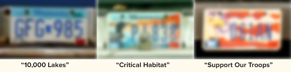
I’ve blurred all three plates in the bottom three photos just to show how much harder these new plates are to read under less than ideal conditions. You can still easily make out the first one, but the others are anyone’s guess.
I always thought license plates were meant to make it easy to identify individual vehicles, say if a car is stolen or used in a crime. I guess that’s not such a big deal anymore compared to the fundraising and promotional opportunities.
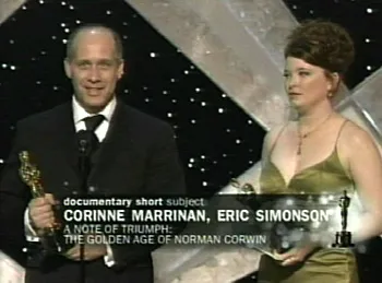
Well, none of my fonts showed up on the Academy Awards show this year unlike last year, but my cousin Eric Simonson did. He and his co-producer Corinne Marrinan snagged an Oscar (Best Documentary Short) for their film “A Note of Triumph: The Golden Age of Norman Corwin.” Eric was nominated once before for another documentary short, “On Tiptoe: Gentle Steps to Freedom” (2000), and our whole family was excited to hear that he had been nominated again. Only this time he got the statue. Way to go, Eric! (And Corinne! though I don’t know you.)
I confess that I probably wouldn’t know Norman Corwin from Irwin Corey if I hadn’t worked on a package design for a collection of his radio broadcasts back in the nineties. I also confess I don’t know much about Eric’s documentary. All the years I have watched the Oscars, I have always wondered, where the heck can you see these short films? I saw his earlier nominated film at a family reunion. As luck would have it, “The Golden Age of Norman Corwin” will be screened this week at the Plaza Maplewood Theater in nearby Maplewood, Minnesota. I’m planning to go.
Congratulations, Eric!
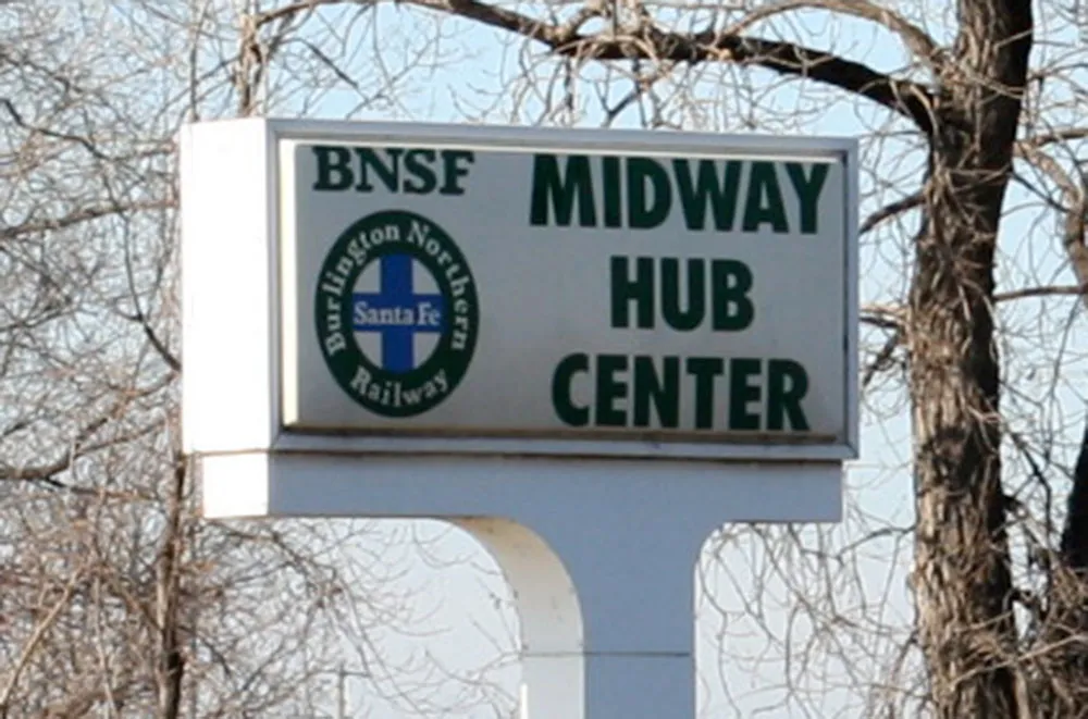
After driving past it for years, I suddenly realized what an absurd sign this is. Photo taken February 2, 2006, in the, uh, Midway area of Saint Paul, Minnesota.
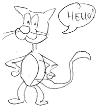
My daughter and her friend asked me to draw a picture of Hello Kitty. For better or worse, I can’t resist playing the fool. We all had a good laugh.
So, there’s this thing going around blogs where you answer this list of questions, four answers each. I was tagged this morning by John Martz (a.k.a. Robot Johnny). It seems a bit like a chain letter, but I enjoyed reading other people’s answers, so I’ll play along:
Four jobs I’ve had:
- Bag boy, Penny’s Supermarket
- Art director, Minnesota Public Radio and several other places
- Freelance graphic designer and illustrator
- Type designer
Four movies I can watch over and over:
- Blade Runner
- 2001: A Space Odyssey
- The Wrong Trousers
- Time Bandits
Four places I have lived:
- Beloit, Wisconsin
- Osseo, Minnesota
- Minneapolis, Minnesota
- Saint Paul, Minnesota
Four television shows I love to watch:
- Lost
- Monty Python’s Flying Circus
- Futurama
- Doctor Who
Four places I have been on vacation:
- Jamaica
- Montreal
- Lanesborough, Minnesota
- New York City
Four of my favorite dishes:
- Pizza
- Greek salad
- Aloo Mater Paneer
- Bowl of cereal
Four websites I visit daily:
- Typophile
- Typographica
- kottke.org
- Drawn!
Four places I would rather be right now:
- Asleep in bed (up too late last night)
- New York, 1930, with a camera
- Someplace warm
- A good bookstore or library
Four bloggers I am tagging:
The new release of Proxima Nova features a couple of compatibility fixes and more flexible access to alternate characters.
As a side benefit of one of the fixes, the Normal, Condensed, and Extra Condensed styles appear in their own font submenus. This turns out to be a better arrangement than having the whole family all in one submenu. I should have done it this way in the first place.
Alternate characters will now be much easier to deal with. I’ve set up seven “Stylistic Sets” so that alternate characters may be substituted globally in any combination. The new sets are also smarter the the original two in the way they handle the two-story and one-story lowercase “a” in the roman and italic. Again, I should have done it this way in the first place.
The update is free to customers who purchased before December 14, 2005. Customers who purchased after December 14, 2005 already have the new version.