Mark’s Notebook - Page 40
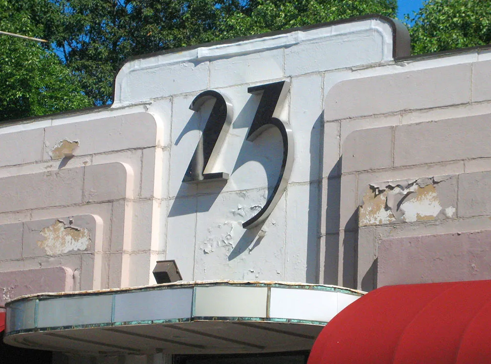
Dimensional letters seen on a building in Cambridge, Massachusetts, August 8, 2006.
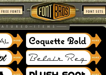
Fellow font guy Stuart Sandler and his partner, Mike Ibach, have launched a new online font venue called Font Bros. The site has some of the same retro look as Stuart’s older Font Diner site, but unlike Font Diner, it offers a hand-picked selection of display faces from a dozen or so independent foundries (including Mark Simonson Studio).
The range of styles covers the whole gamut of type and lettering genres, not just retro. Some of the fonts (like Michael Doret’s amazing Metroscript) are brand new. They are also in the process of remastering the formerly freeware Fontalicious library, bringing it up to professional quality standards.
So, go check it out. It’s pretty cool. www.fontbros.com
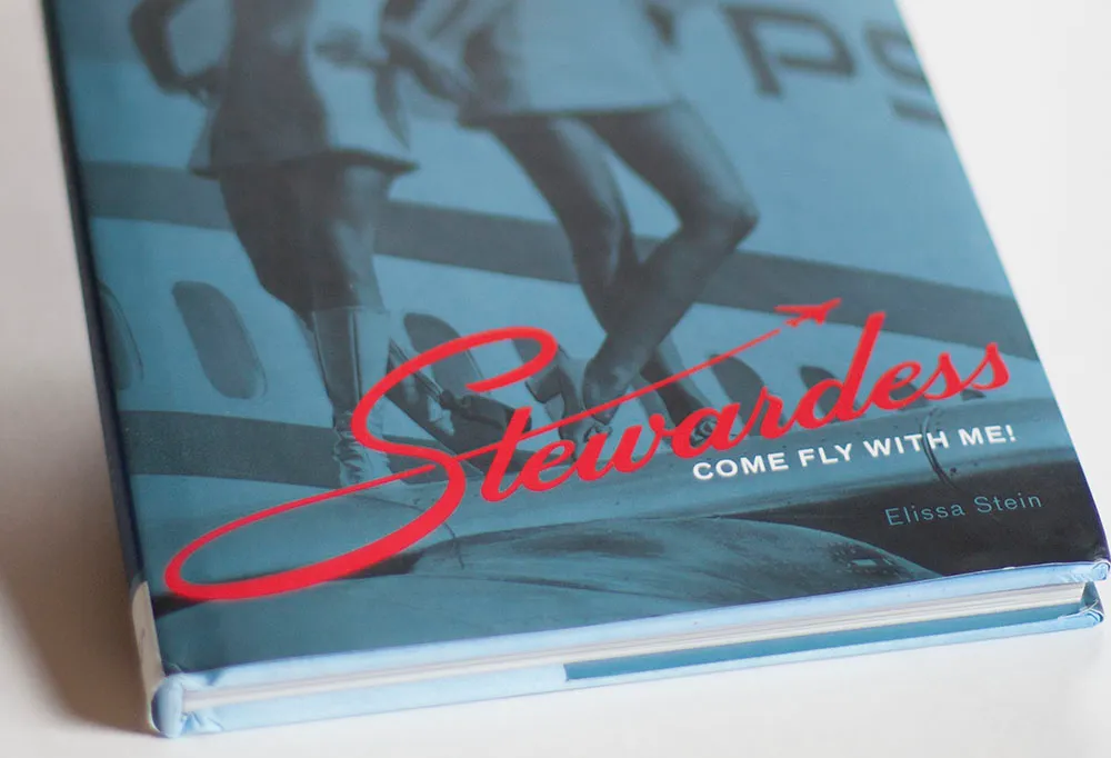
Earlier this year, I completed a lettering assignment for the cover of “Stewardess,” a book by Chronicle Books, which was just published. Designer Ben Shaykin came up with the idea of doing a take off (!) on the old Skyway Luggage logo.
It can be tricky to get things like this to work if you don’t have the right letters, or too many or few letters. It can also be tricky to come up with the letters that didn’t exist in the original logo. In this case, the style was a straightforward script. It would be conceivable to base an entire font on this style, which is not always the case with logos.
I’m happy with the way it turned out. The book itself is a lot of fun to look at (it’s mostly a picture book) and is getting positive reviews.
Some time in the last year or so, I bought, through Amazon Books, Paula Scher’s book Make It Bigger, a beautiful overview of her outstanding career as a graphic designer. If you’ve ordered books through Amazon and haven’t opted out of their periodic mailings, you regularly get recommendations for other books in which you might be interested, based on your previous purchases. It usually comes up with reasonable suggestions, but take a look at the one I received the other day:
We’ve noticed that customers who have purchased books by Paula Scher often purchased books by Peter Hall. For this reason you might like to know that Peter Hall’s newest book, Understanding Disease: A Centenary Celebration of the Pathological Society, will be released soon. You can pre-order your copy by following the link below.
I guess there must be more than one author named Peter Hall.
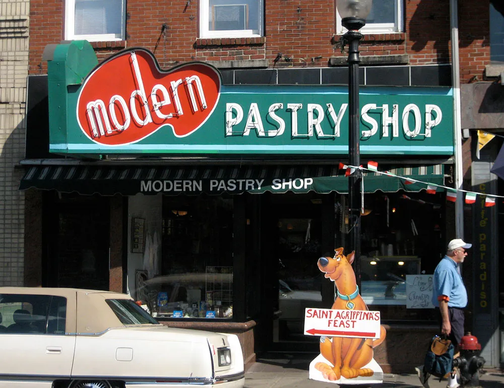
Just arrived in Boston yesterday for TypeCon 2006. While walking along the famous Freedom Trail, I snapped this photo of a great vintage sign. Scooby seems to like it, too. (By the way, if you walk on the Freedom Trail the wrong direction, should it be called the Tyranny Trail?)
Update, Febrary 2013: I never got around to writing more about TypeCon 2006. Sorry about that. It was pretty great. I did a short presentation about Adrian Frutiger (who was awarded the SOTA Award that year) and the folks from Bitstream did a musical number about Bitstream typefaces in the fashion of Gilbert and Sullivan.
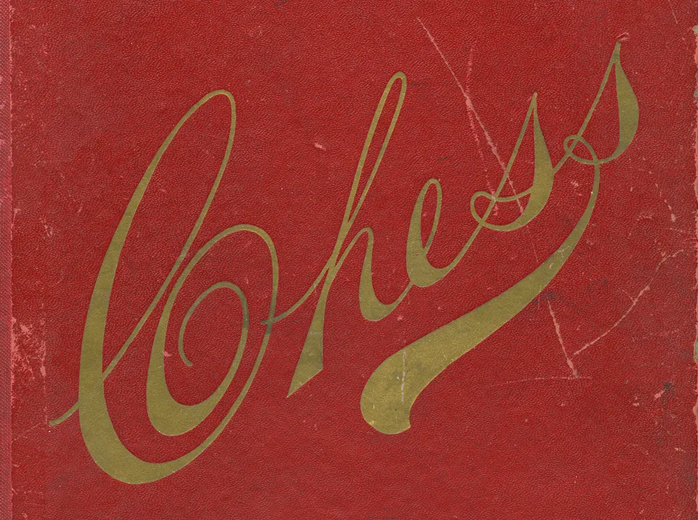
Lettering on the back of an antique cardboard chess board. Discovered in a yard sale, St. Paul, Minnesota, summer 2005.