Mark’s Notebook - Page 20
I’ve heard this movie compared to Mad Men—or maybe it was the other way around. I didn’t like this as much as Mad Men. In spite of great characters and great acting (the neighbors’ crazy son was great), and beautiful photography, it just didn’t do much for me. The principle characters, a married couple played by Kate Winslet and Leo DiCaprio, have two kids, but the kids might as well have been played by extras and barely appear in the movie. Maybe it was intentional and meaningful, but it seemed weird.
Anyway, you probably don’t come here for my review (the movie’s a few years old after all). You came for the dirt on the typographical props.
The movie is set in 1955, so there’s lots of opportunities to get things wrong. It wasn’t too bad for the most part—a lot like Mad Men in fact. The general effect is good and authentic, but things kind of fall apart in the close ups, especially in HD. (The prop people must hate HD.) Magazines look like what they are—fifty-year-old magazines. Same with other vintage ephemera. There didn’t seem to be a lot of typographic props made for the movie. I did catch one klinker, a “for sale” sign:
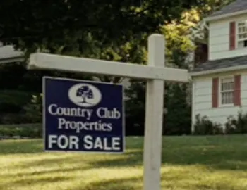
That’s ITC Garamond (1976) and Helvetica (1959). Did I mention the music was pretty?
I was going through some old papers today and found this:
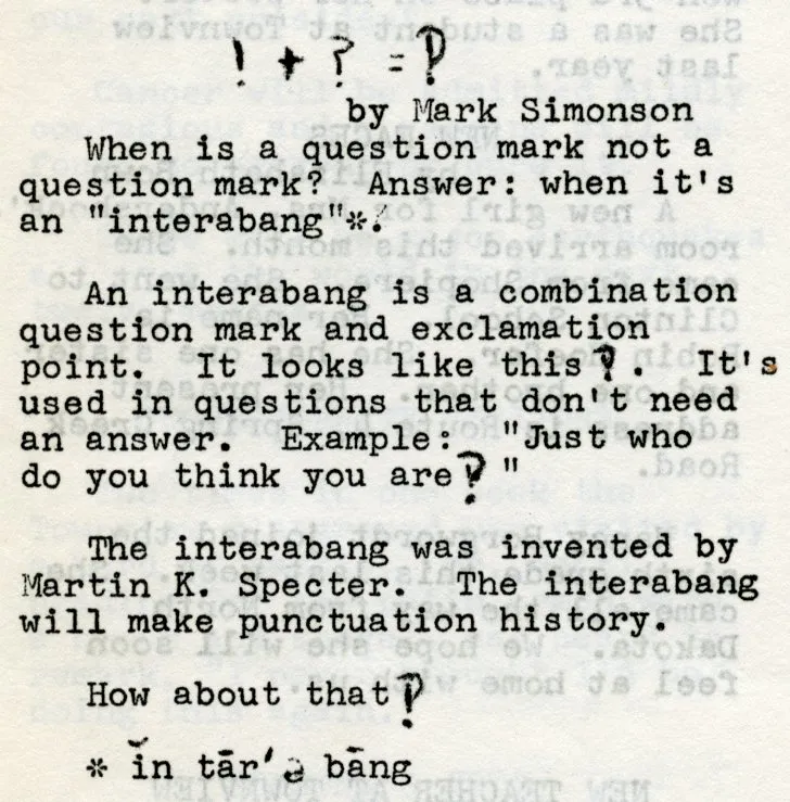
It’s a short article I wrote that appeared in the November 1967 issue of Town Views, the student newspaper at the elementary school I attended. I was 11 years old at the time.
As I recall, I heard about the interabang* from a newsletter my dad used to bring home from work. It was published by Falk, an industrial company that made forklifts or something. But always had interesting topics. I remember seeing M.C. Escher’s work for the first time in one issue.
Seeing this again I realized it’s probably the first type-related thing I ever wrote. I’m sure at the time I just thought it was interesting.
*This is an alternate and apparently older spelling that still appears in some dictionaries—usually it’s spelled “interrobang” today.
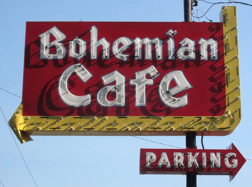
While I was visiting Omaha this past summer (I spoke and did a workshop for AIGA Nebraska), I spotted this curious bit of typographic design:
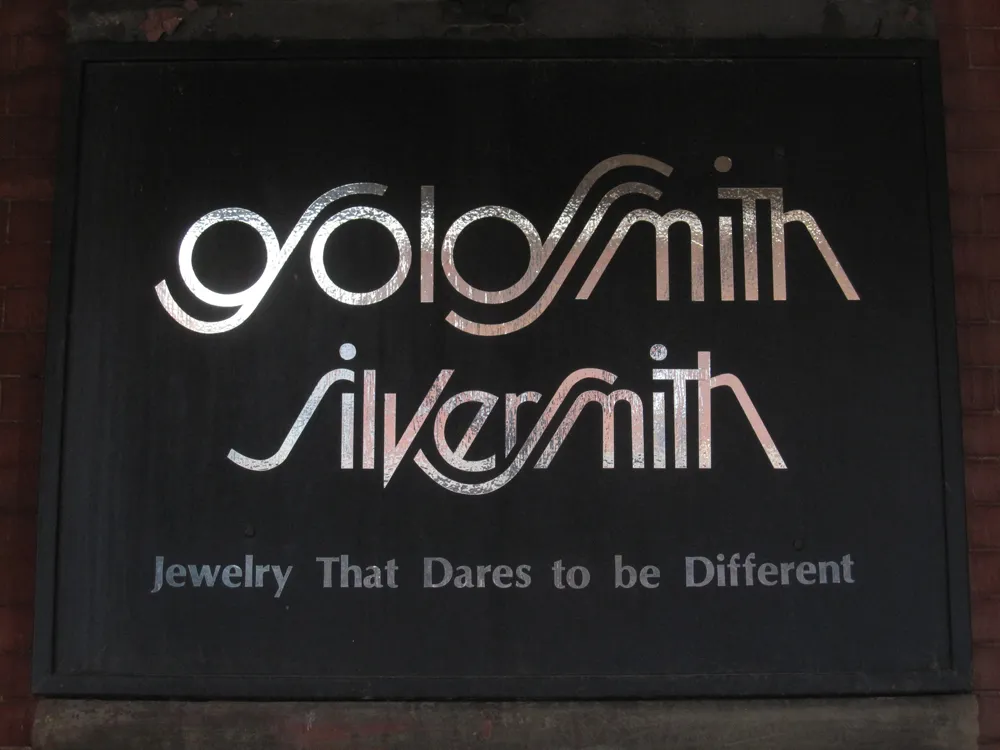
Looks like the artist was going for a Lubalin-style solution—Avant Garde with Swashes. It’s attractive, but not very easy to read, especially the “g”.
I wonder how long it’s been in use? I can’t decide if this is a design from the seventies or eighties, or if it’s a recent design imitating that period. I’m leaning toward the former, mainly because of the use of Optima in the tag line.
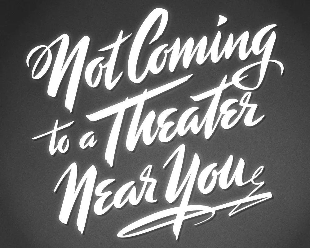
Last year, I did a logo design for Not Coming to A Theater Near You, a website devoted to movies off the beaten path. The designer, Rumsey Taylor, who was redoing the look of the entire site, wanted the logo to look like a title card from a film noire feature. What I came up with is based mainly on the title card from “Mr. Arkadin” (1955).
In spite of appearances, I don’t usually use an actual brush in my lettering designs, but in this case I did. The final art is vector-based, but I worked out the construction of the letters with brush and ink. (I’m not skilled enough at brush lettering to do the final art that way.)
The image above is a “treatment” I did to make it look like an actual title card from an old film, sort of a “serving suggestion.” On the wesite, Rumsey chose a simpler approach. The site redesign looks great, and I was happy to see that he’s using Metallophile Sp8 as a webfont (via Typekit).
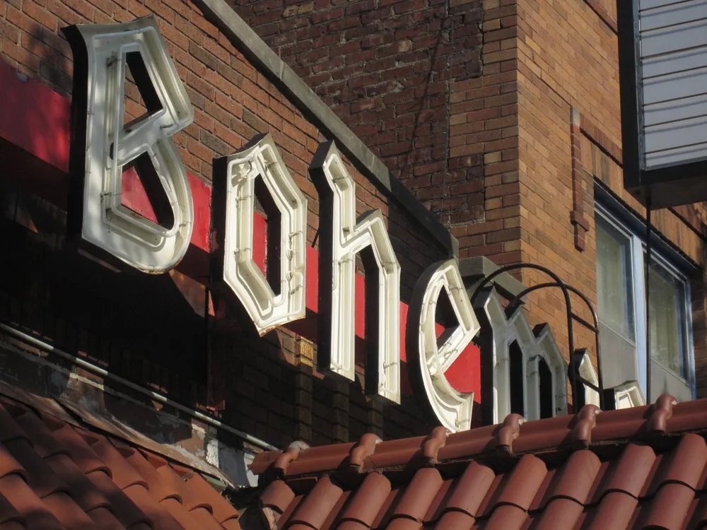
The Bohemian Cafe in Omaha, Nebraska. Shot on August 23, 2011.
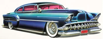
I just discovered today that my old pal, illustrator Dan Picasso, has a new website. danpicasso.com. Back in the eighties, Dan and I worked together at MPR and later shared an office together as freelancers. We’ve drifted apart since then.
Dan uses a real airbrush in his work—none of this Photoshop nonsense. Most of the works displayed on his site are new to me. He’s done some amazing pieces of lettering design. He definitely had an influence on my taste for lettering and type. And I love the car paintings. I don’t think I’ve seen them before.