Mark’s Notebook - Page 21
I’ve attended all three of the Hamilton Wood Type and Printing Museum’s annual “Wayzgoose” events so far. Last year’s, held in early November, was enjoyable as always, but I think I prefer the mix of presentations and hands-on workshops of previous years over having only workshops.
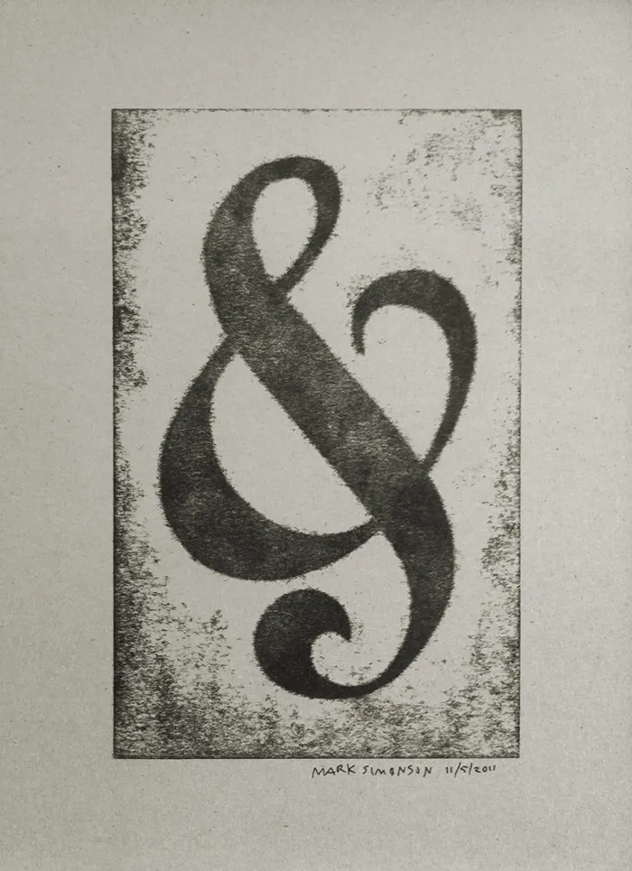
Still, it was great how they tied all the workshops around a common purpose—creating a portfolio of prints (including the portfolio itself). You can see one of my prints above, a pressure print from a hand-cut plate based on a free-form ampersand design.
I highly recommend the Wayzgoose if you are a type fanatic like me, into letterpress printing, or both. It’s held in the Fall in Two Rivers, Wisconsin. Attendance is limited, and it fills up quick, so you might want to get on their mailing list to be notified regarding when the next one will be held.
I used to draw a lot more when I was young and got to be pretty good by the time I was in college. I might have had a career as an illustrator if I hadn’t taken a detour into graphic design and art direction.
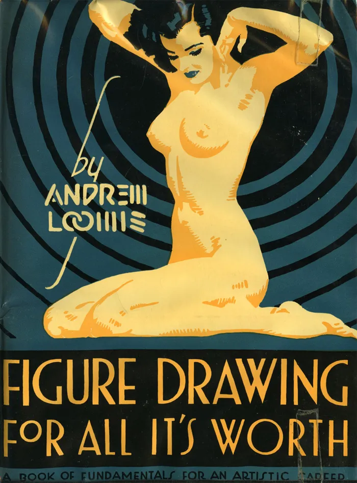
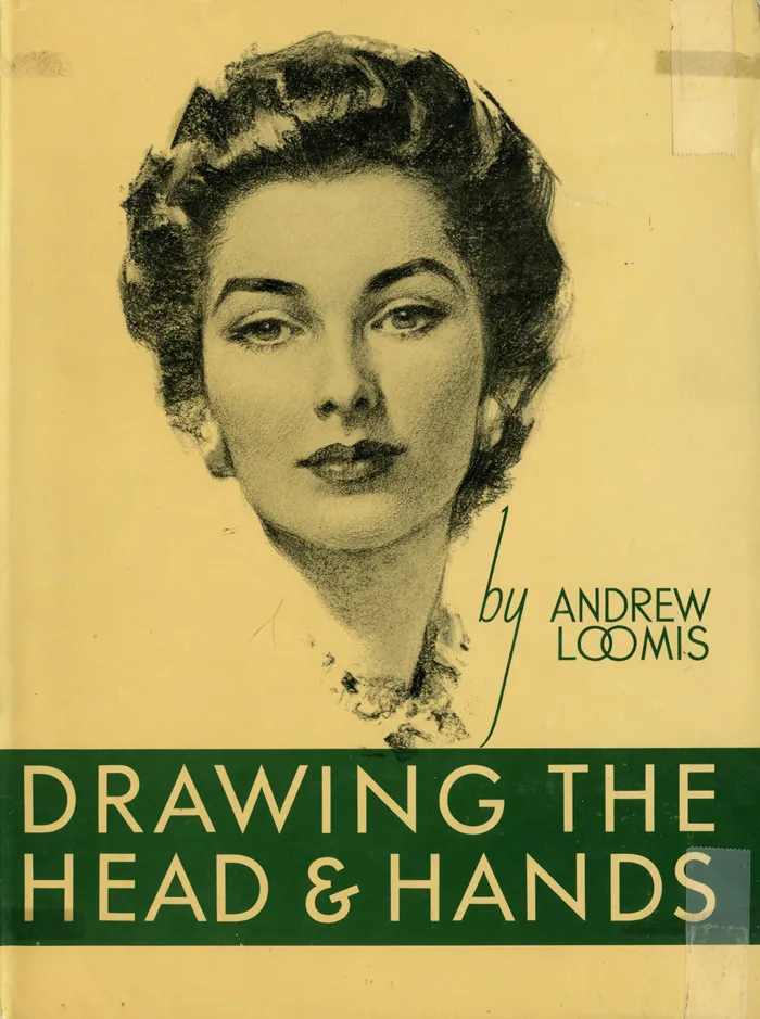
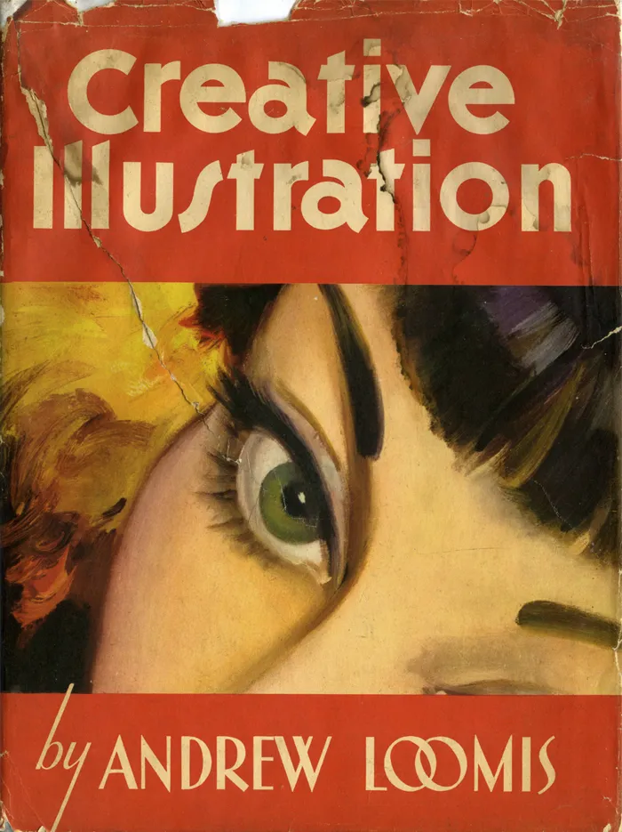
For the last few years, I’ve been trying to get back into drawing again, but more for enjoyment than anything commercial. Not long ago, I discovered the books of Andew Loomis, who died in 1959. He was a commercial illustrator who did a popular series of books on drawing and painting, starting in 1939 with Fun With A Pencil.
Loomis’s facility for drawing was astonishing. One thing I’ve never been good at is figure drawing without referring to a live model or a photo. Loomis lays it all out clearer and with more depth than anything I’ve seen before. Where were these books when I needed them?
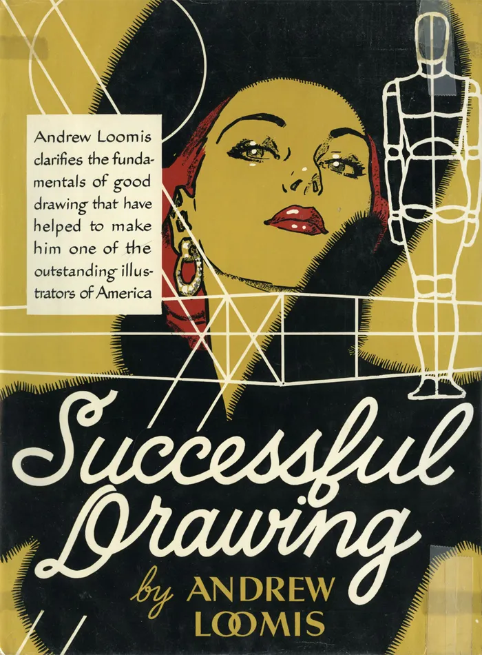
I don’t know if I have the time or patience to begin again with these books, but I’d love to try. More likely, they’ll be fuel for day dreams, and I’ll stick to doing what I do—type and lettering. Speaking of which, aren’t the covers terrific?
By the way, don’t write asking what fonts are used on the covers. Except for some Futura on the first cover, it’s all hand-lettered, presumably by Loomis. There’s lots more lettering inside, too, for title pages and illustration captions.
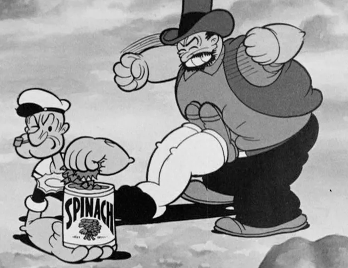
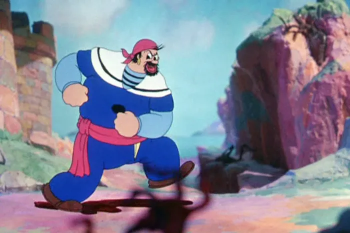
Popeye was my favorite cartoon when I was four or five years old. The ones I remember best—and love most—are the early one’s made by Max Fleischer Cartoon Studio. These are the ones in which Popeye wears a black shirt and the characters all mumble a lot.
The drawings have a solid feel to them, like they’re three-dimensional, but everything is stylized in very a cartoony way, including the movement. You can see a similar sort of style in the Beatles’ Yellow Submarine.
I’ve been making my way through the “Popeye The Sailor: Volume One, 1933-38” DVD set (which, coincidentally, uses my Mostra fonts on the package). Here are some things that have crossed my mind while watching these classic cartoons:
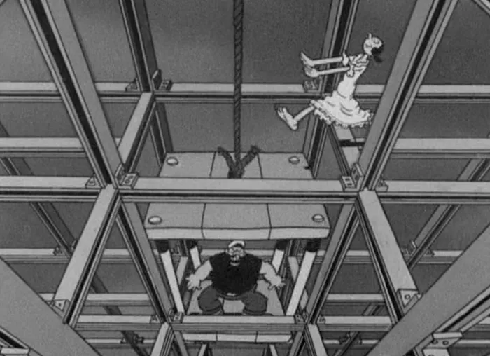
- “A Dream Walking” is one of the cleverest animated cartoons ever. Popeye and Bluto fight over who will save Olive as she sleepwalks through an under-construction skyscraper. There is a lot of complicated timing and tricky animation in this, and the humor comes out of it.
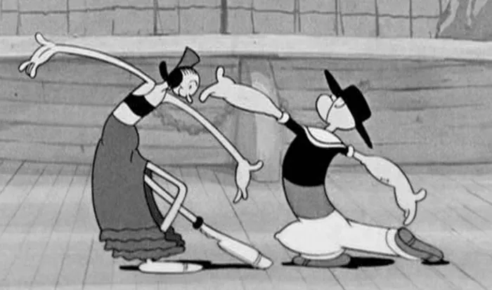
- The dance scenes in “Morning, Noon, and Nightclub”, in which Popeye and Olive Oil are nightclub performers, are beautifully cartoony—and funny. I also love the way Bluto walks in this one.
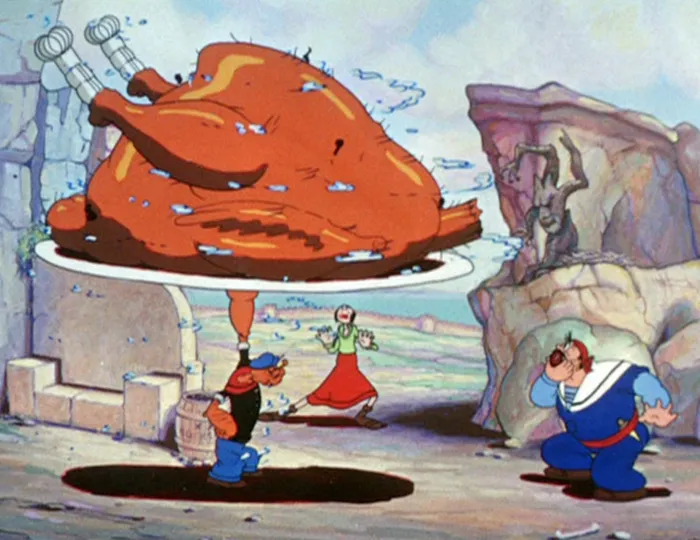
- “Popeye the Sailor Meets Sinbad the Sailor”, the earliest of the three two-reel Popeye color cartoons, has to be my all-time favorite. It’s too bad the Fleischers didn’t do any feature-length Popeye cartoons in this style.
-
Several of the cartoons in this period (including “Sinbad”) utilize three-dimensional set for backgrounds. They are built to look like the usual painted backgrounds—until the camera moves, and the characters seems to be walking through a three-dimensional world.
-
When I was in kindergarten, Olive Oyl was my dream girl. I’d forgotten about that.
-
I was so into Popeye when I was little, I asked my mom to buy canned spinnach for me, which I ate—it was actually kind of good if you put enough butter on it. Had to be the first time I ate something because I heard it made you healthy.
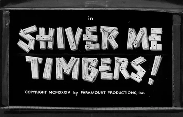
- Every one of the title cards is beautifully hand-lettered. This was routine back when these shorts were made. It was much easier to use lettering than type for movie title cards, and less expensive. It affords much more variety of treatment as well, including illustrated effects.
A week or so ago, I had a phone call from a guy from St. Petersburg, Russia. It wasn’t clear from his preliminary emails what he had in mind to talk about. I assumed it was something about type, or an iPhone app he was working on, or both.
Turns out, he is a fan of my blog. It was an interview about blogging. Blogging!
I felt a little embarrassed. I’ve posted only eight items here in the last two years. And most of those were to promote something. Some blog.
But talking to him rekindled my interest. I like what I used to do here, and I really want to get it going again.
So, here’s my first post of the year. No promises, but I’m going to try to post at least one item every day from now on. We’ll see.
My new Bookmania fonts are now available at my own site, and Fontspring. More vendors will be added to this list as they are ready. Update: Bookmania is now available at nearly all my distributors and on my own website. To buy it from me directly, see the Bookmania page, under Buy.
For the last four years, I’ve been working on a revival of the classic ATF Bookman Oldstyle and the Bookmans of the 1960s. But it’s not a slavish replica. It’s my own idea of what Bookman could be. It’s the revival I always wished someone would do.
I thought about doing a cursive italic, like others have tried, but in the end I decided that the original slanted roman should be preserved. Bookman has always been known for its swashes, so I also made a superset of the dozens of swash characters that have been added to Bookman over the years.
I wanted to go beyond its past and make something new. I added things that Bookman never had like small caps, old style figures, alternate characters, ligatures, stylistic sets, extensive language support, and more.
The family is composed of five weights—Light, Regular, Semibold, Bold, and Black, plus italics.
It’s my love letter to the classic Bookman: Bookmania.
Coming soon to all the places you can get my fonts.
Follow @marksimonson on Twitter for updates on availability.
Update: Now available at Fontspring. Other distributors to follow.
I’ve also updated my website and added a page for Bookmania here where you can download a PDF specimen booklet.