Mark’s Notebook - Page 18
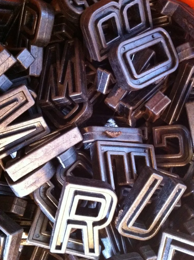
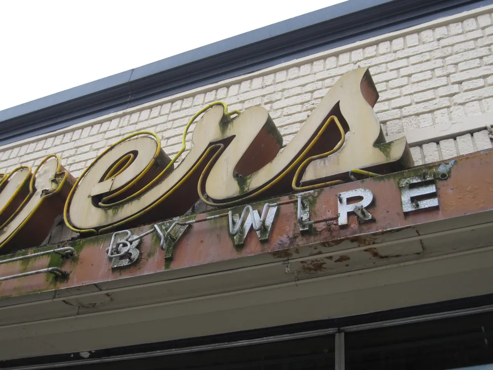
Seen in an antique store in Mount Vernon, Iowa, October 23, 2010.
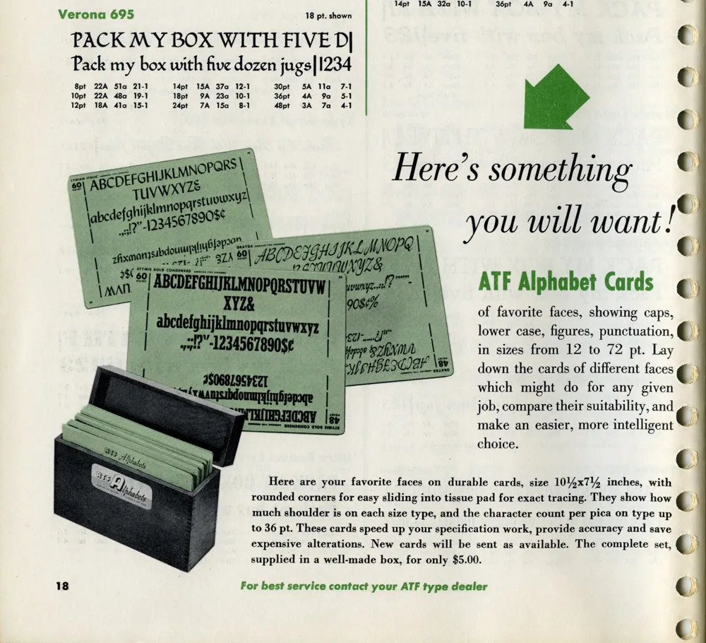
While looking for some obscure typographical thing this morning, this ad in a 1955 ATF (American Type Founders) catalog caught my eye:
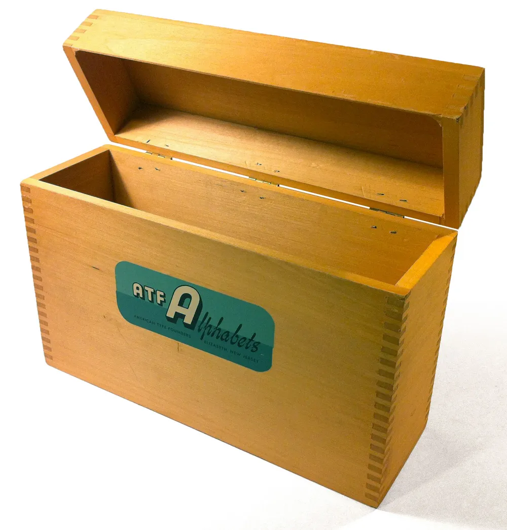
I have several boxes like the ones shown in the photo. I acquired them with a bunch of other stuff some years ago when the University of Minnesota Journalism School revamped its graphics lab. Here’s one of them:
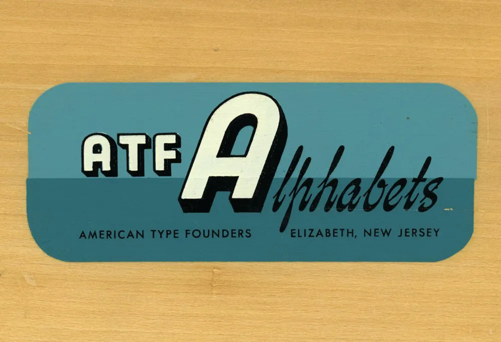
The silk-screened label is beautiful:
It’s too bad I don’t have any of the type sample cards they were designed to hold. “Here’s something you will want!” Still true, even in 2012.
Postscript: An Etsy page with photos of what went in these boxes. Thanks to Joel for the link, and thanks to Kathy for sending me a complete set of the cards.

This is either really cool or really sad. I can’t make up my mind.
Seen in Saint Paul, Minnesota, November 3, 2010.
After posting my follow-up on Sunday, my uncle sent me some more details about the CCA calendars:
“Most of the calendars during the late sixties and early seventies were designed at the CCA Corporate Design Center, which was located in downtown Chicago. It was run by John Massey who was head of all CCA corporate design and promotional material. He had two brothers that worked for him. We referred to them the Kalfus brothers (not sure of the spelling). They did many of the calendars. John Massey used Helvetica type only on everything they designed. Bill Bonnell came later and may have designed some of the last calendars CCA did.”
Somebody ought to do a site about CCA’s design history. So many things like this are virtually non-existent on the web.