Sharktooth (2000, 2003) began as an attempt to turn Felt Tip Roman into a “real” typeface. My approach was to take the essential underlying forms of Felt Tip Roman and rationalize them into regular typographic forms, simplifying and stylizing a subset of the existing shapes. In the end, only glimpses of Felt Tip Roman remained, and Sharktooth turned out distinctly different from its source. As a text face, it has a lively texture and is quite legible. The name comes from the sharp, angular shapes seen in many of the letters.
Buy Sharktooth
1. Select styles
| Sharktooth Family Styles included • Regular • Bold • Heavy $64.99 |
|---|
2. Select licenses
Interested in an extended or enterprise license? Please send an email to info@marksimonson.com.
Name
Description
$0.00
Sharktooth Font Styles
A wisecracking jackalope on a freight vexed by Moz’s bequest.
A wisecracking jackalope on a freight vexed by Moz’s bequest.
A wisecracking jackalope on a freight vexed by Moz’s bequest.

Sharktooth Features
- Three weights: Regular, Bold, and Heavy.
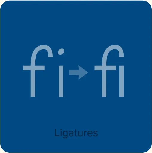
- Ligatures.
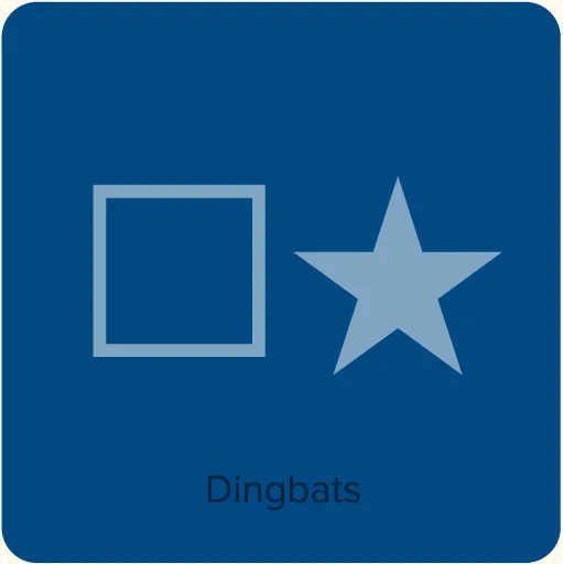
- Dingbats.
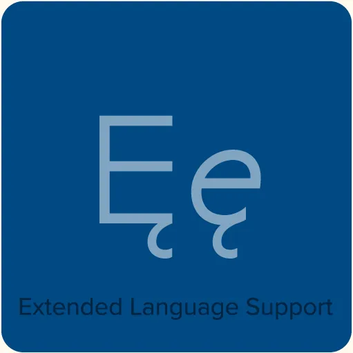
- Extended language support for most Latin-based Western and Central European languages.
Specimens
Sharktooth Specimen. Complete showing of all the fonts and usage examples. 7 pages. 119 KB PDF.
Additional Information
Sharktooth Loupe A Flash animation I created in 2003 to promote Sharktooth.
?756e)
?05aa)
?d764)
?a345)