Hardcover (2025) is an elegant serif typeface intended for display use. It was one of my earliest typeface ideas, dating back to a sketch I did while working at one of my first design jobs in 1978, inspired by the slick lettering I’d seen on mass-market book covers. The capitals follow a classic roman model, reminiscent of Times New Roman, but with more modern, simplified forms. The lowercase and figures are constructed similar to the capitals, avoiding features typically associated with lowercase such as ball terminals and angled serifs. Although it may be used in short blocks of text, Hardcover is designed to be used large. It features matching italics and small caps for all weights and a set of dingbats.
?f9e7)
?3a67)
?c50e)
?f0db)
?9ef3)
Buy Hardcover
1. Select styles
| Hardcover Superfamily 14 styles, 2 variable fonts included for FREE! $269.99
Save 36% |
|---|
| Hardcover Family 14 styles $245.99
Save 41% | |
|---|---|
| Extra Light $29.99 | Extra Light Italic $29.99 |
| Light $29.99 | Light Italic $29.99 |
| Regular $29.99 | Regular Italic $29.99 |
| Semi Bold $29.99 | Semi Bold Italic $29.99 |
| Bold $29.99 | Bold Italic $29.99 |
| Extra Bold $29.99 | Extra Bold Italic $29.99 |
| Black $29.99 | Black Italic $29.99 |
2. Select licenses
Interested in an extended or enterprise license? Please send an email to info@marksimonson.com.
Name
Description
$0.00
Hardcover Font Styles
A wisecracking jackalope on a freight vexed by Moz’s bequest.
A wisecracking jackalope on a freight vexed by Moz’s bequest.
A wisecracking jackalope on a freight vexed by Moz’s bequest.
A wisecracking jackalope on a freight vexed by Moz’s bequest.
A wisecracking jackalope on a freight vexed by Moz’s bequest.
A wisecracking jackalope on a freight vexed by Moz’s bequest.
A wisecracking jackalope on a freight vexed by Moz’s bequest.
A wisecracking jackalope on a freight vexed by Moz’s bequest.
A wisecracking jackalope on a freight vexed by Moz’s bequest.
A wisecracking jackalope on a freight vexed by Moz’s bequest.
A wisecracking jackalope on a freight vexed by Moz’s bequest.
A wisecracking jackalope on a freight vexed by Moz’s bequest.
A wisecracking jackalope on a freight vexed by Moz’s bequest.
A wisecracking jackalope on a freight vexed by Moz’s bequest.
A wisecracking jackalope on a freight vexed by Moz’s bequest.
A wisecracking jackalope on a freight vexed by Moz’s bequest.


Hardcover Features
- Dingbats & symbols.
- Filled Manicules.
- Small caps for all styles.
- Arbitrary fractions.
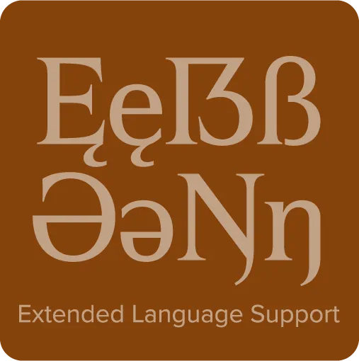
- Extended language support for most Latin-based Western and Central European languages.
*Requires an application or operating system with support for OpenType advanced typography, such as Adobe Creative Cloud, Affinity Designer/Photo/Publisher, or QuarkXPress. Check your application’s user guide. OpenType advanced typography is also supported by most modern web browsers through the use of Cascading Style Sheets (CSS).